The Words Construction
Lena Chen
9/25/2017
LS Studio 1
Fall 17
Derek Haffar
Project Name: Big Rock Candy Mountain Intro
Describe the project from beginning to end here:
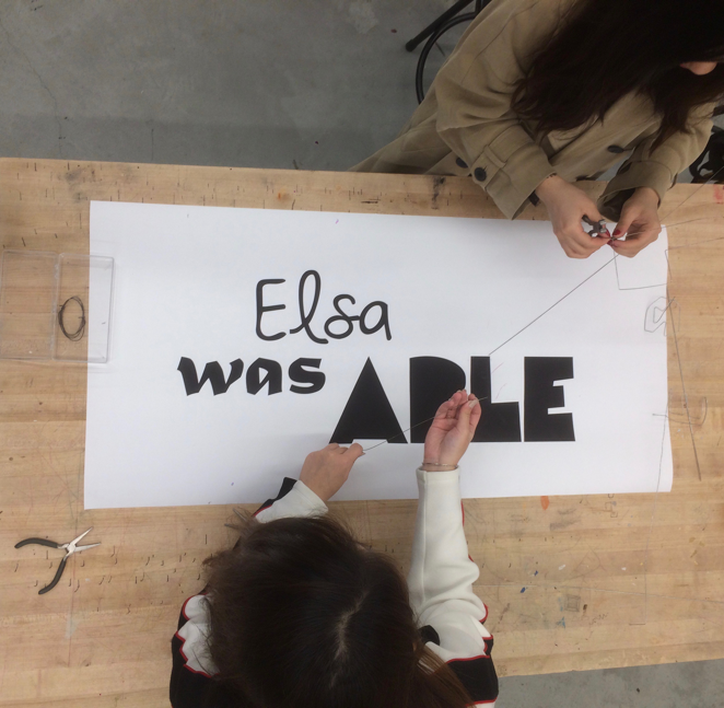
In this project, we use ordinary materials to give life to words. First, my partner and I looked up the dictionary definition of the assigned words. We analyzed them, and chose the most suitable fonts for each one. Instead of simply placing them from left to right, we arranged the three words in a particular way to best convey their connotations. Then we sized the whole layout and print the words out. After that, we transferred them from 2-D printing into wire constructions in the making center.
Write the words you were assigned here:
“Elsa was able”
Elsa
noun. a female given name, form of Elizabeth
was
verb. 1st and 3rd person singular pt. indicative of “be”
able
adjective
1.having necessary power, skill, resources, or qualifications; qualified:
able to lift a two-hundred-pound weight; able to write music; able to travel widely; able to vote.
2.having unusual or superior intelligence, skill, etc.:
an able leader.
3.showing talent, skill, or knowledge:
an able speech.
4.legally empowered, qualified, or authorized.
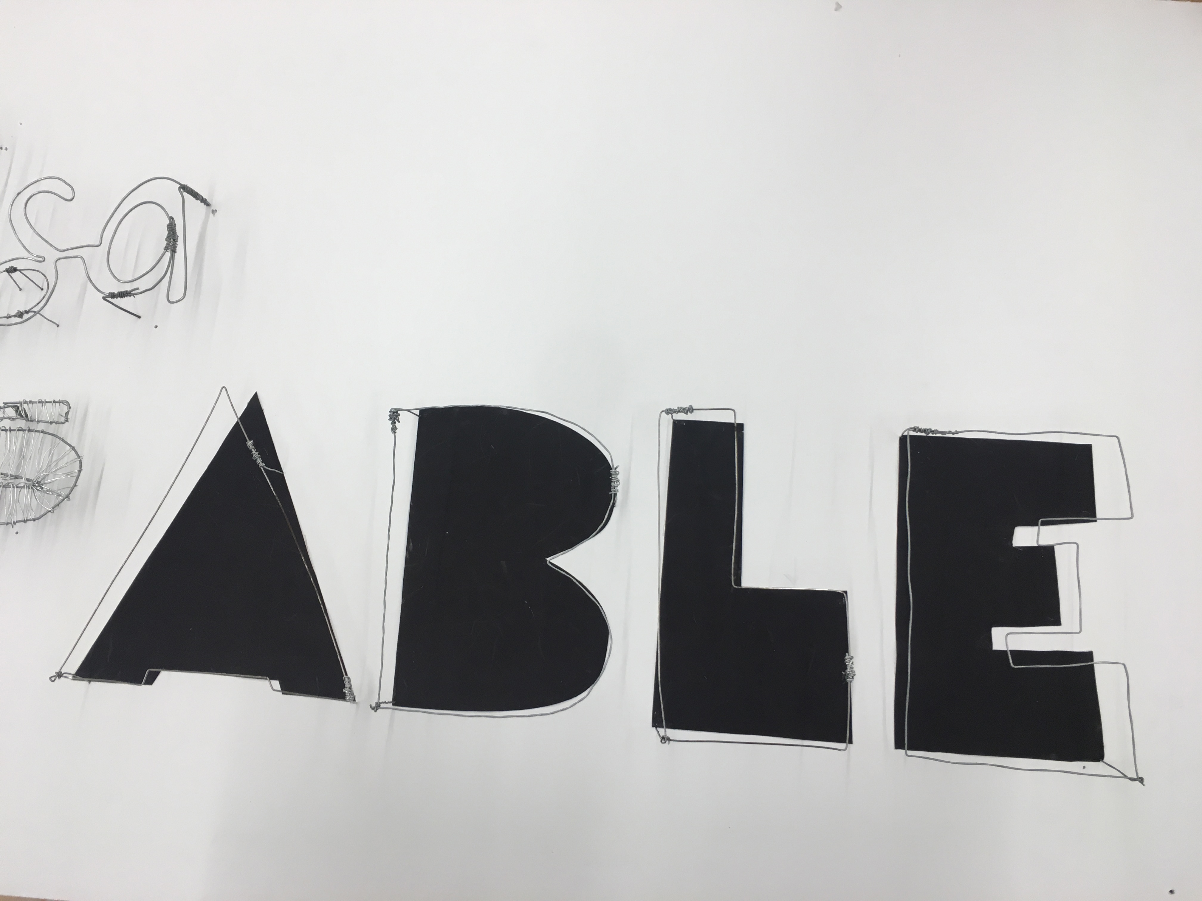
Put an image of the words as you altered them here explaining why you chose the font or style:
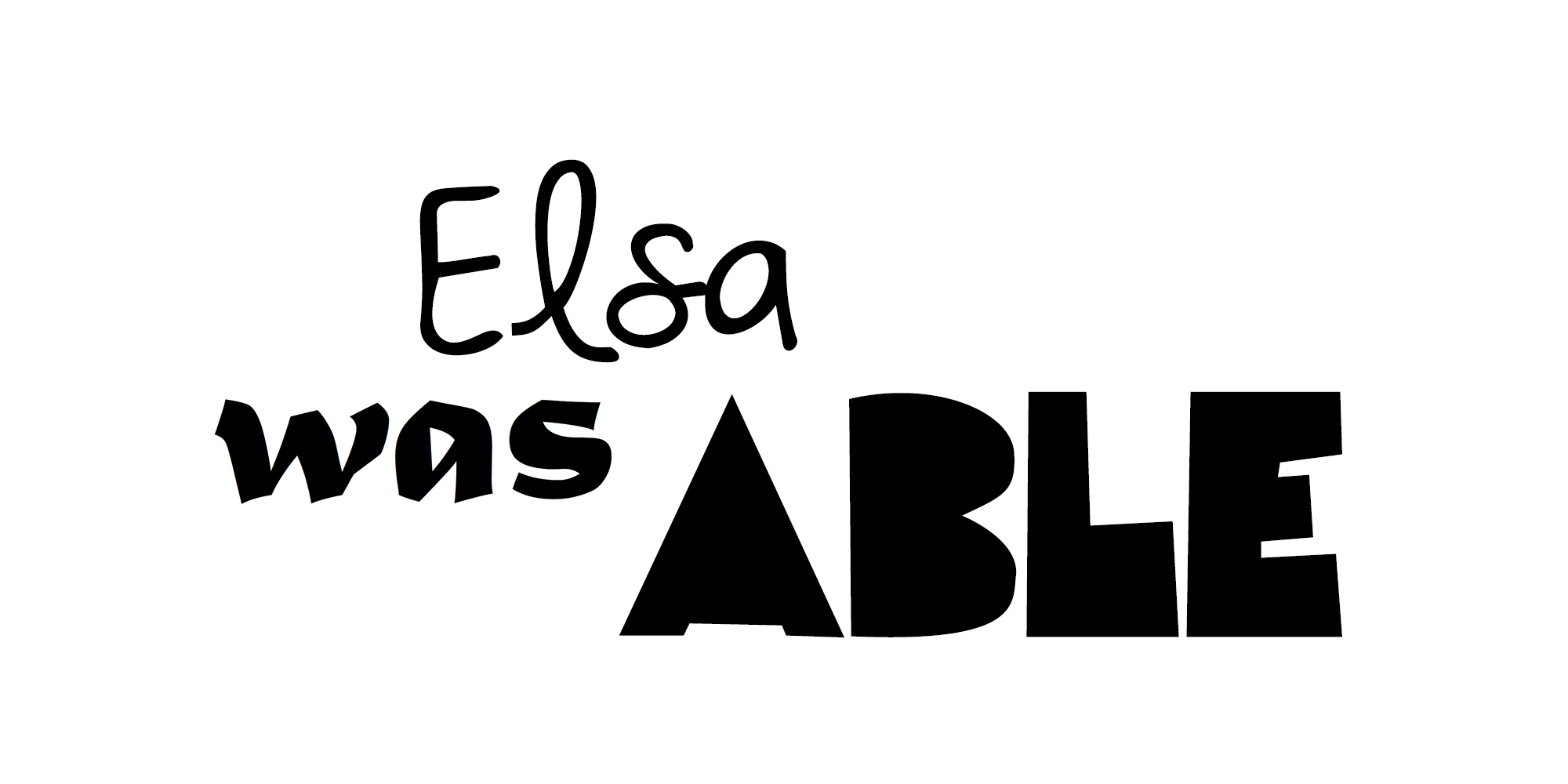
Fonts:
Elsa – Beautiful Every Time
was – Matura MT Script Capitals
able – Fat Cat
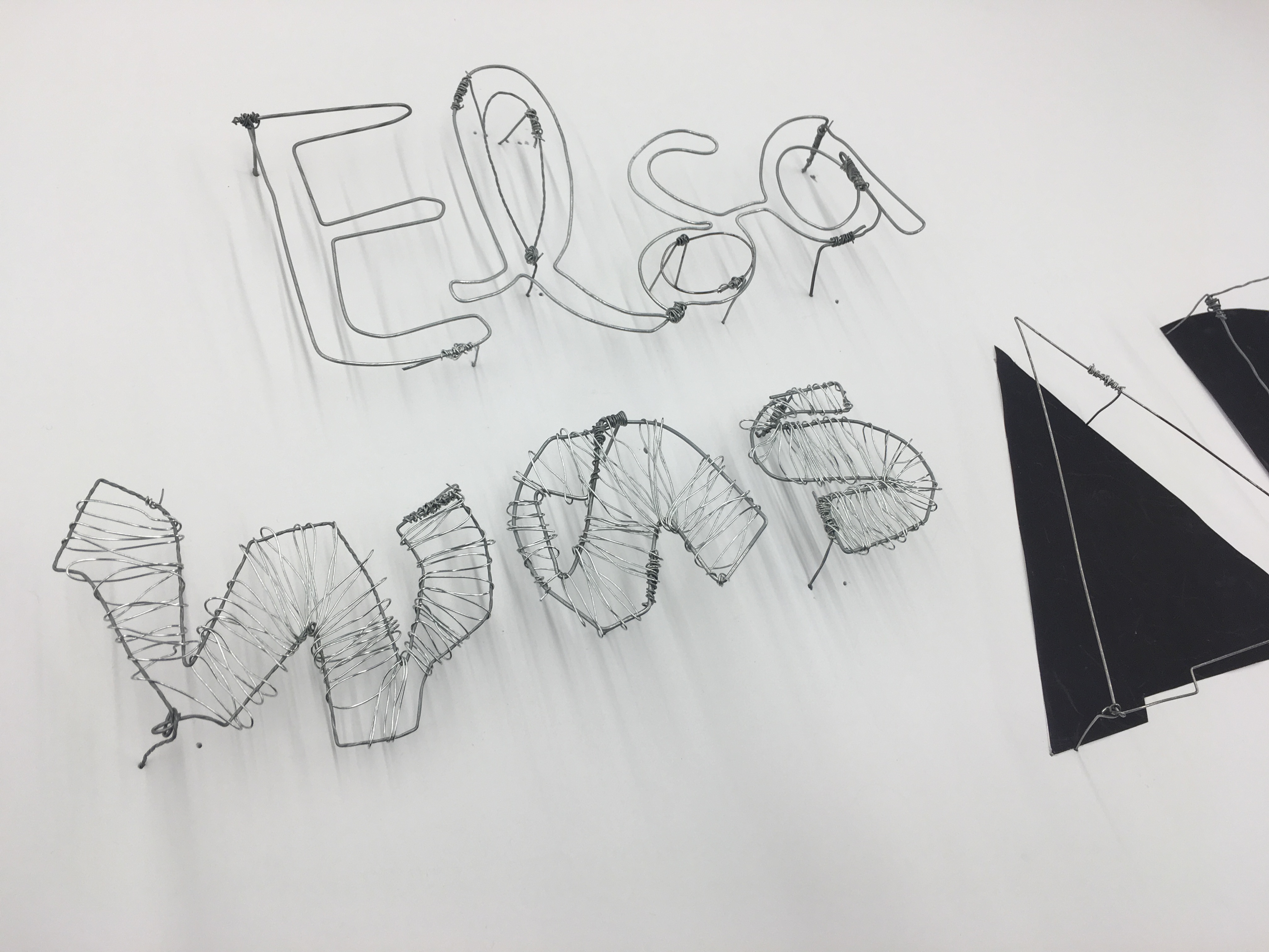
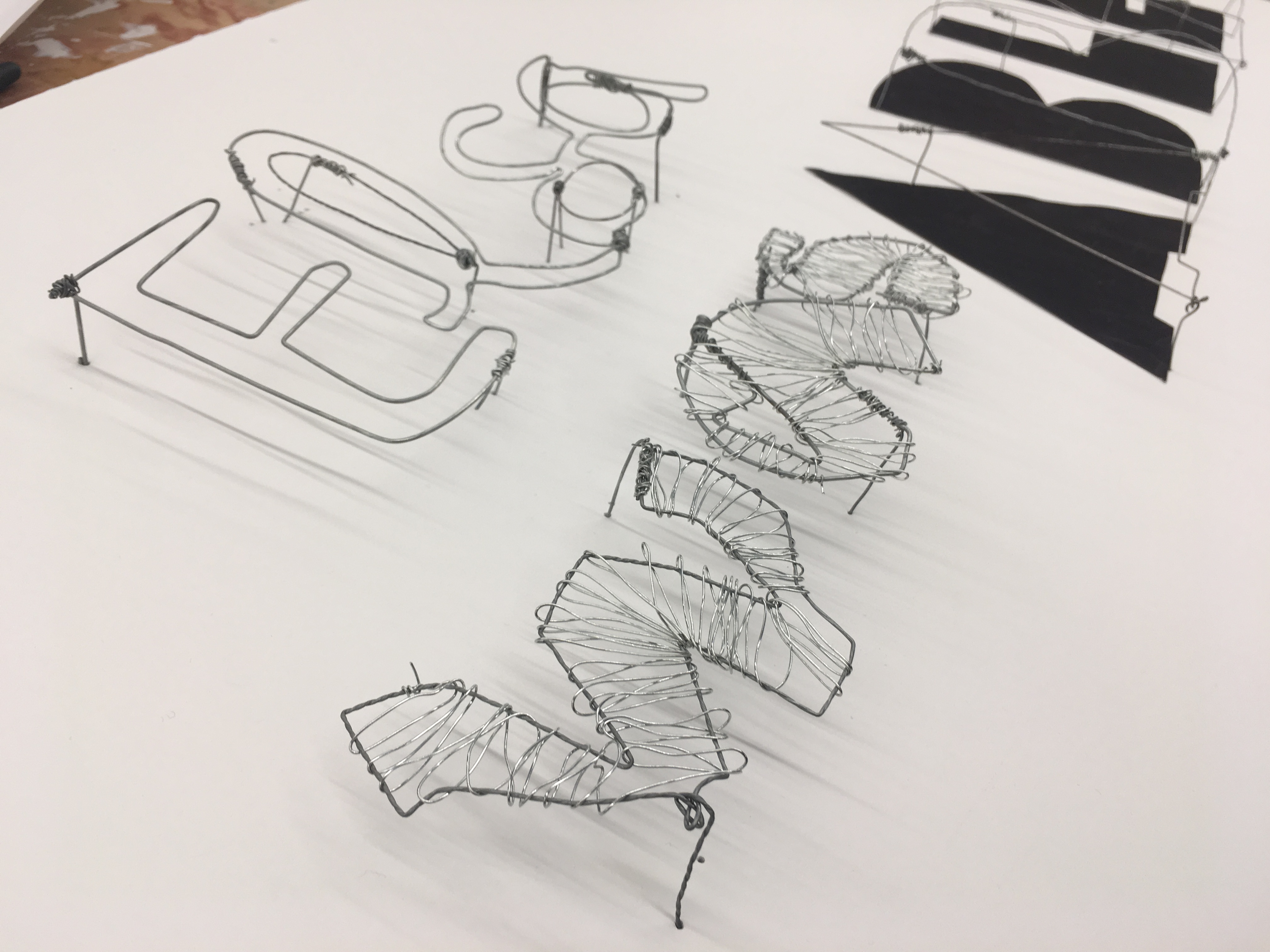
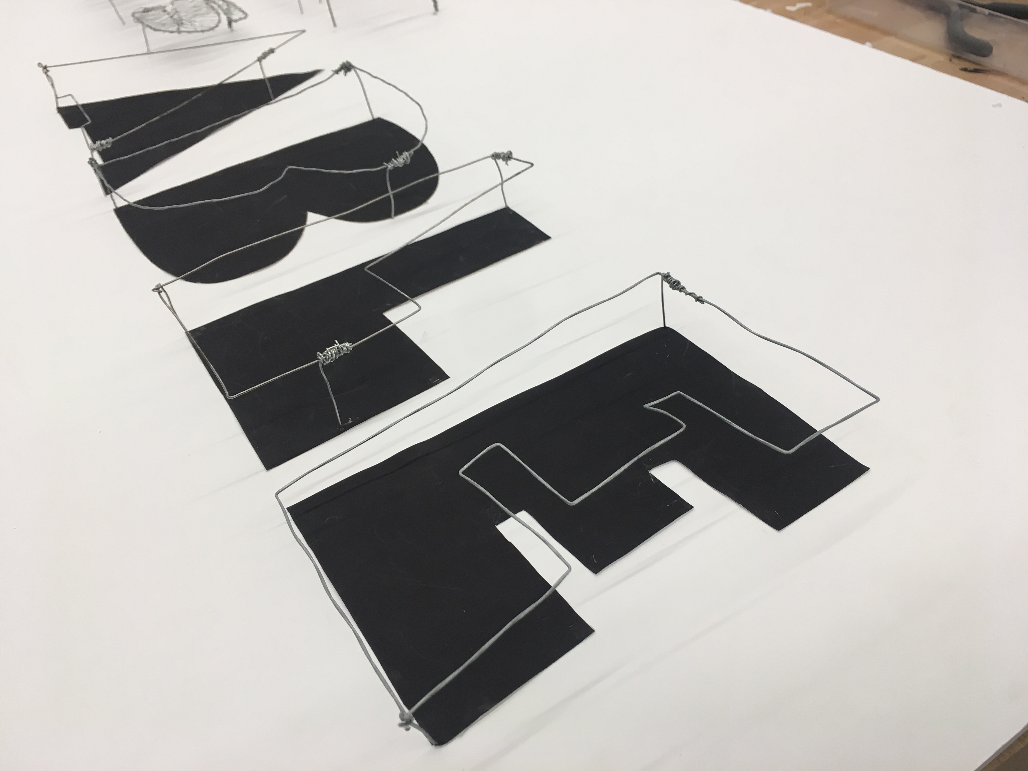
We chose a very feminie font for “Elsa”, almost in a hand-written style to show its softness and delicacy. For “was”, we adopted an old-fashioned, ancient, newspaper-like font to suggest the property of being in the past. And we also deliberately placed it a little leftward to “Elsa”, as a flashback in the timeline. Finally, we used a really huge, bulky and bold font for “able” to demonstrate its capacity, power and strength.
Explain the process you used for making the words 3-dimensional. Include any problems or changes you made along the way.
In the first class of this project, we started from the outline of the words.
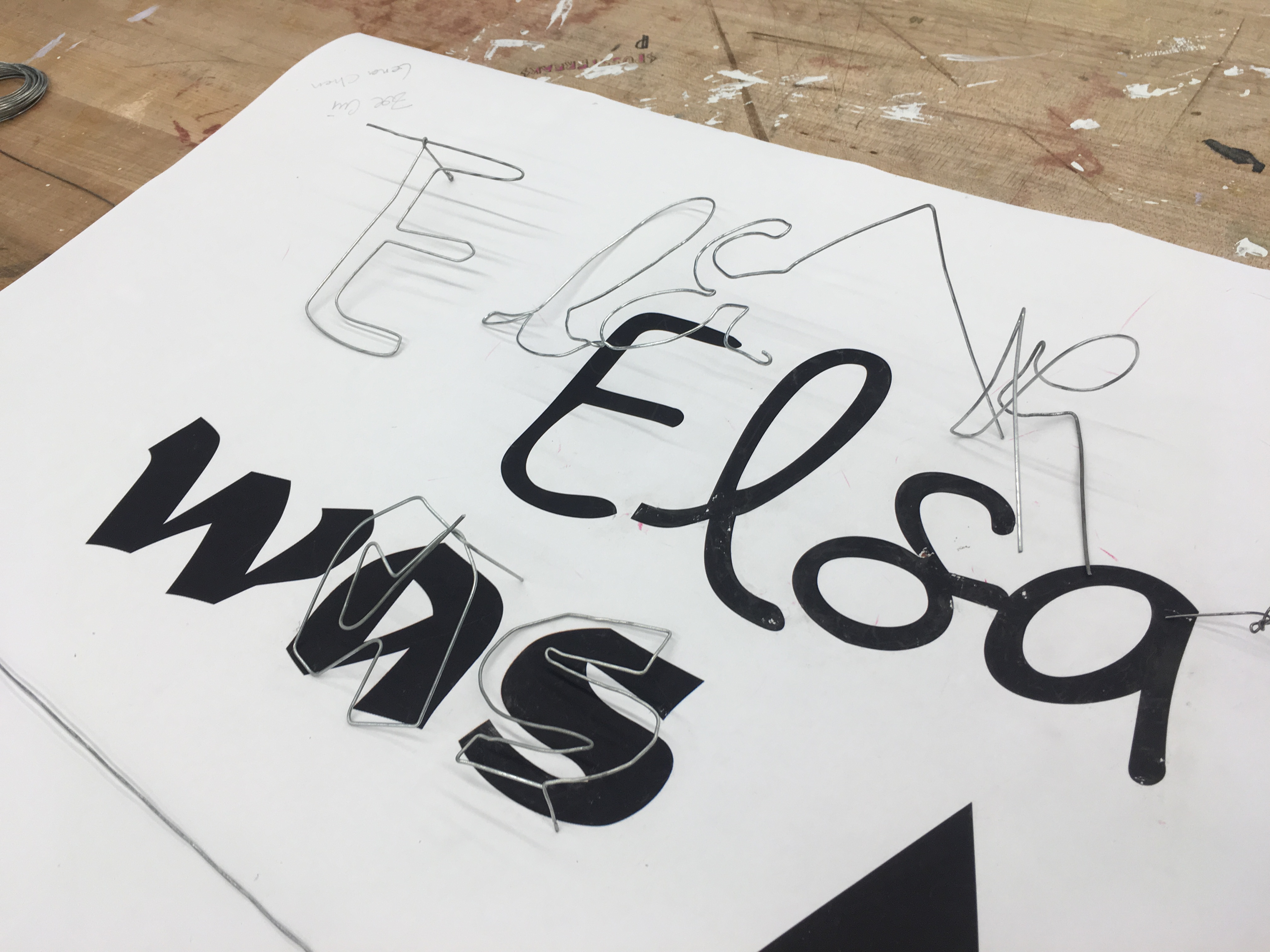
We used thicker wires for the outlines of the words, and thinner wires for the joints so that it looks clean.
The short supporting wire sticks are also made of the thicker ones.
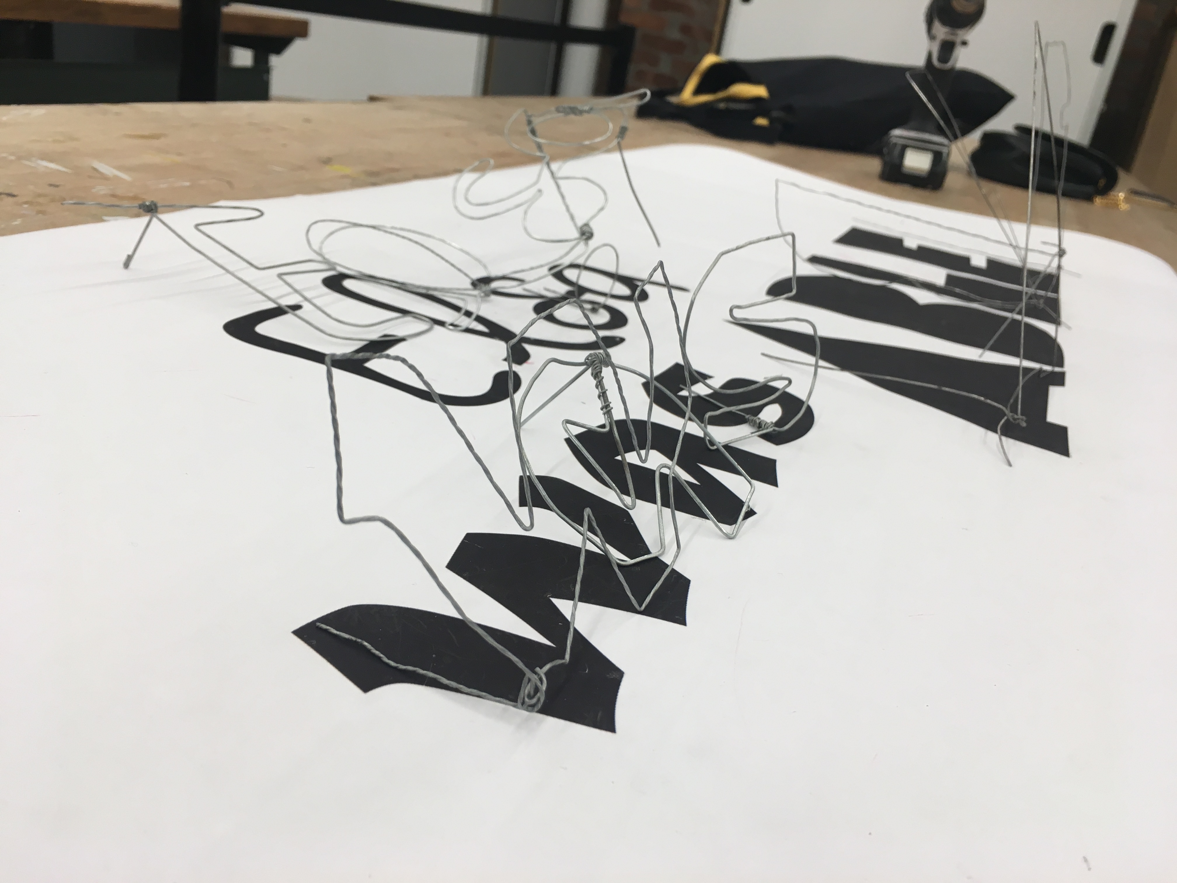
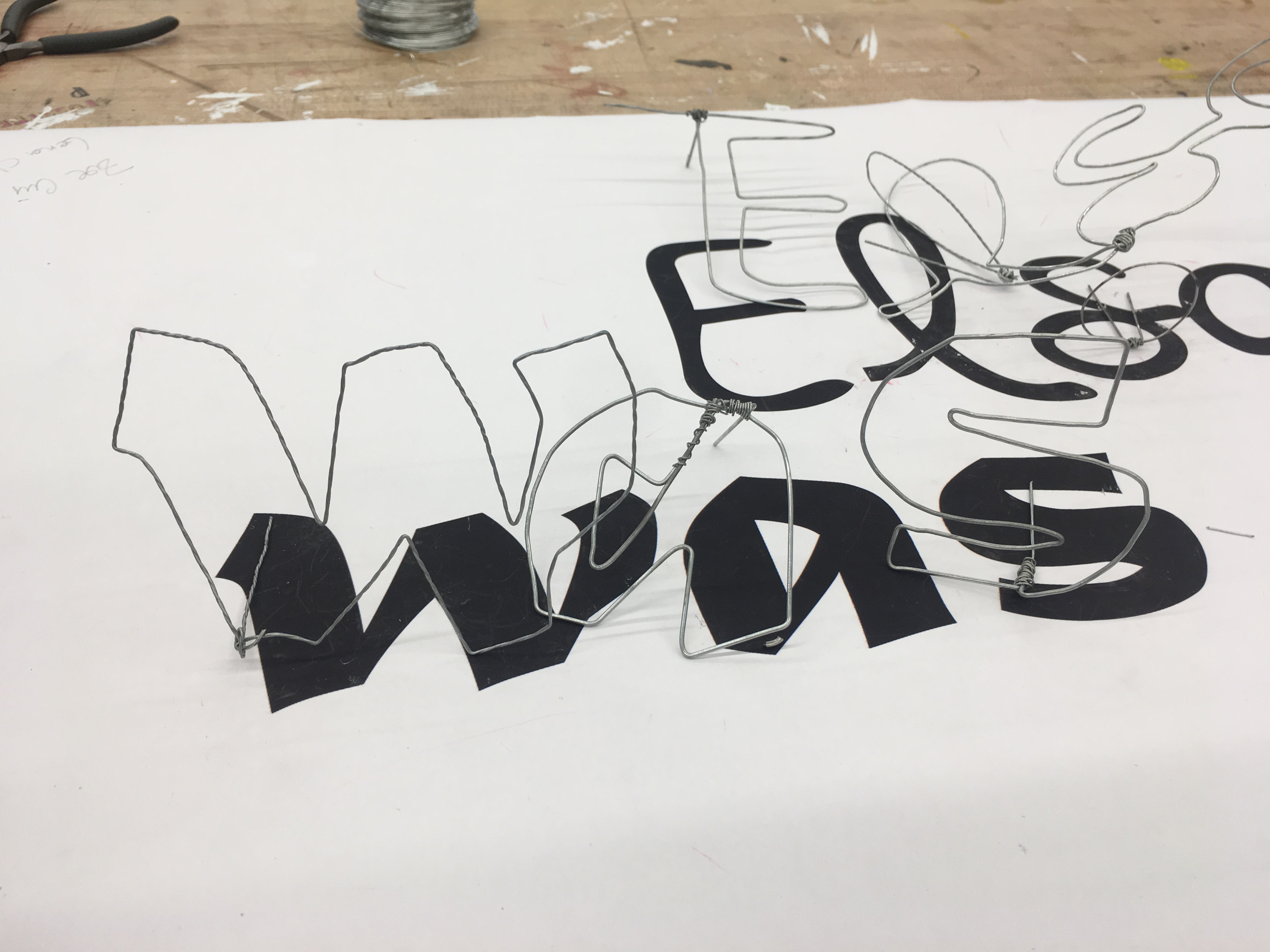
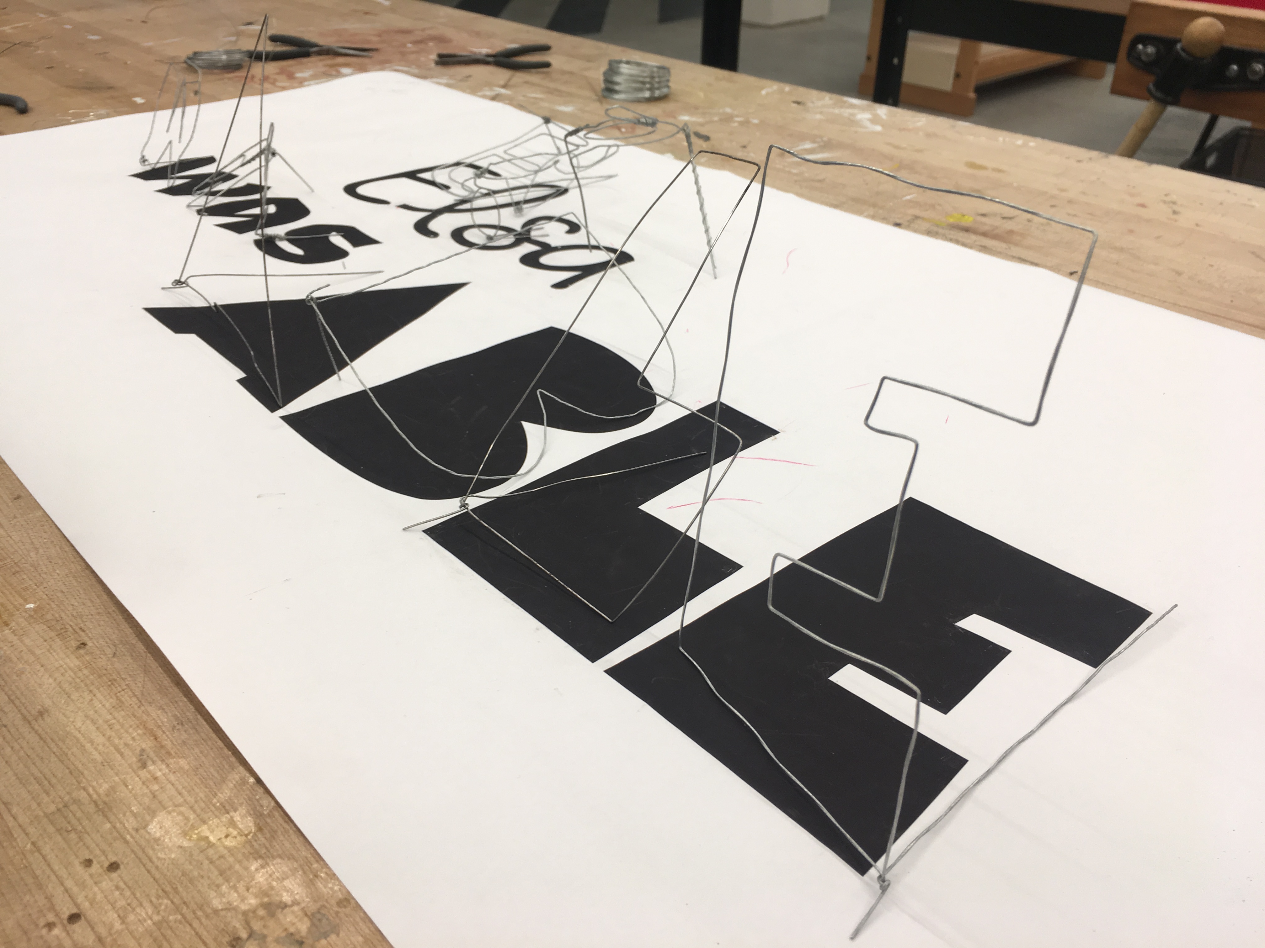
In the second class, we filled in the details. For one thing, we added shadows to “able” to make it stronger, so it fits better into the definition of “having necessary power”. Also, we wrapped “was” with thin wires which created a sort of texture to the word so that it looks more ancient rather than modern.
Show a picture of you or your partner working. If you don’t have that maybe a picture of the tools and wire. I want to know about your problem solving!
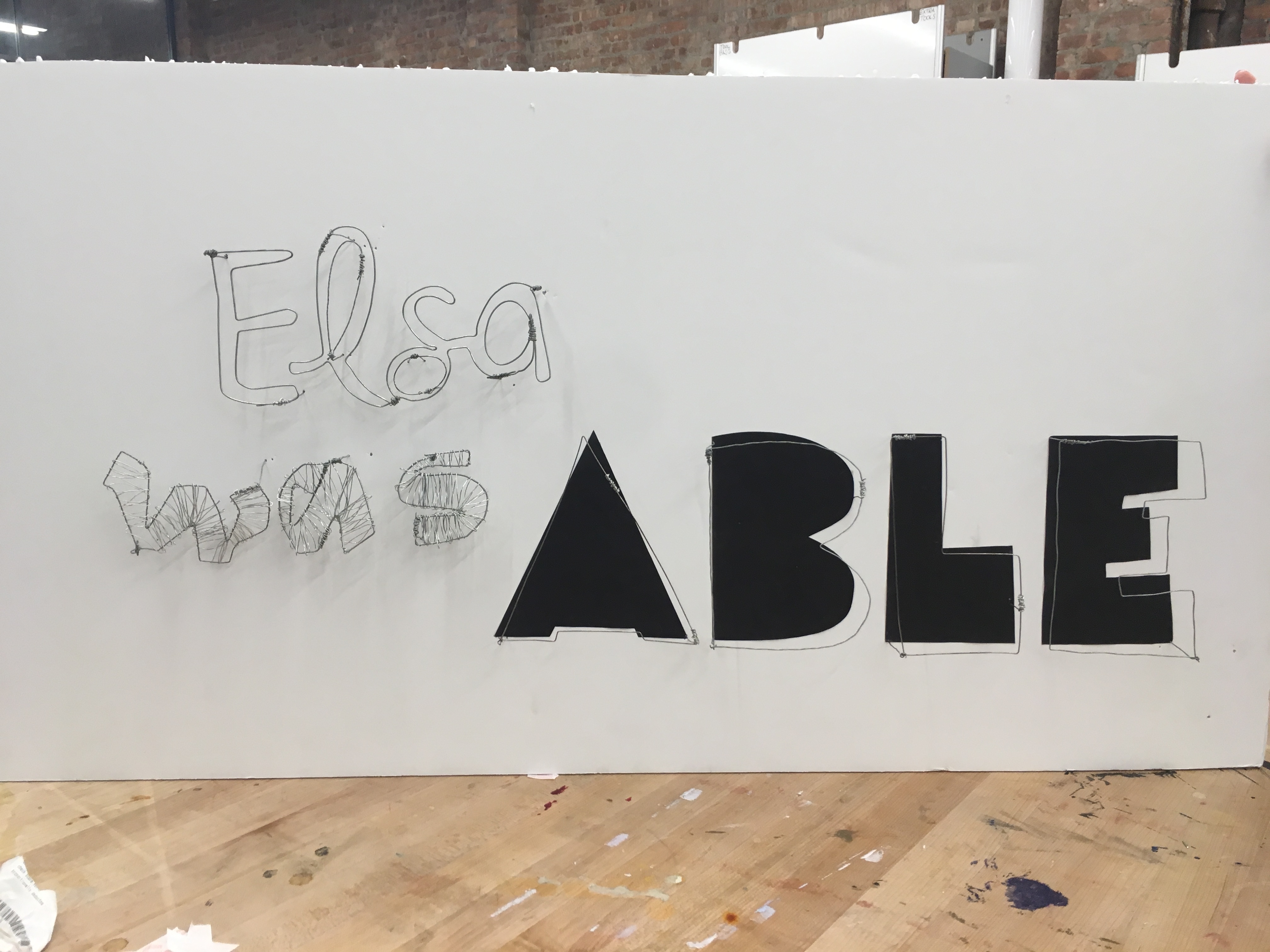
Now you can talk about the final outcome in the piece you have made with your partner. Do the words or the phrase you were assigned have any resonance with you? “Elsa was able” is quite a strong statement for example, how do you relate to that? In the piece below the team is using very bold text, think about your own words and why you chose to render them the way you did.
For “Elsa was able”, we created the sense of a little girl who has tremendous power. “Elsa” is light and ethereal, so we didn’t add anything else other than its outline. Because of the thin wires wrapping around “was”, its shadows on the board seem subtle and beautiful. “Able” is the only one with artificial shadows which stresses the mighty power the word itself implies.
This is where you show a final photograph. Keep in mind that you will want to add another when we link all the fragments together in class!
Reflection
We are happy with what we’ve done. But I think there is still space for improvements on the techniques. The big letters look decent, but the small, more complicated ones can be better if they are cleaner and more fluent. For example, the joints on “Elsa” seem to stand out as black spots. Maybe we should have spent more time on planning how to make the shape of “Elsa” with the least amount of joints. But since this is the first time playing with wires, I’m mostly proud of myself. And the both of us were having lots of fun.