


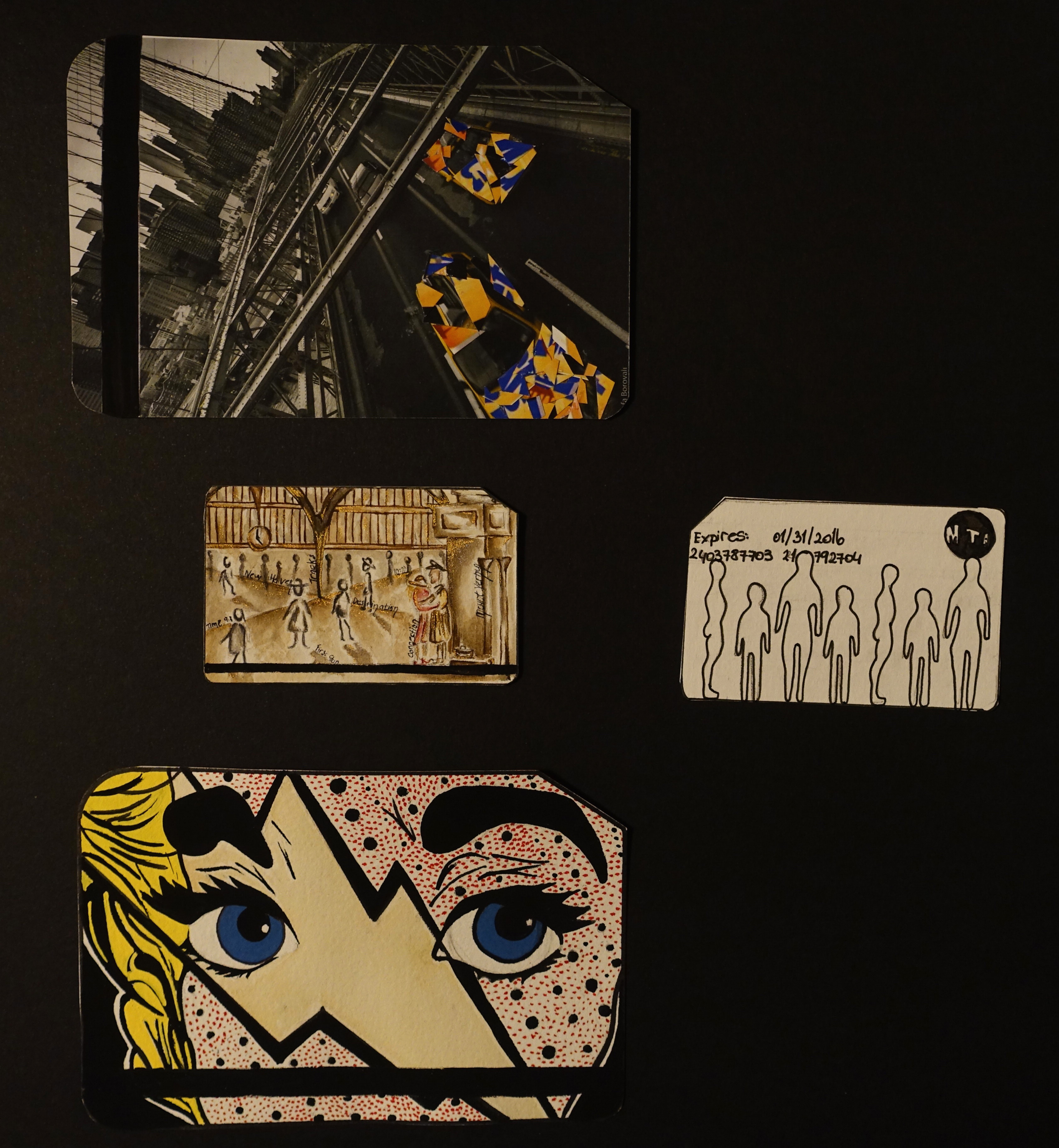
The second project for my Drawing class was coming up with three different metro card designs and a back design.
***
For my first one, I wanted to stay with the vintage look of the Grand Central. The iconic clock tower, high ceilings and of course the lovers were included in my design.

Moving towards the second one, I was inspired form the Pop Art movement. The big blue eyes and the long lashes take the attention first. After a few seconds the complicated look in the woman’s eyes ad a mysterious touch to the design.

The last front design of a metro card is a photo collage which my brother, Vefa took from the Brooklyn Bridge. I cut up some metro cards and positioned them on top of the yellow taxis and created a minimal but powerful design. This particular design was very precious to me due to the fact that a collaboration was shaped between mine and my brothers work.

As a back design of a metro card, I wanted to be literal and simple. I have added a simple outline of a woman, man and a child to represent all types of travellers.