1.Line Drawing and Compositional Thumbnails
- Line Drawing
- Compositional Thumbnails
My line drawing of my chosen three objects was a flower vessel with a metal ball, a perfume, and a box. The final composition was chosen because I want to show the whole overview of the object including all of the shadows that were shown.
2.Collage, Fill & Brush, and Combination
- Collage
- Fill and Brush
- Combination
I started with the collage and used the panting from The MET, which is called Fish Market by Joachim Beuckelaer. Also, to develop my next fill and brush piece, I adapted different tones of browns from the painting. As you can see from the followings:
- ‘Fish Market’, Joachim Beuckelaer, Oil on Baltic oak
- Color Palette from ‘Fish Market’, Joachim Beuckelaer
Process
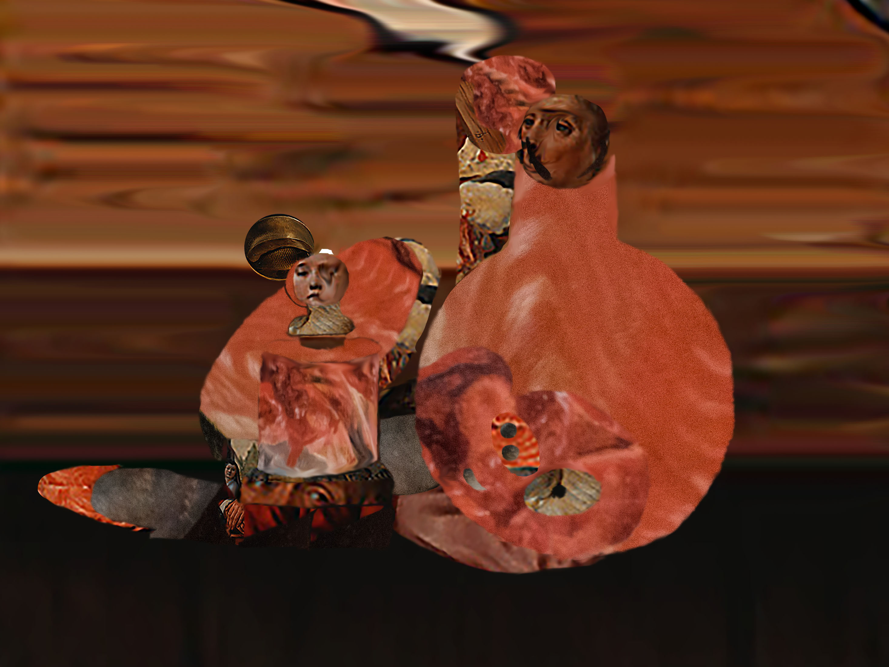
From the line drawing, you can see there are many layers of shadows and even light reflection shadows behind the objects. When I was drawing the lines of the shadows, I separated the light and dark to two enclosed forms. Therefore, bringing the line drawing two photoshop, I have to think about what color or texture to use to project light and dark shadows.
The first photoshop work was the collage piece. I have used particular parts that have textures/patterns, which is appealing and interesting. Especially, the pattern of the fish meat looks almost like a painting technique that Francis Bacon have used. The twisting colors and brush strokes swirling with textures. Moreover, I have used the smudge tool to twist the parts of the face, so it matches with the twisted color concept.
The second piece was the fill and brush, I had became more concerned with the values in the piece. Therefore, I chose different tones of browns and I wanted to create a peaceful unity within the colors, also as a whole. Furthermore, to add textures in the light shadows, I have used the watercolor brush, so it will have a gradual change.
Finally, for the last combination piece, we have to combine both collage and the color filling pieces. Therefore, I chose to first color the whole collage piece and then erase the parts that I needed. As result, there are more plain colors than detailed collage parts. Also, I made lines crisper and geometric to make the whole piece minimal and abstract. Similar to the second piece, I used different light and dark tones to differentiate the different values of the shadows. Also, left some collage parts to bring textures to the objects and roughness to the shadows.


