Process- Brainstorming and Planning
The final Catalogue
Cover
My First Perfume: A novella that describes the spirit of a Mediterranean garden luxuriant with trees and flowers, and evokes a mosaic of scents gathered from a private garden in Tunisia. Like a travelogue, this fragrance conjures up an idyllic world of shadows, water, and light, on the theme of a fig tree allied with Mediterranean zest.
“An expression in perfume of a Mediterranean memory, a mosaic of olfactory, visual and tactile sensations.”—Jean-Claude Ellena
Canada custom form: Often to Canada.
Bear: My teddy bear from 5 years old. A soft toy bear.
Pins: a thin piece of metal with a sharp point at one end and a round head at the other, used especially for fastening pieces of cloth.
High school rilakkuma phone: My favorite bear character from Japan.
Cake: I love sweets.
Middle school friends photo: Tickets from different exhibitions from graduation trip in Japan.
Tickets: From different art gallery I went.
Red envelope: My cultural item.
Red envelope, an Asian tradition that is distributed from elder or friends in New years or formal events, such as wedding and birth of a baby.
Sonny angels: Collecting.Sonny Angel is a cute boy angel who likes wearing all sorts of headgear. He doesn’t talk, but Sonny Angel makes you happy and makes your daily life bit more delightful. As your tiny friend, Sonny Angel is always by your side, to protect you, give you comfort, and make you smile… that is Sonny Angel’s mission. —– Sonny angels official
Hamlet book: My favorite book.
The Tragedy of Hamlet, Prince of Denmark, often shortened to Hamlet, is a tragedy written by William Shakespeare at an uncertain date between 1599 and 1602.
“There is nothing either good or bad, but thinking makes it so.”
—William Shakespeare, Hamlet.
Back and Last 2 pages
Reflection
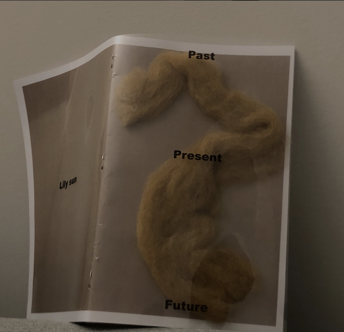
I learned using your aesthetics to design the cover and adding your idea of materials to create the catalogue. It was a fun project since you do not have use formal way of making a book with text; you have the flexibilities to make and design the catalogue. At the start, I want to make each page inside the catalogue more consistent, so it would not look messy. Moreover, all the color I used stayed consist as well, so the whole catalogue maintains matching color swatches. Moreover, the use of transparent paper and wool at the cover to make it have more texture and also uniqueness to it. The sequence is sorted by the image that I made with pen and makers on a canvas. I look at the size and details to figure out which one goes first and which other goes next to make it look aesthetic to me. The duration of it is just as looking at a picture book, since most of the texts are short and are quotes, therefore it results it to be easy to read.


