- Color
- Space, objects and Composition close up
- Monochrome
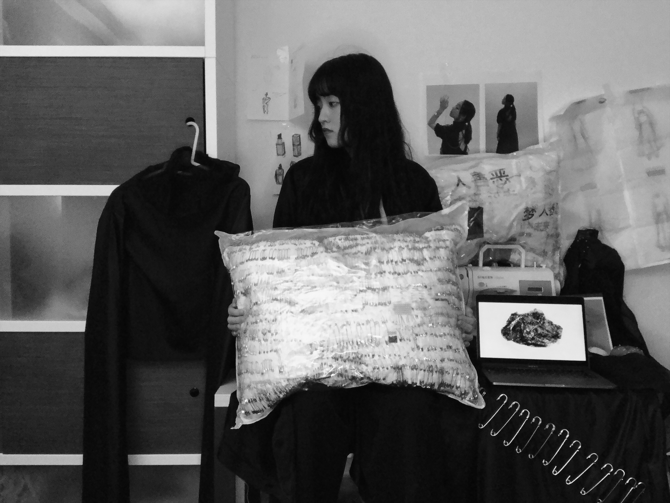
From the photo, you can recognize clearly of me, since I am sitting on a table and I am looking at one of my artworks. I am also surrounded by my artworks and tools that I have used during making the artworks; there are some leftover materials shown in the background too. The space I am in is where I usually work; it is a space with a table and a bookshelf beside it.
Moreover, by looking at my photo, you can see that the camera angle is facing towards me as well with lighting that can help the viewers to see the whole view of my works and space. Myself is wearing the same color theme as my works; the typical color black with a white t-shirt on. The sort of messy surroundings was just what I was inspired by Francis Bacon’s studio photo and I was more so inspired by wearing the same color theme with my artworks, just like how Helen Frankenthaler has done in her photo. Also, since I wasn’t able to decide between color and monochrome, therefore I chose to include both of them. The color one gives the viewers a better understanding of my original artwork’s colors, however, the monochrome intensifies everything, so it looks more overwhelming in a good way.
Moving on, what I am mainly focused on was how to make the photo look intense and how will it show your style of art. Therefore I see it as a fine art, where each object is placed for a good composition and from far it looks like a bunch of different patterns interacting with each other too. My studio photo is to show what personal style I have maintained throughout the year and this photo helps me to embrace it more; also show myself through art more.


