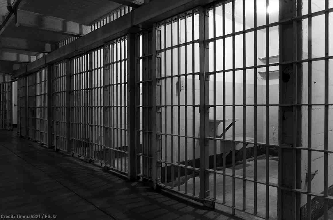

This is the sketch of my designed logo for the final Studio project. For my project, I am designing a nonprofit prison system as a response to the prison-industrial complex and mass incarceration. In order to do so, I essentially have to create a brand, since that is what a nonprofit is. My brand needs a logo in order to be easily recognizable. The logo I have designed says “CJC.” This stands for “Criminal Justice Co-Op,” which is going to be the name of my nonprofit. I designed the “J” in the logo to imitate prison bars with two hands clutching them. The hands will be shaded in dark, because my nonprofit is going to focus on the the prevalence of racial disparity within prisons and will highlight African American inmates. I decided to design the logo with a more formal, rather than playful or whimsical font, because the matter I’m addressing is very serious. In order to make the font more attractive/interesting, and to create the prison bars within the letter “J,” I created a thick outline for the letters. I think my logo is straightforward, as I hope my nonprofit prison system will be.