This is my response to the documentary, “Helvetica”, which talks about the history of the font and the huge impact it had on design.
The use of Helvetica is ubiquitous to the point where it is the default typeface of society. It has essentially become the face of corporate culture and capitalism, with governments and companies alike using them in order to seem more accessible, accountable and transparent. As seen on tax forms, shop names and public signage – a mere few examples, the clean lines and perfect balance of push and pull between the letters gives them an impression of efficiency and neutrality.
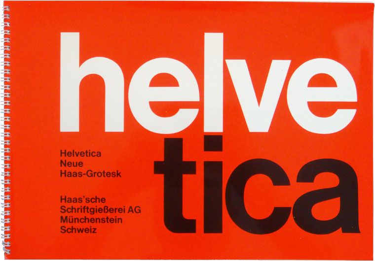
However, its widespread use has in recent years, given way to a debate over the status it has been given. Some designers describe it as the ultimate typeface and revel in its pioneering stance in typography industry. Helvetica was like a breath of fresh air when it first appeared in 1925, as it differed dramatically from the busy and frivolous typefaces previously used and fulfilled society’s need for rational type – in order to be able to communicate information in a legible way. These people believe that typography is meant to create order and hence, typeface should be neutral with the meaning being found in the content of the text, rather than the typeface. Mostly having begun their career during the early stages of typography, they also feel it is unnecessary to ever have to use more than 3 or 4 typefaces.
On the contrary, other designers feel that Helvetica has been overused and is a sign of laziness from a designer. For example, typographer Erik Spiekermann dislikes the ‘lack of rhythm’ Helvetica offers, while graphic designer Paula Scher criticizes the conformity of its usage – a situation that has arisen from its adoption by government and business entities. The more used something is, the more predictable and dull it becomes. Hence, these people believe that it has become too routine and there is a need for change. Unlike the designers discussed in the previous paragraph, these designers tend to have a more modern and radical mindset, feeling that rather than just holding and organizing information, typefaces naturally incite some sort of emotional response in the audience and thus, varying typeface is important and something that should be done.