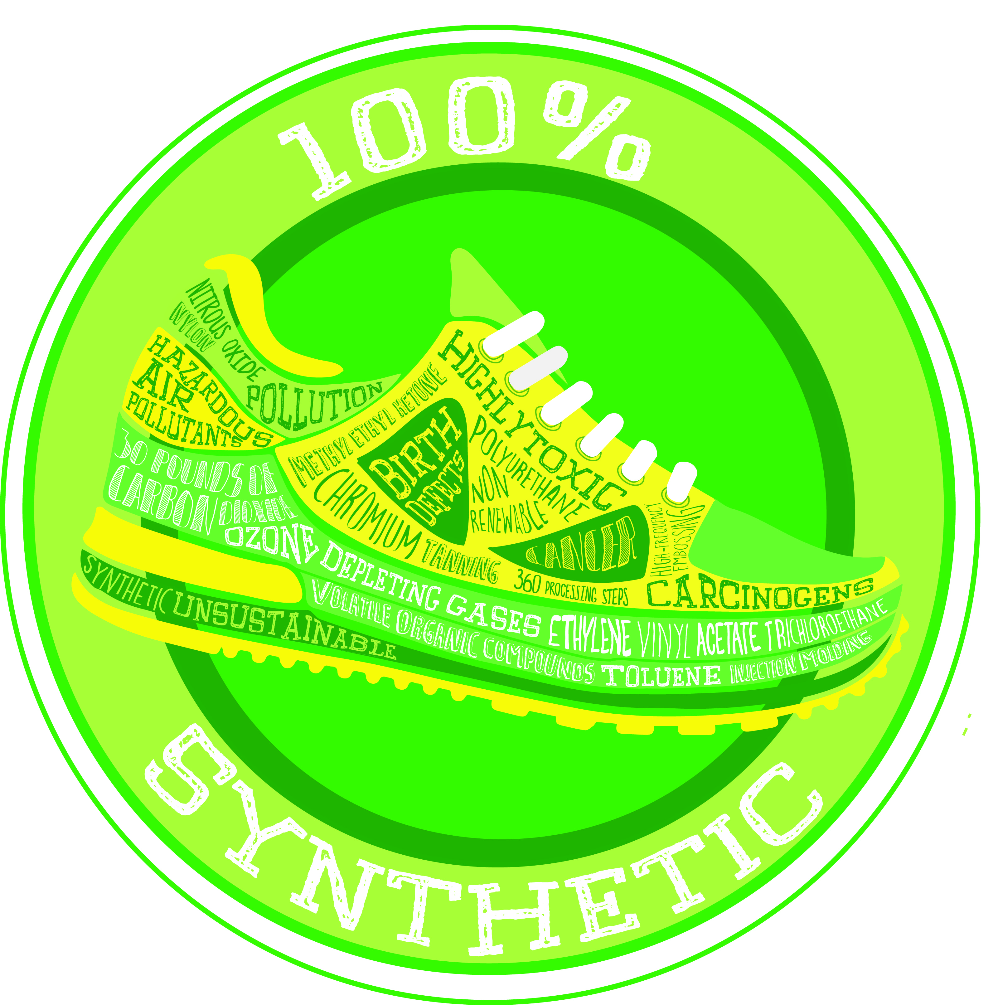
My label project was focused on the manufacturing process of a pair of athletic shoes and highlighting all the chemicals, pollutants and harmful effects that comes about from this process. Inspired by organic food packaging, I decided on producing a graphic style illustration similar to a sticker. I wanted to play around with juxtaposition and humour, by referencing and appropriating the different elements of eco-friendly and organic designs, such as the color and the fonts, making it appear very positive and seemingly environmentally friendly. This contrasts with the actual meaning of the text, which lists out all the chemicals and harmful effects of making the shoe. I tried to give more weight to certain words relating to the harmful effects of the chemicals used to make them stand out and emphasize their impact, by using a thicker font. I also used the term 100% synthetic instead of 100% organic, to further emphasize the non natural nature of the product. Overall, I feel my label was successful, because it not only draws the viewer’s attention to the words, but it also makes them pause and reflect more on the meaning of the piece, because of the juxtaposition of the text and the color scheme and design.