Figure ground organization is a type of perceptual grouping which is a vital necessity for recognizing objects through a certain scope of vision. The gestalt principle that applies most to space is that of figure- ground. Figure and ground can enhance or detract from each other, and organizing the two in relation to each other is one of the main aspects when it comes to designing an object. The theory of perception proposes that people make sense of the world around them by talking separate and distinct elements and combining them into a unified whole. There are four aspects that come into play that allow us to distinguish between Figure and Ground. The first is blurriness, we are able to tell apart objects from one another though its distance, objects that are in the foreground tend to be crisp and distinct while those in the background are blurry or hazy. The second is contrast, high contrast between objects leads to the ability to distinguish between the two. Size is the third, various forms will appear to be larger in scale and is therefore perceived closer and part of the figure while those that are smaller will seem further away and more in line with the background. The fourth is separation, an object that is kept apart from the other paraphernalia that surrounds allows the viewer to define the visual scene as we see the figure versus the background and not a part of it. One of the main examples of figure- ground perception is the “the faces or vases” illustration, which is one of the most frequent demonstrations of figure-ground, what you see depends on whether you see the white as the figure or the black. The area around positive shapes, the background, is considered as negative space. In art, positive space refers to the main focus of a picture, while negative space refers to the background. When used creatively and intelligently, positive and negative space together can tell a story using visual composition alone.
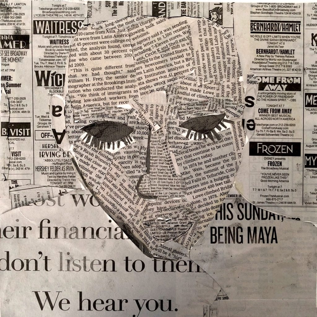
Text/Image newspaper collage:
Below is my text/image newspaper collage. It is a self-portrait where I used different cutouts of text from The New York Times newspaper issue. My intentions for this particular piece was to create a figure and try to make it in which it stood out from the background. I did this by using texts that were smaller and placed closer to one another so as to not allow the work to look flat and for it take a certain form where the viewer can tell the difference through the contrast in the cutout texts.

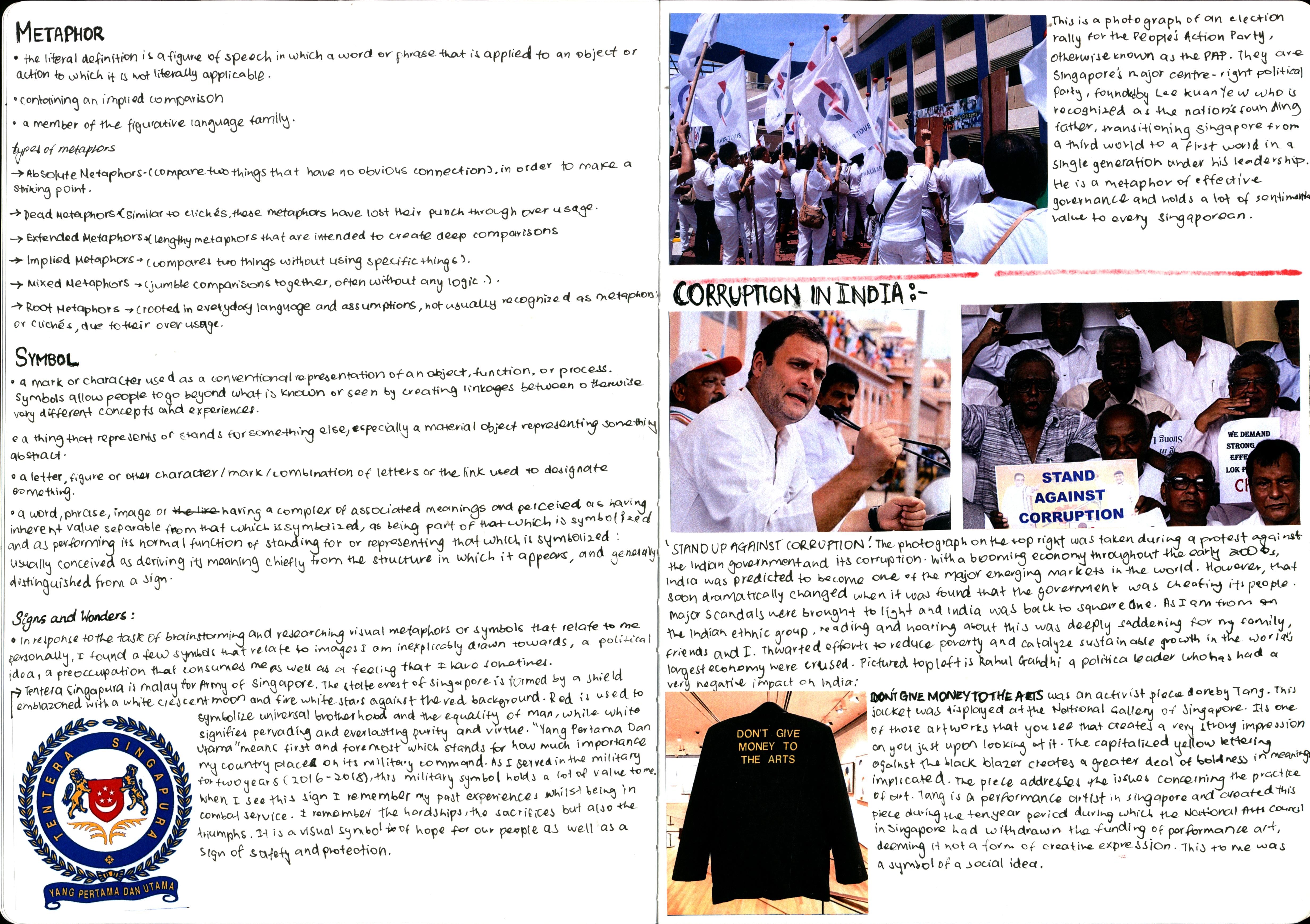
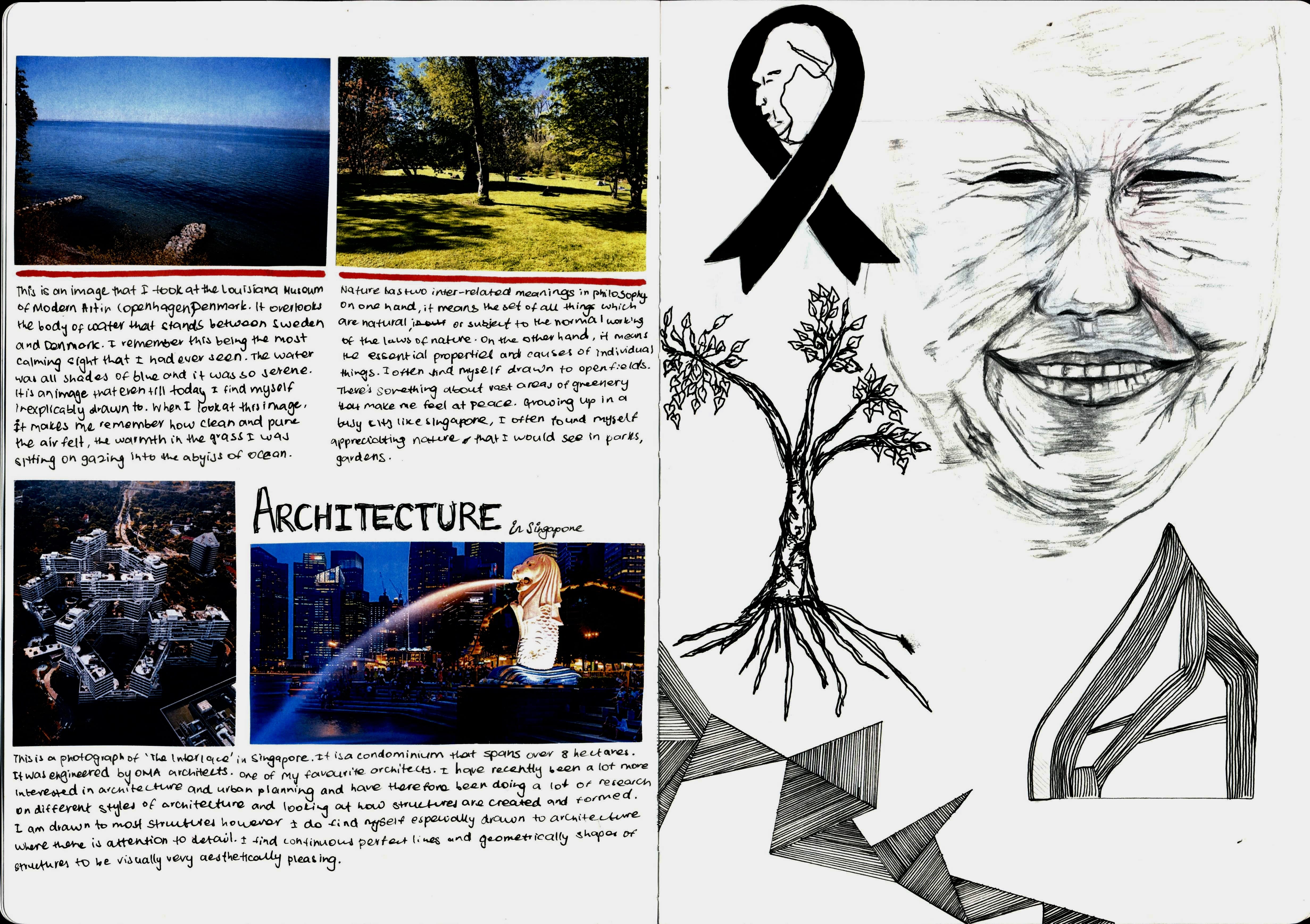
Signs and Wonders sketchbook assignment:
For the Signs and Wonder sketchbook assignment that I have documented above I began the process by brainstorming and doing some research with regards to what a metaphor and symbol are and how they represented. After documenting all the data that I had gathered on these two words I began finding symbols/ metaphors that I felt resonated with me. I began to look into visual metaphors and symbols that I felt that I identified with or around and then made some drawings in response to them. In the scan of my sketchbook above, I wrote about these visual metaphors and symbols and explained how they meant something to me.

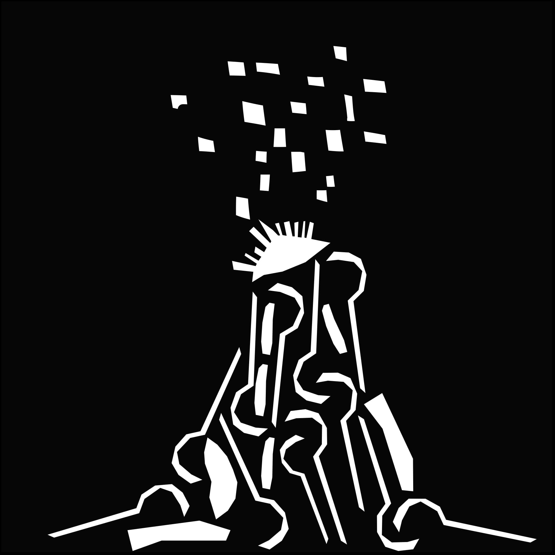
Positive/ Negative Shapes:
The assignment goal for this project was to create three different illustrations; black on white, white on black and ambiguous from the ‘Image as Text’ newspaper collage. I started this process by scanning my ‘Image as Text’ Newspaper collage and then placed my collage into a 6″x6″ illustrator file. I then used the pen tool to trace various shapes from my collage scan. I paid close attention to draw out specific shapes that would be somewhat useful to create a new piece with. After which I used the pathfinder tool to divide my various shapes into ‘jigsaw puzzle’ pieces. I used various subject matter from the ‘Signs and Wonders’ sketchbook assignment as inspiration for creating these shapes. After forming these three files I cut them out and mounted them onto one sheet of 18” x 24” Bristol pad.
- Black figures on a White ground
My inspiration for this was nature, to show growth of life under ground and above. I used almost all the parts of my face to illustrate this black figure on the white background.

- White figures on a Black ground
In this file I tried to create a volcano that has exploded, I used the form of my nose and the various shapes that I could draw out from my eyes and other parts of my face to piece together this piece, this was one of the drawings that was in the David Wojnarowicz exhibition that I had drawn inspiration from in my Signs and Wonders sketchbook assignment.
- Ambiguous – white and black shapes interlocked
In this piece I created a bullseye map using both black and white “jigsaw puzzle pieces” in my work. I think this was the least aesthetic one as its difficult to derive what the structure is meant to be, though there are some sections that are quite interesting if I could go back and change this I would have tried to form another shape that can be seen and understood.
