Our task for this assignment was to visit three specific exhibitions that were on display at the Museum of Modern Art (Charles White, A Retrospective, The Long Run as well as Permanent Collection Galleries 1880 – 1950). We were instructed to play close attention to the methods in which the artists’ had used to manipulate pictorial spaces within their two dimensional artworks. Such methods include where the shadows lie within the piece, the saturations of color, whether the space drawn is shallow or deep, what the scale is like as well as the linearity that the piece holds.
Charles White, A Retrospective:
Charles White was committed to creating powerful images of African American people. He was a key figure within a vibrant community of artists, writers, performers and activists who shared very similar concerns and views: the hardship of African Americans and oppressed people everywhere, the poverty, the rights of workers and the social justice. What was also shared between them was their dedication to creating art that exposed and addressed these problems. White used technical skills as a draftsman, printmaker, painter as well as experimental work across various mediums to achieve such a high degree of impact.

- Charles White, Young Farmer, 1953
I was particularly drawn to this printmaking piece due to the way in which the composition was put together. The observer/ viewer of this piece is able to tell the foreground from the background due to the colors used. In the foreground on the piece on the right, White uses darker marks/ shades to illustrate where the light falls, he also exaggerates the shadows to show an increase in definition of the person that he is illustrating. The background is of a landscape that has been done in a very faint white against a light brown background, this subtle creation of marks to form the background has been done with the intent of creating a strong contrast between the foreground and background of this work.

- Charles White
Clockwise from top left
Worker 1944, John Brown 1949, Gideon 1951, Untitled (Bearded Man) 1949, Frederick Douglass 1950
This was one of my favorite works in the gallery. I really liked the way in which the variation of shades were created. It looks very smooth and is in a high contrast which helps to represent where the space is present as well as where the light is coming from. In each of the works, the eyes draw the linear perspective for the viewer. The space presented in all the works is deep due to the strong contrast it has with the plain background. White has chosen to use the original color of the paper as the base layer to work into with a much darker tone in contrast which dramatizes the marks made.

- Charles White, Sound of Silence, 1978
In this piece there is not much of depth from what appear to be a shell on the top with the woman on the bottom. We do however still see a high level of contrast in the woman clothing by the way in which the folds are. The high level of saturation in the woman’s neck as compared to the cloth she has wrapped around her helps add depth within the piece. The color of the shell is also lighter than the dark blue background that fades out to help match the dark tones of the woman. The fading out of the color makes me feel as though there is a large area of space present within this work.

- Rene Magritte, The Menaced Assassin, 1927
I was intrigued by this piece due to the several varied events that seem to be taking place. Though the attention is spatially drawn towards the woman who seems to have been murdered, there are other paraphernalia that could confuse the viewer on where the centre of attention should be drawn towards. We see a lot of depth in this painting as we see four different frames, the first comprising of the two men, the second where the murder has taken place, third where we see the three men peaking into the second frame and fourth which is a small glimpse of a landscape that we see through the window.
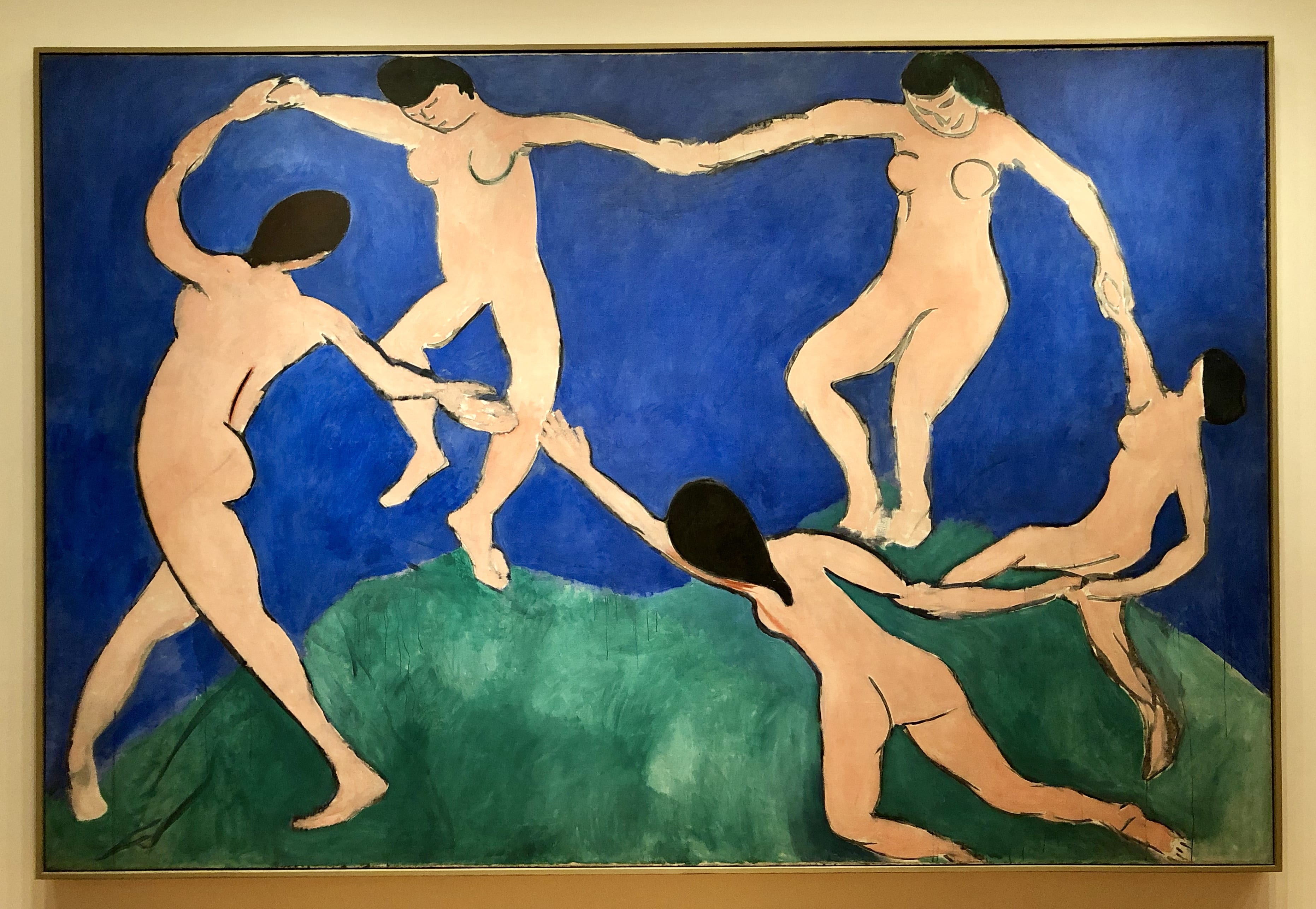
- Henri Matisse, Dance (1), 1909
In the composition of this piece I noticed that the figure on the left appears to move purposefully, while the other dancers seem to be floating in the air. The momentum of their movement breaks the circle, with the dancer in the foreground reaching out for the person on her left. It is through this movement that Matisse shows space. The colors of the woman that are drawn are somewhat pale in contrast to the vibrant background made up of a blue and green separate shades.

- James Ensor, Tribulations of Saint Anthony, 1887
In this piece Ensor brought used wild brushstrokes and audacious color choices to represent the familiar story of the Saint Anthony battling the world of temptations. I found this piece very confusing as there is just a lot of stuff going on in within every inch of this piece. Upon gazing at this piece for a few minutes I found myself particularly drawn to the bottom left side of the painting due to the intricacy in the matter of the female bodies where Ensor had intended to show the ‘world of temptations’. The detail in which this has been created helps the viewers identify this as the foreground of the painting and the loosely rendered landscape as the background.

- Henri Matisse, The Red Studio, 1911
It is clear that there is only one point of perspective that comes from the very bright pink/ purple array of colors that can be seen on the left hand side of the work. The main color palette in this piece is a darkish red brown however there are areas where there is a use of some other lighter colors like yellow and green that compliment the background. The very faint lines that form up the layout of the room as well as the physical objects present such as the cabinet, table and chair also help to create space, redefining the linear perspective in the piece.
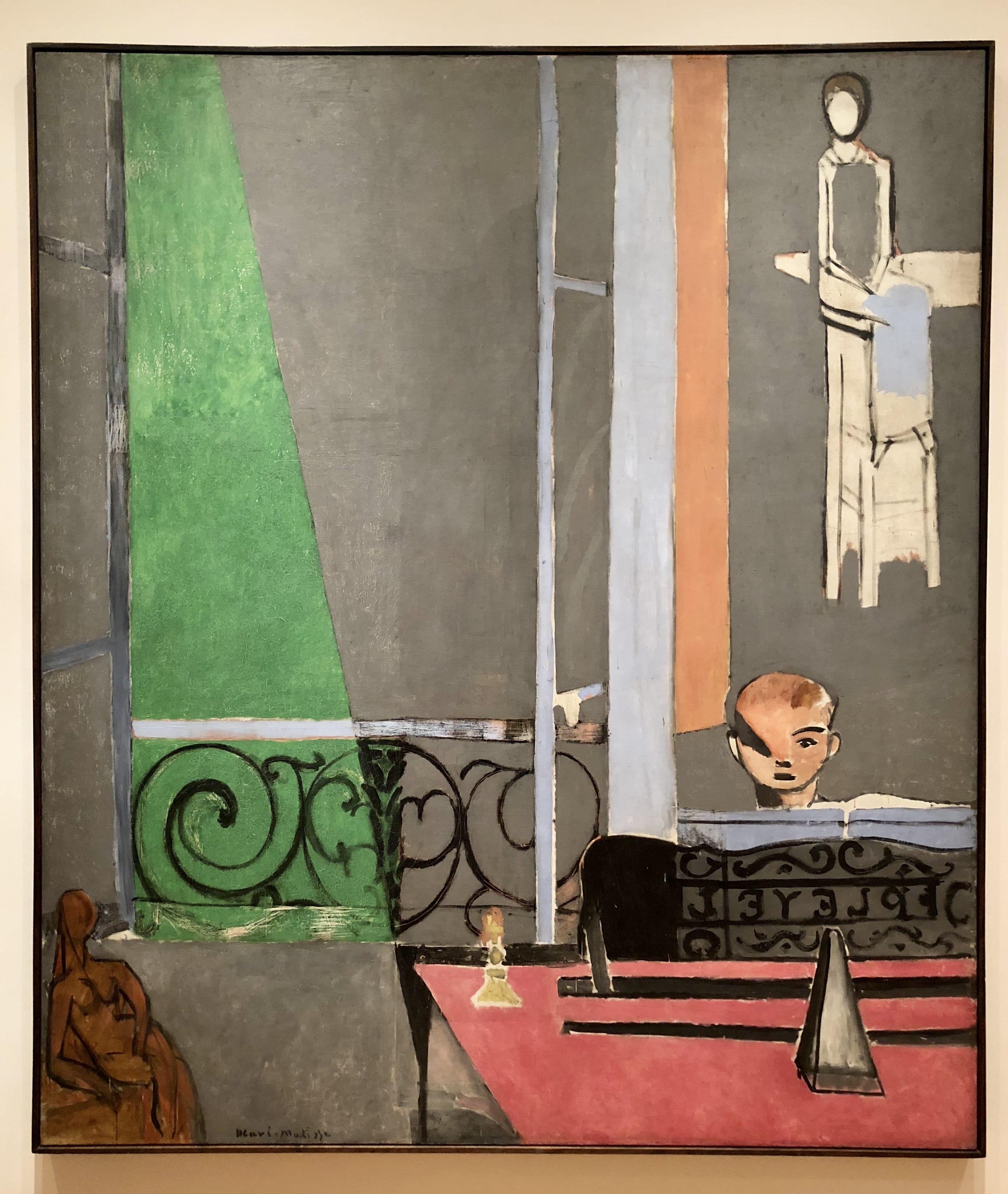
- Henri Matisse, The Piano Lesson, 1916
After paying closer attention to this piece I noticed that the triangle of shadow on the boy’s face corresponds to the green triangle of light falling on the garden as well as the triangle like structure on the pink countertop. The colors used are very pastel in their tone which makes the very faint black lines look as though they are standing in-front of the pastel background. This can be seen in the green triangle and the faint black design that acts as a barrier/ fence.

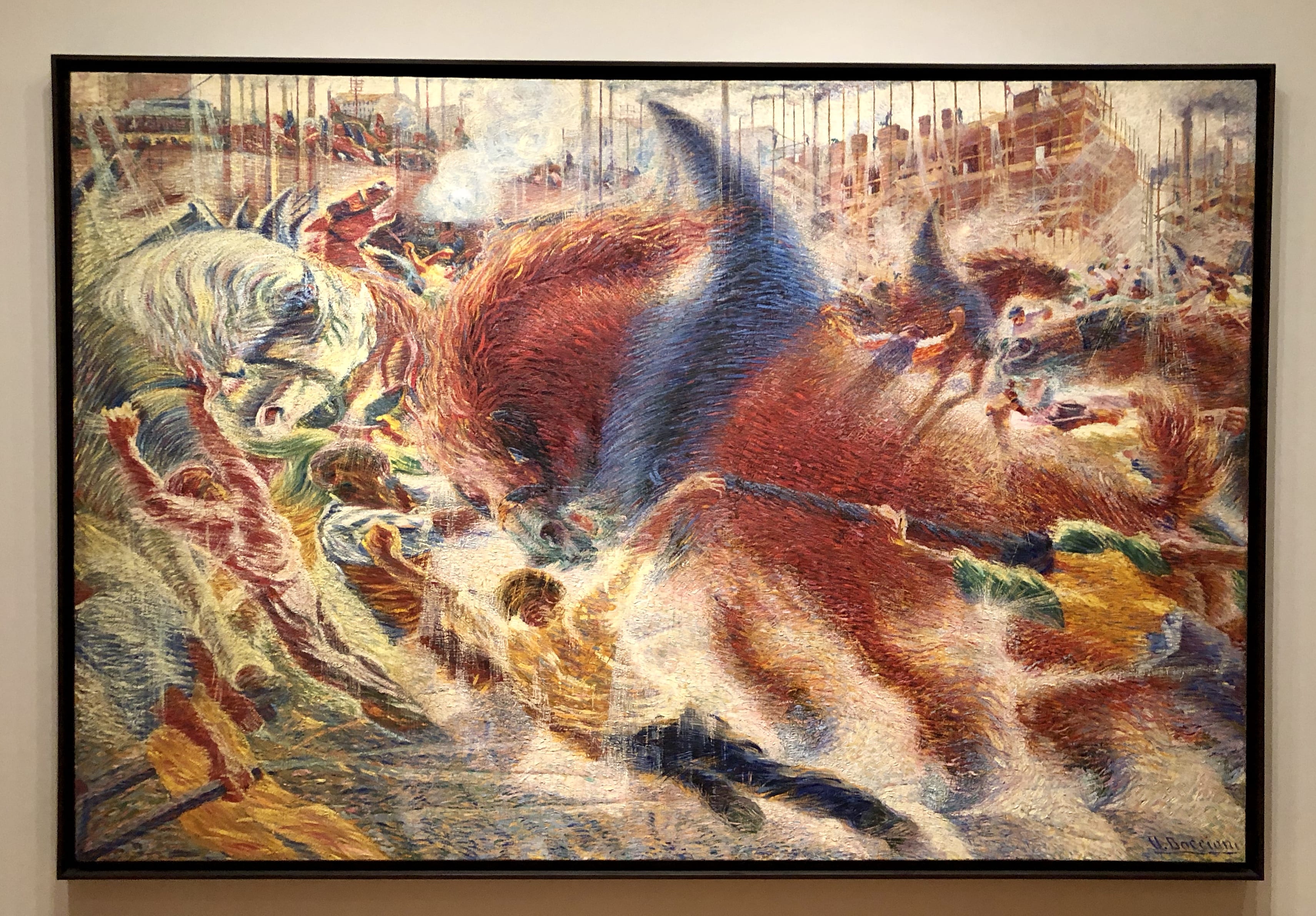
- Umberto Boccioni, The City Rises, 1882
Similar to James Ensor’s piece on Tribulations of Saint Anthony there is a wide and wild array of brushstrokes used. Upon an initial glance- it is difficult to determine what the subject matter is within this piece. After taking the time to look closer into the more intricate areas in the piece we can infer that there is a fight taking place, this also appears in the closest foreground to the viewer. This can be said because the two figures have been painted with most intricacy. The buildings on the top of the painting are not painted in the same style as the rest of the painting (foreground). It is much less textured and not as saturated in order to appear to be part of the background.
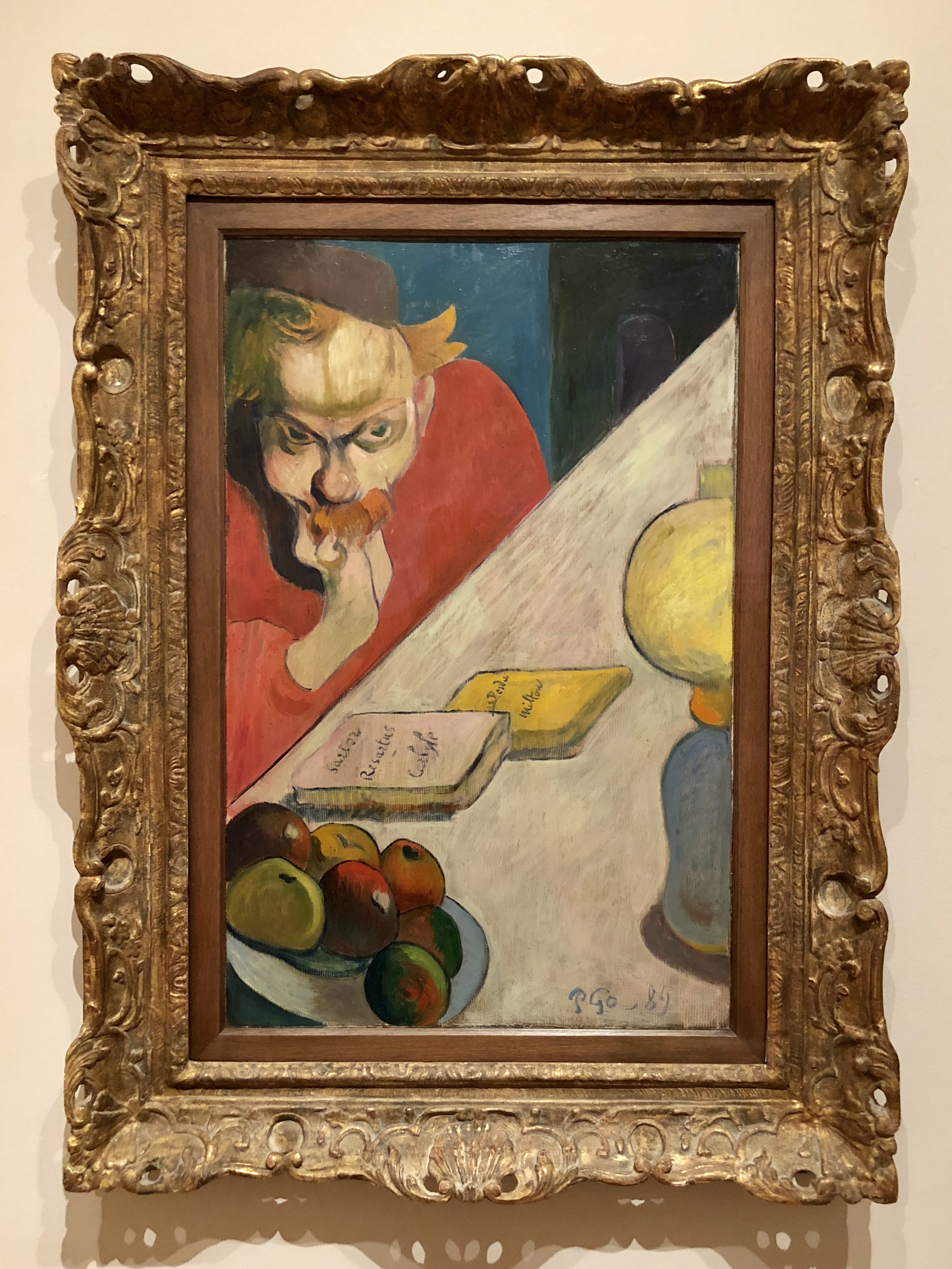
- Paul Gaugin, Portrait of Jacob Meyer De Haan, 1889
In this piece due to the very clear distinctions between the dark and light areas as well as the shadows been filled in it is clear as to where the light is coming from. This makes the composition of the work easy to understand and interpret. The dark blueish grey door appears to be very far in the distance from the foreground (the man and the table) due to its scale. It is much smaller in size in comparison to the objects in the foreground.