MOMA Influences/ Inspiration:


- Charles White, Young Farmer, 1953 (first image)
I was particularly drawn to this piece due to the way in which the composition was put together. The observer/ viewer of this piece is able to tell the foreground from the background due to the colors used which gives it space and helps it take form. White uses darker marks/ shades to illustrate where the light falls, he also exaggerates the shadows to show an increase in definition of the person that he is illustrating. I was inspired by this work because I was drawn to the detail that the drawing consisted of and was inspired to incorporate intricacy in my own Times Square drawing too in order to create depth and definition in my work.
- Henri Matisse, The Red Studio, 1911 (second image)
I was inspired by this work as well due to the one point perspective that is present in this piece as well as the Times Square Image that I was referring to when I was creating my work for this project. The very faint lines that form up the layout of the room as well as the physical objects present such as the cabinet, table and chair also help to create space, redefining the linear perspective in the piece. Even though the lines are faint we still see definition and depth in the piece which shows that with slight contrast in color I could also achieve definition in my detailing.
Times Square Photographs:


In the series of photographs that I had taken at Times Square I was particularly drawn to these ones above as I found them interesting in different aspects. Though some of them are with regards to perspectives the others compose of people in motion which captures the hustle bustle that goes on in this fast paced city. I was especially drawn to taking photographs from a low angle as I liked seeing how the buildings met with the sky, this can be seen in the first photograph I had taken for example where it almost looks as though the building is piercing into the clouds. I was also drawn to the billboards that were all of ranging themes and seemed to be so crowded in their display. I did not like seeing so many different advertisements placed so close to one another as they had no similarities in contexts which did not present an aesthetic view as well as it covering some of the beautiful architecture of buildings/ structures of Times Square.
Perspective Sketches-
- One point perspective:

- Two point perspective:

- Three point perspective:

Perspective Analysis-
- One point perspective:

- Two point perspective:

- Three point perspective:

Illustrations in sketchbook and ideations:


These three images that I have taken from my sketchbook were the three different drawings that I had done from different viewpoints of Times Square. I did this in order to familiarize myself with the composition of the various perspectives as well as making a decision on which drawing I wanted to push forward with for my final composition.


My ideations for the final composition for this project went from creating a traditional Indian silk styled pattern that would run over the buildings creating a Jean Claude + Christo Wrapped Reichstag inspired style of work to swapping out the billboards with images of poverty and the struggles of the lower classes in third world countries to bring about more of an awareness at one of the worlds’ most famous streets to then working on my original ideation which became my final composition using the one point perspective drawing that I had first created while working on which part of Times Square that I wanted to have a starting point for my piece. I wanted to create an intricate geometric roots like pattern that would look as though it were taking over Times Square. My idea for this project was to have these roots like patterning swirl around the floor of the body of my composition and then work itself up by intertwining around the buildings at Times Square giving an overall image of Times Square being taken over by the roots in our ground. I chose the one point perspective in order to show a clear pathway for the geometric shapes to travel in my drawing.
Line Drawing:

Illustrator File:

As it appears, my illustrator file is incomplete which is solely due to the fact that my drawing comprised of many tiny lines and details that I wanted to manipulate in more of a bulk where I could do so on photoshop. Apart from that I like the variation of colors that I placed. I used a variation of darker and lighter saturations of colors in order to represent the darker and lighter areas that would be seen in the drawing due to where the shadows would fall.
Final Image:
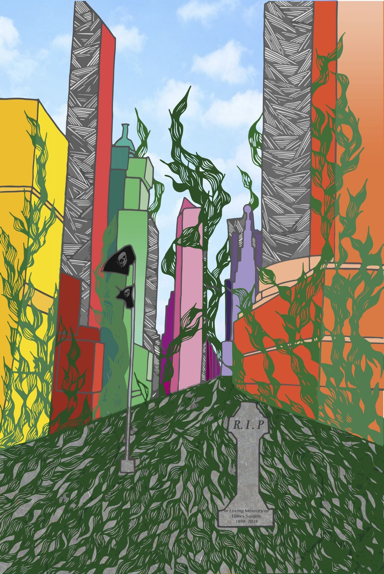
I used photoshop to add in the rest of the colors of the geometric vine like roots detail on the ground as well as placing a cropped image of a grey pavement in order to allow for some texture as well as variation in contrast with the roots that scale over and around the buildings. I also carefully made lighter and darker tones of the green in different sections depending on where it was placed in my composition in order to show a difference in the appearance of the roots on the buildings as the light is coming from the right side of the image allowing for shadows to fall on the sides of the building. In the foreground of my composition I changed the wordings on the back of the state of Lieutenant Colonel Francis P Duffy into “R.I.P” and “In Loving Memory of Times Square 1898-2018” as I found the shape of the back of this structure to resemble a tombstone and wanted to use that to add more of a significance to my piece. I also changed the print on the flag to be of skulls which resembles death or that the land has been conquered by the dark matter. I feel that this piece was successful as I was able to work to create just what I had envisioned for my final piece in terms of creating a one point linear perspective, definition and depth as well as space due to to variations of saturation and trying to implement shadows that would fall on parts of my composition.