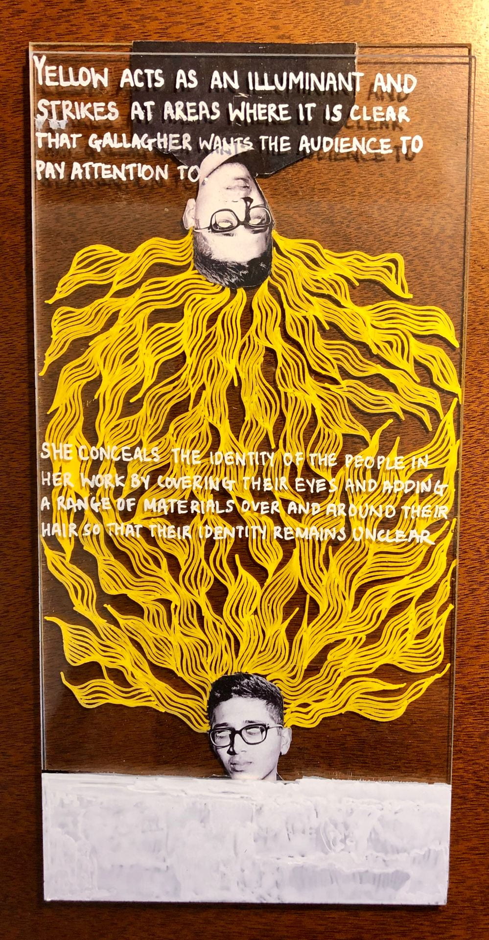
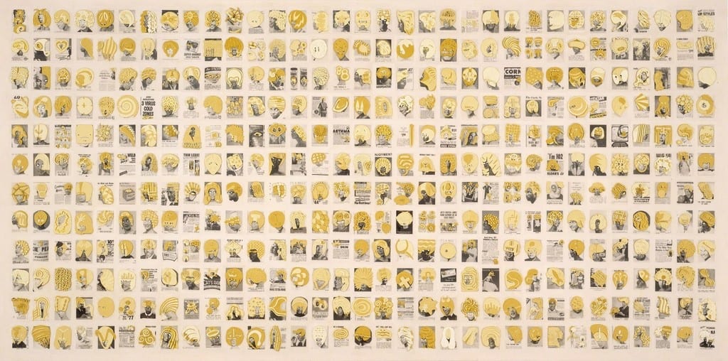
For this bridge project I was inspired by a series of work by Ellen Gallagher titled Double Natural which was completed in 2002. As this project’s outline was to find an image of either an artwork or an advertisement, I wanted to try and implement both of these into the work that I was responded to. Ellen Gallagher uses advertisements from popular American magazines and experiments with it through drawings or materials that she would add directly onto the magazines itself. Her experimentations on these magazines would change the subject and conversation around the actual advertisement. These materials act as enhancements and are diminishing the inferiority of the subject of the work. What first attracted me to her work were the various patterns that Gallagher had illustrated on the magazines. I was also particularly struck by the bright yellow color that stood out against the faint dull black and white background of the advertisement/newspaper. I was very intrigued with the overall tone of color used, yellow acts as an illuminant and strikes at areas where it is clear that Gallagher wants the audience to pay attention to. Upon closer inspection I found myself being drawn to the subject matter of this piece, the texture that Gallagher has used as well as the scale of this work. In this piece, similar to most of her other oeuvres she conceals the identity of the African American people by adding a range of materials over their hair, covering their eyes so that their identity remains unclear and hidden. By adding these materials over the advertisement, Gallagher manipulates the content of the advertisement which is typically a subject/theme based of beauty products targeted at African Americans into a work of art.
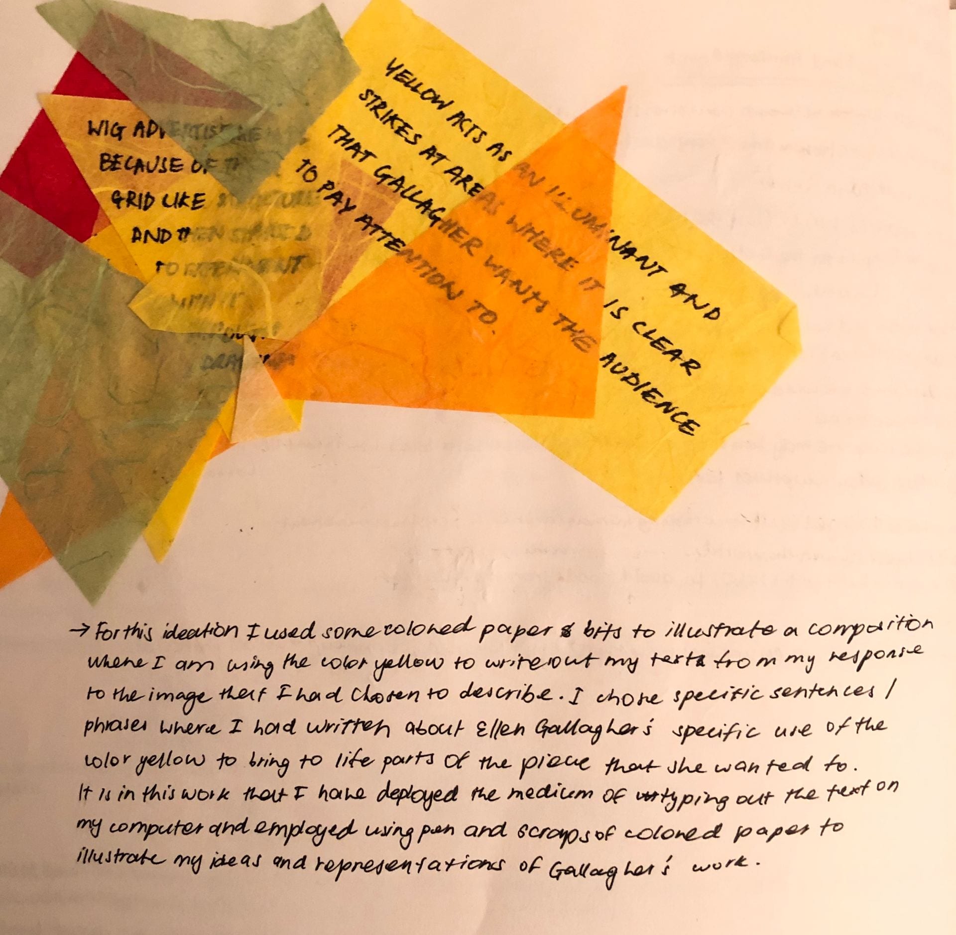
In creating this piece, I attempted to try and find ways in which I could bring out the elements of the work in my own work that stood out to me when I was analyzing Gallagher’s piece. These elements included the color yellow, how identity is captured within her work, intricate design that is present within her work. I created two small studies to help visualize the text within my response. In the first study, I collaged some colored scraps of paper and then tried to conceal sections of my writing which I had written over the yellow colored scraps. In the following study, I used yellow straws to try and experiment different ways in which I could play around with concealing parts of my text. Even though these two studies were not implemented into my finalized piece it helped create a path that led me towards my final piece for this project.
In my final work I decided to use myself where it would demonstrate my relation/ feelings towards Gallagher’s work as well as the elements that I talked about earlier in this learning portfolio post. I layered two sheets of acrylic glass where I stuck on two black and white images of myself where I had blurred my eyes out in the act of concealing my identity- similar to what Gallagher would do in her pieces and then used a yellow paint pen to create an intricate design that morphed from the top to the bottom which was done in close attention to what I had seen in Gallagher’s work.