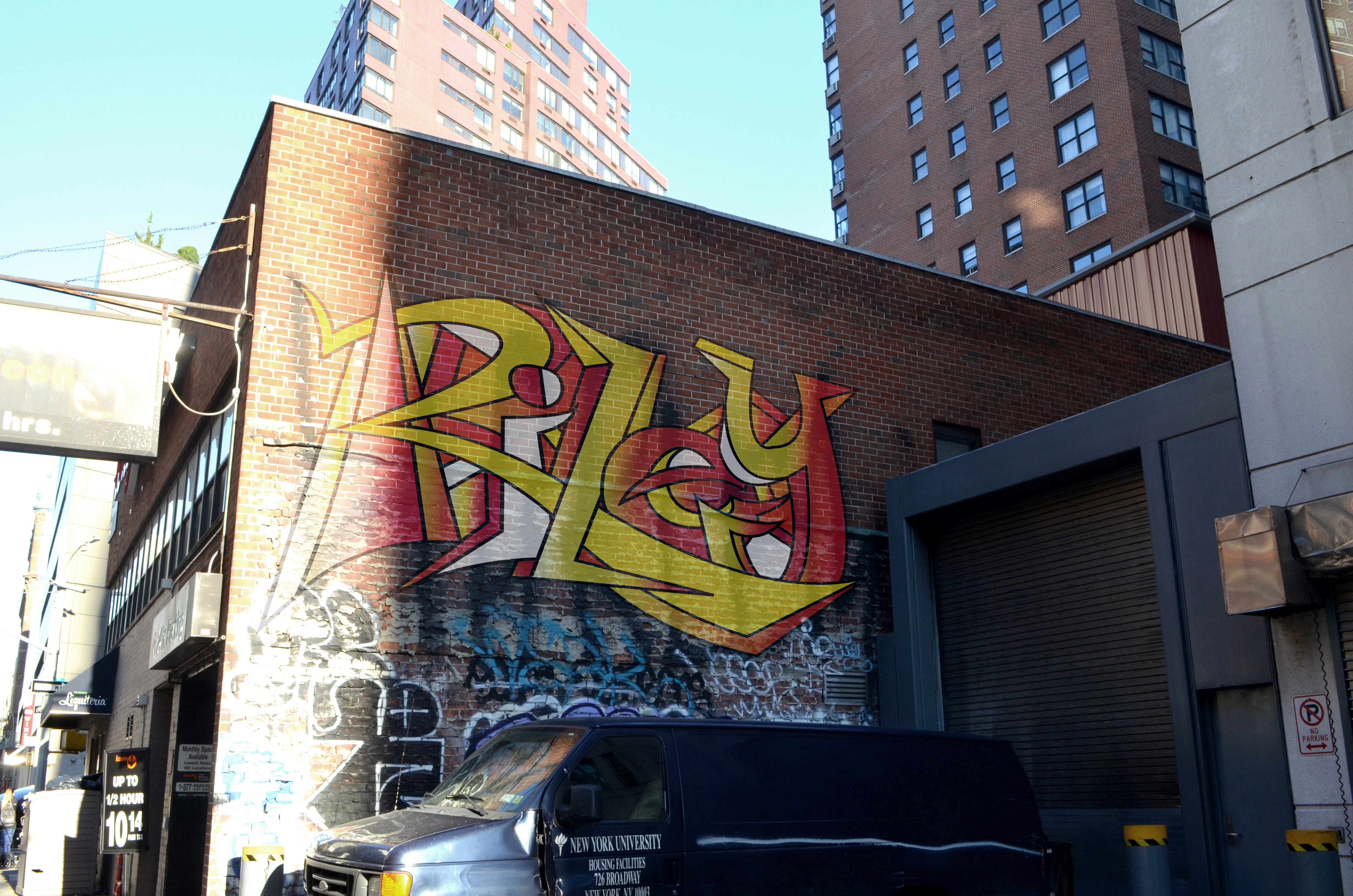
First I sketched my name in various graffiti styles.


I then decided to focus on the sketch below.

I redrew it to be only an outline and then scanned it in Photoshop.

I used the pen tool in Illustrator and then filled the letters with various gradients and colors to make them look more graffiti-like.

Finally, I used photoshop to put the graffiti writing on a wall. I used tools such as opacity and blending modes and dodging/burning to make the image look as realistic as possible. Because of the image I chose, I had to work with the unique lighting situation and perspective in order to make the illustrator file look like it was really on the wall.