- Mood Board
- Sketches of possible logos
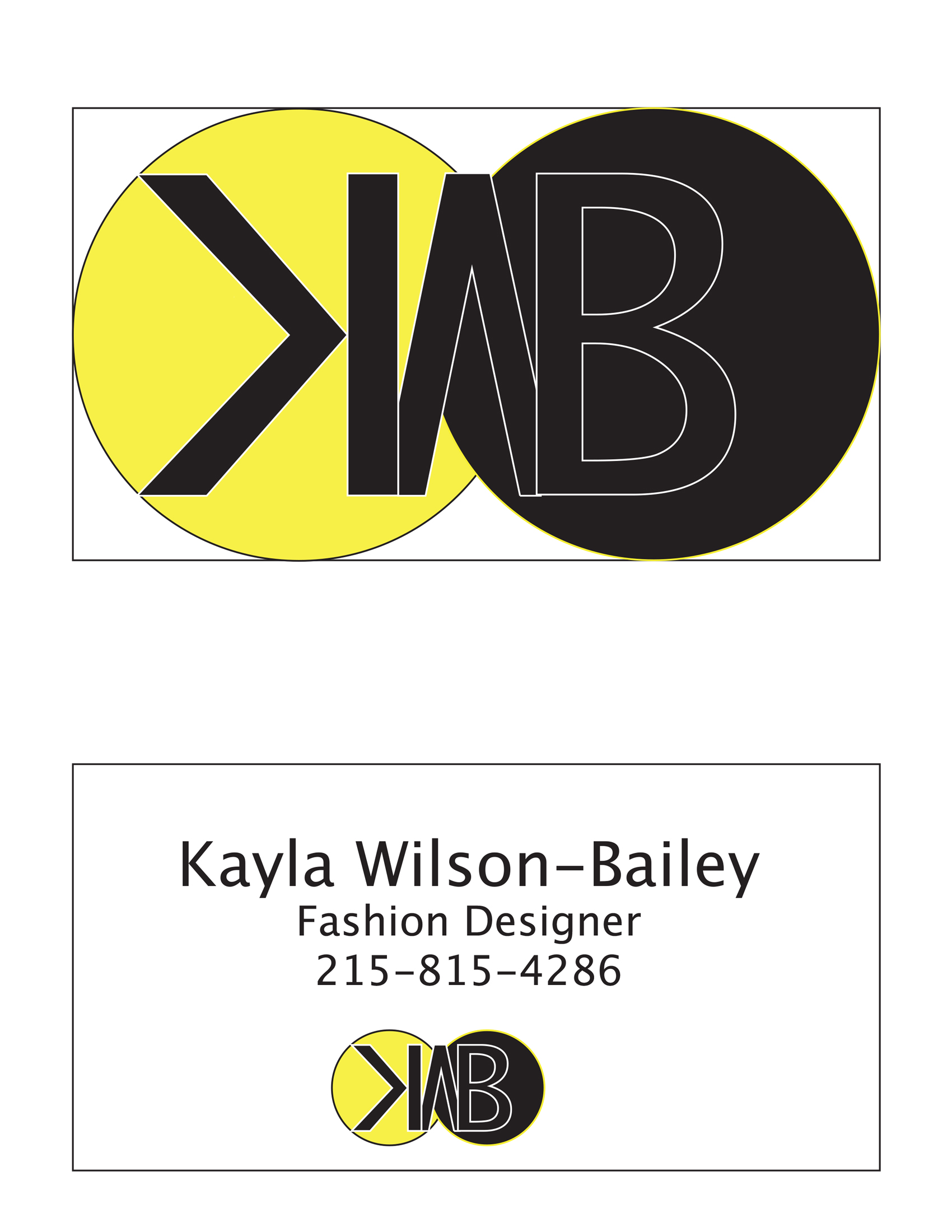
- Final Business Card
In the beginning of this assignment, I interviewed Kayla and asked her questions like what her major is, her favorite colors, and what she wants to do with her major after she finishes school. I found out that as a fashion major, she likes designing with vibrant colors and patterns. After school she wants to create fashion calendars and organizers and eventually design her own clothes. Kayla thought I captured her personality and style very well and approved of the mood board. Over the next few days, I designed three different logos that I thought might fit my clients career. I used black, purple and yellow (orange being my substitute). Knowing many logos incorporate initials or someones name, I played around with Kayla’s initials, liking the idea of the backwards K connected with the W and the B. The lips were inspired by the trend of bright colored lipstick and during the interview, Kayla told me she likes to laugh and be happy. I was going to try to fit her initials in the jacket design but was unsuccessful and I think it would be too complicated as a logo. The last design was inspired from the mood board and how I used the circles to fill up space and show different shades of Kayla’s favorite colors. On Friday when I showed Kayla the designs, she liked the third one the best. I proceeded working with that design after Thanksgiving break. After designing the logo on Illustrator and collaborating with my partner, she decided the purple was a little unprofessional looking. When I changed the other circle to black, my client was much happier with the way it looked. The white outline of the letters was also suggested by my client.
The most challenging part of this assignment was getting to know someone in a short period of time and collecting enough information to design something they would like. Also, I don’t have a lot of experience with Illustrator and Photoshop so I had to do a little more experimentation with my design even though it was a simple logo. My client was very easy going with what she wanted because I knew she wanted something simple she could put on business cards or use as a letterhead which made it a successful design.


