Subway Mapping
Move your mouse around!
You can view my code here🙂
Description
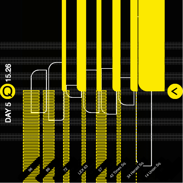
My sketch documents the number of poeple entering and leaving the subway car that I travelled in over the past week. The filled and dashed rectangles (outlined) represent the number of people entering and departing the car respectively. I use Q from 96th street 2nd Avenue to Union Square to primarily to travel to and from campus. Over the weekend I even used lines 1 and 6 to travel both uptown and downtown. I did not count myself in any of these observations. I am not recorded.
Design Process & Reflection
The sketch reche skeords the name of the line, which direction the train is moving: ‘going to’ or ‘returning’, the time of departure from the first stop and the names of the different stations that the train stopped at.
Key observations while recording data
- Number of doors each car has. The Q has a longer car with 4 doors wheareas the local lines like 1 and 6 have only 3 doors
- Each car has doors on either side. The doors open on different sides at different stations so I had to keep moving within the train to get a good view of the people entering and exiting.
- What I was recording: the number of people entering and exiting can be considered ‘ lost data’ something that isn’t recorded otherwise, unless one tracks the usage of subway cards within stations. This however, does not record where people get off or even if they are transferring between stations. This is because one doesn’t need to swipe while exiting teh station or changing trains within the same station.
- How do I record or make a note of when commuter A gets in and then leaves (changes their mind) versus the more common situtation when commuter A gets in while B gets out
- Studying human behaviour – who stands where, how they orient themselves towards the exit doors, how they get ready to get off the car (move to the front of their seat, pick up their bags, etc)
- How people move around to give way for cycles, strollers, suitcases and other large bags. They also hey also offer seats to the elderly, pregnant women and parents with young kids
- No other person takes the exact same route at the same time in the same car
- The duration from Lex 63 to 57th street seemed to be the longest interval, even longer than the 20 street gap between 34th Herald Square and 14th Union Square, probably due to the L – shaped change in the tracks from 2nd to 5th Avenue
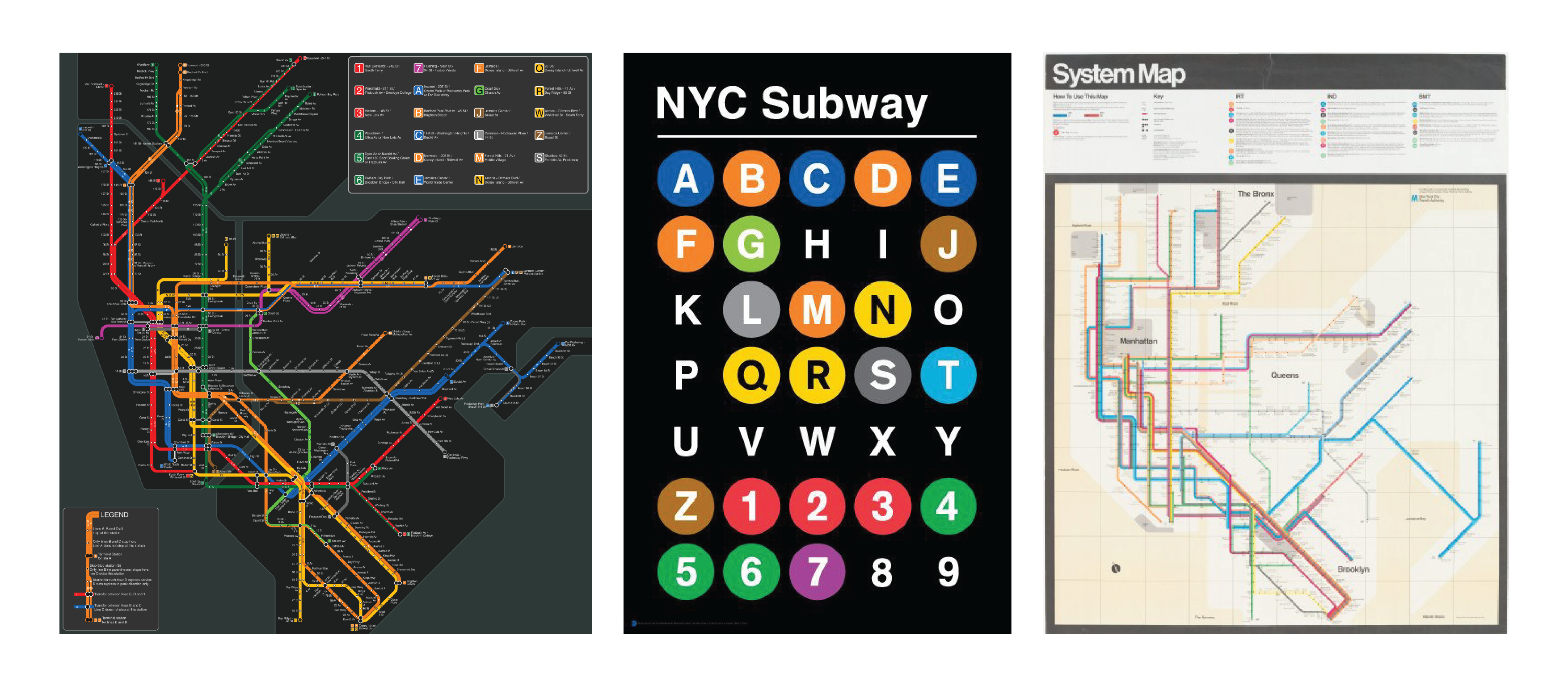
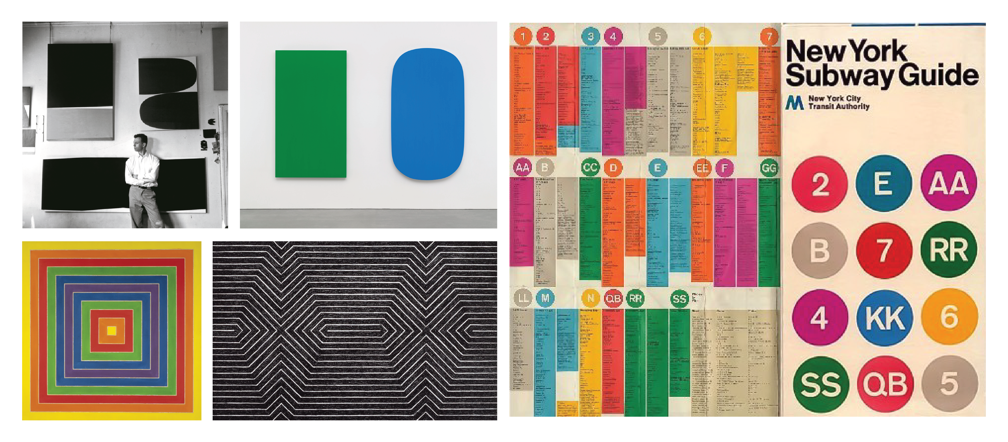
One of my main sources of inspiration for the sketch was the graphic design system of the MTA itself.
The shapes and geometric forms that I used to represent the elements of the sketch: the filled, outlines and curved rectangles are a direct ode to painters and printmakers like Ellsworth Kelly and Frank Stella who worked primarily with minimalism and abstraction using flat colours. I felt this design style perfectly complemented the MTA graphic system first set up by Massimo Vignelli. I like basing my work on things I’ve learnt in the past, rooted in art history and past design styles.
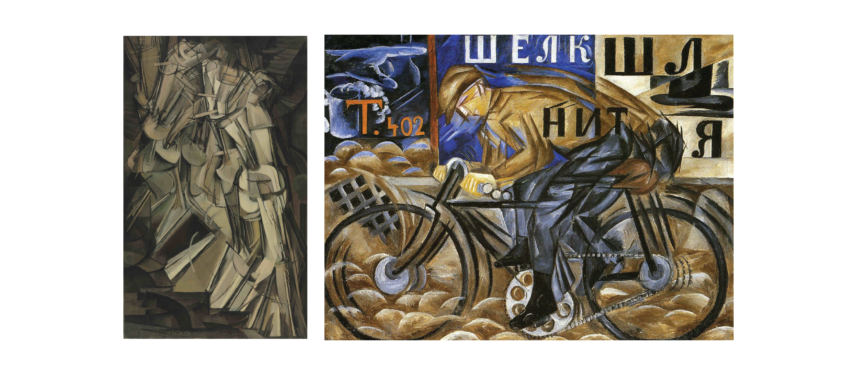
Initially I thought of having a button or slider to view the different days and the visualization, but this seemed a bit boring. Then I decided to use the position of mouseX to display the data. I also changed the background alpha value/ opacity so one sees a certain lag that makes the sktech more dynamic. This is akin to the ephemeral quality of the fast-moving MTA trains.The ‘lag’ seen in the final sketch reminds me of lags or movement documented in painting, like in Marcel Duchamp’s Nude Descending a Staircase (1912) or Natalia Goncharova’s Cobo-Futurist Cyclist (1913).
Credits
This project was created based on the tutorials provided on the Critical Computation website, and the hundreds of people who travelled in the same subway car as me over the past week. I also referred to the NYC subway colour system.