So in this post, (after further discussing with my professor the actual criteria of this post and fully understanding); I have concluded that my aims in the initial post were off as to what I was trying to convey and my photographic documentation was inaccurate. To make amends and corrections, here is a re-evaluation of this assignment focusing on what I decided to create to capture a small essence of both my partner and I through large portraits incorporating image and text. Let’s begin!
1). Peer Portrait:
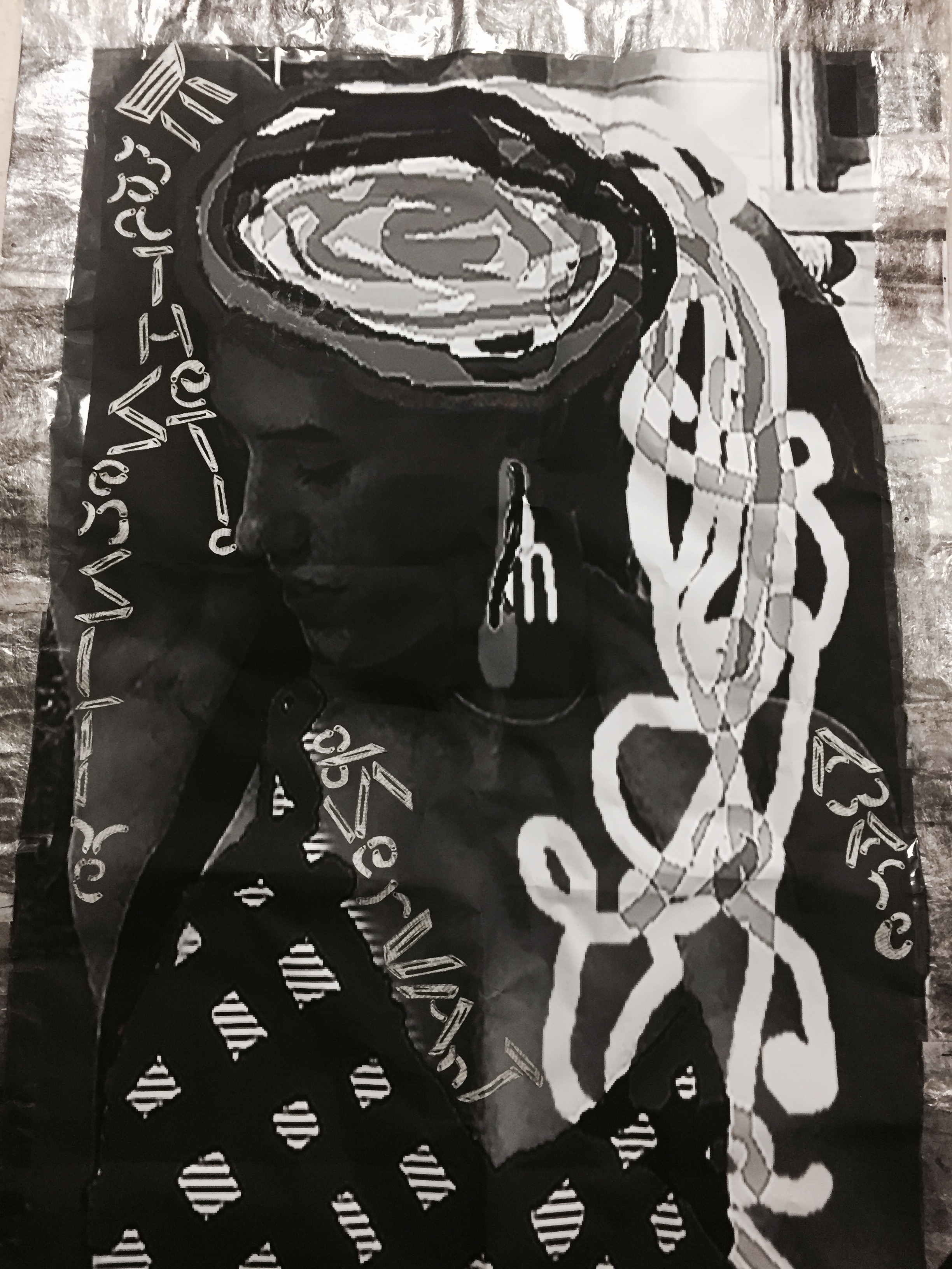
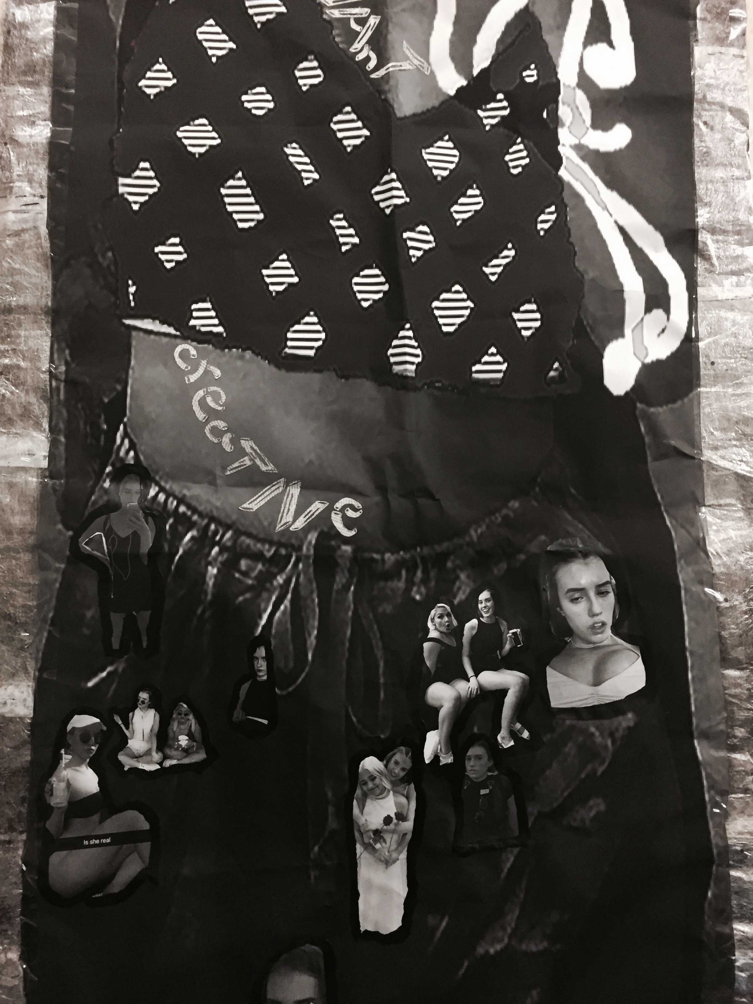
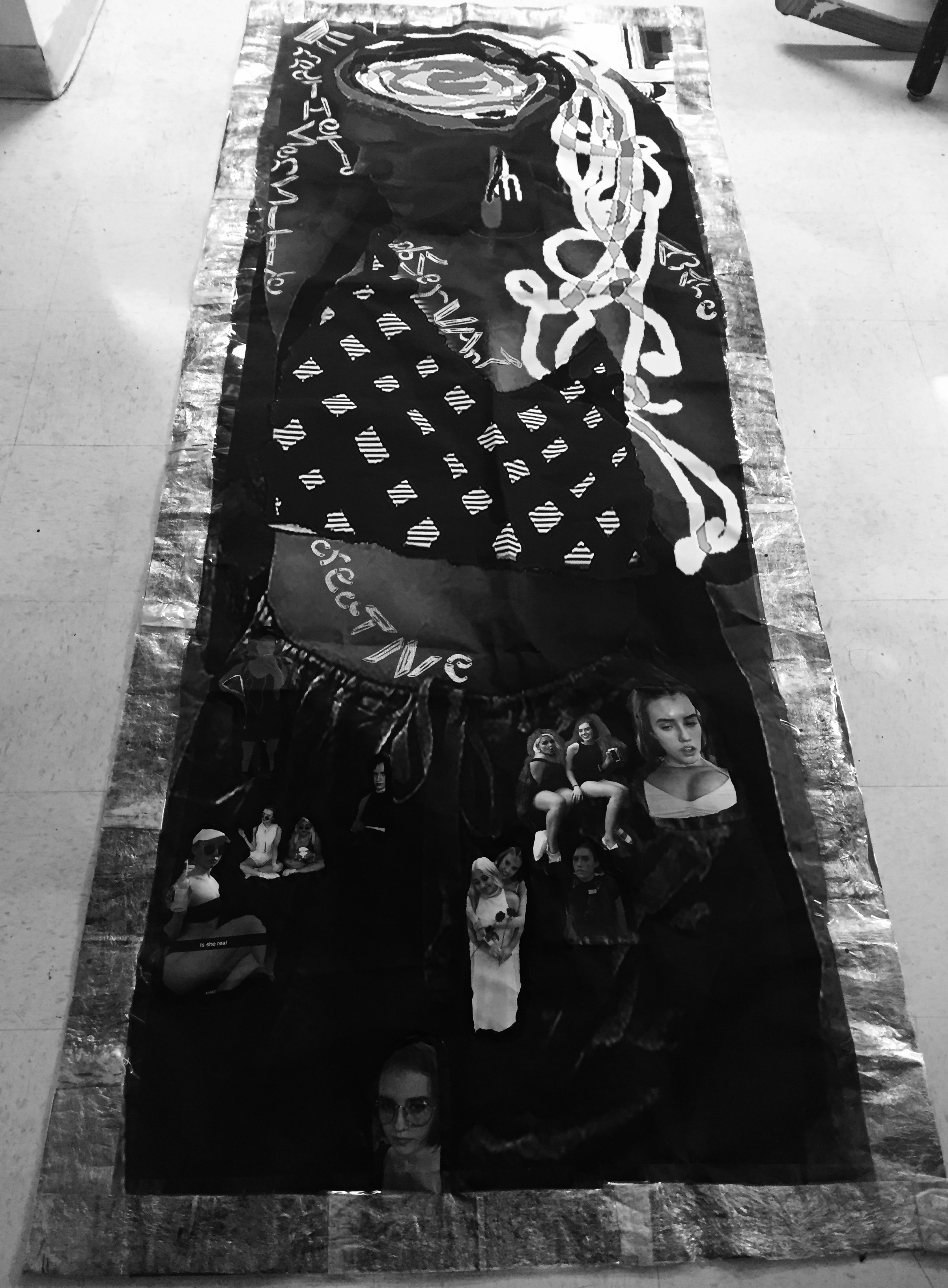
For the text of this particular portrait (and my personal portrait as well), I decided that I would work with Adobe Photoshop in black and white grayscale, and use Adobe Illustrator to form a plate of spaghetti atop my partner’s head with dangling utensil earrings and her crop top was altered to imitate a checkered tablecloth pattern. The background was from a photograph that my partner submitted to me in which she was posing next to a large statue outside the Metropolitan Museum of Art. For the text;( to make the subject matter light, playful, and connected)- I cut penne and macaroni shaped newspaper pasta noodles and chose to place the words she used to describe herself throughout her body using those forms: “Empathetic. Sensitive. Aware. Observant. Creative.” Lastly, the borders: (to keep with the subject of her favorite food being pasta, and food in general)… I made several plastic wrap panels with paper ink seeped through with an iron to leave a silvery sheen; to keep everything together I simply used Scotch tape…this was to make the portrait act as a giant placemat, like the ones you would fine on your dining room table. Here it is! (Below)
2). Self Portrait:
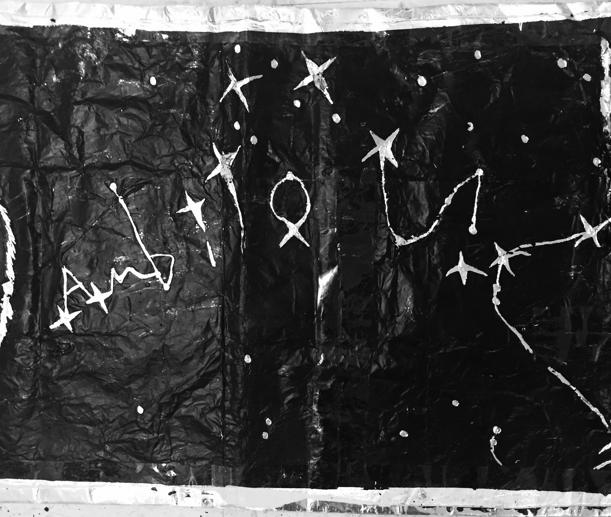
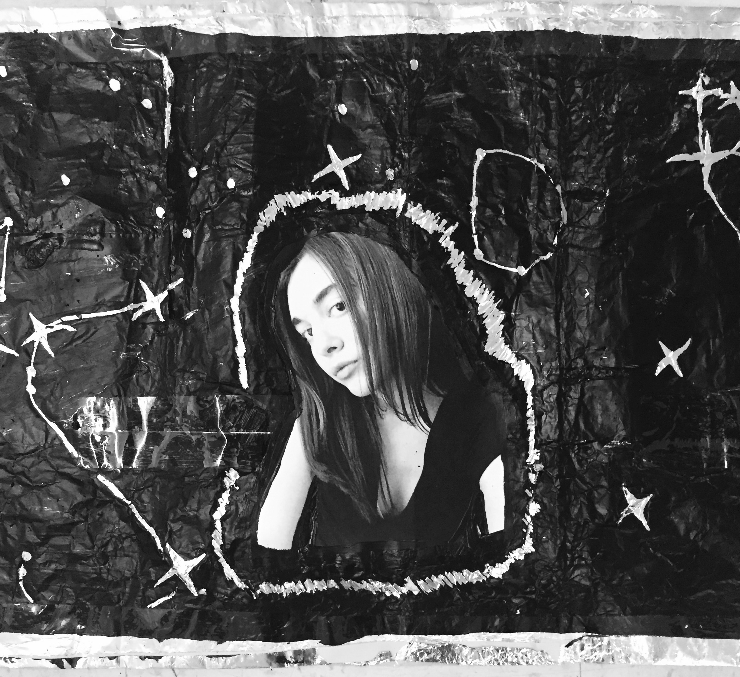
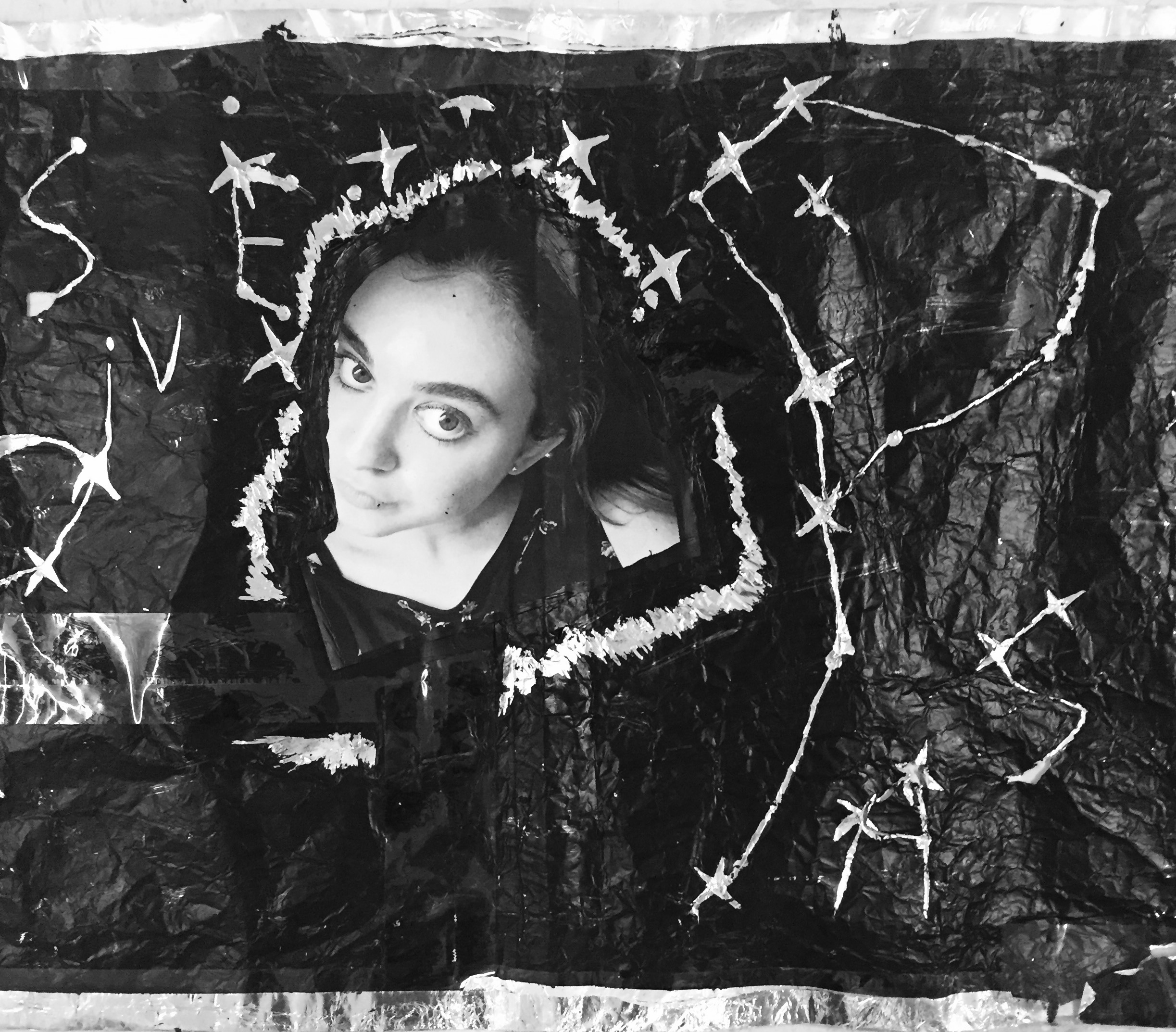
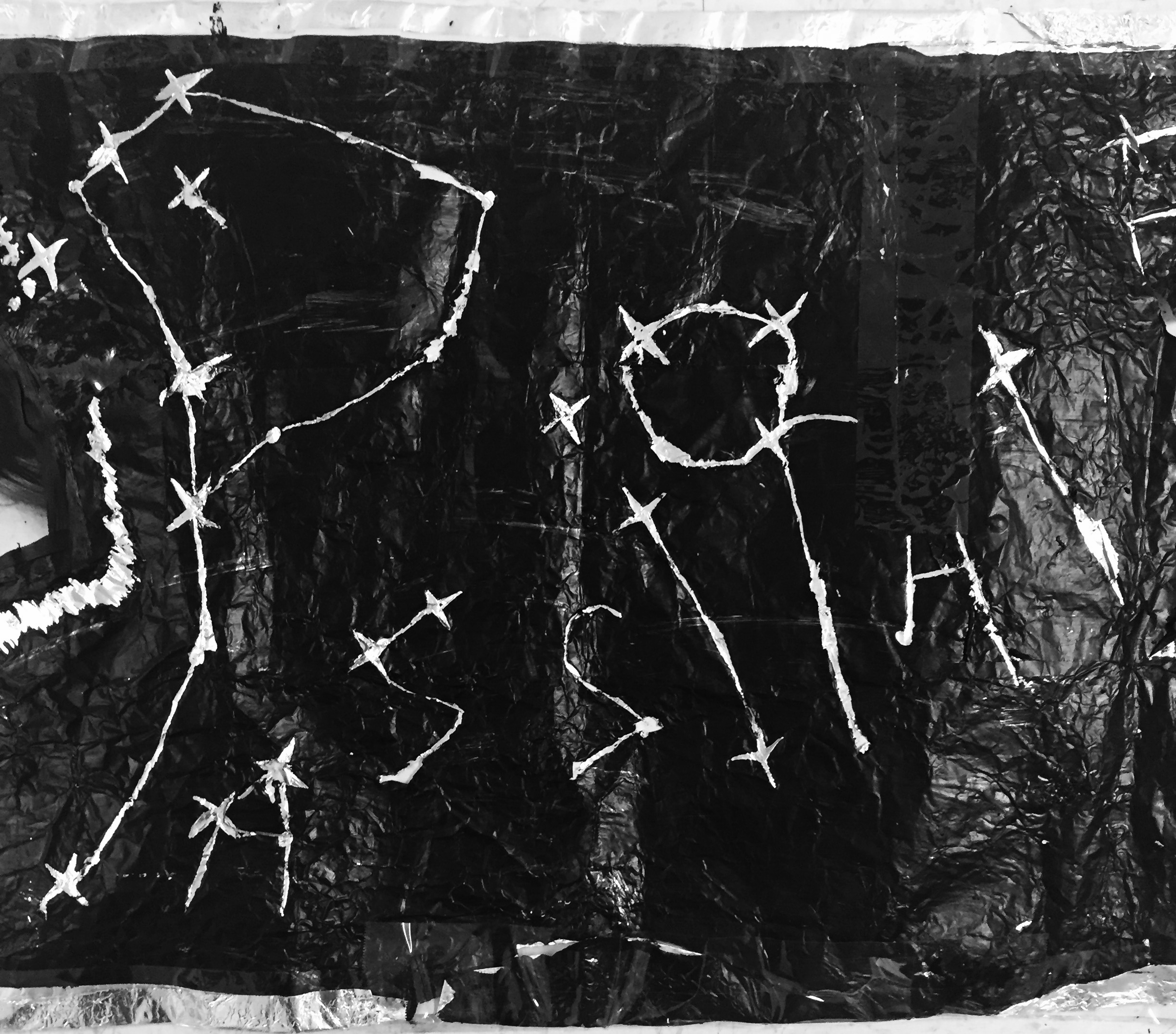
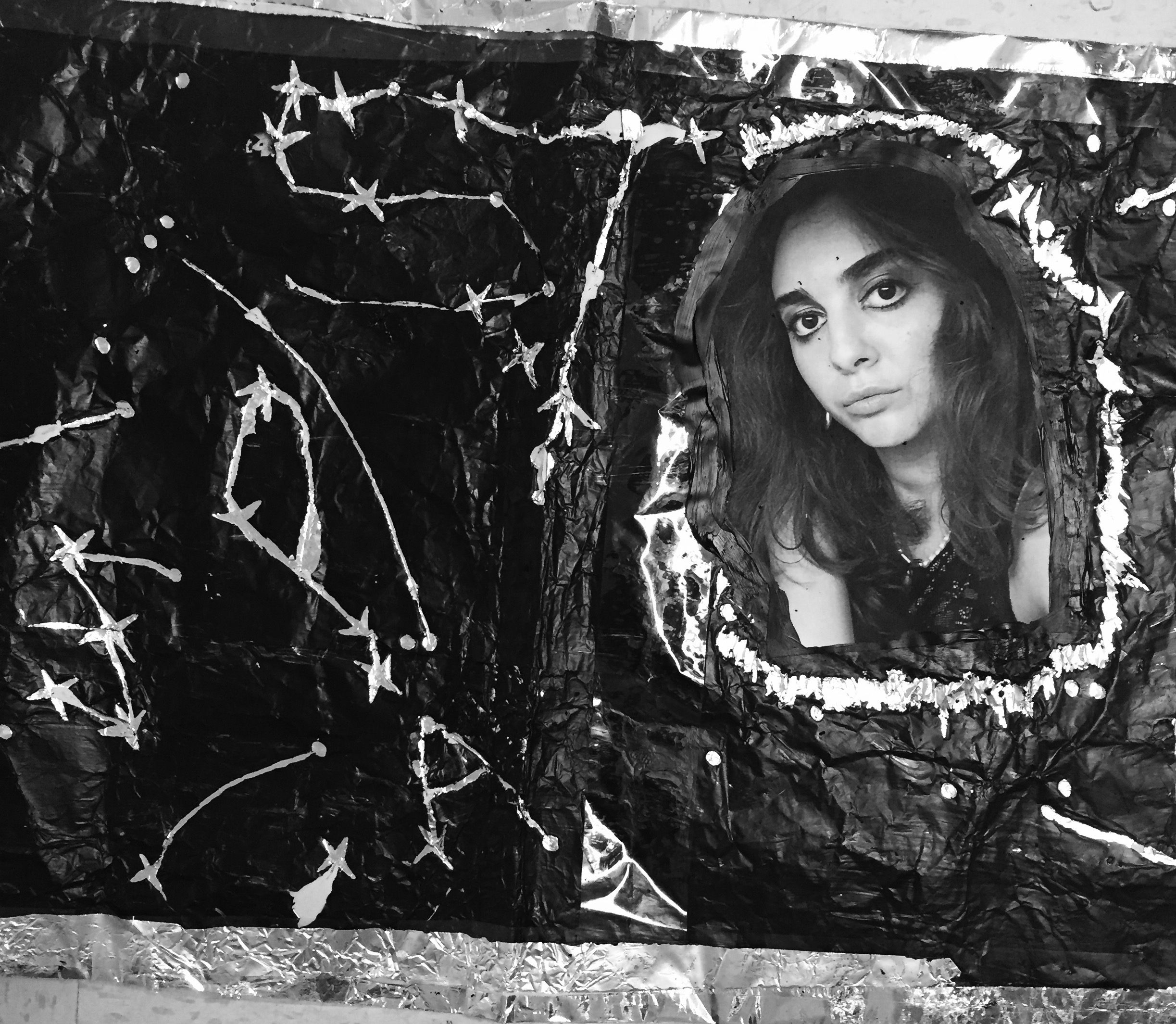
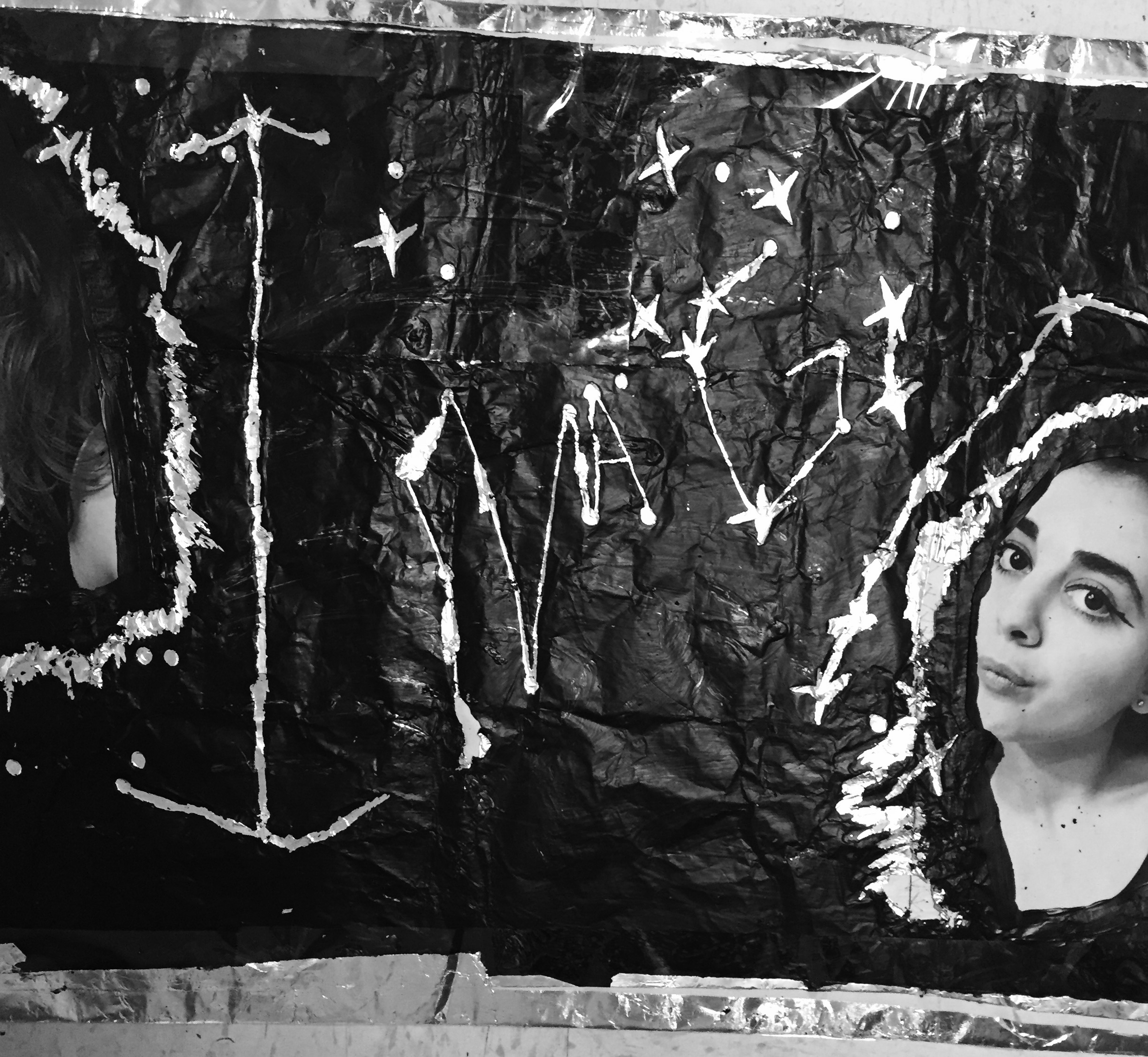
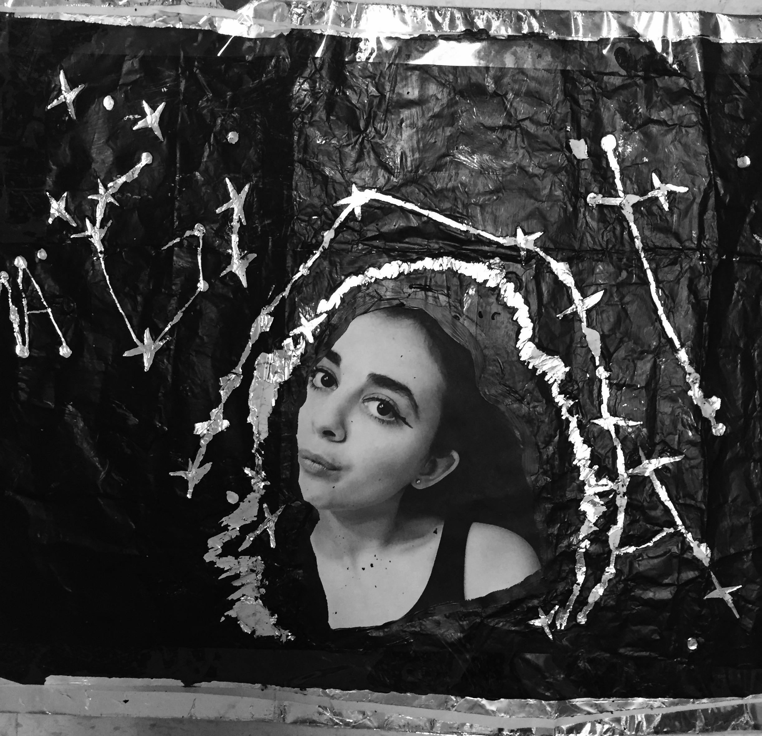
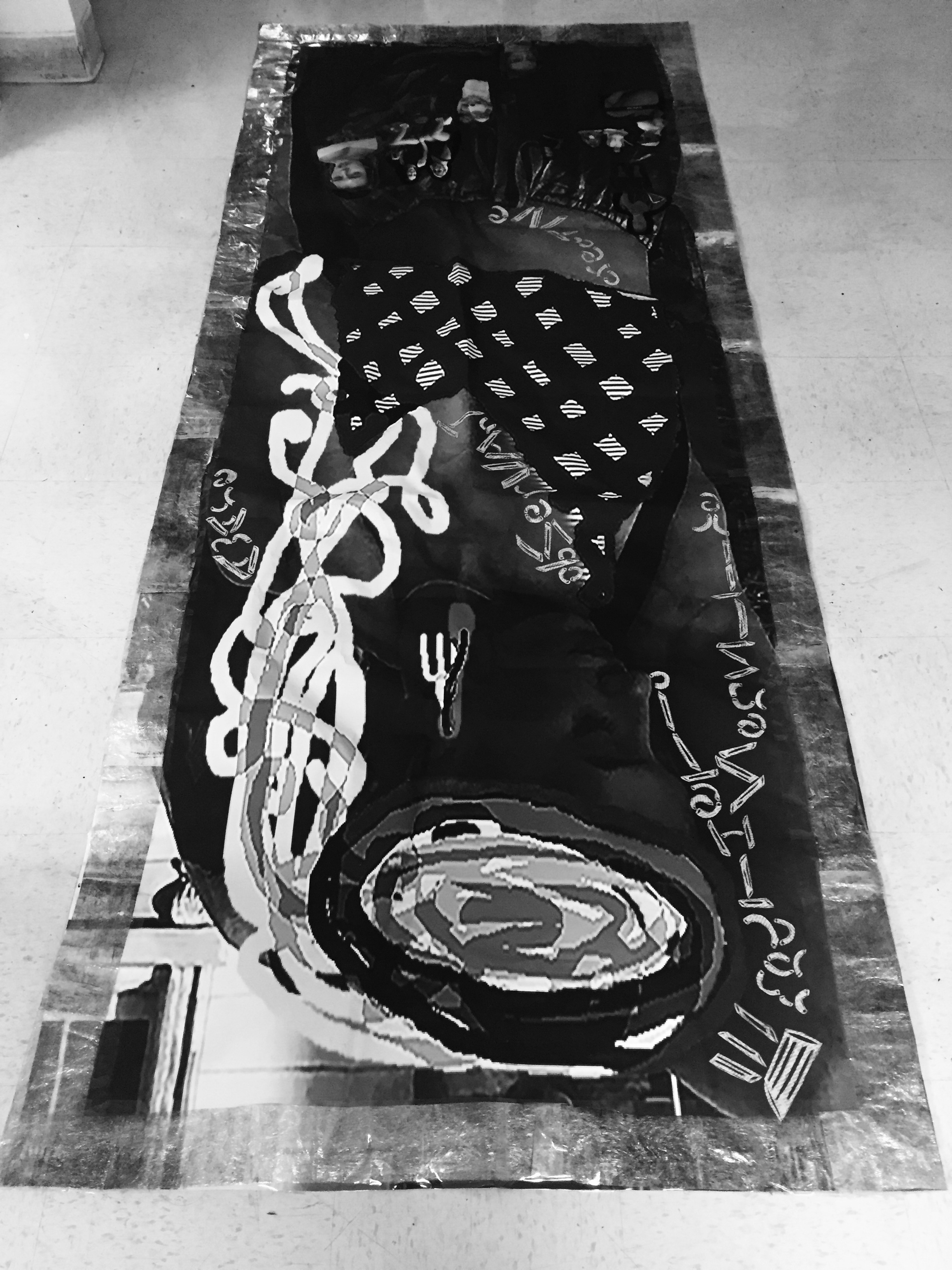
As you have discovered in the subject matter of my partner’s portrait, it was based upon her favorite food and words that she used to describe herself. When we collaborated together we actually asked each other general questions about what our favorite: food, color, music, etc is. The idea was that we were trying to gather what interested us. One of the interests of mine was astrology; so I figured I could create a portrait that represented myself through image and text using this as my personal theme. For the base of my portrait I used: newsprint paper, aluminum, black paint, and coffee stirrers (for etching). I went about this by first sewing together the eight pieces of newsprint (for binding), I then layered that with eight sheets of aluminum foil of the same dimensions, and painted over this with black. From there I allowed this to dry and pasted mini portraits of myself throughout. After this I utilized the coffee stirrers (and to keep with theme), I etched my personal natal astrological placements and formed my text organically by connecting stars to match my selected descriptive words: “Ambitious. Passionate. Obsessive. Escapist. Imaginative.” Lastly, (for borders) I simply folded over the portrait on all sides and to reinforce; used Scotch tape. Here it is! (Below)