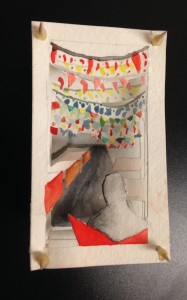
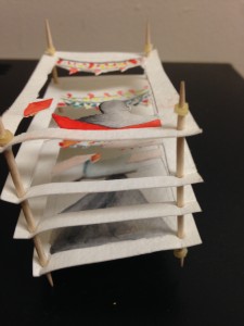
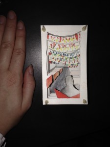
While recapturing the memory with Jo from Panna II, I was mostly inspired by the perspective Jo had that channeled the environment of the restaurant. Instantly, I wanted to emphasize on the depth and chaos of the lights that felt entrapping. Therefore, I did this by creating different layers of lights and flags similar to the restaurant, and had the lights closest to the figure more detailed and more vague the farther they became. Thus, I chose watercolor to help with this effect, but also because watercolor relates to the dreamy emotions. In regards to the figure (myself), I wanted that to be non-focal and make the restaurant the main point since it was the primal reason for choosing that specific Indian restaurant. After having our delicious meals, and part-taking in new and exciting flavors, we took the mementos: toothpicks, business cards, and a tinsel American flag (from their fourth of July decorations amongst the rest of the holiday decor). So I wanted to physically use those mementos as my medium. Plus, by using the business card size, it also simulates how skinny and narrow the air-plane sized restaurant felt to us (and the rest of the customers). Overall, I think this piece may be quaint in size, but it successfully connects the memory to the reality of the restaurant. The chaos finally has a beauty in this depth-defining enchantment.


This is excellent article, thank you for the share! This is what I am looking for, hope in future you will continue sharing such an superb work.
Boy Kills World Jessica Rothe Yellow Jacket