![[LS] Int Studio 1: Fake: Graphic Design Basics](https://portfolio.newschool.edu/xingyuling/files/2018/10/zazhi-1fkqyjf.jpg)
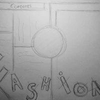


The principle of the first picture is symmetry. The principle of the second picture is scale. The principle of the third picture is framing.
NOTES:
Symmetrical layouts are inherently stable and balanced and that’s why designers, for centuries, have gravitated towards centered layouts.
Symmetry is more inherently understandable because we can all relate as human beings that are symmetrical to that principle.
Asymmetry is design really is distributing elements, so that moving them around until they really do feel balanced.
Nature’s full of asymmetry.
Scale is relative. An element will seem larger or smaller depending on its context.
Scale conveys meaning.
Scale relationships can be conceptual.
Scale is used to represent precise differences and quantity.
Scale can tell a visual story.
Scale is size but scale is really relationships.
Scale is an important tool in graphic design because it can often energize the design by changing what we expect.
Framing is part of almost everything graphic designers do.
Framing is a ways to call attention to the content, to direct people where to look, to show people what’s important.
Visual hierarchy gives order to information.
It allows readers to navigate complex content or to get the big idea quickly.
The key to hierarchy is separation
Grids are a powerful tool in page layout. They give structure to the page and they increase the efficiency of the design process.
Grids can unify the many pages of a publication.
Grids created for the web and digital media tend to be more unifomr than print grids.