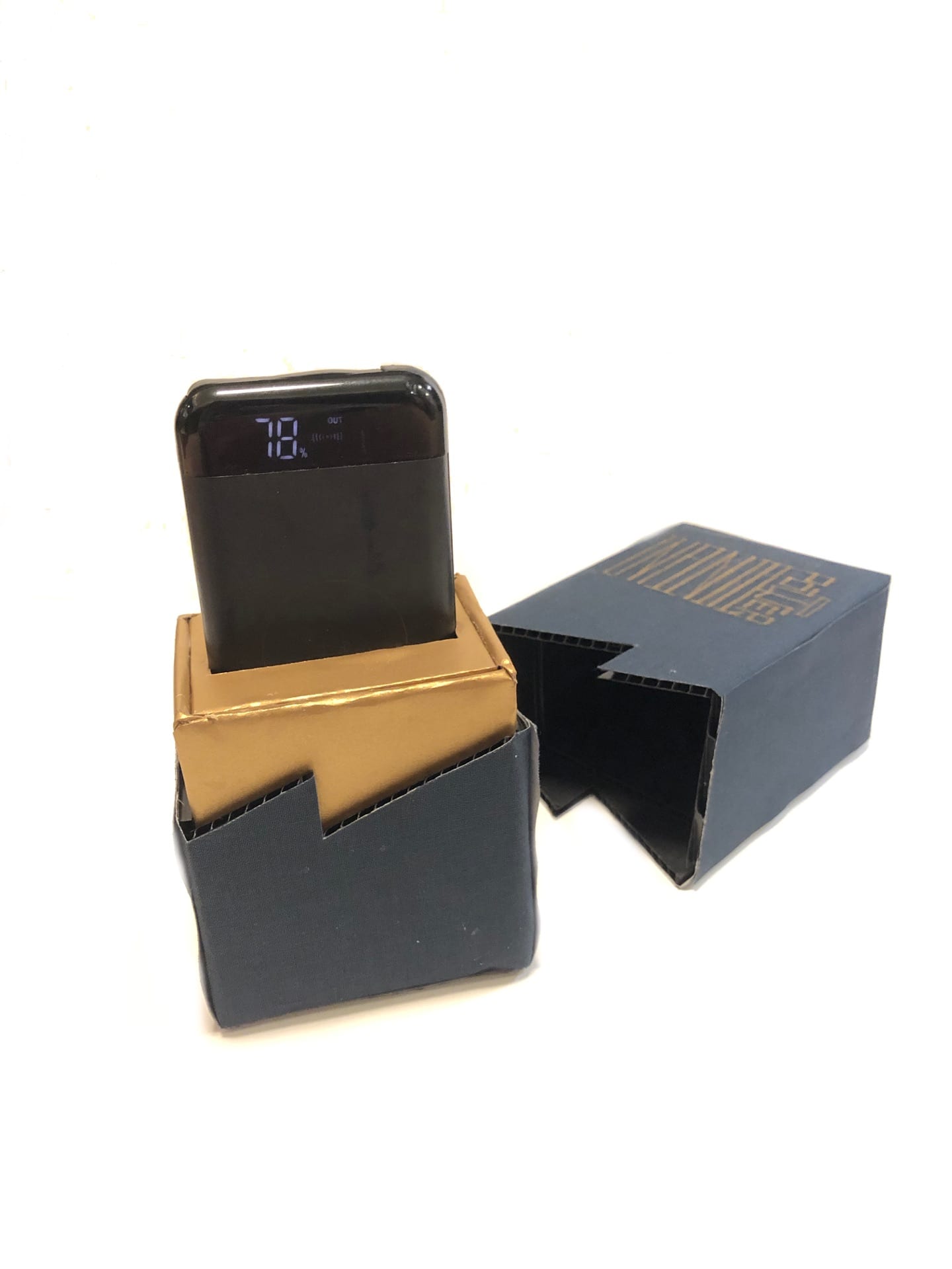
 This is my packaging design for a portable charger.
The front view and back view. 👇
For the first step, I try to separated the portable charger into different elements, like electricity. I follow this point and then think about how people usually visualize this invisible thing. Lightning is one of the most obvious way to see the electricity, so I decide to mimic the visualized symbol of lightning–this zigzag shape. For the second step, I focus on the typography. I try to think about the description for this product first. What do consumers expect from this product? They might think about how long it can charger for their phones. How about giving them information directly without asking? Thus, I decide to use “Infinite Power” to describe the product. After that, the idea of a battery jumped out my mind. To simplify this product, it is a battery, so I wanted to put this element to my design as well. The whole shape of this typography is designed as a rectangular battery shape. Additionally, the word “Infinite” does not have any curve lines in it, so I decide to stretch them into rectangular shape and put “power” in to a different direction.
  For the third and fourth step, I apply colors and patterns to make it more attractive. The yellow zigzag is to make it more like flash, and the dark blue is based the the color theory to show the strong contrast. The patterns are trying to express the feeling of electricity as well.
  This is the final digital version of the back side and front side. The actual packaging is shown at the beginning. 👆


