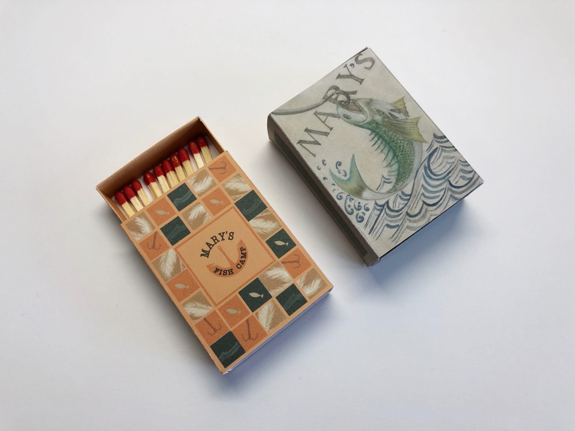
In this matchbox packaging design project, I had a lot of fun designing and making them. Because I was given a specific restaurant called Mary’s Fish Camp to design matchboxes or matchbooks for, I actually went there to have a dinner with my friends. The environment is quite different from the restaurant I usually go for to have a dinner. There is not big space there and most of the menu are written on the blackboard because this restaurant serves seasonal food.
For the design part, I caught several features of this restaurant including the “camp” feelings, the seasonal food provided from Florida and the way people do fishing. I originally planned to do all the design through hang-drawn illustration, but through the process, I designed one illustration piece and a more graphic piece. The elements in my design most come from the posters in the restaurant and my personal feelings when I was sitting there having dinner. I chose the elements which are mainly fishing hooks, fish, waves and the color of yellow and green to represent the feeling of camping.
(Design process: the positions of titles with its shape and test the colors)
(The first rough sketch of the fish design)
For the final result, I am pretty surprised my graphic one is really nice shown on a tiny box. Instead, the illustration one is not that clear to see the details on it. I realize that considering about the actual size of the packaging is an important part for design as well. It will be a little inappropriate to put too much details on a tiny box even though the bigger size can show its beauty very well. To conclude, I am still pretty satisfied with my final work of matchboxes.


