Class – Time: Metropolis | Instructor – Cooke John, Nina
[NOTE: This is the second part to a two part submission, for part one click here]
For this assignment, we had to create a time map, which, like the previous assignment, is based on the narrative (click here for the narrative). What was different about this assignment, was that we were allowed to use colour.
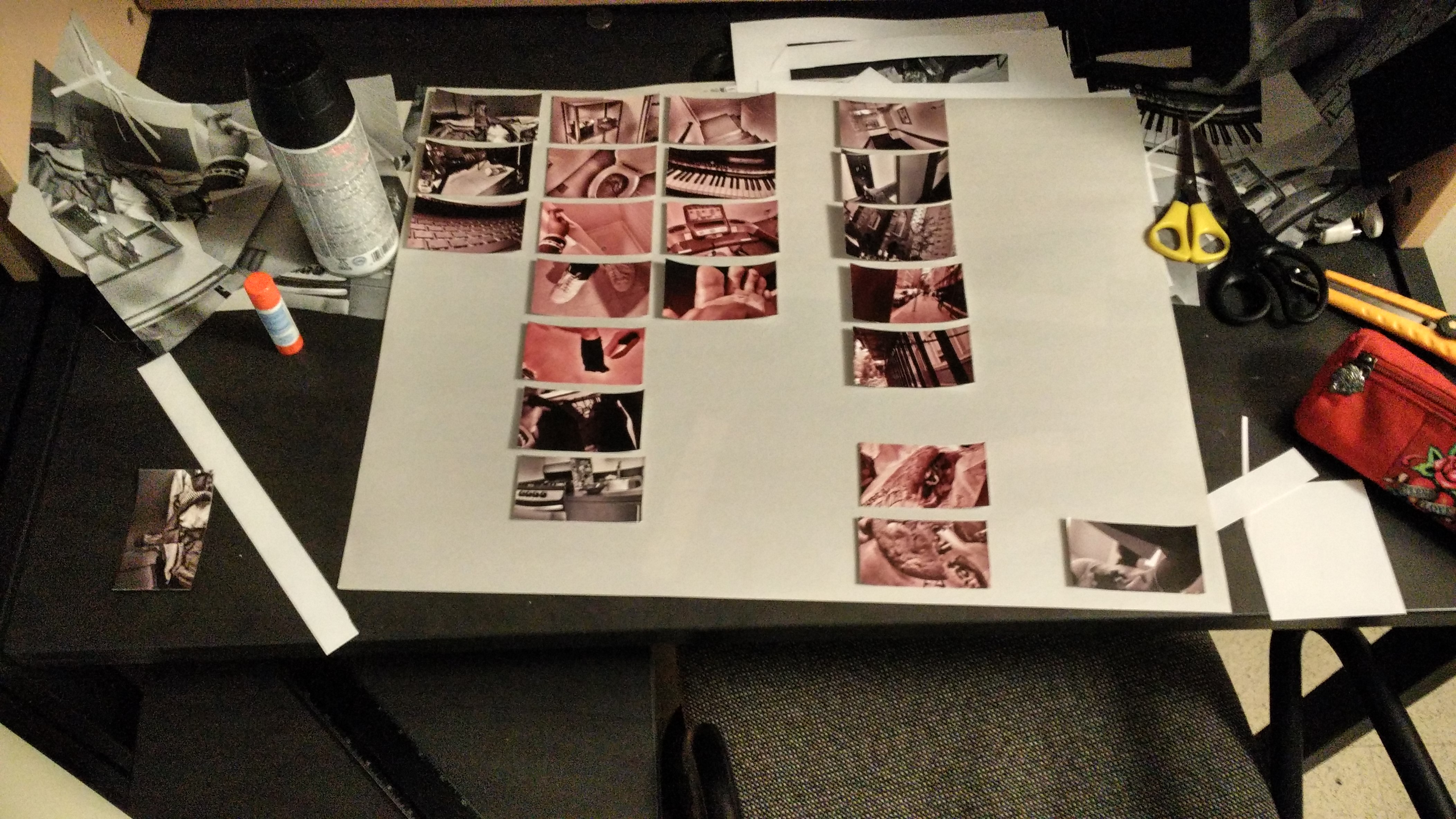
I wanted the time map to have a rough geographical layout. I decided to add a red tint which would convey how much energy / activeness / level of interest I have in an activity throughout the day. For aesthetics, the red tints go up in intensity gradually.
I laid out the images until I was happy with the layout (pardon the background):
And then I pasted them down; Here is the first iteration of my time map (pardon the low quality and the clipping at the edges):
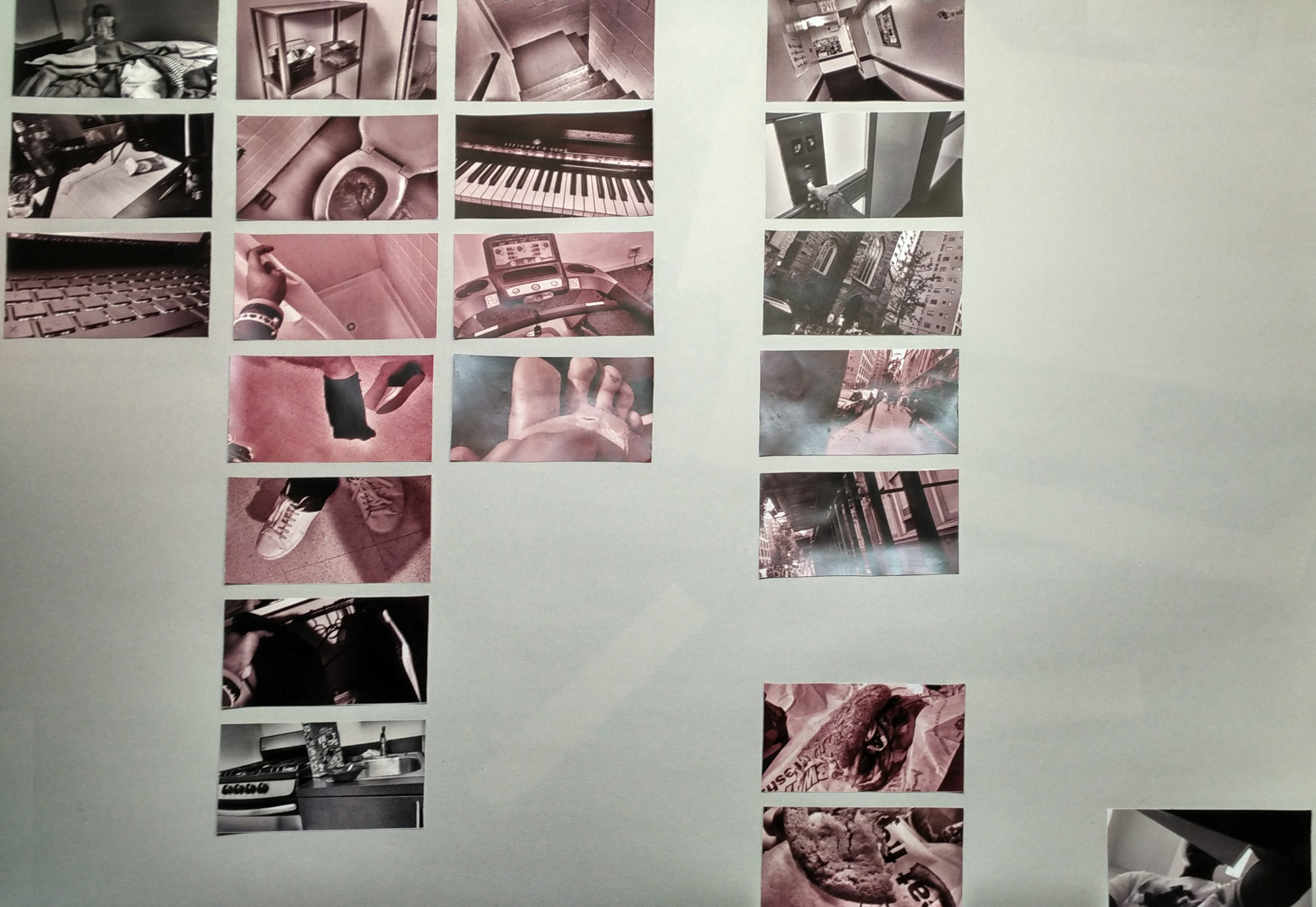
The feedback I received dictated that the gradient of red is going to ease the audience into the red; it might be more effective if a single red picture was amongst the monochrome. I was also asked to consider spreading the time map over two sheets of newsprint (18″ by 24″ x 2).
I decided to remove the gradient and instead only made the pictures that were somewhat stressful in strong red (such as me getting ready in the morning, because it is rushed). I also gave slight colour to the outside shots to add variety, but also to suggest the outside is somewhat stressful.
Here is the second iteration:
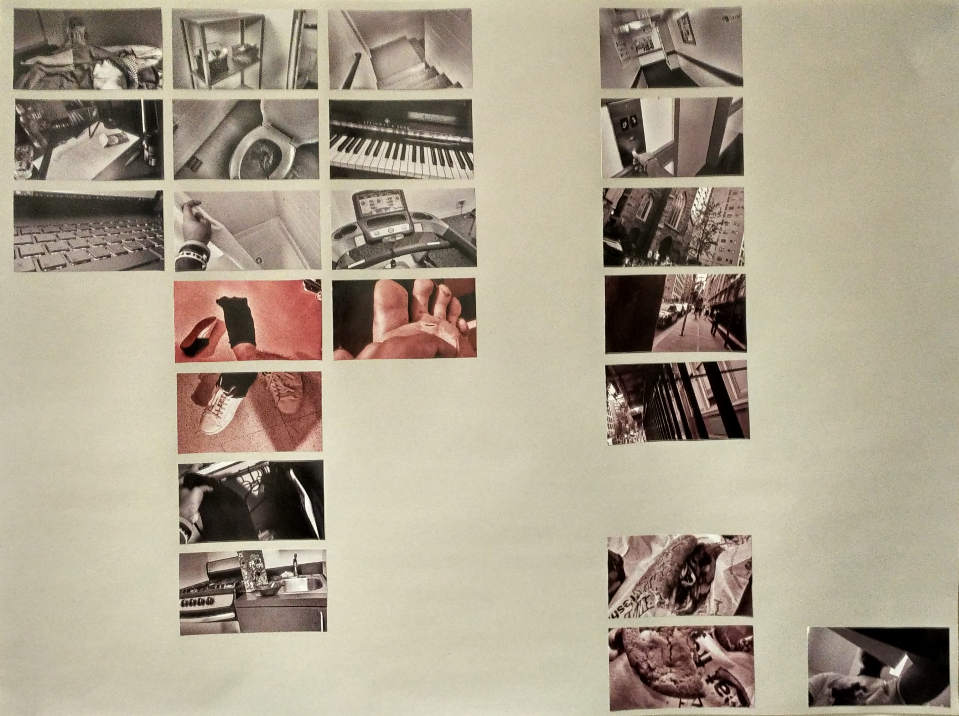
As you can see, only a handful of photos are distinctly red, where as the others are either monochrome or slightly tinted. I believe this iteration was a lot more effective than the last as it is more visually appealing and more impactful.