

This project from my drawing and imaging class and was inspired by one of Joseph Kosuth’s pieces of work called one in three chairs (circa 1965). In this work he displays a chair using 3 different types of mediums. The first being the the dictionary definition of Chair, the second being a photograph of the chair having just been made in the factory and the last being the chair. Kosuths idea around this piece was to question if any of these 3 examples of chairs all in different forms were a more valid example of a chair then the other.
There fore questioning if what you see is more valid then something else even though it may represent the exact same thing.
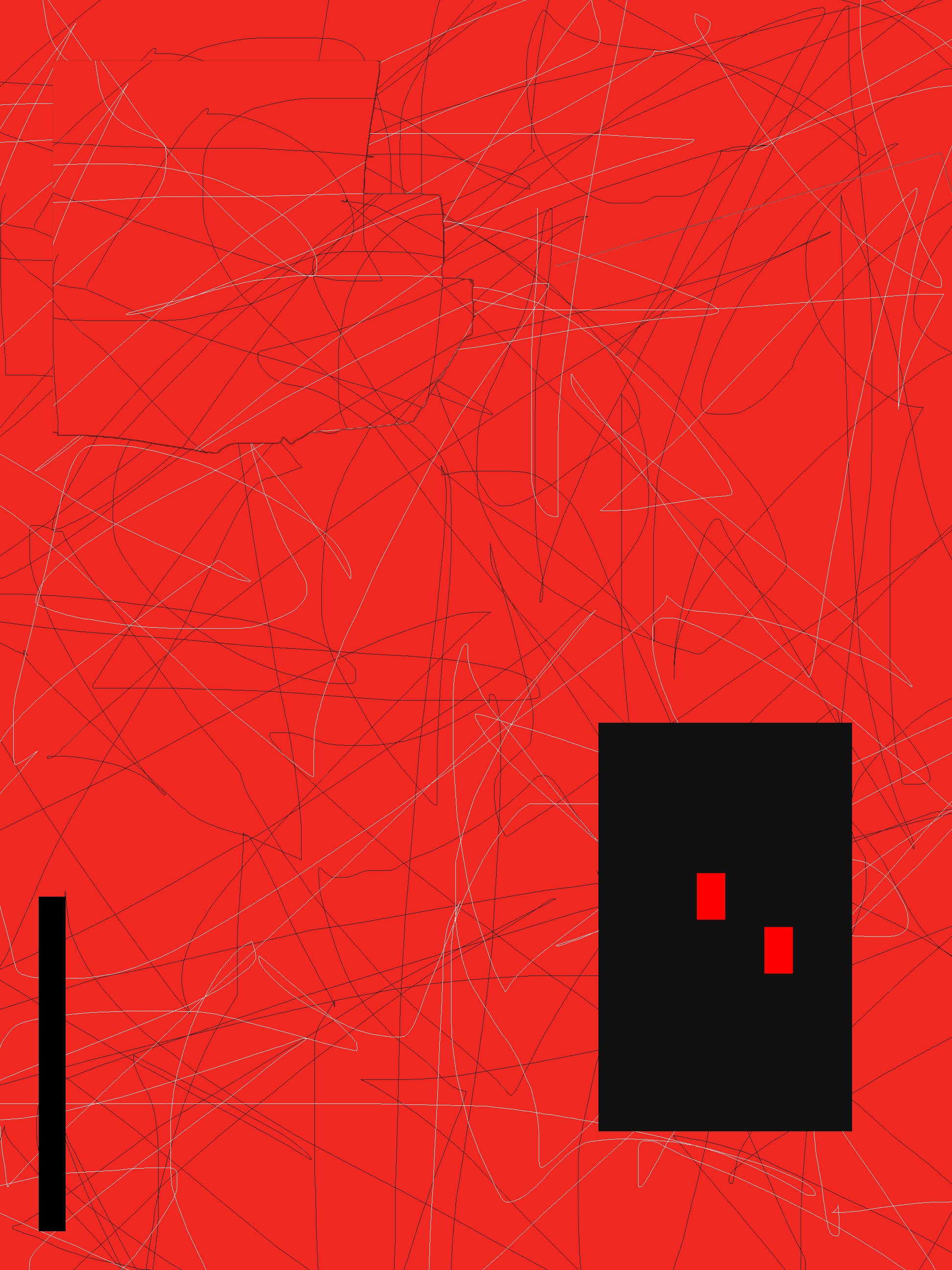
So for this project I set out to do the same thing. In order to do so, I found two objects that had a special meaning to me. One being my teddy that I have had since I was little and the other being my Vintage Vivienne Westwood bag, this bag is very special to me as I literally carry it everywhere. And any of my friends back home in London can definitely vouch that there are very few occasions that I will leave the house with out it. With these two objects I went on to draw a still life on briton board paper. Once I had done that I started on my abstraction using photoshop. The black swirly lines all over the page represent how I have taken my teddy around the world with me, almost like a route of where a plane has gone. My teddy was made in China which is why I choose to make red by back ground as it is a colour hugely associated with china. The black bold squares represent my bag because when I wear it almost always stands out in my outfits. After that was complete I moved on to the last stage of this project which was the text based piece. To created this piece I used illustrator which I must admit I found a bit of a struggle as I had never used it before, so after a few hours of trying to figure it out I finally came to a piece that I liked. I Followed some of the same principles that I had used in the abstraction piece. For example, the red and black representing my teddy. But I decided for the text that I wanted it to be rather minimal as the bag is also very minimal yet bold at the same time, which is why I made the text large so it would stand out but I didn’t add too much of it.
Overall I throughly enjoyed this project as it was something completely different to anything I had done before and defiantly not something I was expecting to do in my drawing and imaging class. I also learnt a lot of new techniques especially when it came to illustrator and photoshop!

Still Life

Photoshop Abstraction

Illustrator text based piece