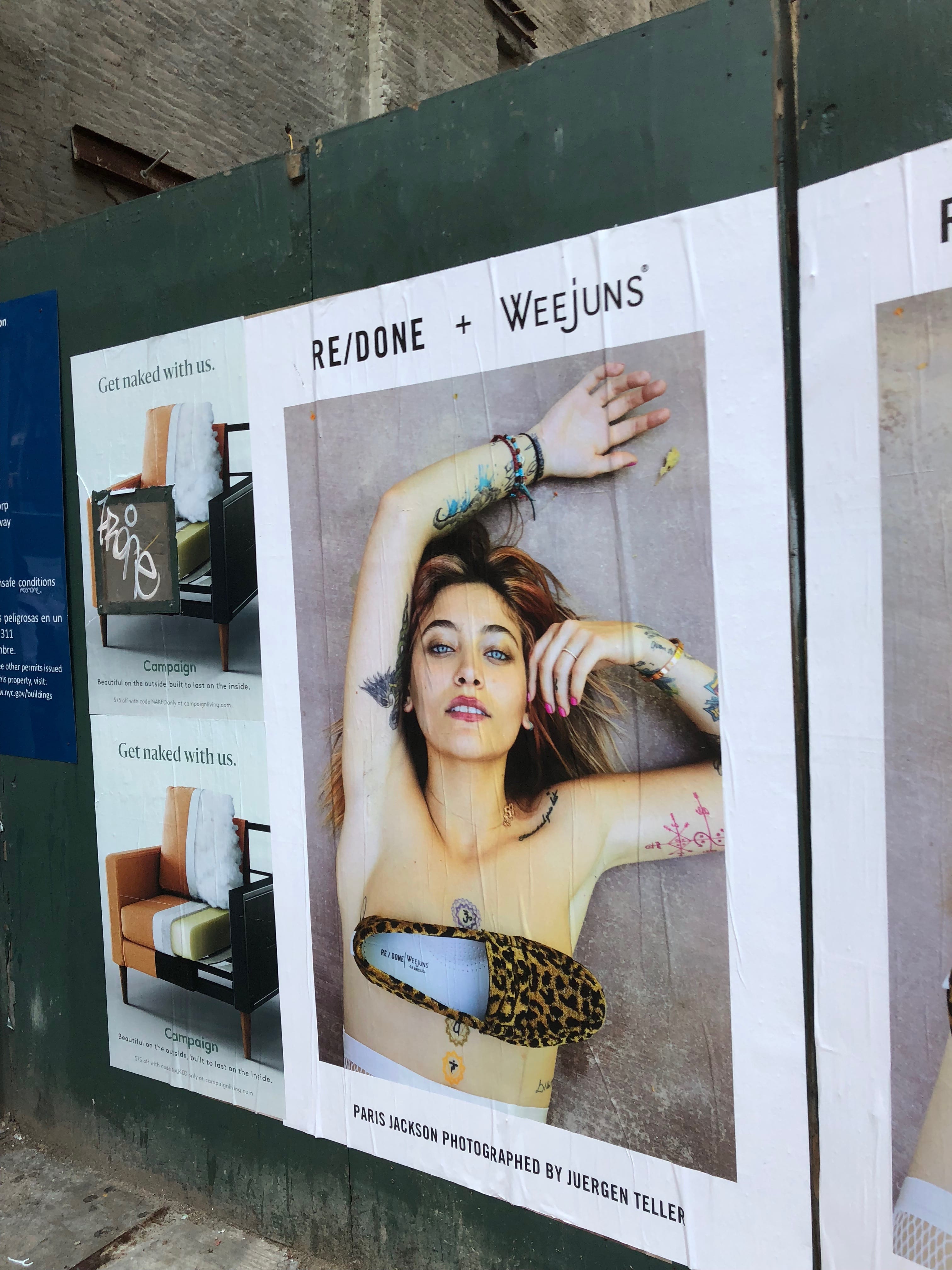

Inspiration- Murray Hill
Primary images- model, cheetah print shoe
Tagline- RE/DONE + WEEJUNS
Location- posted on a wall in a large format
Target audience- young women in Murray Hill
This ad is clearly an advertisement for the shoe. I believe the target audience are young women in the neighborhood because of the way the photo is taken. The model is naked and oozes a certain sex appeal that is not suitable for children or older women. The shoe is strategically placed on her chest and the raunchiness of the advertisement makes the ad more noticeable and stand out. The fact that the model is also Paris Jackson, daughter of the late Michael Jackson, may make this shoe more appealing to some.
RE-DESIGNS
- For the 3 redesigns, I chose to use one sector and create 3 ads. I liked the simplicity and straightforwardness of the original design.
- The platform would most likely be digital (Instagram). Also I like the print of the original ad as well

For this first redesign, the target audience are young women. The primary images are the model, the hairbrush, and the logo. I kept it simple and I feel the color scheme and simplicity make the ad feel elegant. I kept the cheetah print design on the hairbrush to give the piece an edgier feel and attract a wider audience. I tweaked the logo from re/done to re/new in order to suggest the hairbrush brings a new luxury to audience’s hair. The location would be on Instagram or a big billboard so it is easily viewable.

The second redesign is similar yet different in many ways. The target audience are mostly young girls and mothers. The primary images are the young girl, the cheetah doll, and the logo. The color scheme emits a pure and simple feel and the girl’s expression suggests content/happiness. I kept the theme of the cheetah print in the original and first redesign. I changed the theme again from re/done to re/born to appeal to young mothers. The location would be on Facebook, Instagram, or the ads of children’s websites or new mother’s websites.
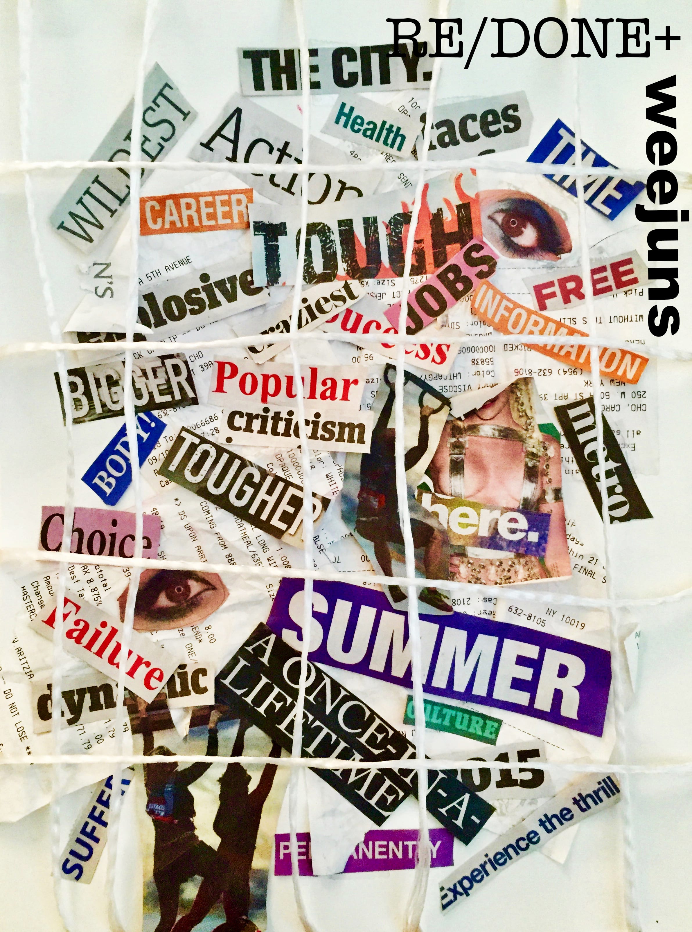
For the last design, I took a different approach. I made a collage out of the words I visualized when observing the original ad and made an advertisement out of it. The original ad is pretty controversial so some may look at it positively while others may dislike it. I took these judgmental words and bound them by a cage (white string) and created this piece. The target location would be on a wall with the image printed in a large format, preferably in Union Square or a busy area. This ad is to be taken however the viewer sees it. One can either feel trapped by these words or let the words be trapped in this cage and let oneself break free.