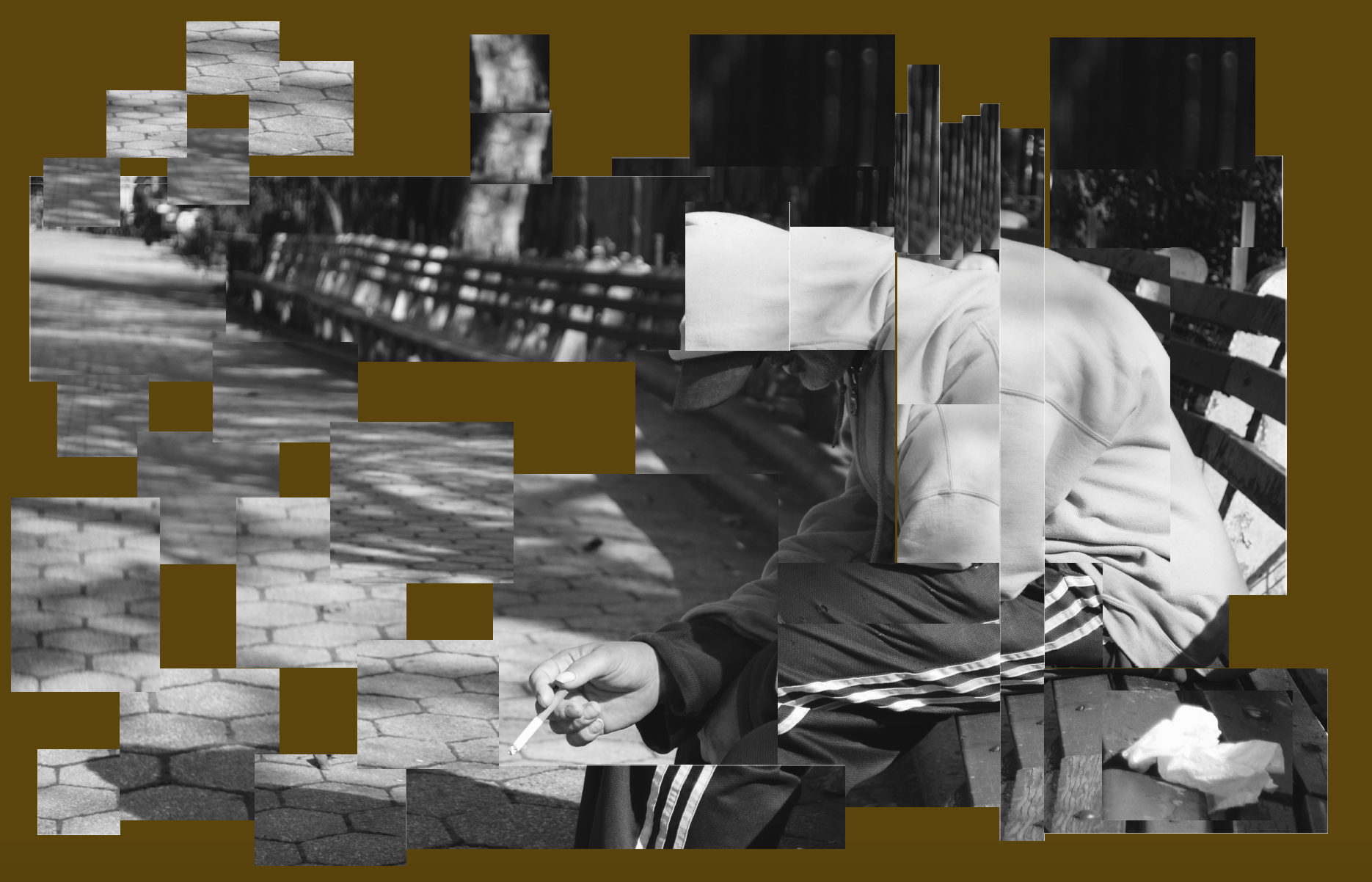
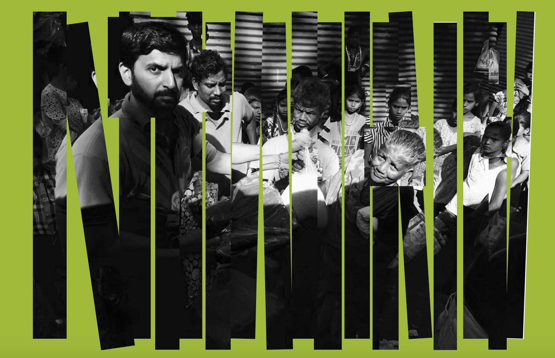
I included the coloured background as a part of the image.The negative spaces in both the images have a reason to be displayed in that way. In the first image, I chose to use a brown shade with an undertone of yellow as the background as it has a touch of gloominess and as this photograph was taken in the park, it also portrayed the outdoors. The first image which portrays loneliness has a bunch of cropped parts from the original black and white image that are placed in very different patterns and in a way infuses the concept of groups. A lot of times an individual is left out in the making of groups that gives a sense of loneliness. Each group in the photo shopped image corroborates with the object and patterns in the original picture. The bricks are placed in alternate direction, which also got me to position the crop outs in a similar way. The colored spaces in between the groups define an unseen line that makes each batch separate from each other. Even with various clusters I kept in mind to show the real essence of the image and still to a certain extent showed what is happening in the photograph. The second image is based on interaction between different bodies. The parrot green colour on the background spreads out positivity and happiness. In this photograph you can see a man with a helping hand, giving out materials and food to the needy. I did not engage in making patterns for this one and made a similar layout to demonstrate equality between the classes. Even the diagonal crop outs join to the others around it. If closely seen, the very significant individuals in the image are not distracted by the spaces between the cut outs and have their faces fully shown. I didthis to show central subject in the image.


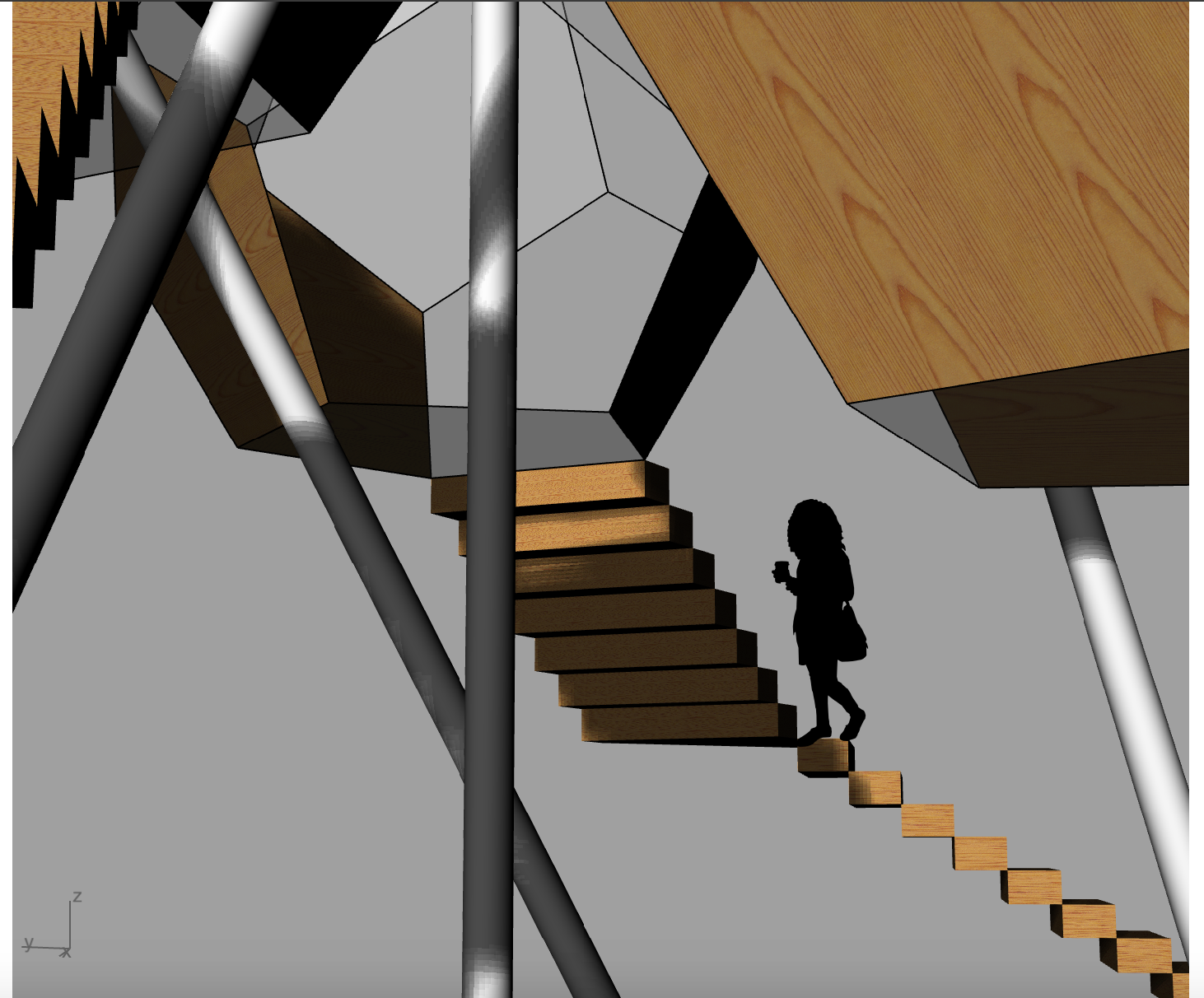
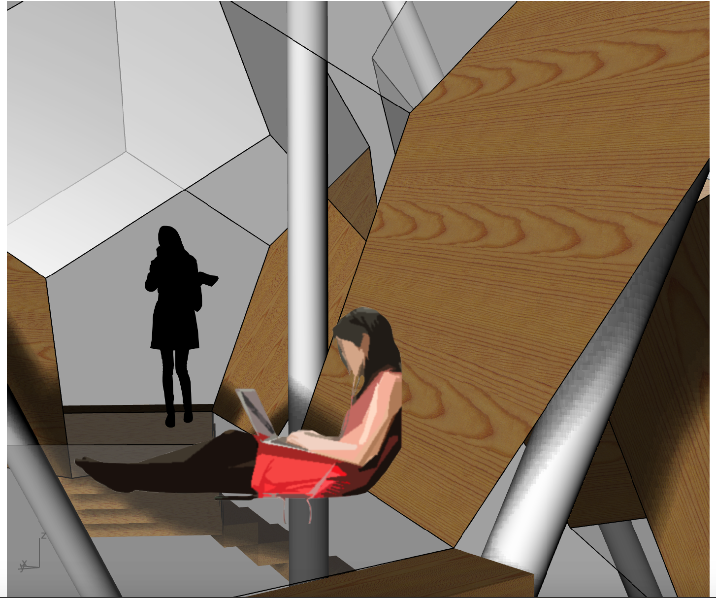
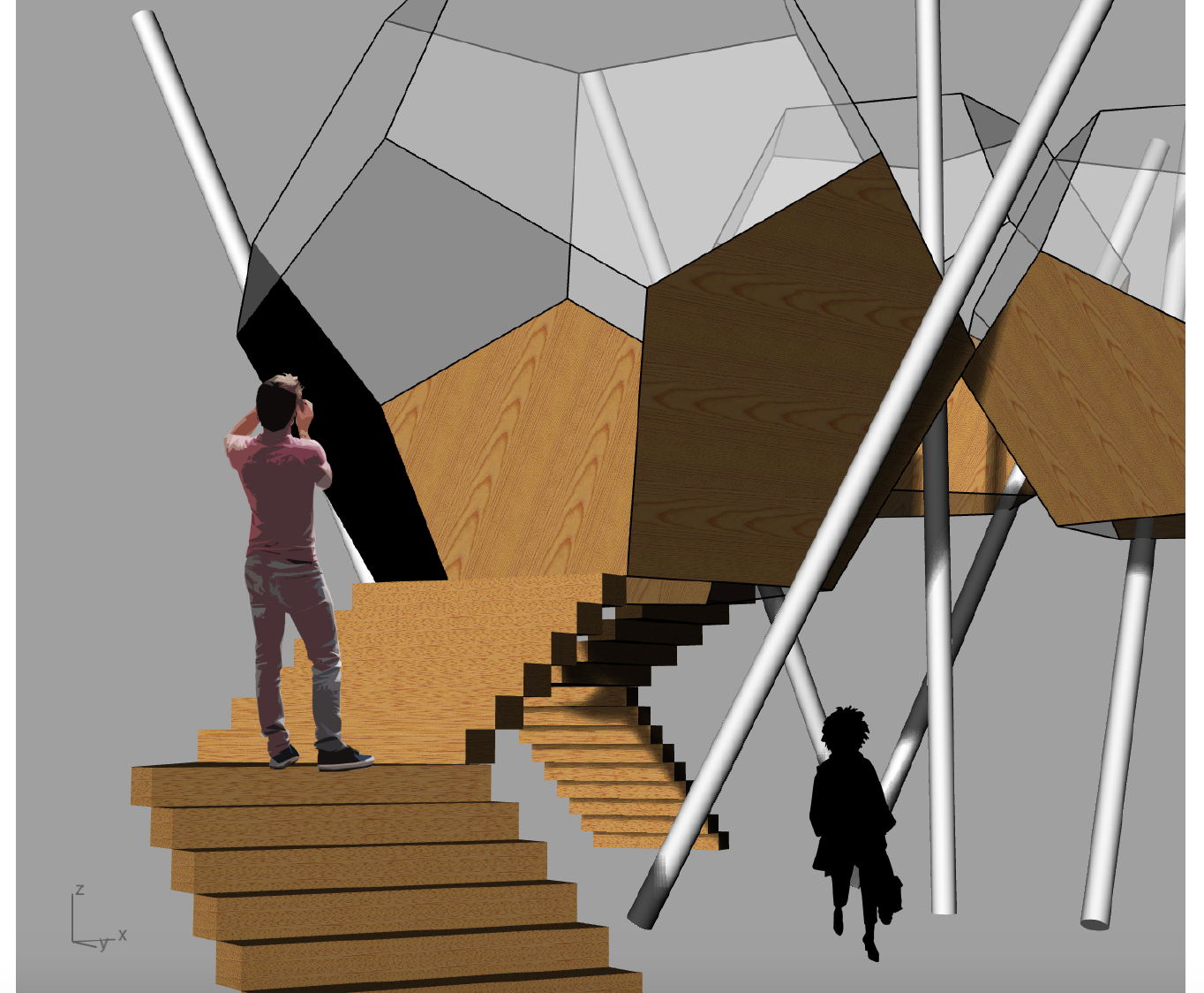
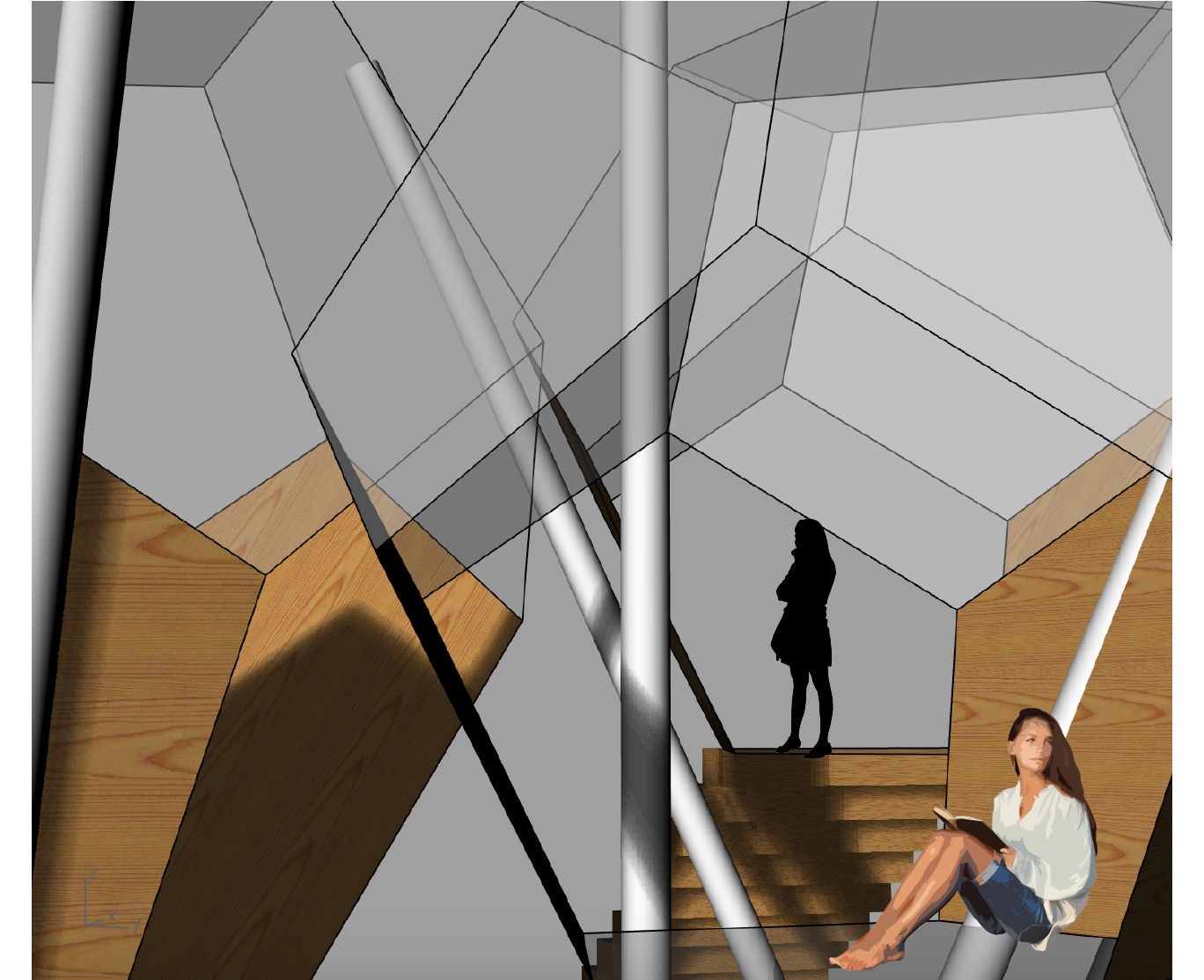
RENDERS