Color Theory: Tone Scale

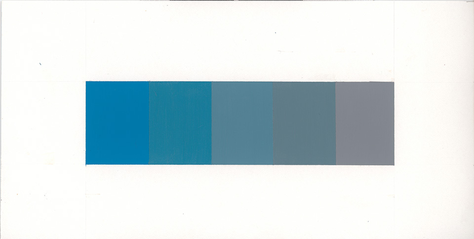
The trickiest part of the tone scale was creating a color (gray) without saturation, with the equivalent tone of a color with  saturation. Creating the gray with paints was also a learning experience because I was surprised by how much black paint was required. Finding the medium between “too light” and “too dark” required over 8 mixing attempts. I wonder what the process would’ve been like if I started with the black paint first and then added white paint.

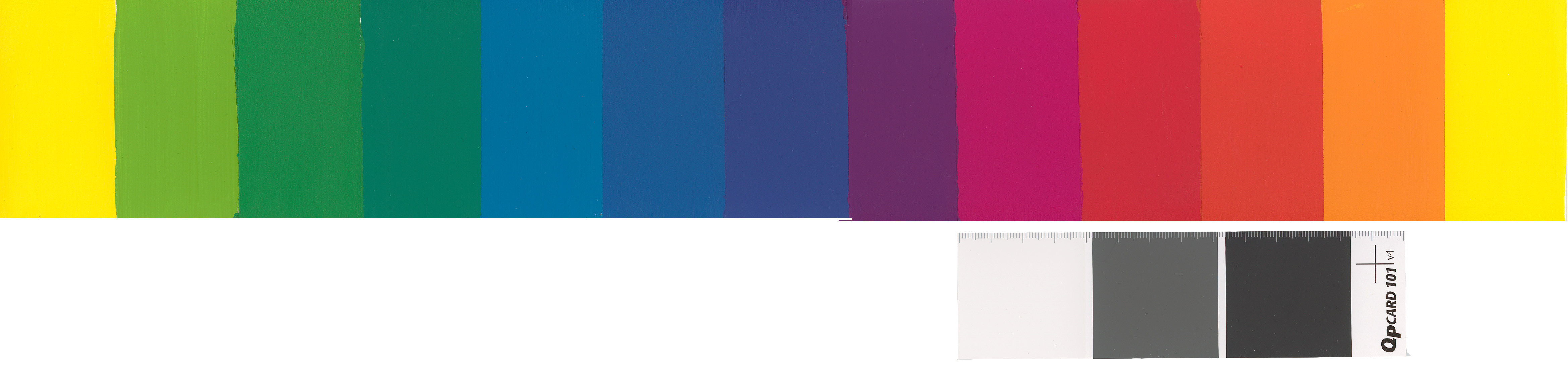
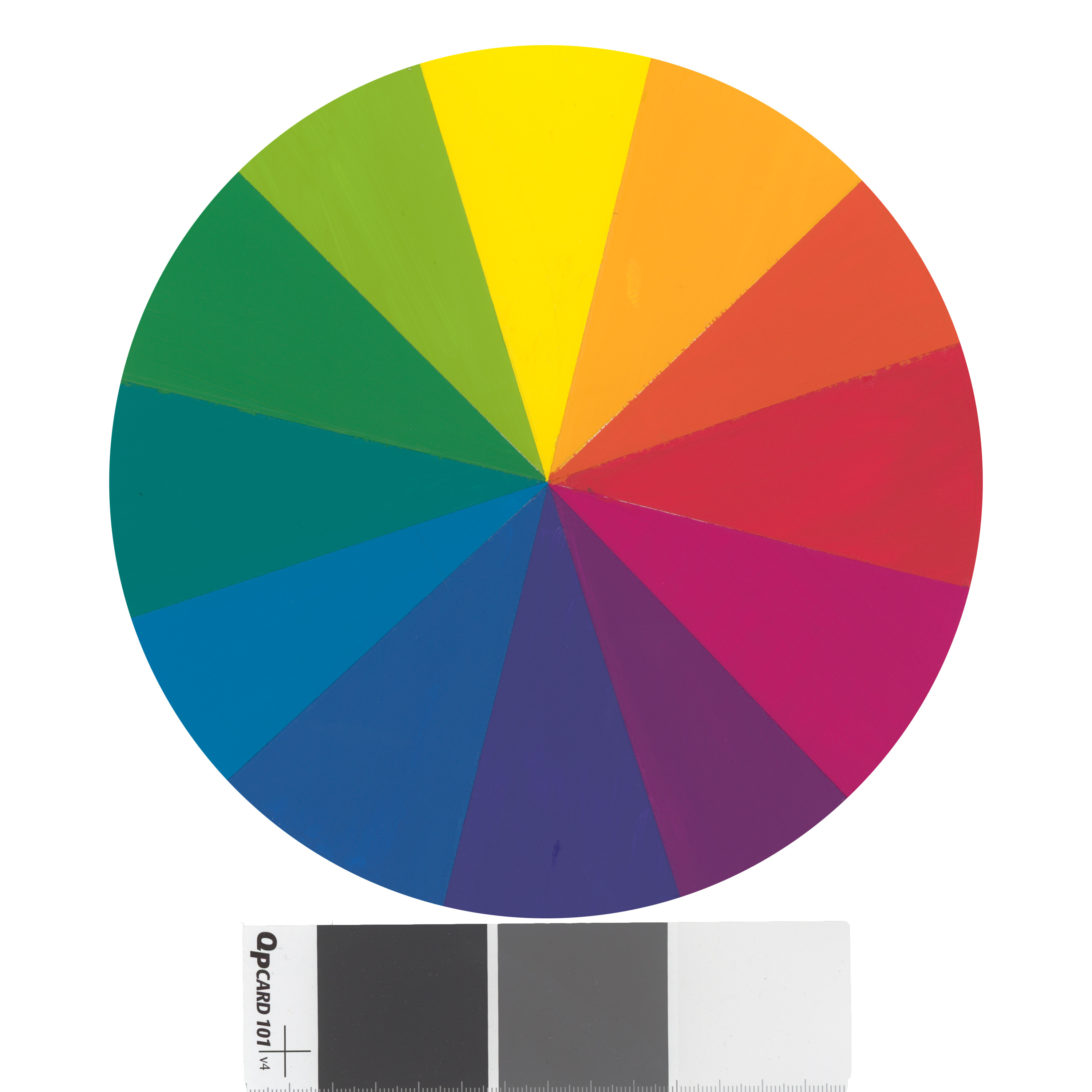
Creating the paints for the tone scale was interesting because as I was mixing them, the colors with more saturation at first glance seemed “brighter” and therefore, looked to have more value, but once I completed the scale, I can see that the values are the same.  Each color required the same number of layers of paint to look fully coated.


Color Theory: Hue Circle Project

This semester was my first time working with both paints and photoshop. The first assumption one would have about painting a color strip is that it would be very easy, but it was the opposite. Not only did it take several attempts at mixing colors to create one secondary or intermediate hue, but working with the paints and color balancing required its own learning curve. One thing I found interesting was how many shades of paint was required to saturate color onto the illustration board, such as yellow and magenta. But the blue violet or yellow-green required less strokes of paint. Overall I found that the project really tested my patience and helped me realize the importance of taking my time and really paying attention to detail.  I also have a new appreciation for how color is created physically and digitally and how difficult it can be to communicate the exact color the creator has in mind.