Final Posters

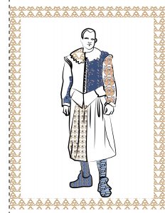
Originally cosmetics and permanent make up was my original idea and final project work, but I changed it because of several reasons do to me not being too comfortable working with people’s faces and because of complications in learning technique. My final project is about a poster series dealing with personal emotional problems and ticks. I got the inspiration for this project after my anxiety, which consisted of crying and nervous breakdowns evolved into more physical problems, like stuttering, hyperventilating, and a nervous tremor. My hand began to shake whenever I got nervous, and it would get me even more anxious because I would get even more scared about not being able to draw because of how terribly my hand would be shaking. My fear would fuel my shakes and the more I would shake, the more scared I would get. My focus in this series was refined into two posters, “Nail Biter” and “Scared”.

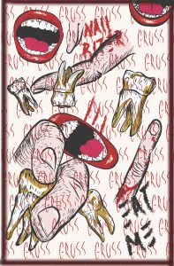
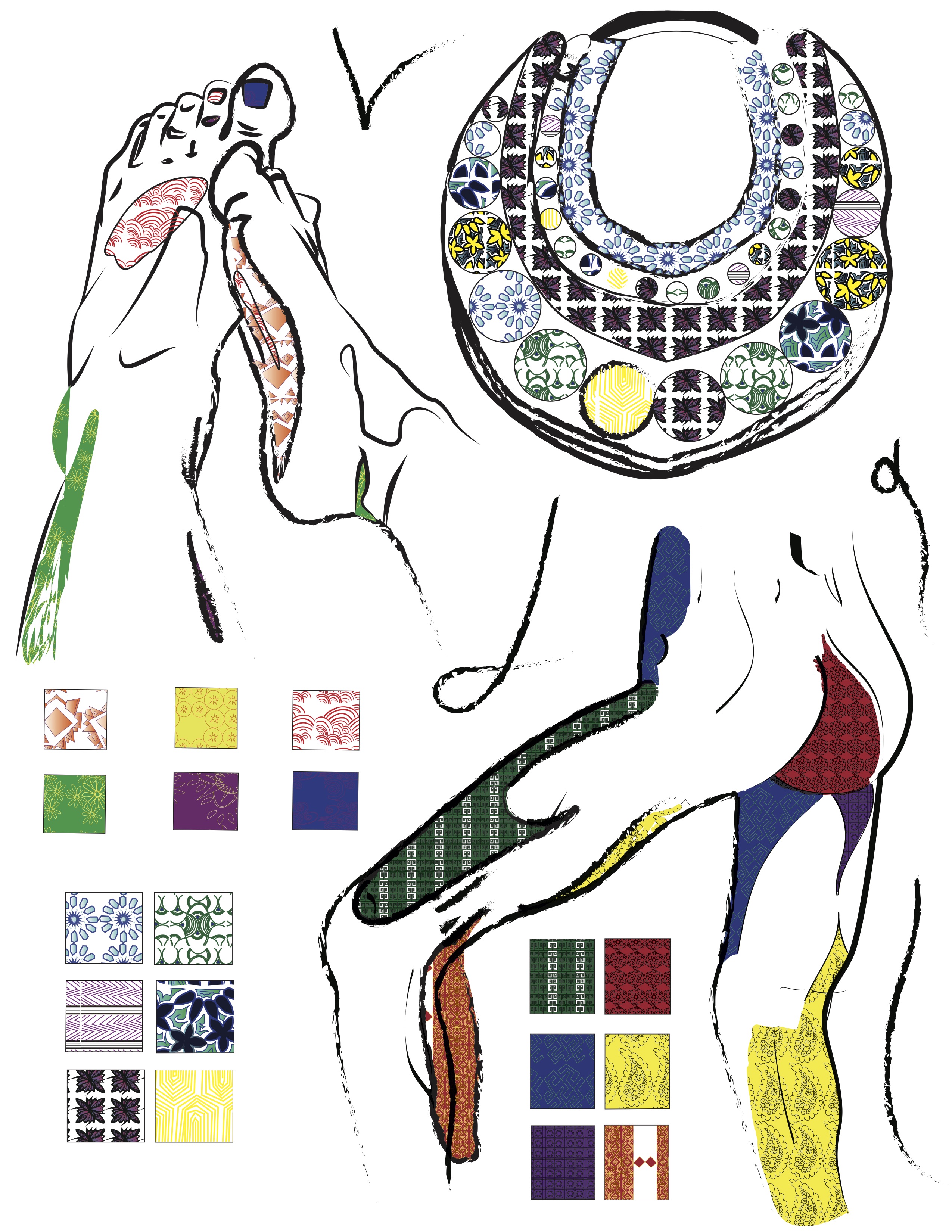
My first poster, “Nail Biter” focuses on my habit of nail biting, and connects to both of my parents. My mom is related to the poster because of the irony of her owning nail salons where she’s able to apply beautiful acrylic nails, yet my nails look bitten down significantly. My father is related to the poster due to the hyperdontia that I received from him genetically. When I was younger, I had six extra teeth that needed to be removed, so the imagery of teeth is a very profound one to me. To accomplish this poster, I had taken photos of my fingers and used a layer mask in Photoshop to make them into png files which I put into Illustrator and traced over with the pencil tool. I found images of teeth and a mouth online, which I distorted slightly and added to a layer which I traced over in Illustrator. I created the background by making a pattern with the word “GROSS” which I wrote using the brush tool in Illustrator. After tracing the lines, I added colors and highlights to the images and brought the poster into Photoshop to edit in order to suit printing. I used curves and hue/saturation in order to achieve a color which would be desirable printed.

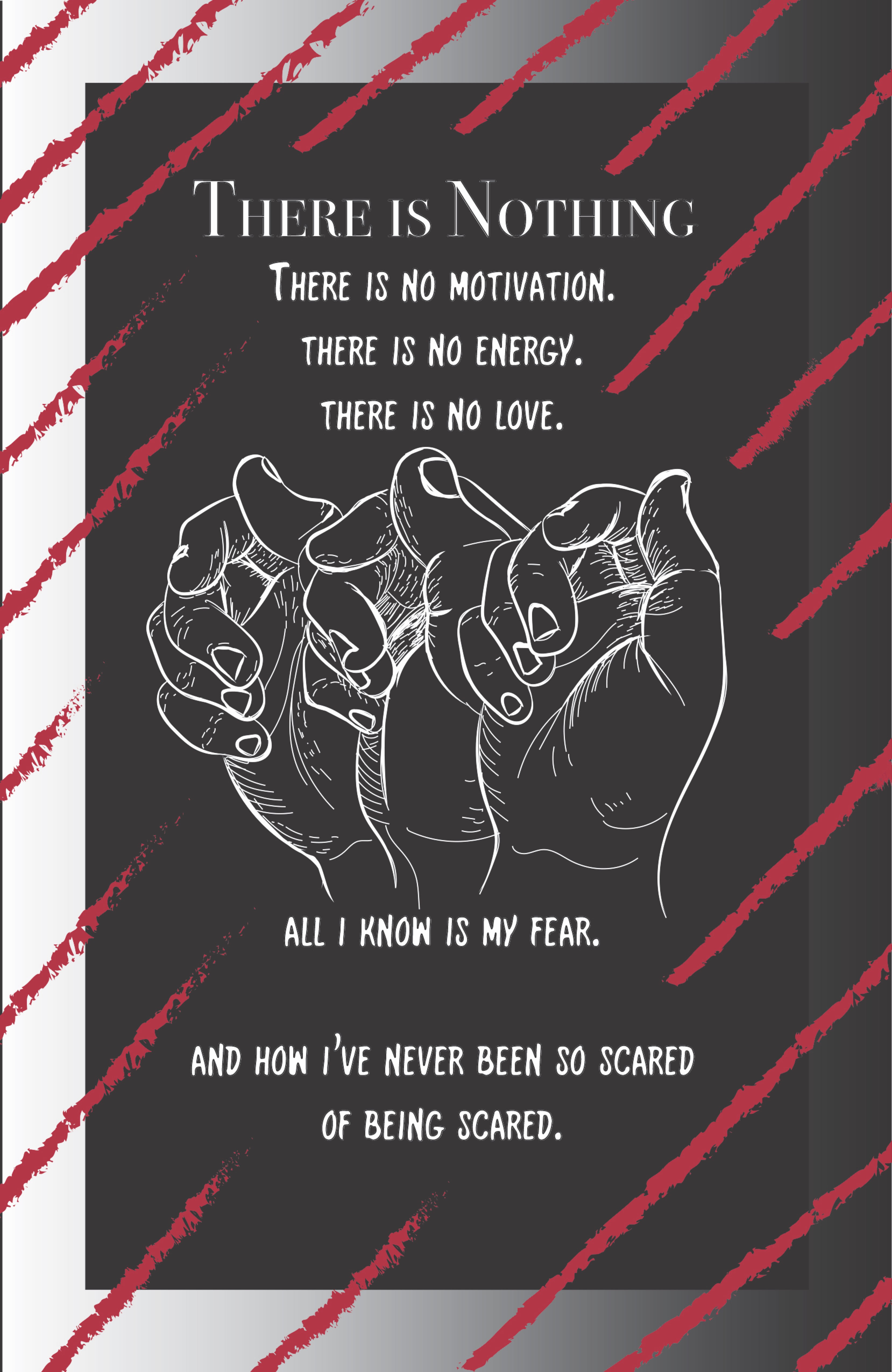
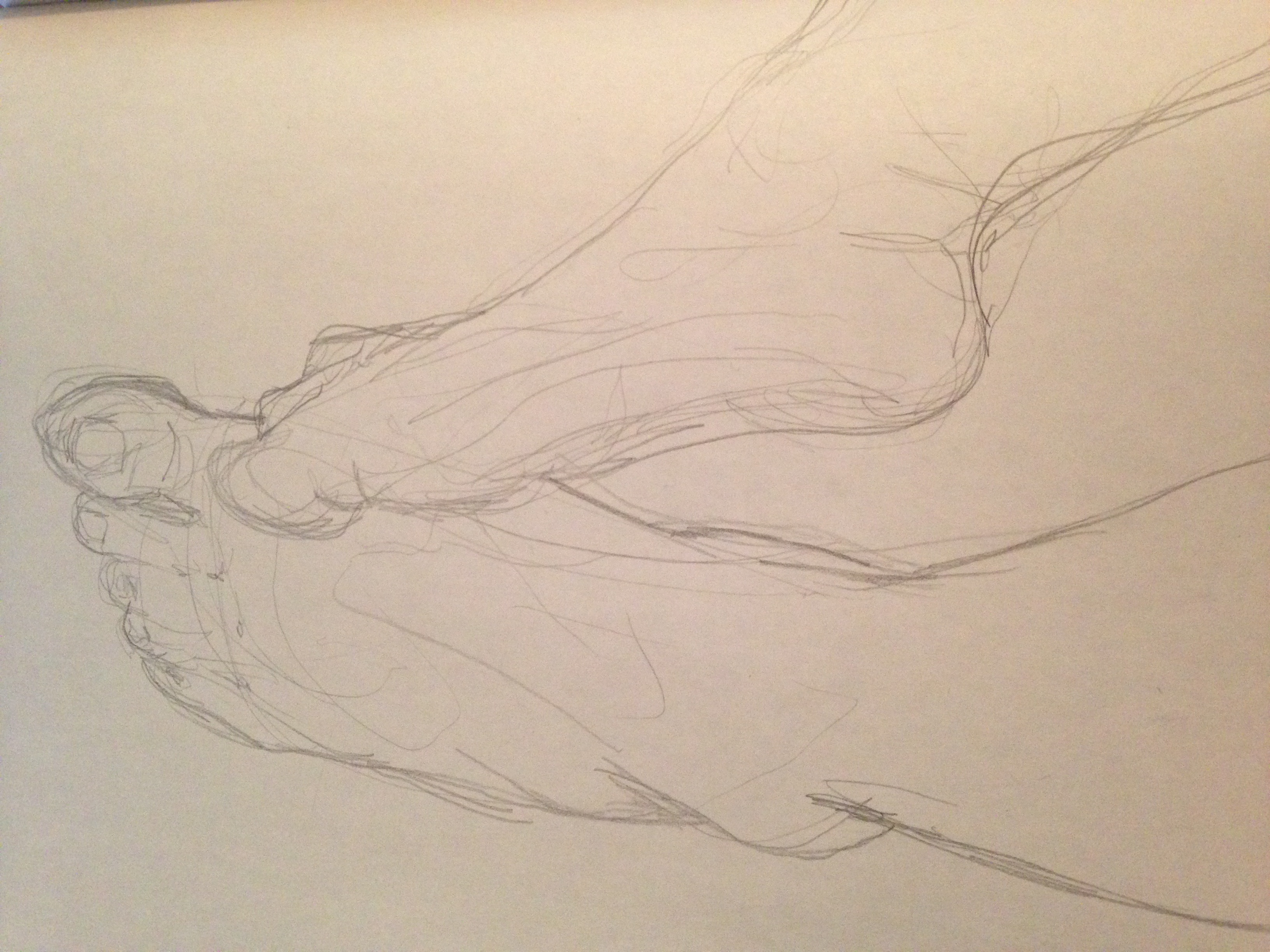
For my second poster, “Scared”, I focused specifically on the new experience of having nervous tremors. Due to the busyness of the “Nail Biter” poster, I chose to go with a simpler design that would be more refined and focused on text and meaning. The focus of the poster is specifically how my worries about my nervous tremors affecting my drawing abilities would create more fear and more shaking, creating a cycle of being scared. I chose to use a darker background with white linework that I made similar to my “Nail Biter” poster in order to make them more cohesive, along with the use of a border and the same red used in the first poster. I achieved this poster by photographing my hand and editing the photos into png files and bringing them into Illustrator and tracing them in white. I added the text and the brushstrokes and brought the poster into Photoshop in order to edit the colors into a similar effect as the “Nail Biter” poster.

In this final project, I was able to work mainly digitally, but I was more comfortable working digitally on this project than any other due to being able to use the Cintiqs in the Graphics Lab that allowed me to trace the lines of the png files in a way that reminded me more of analog drawing and allowed me to be more comfortable working on the project. Compared to the coloring book project, which was done using the trackpad, I was able to add more stylistic lines to my drawings that would’ve been more difficult to achieve on a trackpad. I found the posters meaningful and intimate to me and I was able to utilize skills in the class in order to execute them, such as using a layer mask on Photoshop, creating a pattern, creating a contact sheet for reference photos, and using layers to create different background effects.

Coloring Book Project

Pattern Swatches

I chose to base my pattern swatches off of a Japanese wave pattern, Maori tattoo patterns, a Korean floral pattern, Japanese tebori tattoos, the Celtic knot, African indigenous art, and Greek mosaic pattern. First, I chose to make thumbnail drawings of the swatches, but chose to make them simpler so they would be easier to do digitally. For the patterns, I typically repeated portions of the swatches so that they would be equal to each other and I also used the reflect tool on the swatch of the Greek mosaic pattern. I chose to depict the Japanese wave tattoos with a gradient because I thought that it had resembled the shading technique used in the tattooing.

In order to color the patterns, I edited the color of the swatch images directly and chose to make a new pattern out of them. This resulted in the positions of the image in the patterns being slightly different from their black and white counterparts, but I used this to show the color more clearly. I chose the colors for my patterns by picking a blue and using the color guide in Illustrator.

Pattern Dude

For the first part of this project, which included a figure drawing session, I was unable to come to class because I was feeling unwell. Due to this inconvenience, I chose to draw a figure in a baroque costume from a reference photo which I had found online. I drew from this figure in ink, only choosing to suggest lines instead of making a detailed analog drawing because I wanted more of my focus to be in the digital drawing over it.

In order to make the digital version, I chose to scan the image and made an original and a linework layer. For the linework layer, I did most of my work in pen tool, which I had gotten more creative with due to the previous project. After finishing the initial line work of the figure, I chose to give the strokes more weight by selecting the entire figure and making the stroke weight 2p and selecting the option for varying strokes. Afterwards, I selected individual strokes to either make heavier or lighter according to the image. I then used both the paintbrush and direct selection tool to fill certain areas of my figure with black and white pattern, at some points using the multiply option to show the linework details through the patterns. I wanted to leave some empty spaces for coloring of the figure because it was going into a coloring book. Afterwards, I centered the image and created a 40p stroke rectangle to border the page on a layer underneath the layer with the linework. Finally, I made the rectangle no fill with a patterned stroke.

In order to color the figure, I began by making the colored pattern swatches and opening them on the document from the user defined files. Because I had areas with pattern selected with the black and white patterns, I was able to simply select and replace the pattern with a colored pattern.

Images

Our group chose to use the theme of “The Body and it’s Accessories”, so I chose to draw images of my legs and feet to draw in Illustrator. I chose to make very loose and light drawings in pencil, which I would trace in Illustrator on a separate layer. I chose to make these line drawings very loose and expressive so it would be easier to add pattern to these images. I chose to also keep some closed shapes in the drawing so I would be able to fit them with pattern.

When working further with the images, I chose to use varying line weights as I did in my Pattern Dude portion. I also chose to add certain charcoal strokes in order to create some variety. In order to create cohesion throughout the book, I chose to use the patterns made by those in my group. By sharing files on the Google Drive, we were able to download each other’s pattern swatch documents and use each other’s patterns. I was able to have some fun with the loose nature of the patterns and the freedom of the paintbrush tool. I found that I was able to create an interesting layering effect by using different patterns on top of each other with the paintbrush tool and and even create some darkness in the images this way in order to create a pattern around the image and emphasize it.

Cover/Back

When creating the cover, I decided to utilize different images and swatches from within my group in order to show various work. However, upon meeting up, we were able to finalize some design decisions, which included making my original front cover a back cover instead. I had gotten rid of the original text box, added more artwork, and created new colored pattern swatches. I used this experience to become more comfortable with making color patterns because at this time of the project, we had not completed our individual color swatches yet so I had taken the time to create them before adding them into the cover. I also added some loose charcoal strokes to mimic the look of the front cover.

Reflection

Through this project, I found that I was more comfortable working in a group because we were working with something which I was not used to, which was Illustrator. While I knew the basics of Illustrator, I found myself struggling a bit more with patternmaking and color rather than the brush or pen tool. I found that it was a good choice to be organized early on by creating a group chat and by creating a shared Google Drive folder where we were able to share all of our work with each other. This way, we could message each other when we were confused and were able to keep working with each other’s pattern swatches and images without having to organize meeting up. I found that our project was strong because we were able to utilize a unifying effect with our patterns being used throughout the book in each other’s pages. After seeing the finished product, I was able to feel much better about the way our project looked once it was completely put together.

Museum Sculpture Reference Post

I chose the rafter finial in the shape of a dragon’s head from the Korean art section of the museum because I haven’t been exposed to a lot of Korean art both due to the assimilation to American culture in my family and the lack of art history that I had been previously exposed to in my education. I liked this sculpture because it was a dragon, which was a symbol for strength, and also because it was the purpose of holding the wind chime of a building, which meant it had a significant purpose in the architecture of the building.

Working Title/Artist: Rafter Finial in the Shape of a Dragon Head and Wind Chime
Department: Asian Art
Culture/Period/Location: Silla
HB/TOA Date Code: 06
Working Date: 10th century