Pèrere Lachaise – pt. 1

We decided to create a mocumentary on Pere Lachaise. In a nutshell, the drama that occurs between imaginary dead people in Pere Lachaise. We call it The Cemetery.


We were at first inspired by Barbie and wanted to create Barbie goes to Pere Lacahaise, a satire and overly dramatic show. That led us to be inspired by Keeping Up with the Kardashians. to create a reality TV shows on celebrities buried in Pere Lachaise. We were struggling to find something that wasn’t disrespectful. Finally that led us to be inspired by The Office, a comedy TV show about the everyday life in an office filmed on a low budget.


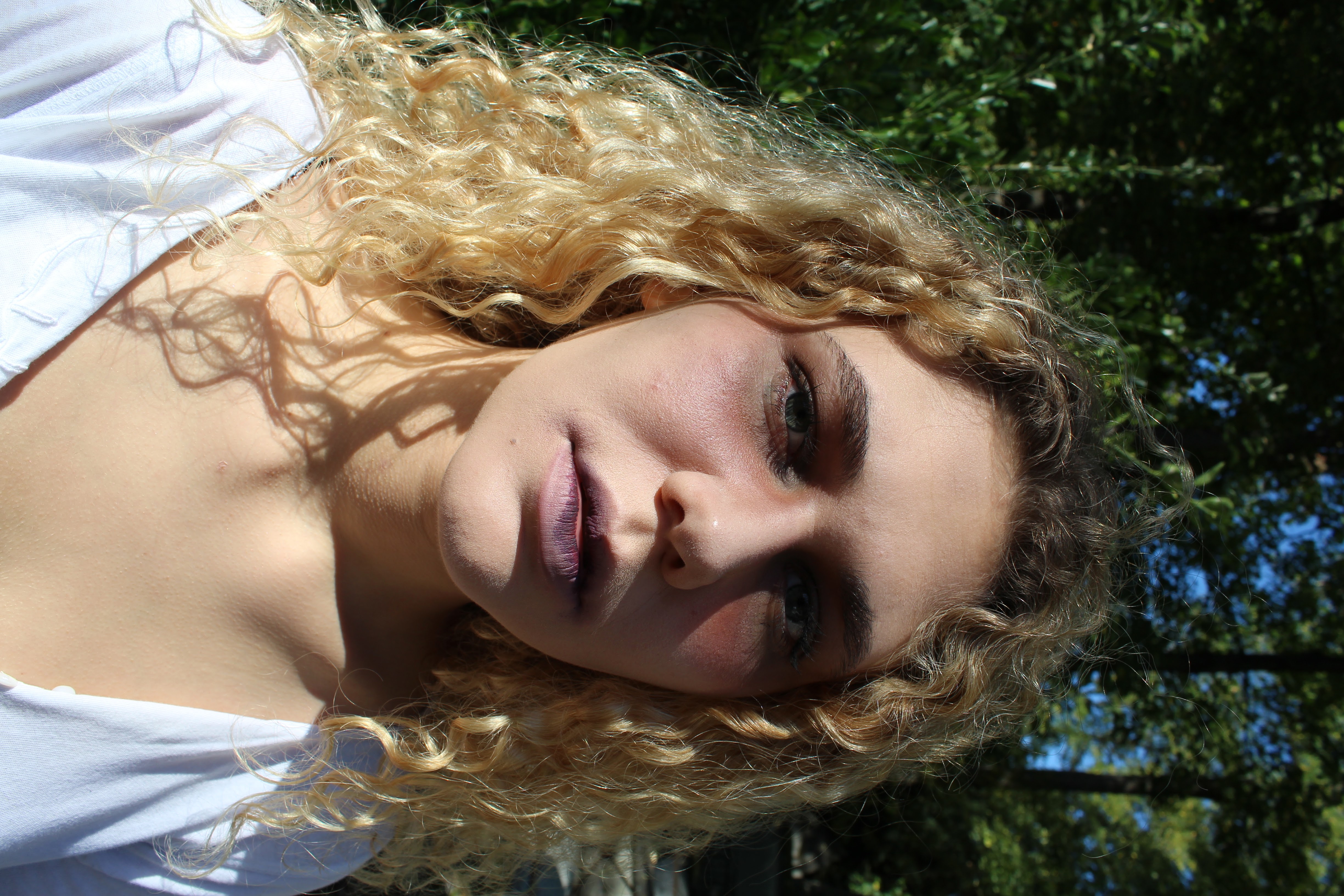
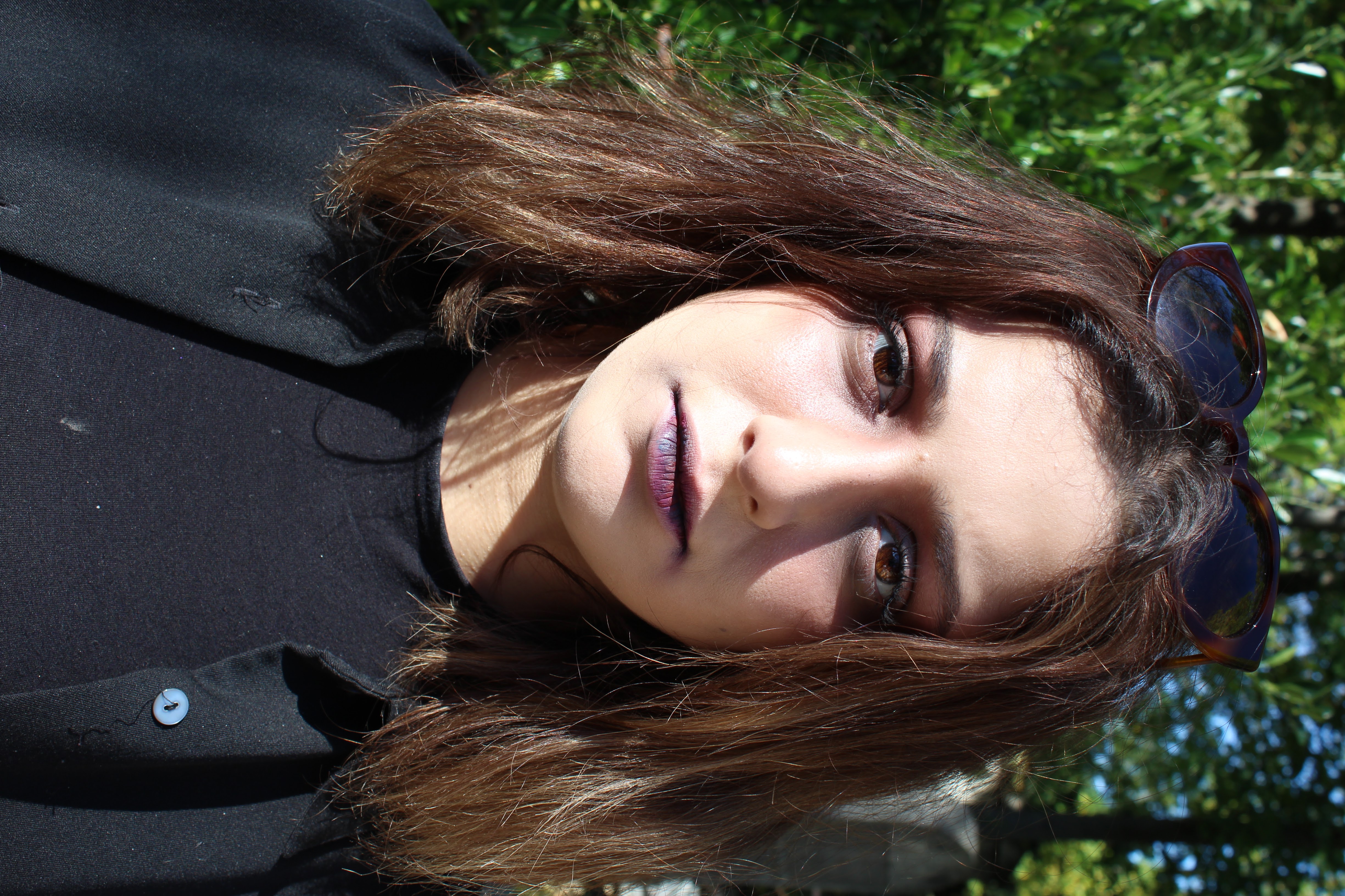
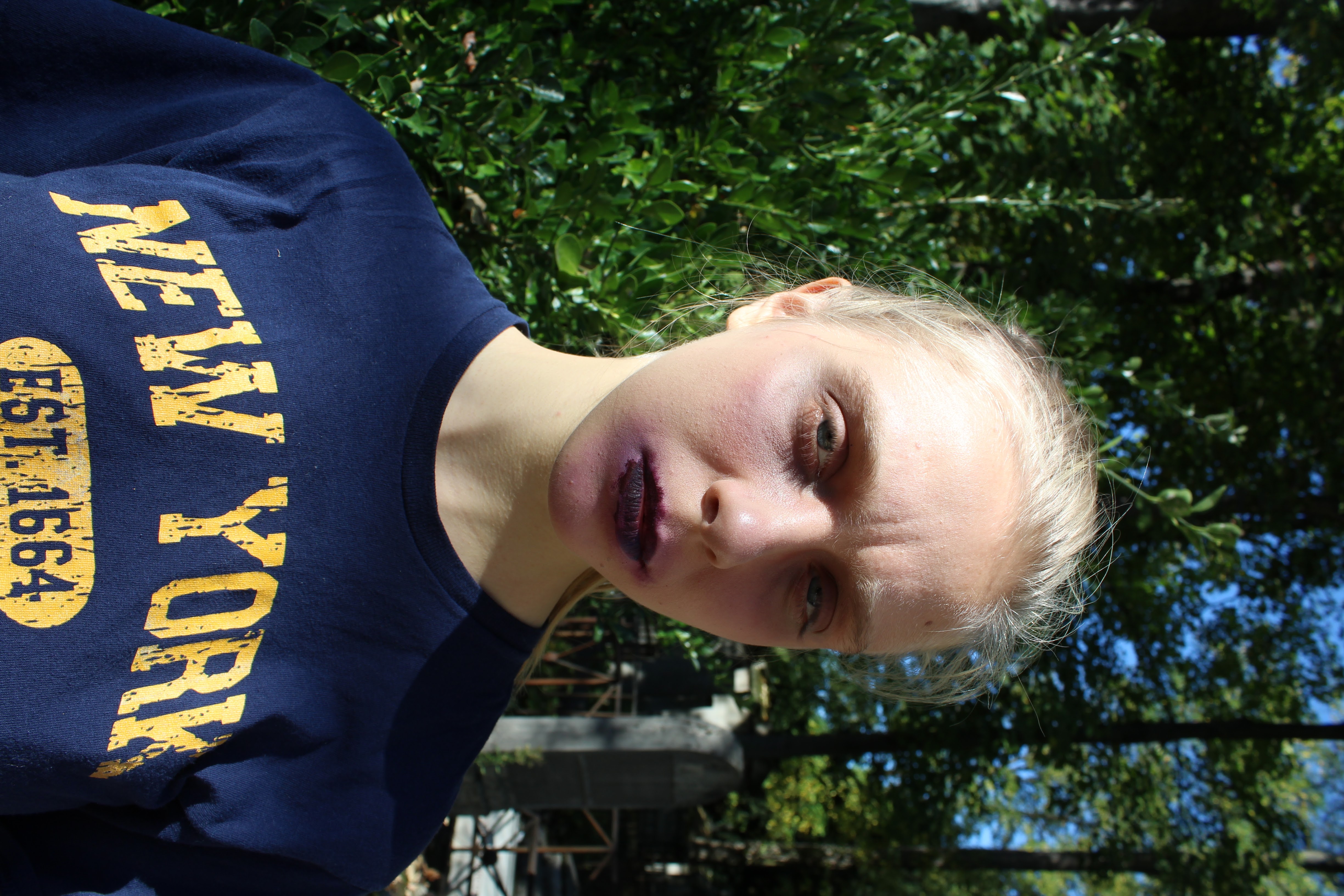
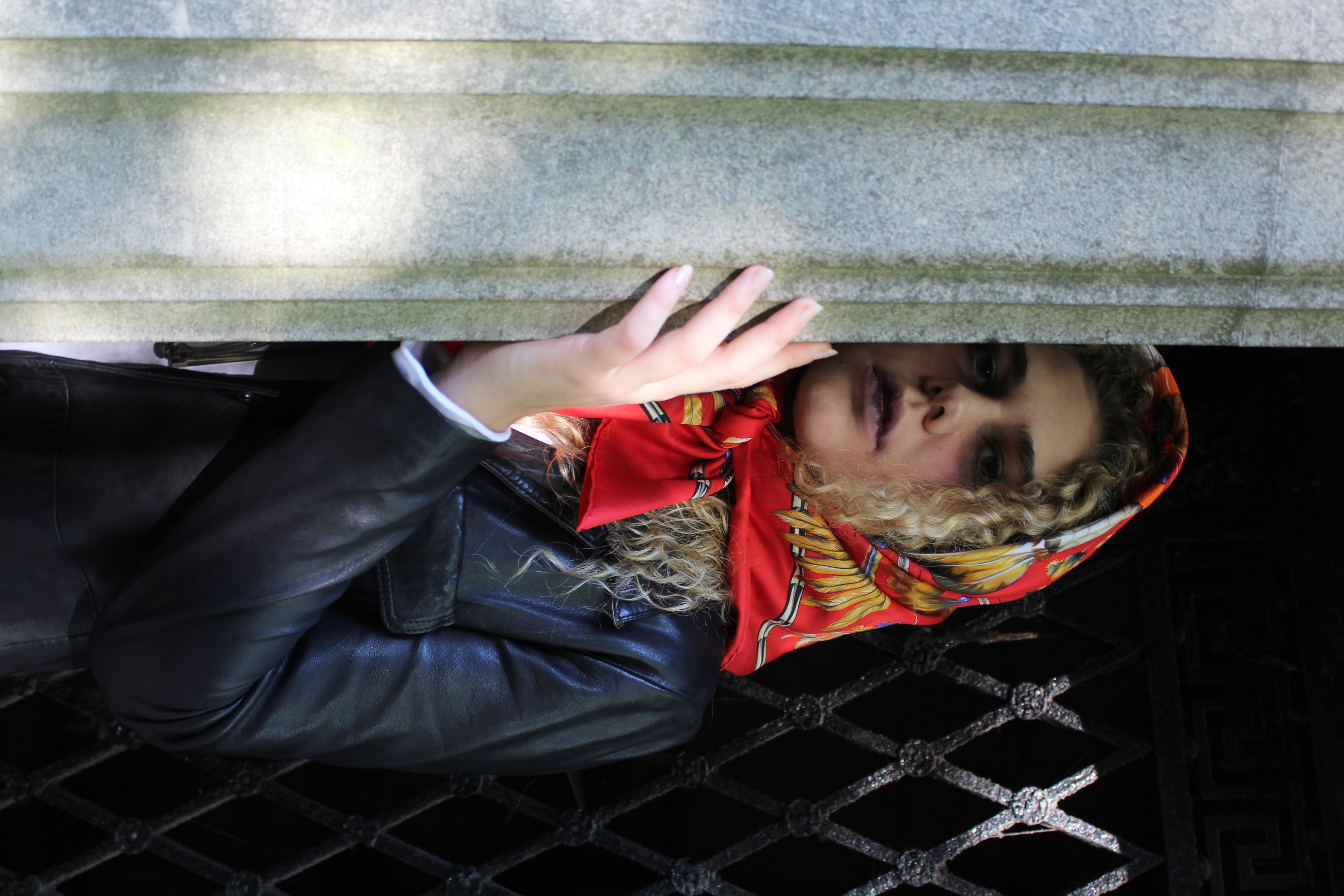
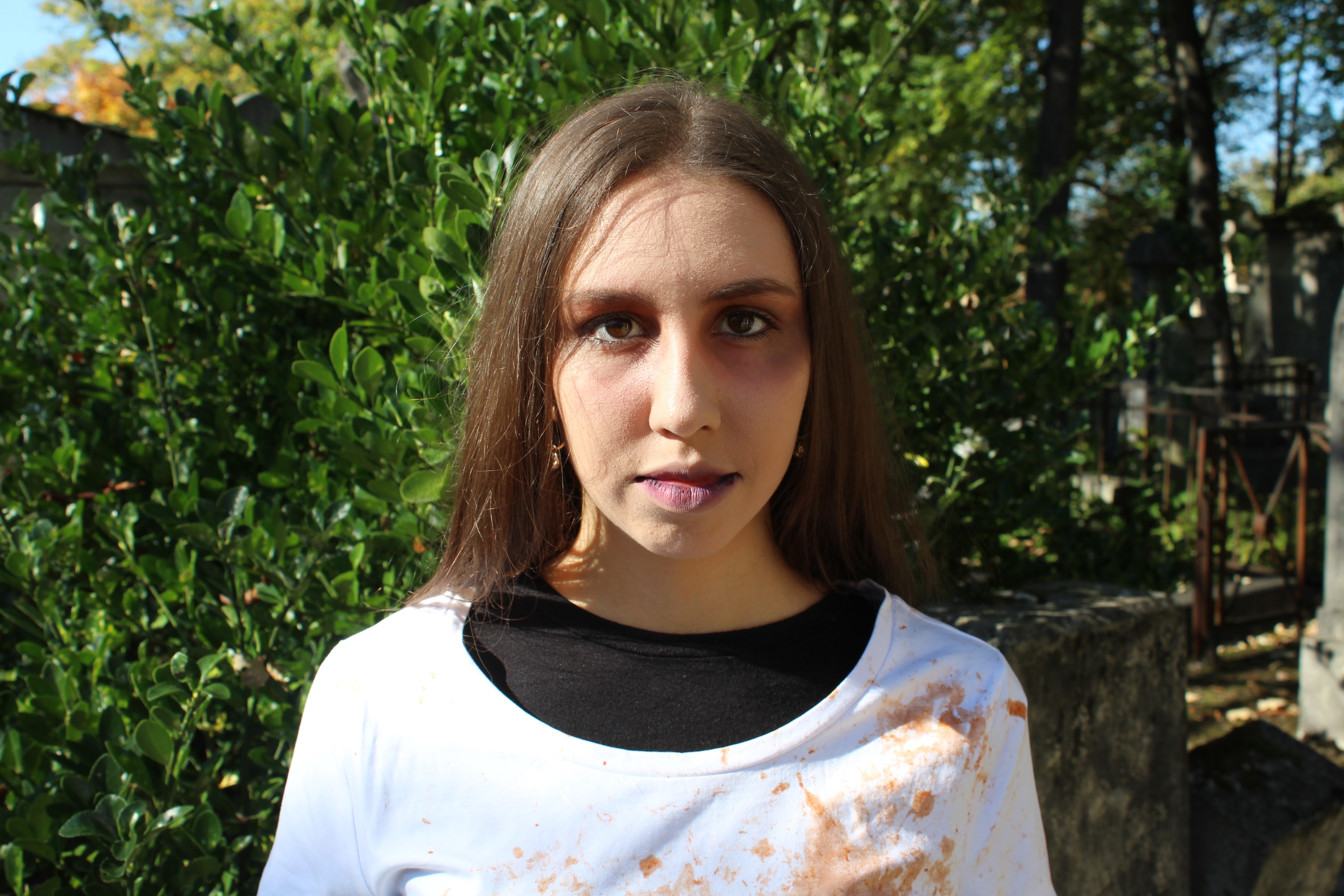
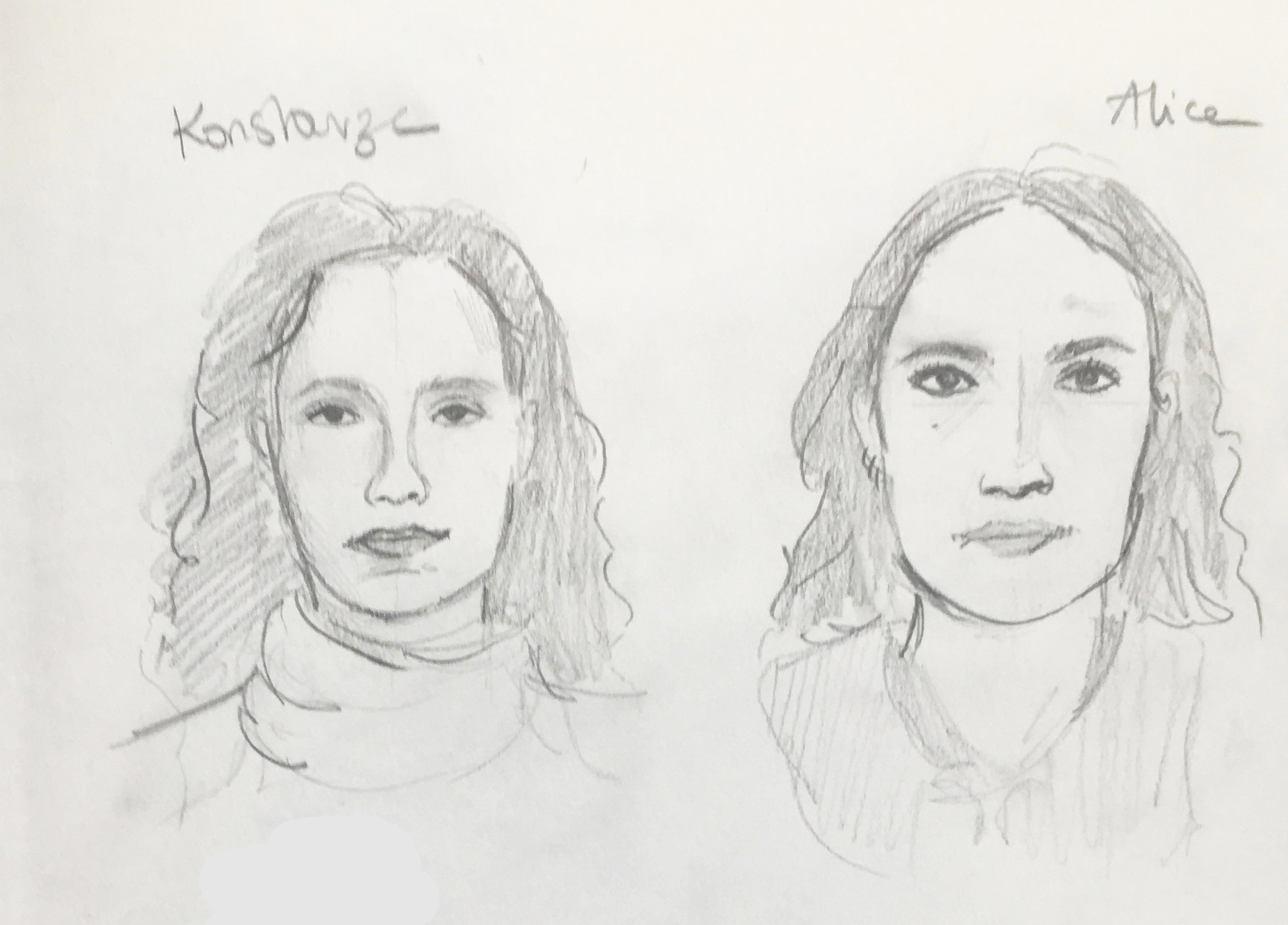
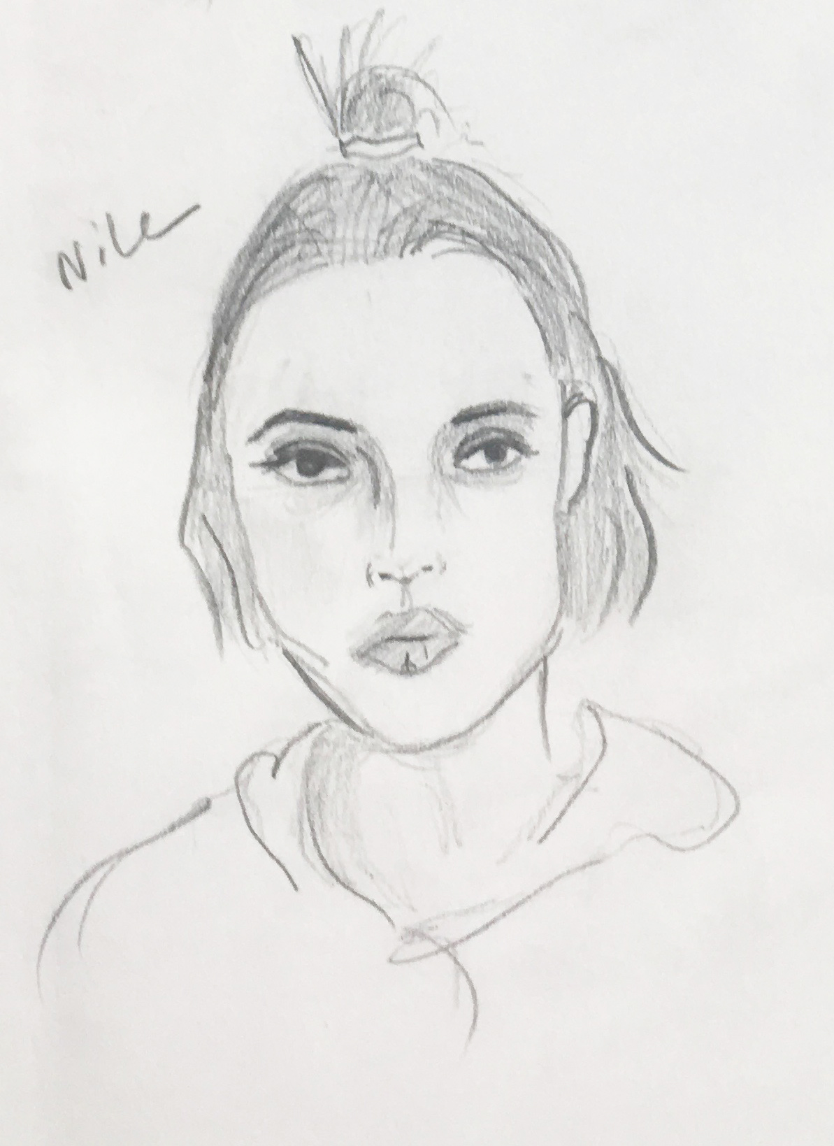
The characters are ridiculous, and some are very unlikely to be in Pere Lachaise which adds to the joke, and makes it more acceptable to do this project. Our characters are a russian scientist, Sacha, who died in Chernoble, Nicole: a French Nurse that died in the first world war one, Wes: a surfer from California who died in south of France and somehow ended up in Pere Lachaise, Godfroy: the oldest guy in the group, from the middle ages, he always forgets he is in the 20th century, and finally Amy the new girl who doesnt know how she died (this is the mistery of the show, she was actually murdered) and whom we are giving a tour of the cemetery.


Politically incorrect and sensitive in topic, the series explores an afterlife spent inside the establishment of a cemetery.

We focus on the aspect of Pere Lacahaise on being a celebrity cemetery. It is a satire and an exaggerated awkward comedy. It is a play on how it is a tourist location but also a practicing place of mourning and remembrance. 


We also got kicked out of the cemetery 🙂


Project 2 – Representing a Childhood Space – Material


I decided to represent my room back in Beirut. Since I was 3 years old, I lived in the same house. We never moved, it was always the same walls. The furniture of my room and even the house changed throughout the years, but the walls stayed the same, that’s why I decided to just represent the structure of my room.

We never moved, it was always the same walls. The furniture of my room and even the house changed throughout the years, but the walls stayed the same, that’s why I decided to just represent the structure of my room.

At some point in time, my mom decided to add a desk and closets in my room, the desk and the closets were wood, and for a long time, my room smelled like freshly carved and burned wood. Surprisingly my maquette smells exactly like that since I used the laser-cutter to cut the different pieces of the maquette.


I even decided not to paint the maquette because even the color of my walls changed throughout the years.


The format of the maquette also is like an homage to my mother, who studied interior architecture and thought me how to draw a map of my room at a very young age and taught me to be very meticulous to size and perspective.

Eyes Without a Face – pt. 2

Pauostyk gėles


The box of flowers is scented with Marc Jacobs Daisy Eau so Fresh.


This box is filled with paper flowers in a cardboard box. The flowers are white, yellow and pink. On the box, there is the address of Parsons Paris, and also written is “No return address” and the word “Fragile” scratched off.

At first, the plan was to do a drapery of paper flowers going from all white to color, but then was inspired by Felix Gonzales Torres, and decided to take the pile of flowers and thought it would be more interesting that way.

I wanted to show the aspect of Vaiva in which she left everything back in Lithuania to come here. She came with very few items. Her perfume is kind of her identity so the flowers are the same as you see on the perfume bottle. It is a surprise to come and smell paper flowers and find a scent.

The flowers are supposed to be fragile, but the word “Fragile” is scratched off the show that Vaiva may seem fragile but is tougher then she looks.

“No return address” is to show that she left everything to come here and put everything on the line to come to Paris.

The flowers are majority white because Vaiva is very private. The colored flowers represent the few things we know about her. Those are also spilled as if they were the ones on the top and are “unpacked”, as she is still unpacking her life here in Paris.


Project 2- Representing a Space – Digital

This is a representation of my current home here in Paris. I live with two other girls in this small apartment. It really represents us as a group of students going to Parsons Paris.

In contrast with my material representation of a space (which is my room back home in Beirut), this is my new environment in which I live in.

I am an only child, and before coming here, I’m used to being alone in the house. Now Living with 2 other people, the apartment is constantly crowded.

I want to represent this space on how it is lived in. I did not clean the apartment or rearrange anything because I wanted to keep it true.  I wanted to show the life in the apartment. The shots are from my perspective when I enter the house and what I focus on the most.


https://www.youtube.com/watch?v=Upa_Gms78-4

Eyes without a face – Pt 1

My portrait of Vaiva is a paper fortune teller.

The initial idea for the portrait of Vaiva is an installation. It is going to be Vaiva’s bag filled with small notes of her answers deducted from the interview. But after the interview at Vaiva, I went on to find another project that reflects her. I ended up with a paper fortune teller.


Vaiva is very unpredictable, complex and random, just like this child’s game. The paper fortune teller’s colors are inspired by Vaiva’s perfume, that marked me the most during the interview since it fits her so well.


I went on using photoshop, to create the pattern of the fortune teller, and printed it out. I later on, asked Vaiva to write down adjectives that contradict themselves, but that describee Vaiva since she is so complex.


Prototype:


I went on using photoshop, to create the pattern of the fortune teller, and printed it out. I later on, asked Vaiva to write down adjectives that contradict themselves, but that describee Vaiva since she is so complex. The colors on the fortune teller are inspired by her perfume that she wears.


Since Vaiva is still trying to figure out who she is, the aspect of the fortune teller fits well, as if she is still rolling the dice to figure out her identity. the unpredictability also works well with Vaiva’s character.


On the fortune teller, you can find under each fold two contradictory adjectives or nouns in Vaiva’s handwriting.


I found a hard time describing Vaiva, both for the studio and seminar project. She is very complex and contradictory in a way and wanted to show that through my projects.


I was disappointed that my idea was not very well interpreted by the class. I would have added a sent the fortune teller with Vaiva’s perfume that basically inspired the color scheme. I would probably develop this project more with an instruction manuel.