Drawing/Imaging: Appropriation

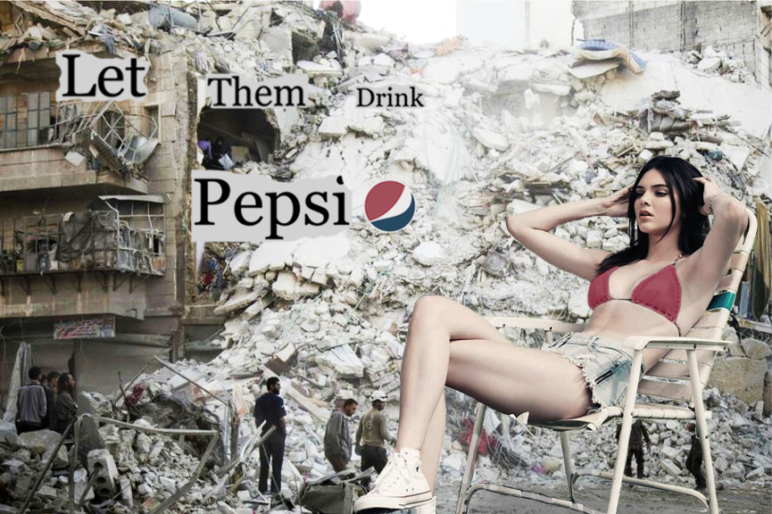
For my Photoshop appropriation assignment, I decided to juxtapose an image of Kendall Jenner with a photo of wreckage from the Syrian War.

This is an example of artistic appropriation, as I took these images from other sources, but it also references a much more negative sense of the word: cultural appropriation. Kendall Jenner is notorious for exploiting other cultures with less socio-economic power than her, and offending groups of people through both personal fashion and professional ad campaigns. Recently she starred in a Pepsi commercial that kind of fetishized protest culture, stereotyped race, and made light of the Black Lives Matter movement, police brutality, and other minority rights. It ended with her handing a can of Pepsi to a police officer, and the conflict subsiding because of ‘the magic of Pepsi’ or whatever.

If Pepsi hadn’t faced so much backlash for this commercial, what would they have done next to try to appeal to a politically active target audience? Hence, my grim and disturbingly absurd juxtaposition.

I drew these images from news articles, so I decided to take the NY Times font and collage a sentence that could work either as a news headline or an ad slogan for Pepsi. The words reference Marie Antoinette’s famous quote, “Qu’ils mangent de la brioche”, which essentially means “Let them eat cake”. Antoinette, like most of the French royalty and nobility at the time, was famous for her frivolousness, lavish spendings, and ignorance about the poverty and atrocities going on outside of her bubble. I aimed to compare her to Kendall Jenner and generally critique celebrity culture and unethical advertising in the media.

I used juxtaposition, layering, fragmenting, and decontextualization for this assignment.

The original sources I used are attached below:

https://okmagazine.com/photos/kendall-jenner-kylie-jenner-pac-sun-summer-2015-collection-photos-flaunt-figures/


Drawing/Imaging: Homework 12

I’m interested in the juxtaposition of the ‘natural’ and the ‘manmade’—IE, nature and city. That’s why I chose The High Line, because it allows you to glimpse at a vast expanse of city, and the next second, to focus in on the intricate texture of a leaf. I’m also drawn to the old train tracks that the plants have kind of taken over. All together, this place reminds me that nature can take over humanity, and vice versa, in the vast scope of time. It tells an interesting story.

I want my project to explore themes of nature vs. city, living vs. dead, past vs. present, and big vs. small. I want it to show an interesting perspective and evoke a nostalgia about a story unknown to the viewer. My color palette will be lilac, olive-y green, orange-y/brown, almost black. I’m interested in showing the texture of plants up close juxtaposed with the cityscape.


Drawing/Imaging: Project 2

Part 1:

Part 1 is a realistic self portrait drawn in the mirror. I drew it while I was extremely allergic and sleep deprived, which you can see in both my expression and the way I drew myself. I don’t think this looks like me; in fact, I had a difficult time capturing my likeness. I don’t find it difficult to draw other people realistically, but when it comes to myself, I have a lot of trouble. This portrait does not capture my overall personality by any means. It is a snapshot of a moment in time, a moment as a tired, sick, anxious college student. Drawing myself was a good exercise, because it’s not something I feel confident in, and I plan on practicing this more.


Part 2:

Part 2, the photoshop collage, is the part I am most proud of. I had such a difficult time producing it, yet it is the best quality image in my opinion. After struggling and struggling to figure out how to use Photoshop, I found out that my Adobe programs were improperly installed. I went to IT and they reinstalled them, but when I opened my computer later that day to work on the project, I found that the programs were still not working. I went back to IT another day only to find out that the hours on the website were incorrect and the entire building was closed. It was so frustrating, and I was running out of time. I ended up having to use the Photoshop on my roommates computer, because my computer lacked many of the tools I needed. I used the tools on my roommates computer that I needed and then sent it to my own computer to finish the rest with the tools my computer did offer. The entire process was extremely stressful and frustrating, but I am happy with the outcome.

For this project, I wanted to evoke the imagination and adventure I felt as a child, through a collage of places that I have lived or that had meaningful impacts on me. I chose to weave together minarets in Istanbul with a building in Senegal, and tie the whole thing up in a bouquet of flowers from Switzerland. The pink and purple hues are meant to enhance the dreamlike feeling, along with having the image in the middle the page as if it is floating in the sky.

Part 3:

In retrospect, I wish I drew part 3 with thin black pen rather than pencil. It would have come out more precise and the detail would not be lost in smudge marks. I chose to make it black and white to see how different the image looks with and without color, when compared to part 2. The colored one feels so much more alive and playful, where the black and white one feels more like a lost memory, or an old photo. If I had drawn part 3 in color and black pen it would look kind of like a children’s book, which I think I would prefer looking at.

Overall, I learned a lot about Photoshop, despite it causing an upsetting amount of wasted time with all of the technical problems I experienced. I think each project captures a different aspect of myself from a different time, and together they represent a larger part of me. However, I don’t think they capture me entirely. But can any self portrait really do that?

Studio: Interpretive Self Portrait

For my Interpretive Self Portrait, I went to The Met. A vibrant blue chalice in the Egyptian Wing captivated me instantly:

Artist unknown, this chalice was made from a material called faience, and fashioned into the shape of lotus flower. It was made during Dynasty XXII (ca. 945-924 B.C.).

I jotted down notes about it and began to draw up a concept. Here you can see my thought process…

And here is the final product:

Studio: Still Life Collage

The object for my Still Life collage is a peace sign necklace that was given to me when I was 6 years old at a New York protest against the Iraq War.

Half the height of the other protestors, I decided to revive the chant after it had died down: “What do we want?” “PEACE!” “When do we want it?” “NOW!” The chanting attracted a lot of attention, including a lot of surprised faces, a radio journalist who interviewed me, and a man who I will never forget.

“You’re quite the leader,” he said to me. “You remind me of myself when I was your age. When I was a kid I marched against the Vietnam War, and a man came up to me and gave me this necklace…”

He handed it to me: a silver metal peace sign hung on a thick leather chord.

“The man told me it symbolized peace,” he said. “He passed it onto me for marching, and now it’s my turn to pass it onto you.

“Someday you can pass it on to the next person who deserves it.”

This necklace will never lose its meaning, but after moving to so many different places, things are easily forgotten or misplaced. I’m pretty sure that today it sits in a box somewhere in Vermont. Whether I have the object with me or not, I will never lose what it represents.

Colors: Blueish silver, very dark brown, warm reddish orange. The orange reminds me of the shirt my mother was wearing, along with a wall in the apartment we lived in when we went to this march. This color feels like home to me, warm, cozy, and familiar, but exciting and lively at the same time. When I see this color, a flood of childhood memories washes over me.

Textures: Strong, smooth texture of the metal peace symbol, next to the earthy, gritty texture of the leather cord it hangs from…

Here are some photos from that day:

I decided to use the actual photos from the day, cut them up, and put them into the shape of a peace sign to show how this object is rich with memories and lessons. I painted blue over it, partially because the color blue means a lot of different things to me, partially because it represents the silver metal, and partially because it is a the complementary color of the orange background.

I wanted the piece to feel more real, so I bought an actual leather chord and weaved it through the paper. I painted the background a warm reddish orange color, to emphasize the nostalgia around this object and the passion for activism that it ignited in me.

I’m not very happy with the quality of this final piece, but I am very proud of the rich symbolism and the extensive thought I put into it.

Drawing/Imaging: People: Project 1 Reflection

Through Project 1, I learned about composition, the value of negative space, and how the two work together. Observing negative space can inform the composition of the positive space, and bring out hidden themes you might not have even realized. My project, which represented the ancient Mesopotamian goddess, Ishtar, explored extremes such as love and war, life and death, darkness and light, and more. Putting the positive and negative space versions of my image next to each other evoked these extremes even more powerfully. I payed a lot of attention to detail on the lion emblem and the intricately tangled cord, but if I were to do this project again I would spend more time on the charcoal. I would have made sure it was smooth and even across the page in the negative space drawing, and I would have found a better way for it not to smudge on both drawings. I sprayed them with fixative but it didn’t seem to work. If I had to approach the entire project differently, I think I would have experimented with shadow and light because I think that would give the necklace more life. This time, I used the draping, twisting shape of the cord to do that; to add softness to the stiff charm. Maybe another time I would focus even more on the chord.

Because of this project, I am so much more informed about composition. In the future I will be able to put more thought into where I am placing things and why, because now I have learned a few basics (like how having something coming off the page allows our eyes to be brought in…), and observed many different compositions from my peers. It was also really empowering to put make a project about something that’s meaningful to me.

Int Studio 1: Shift: Graphic Cut Out Motif


In my first Int. Studio class, we partnered up, interviewed each other, and made an abstract sketch of our partners. Then we took key visual concepts from our sketches, and brainstormed on paper to create a simple pattern to be repeated on a piece of paper. We didn’t have enough time to finish this in the first class, but we learned a lot about our peers and exercised our sketching and conceptual design muscles.

For the sketch, we had to draw our partner as a jelly biscuit. I chose to draw fire instead of jelly, and rather than having the biscuit sitting atop of the wrapper like everyone else, I decided to crumple the wrapper up and put it behind the biscuit. My sketch also had an unusual perspective to it. I drew the wrapper in the foreground of the picture, shaped kind of like a boat. The biscuit seemed to be pointing away from the wrapper, as if it has left it behind. The perspective wasn’t conscious but when I finished drawing I realized it fit very well with the themes I wanted to convey. Wrappers are used to contain or restrict things, so to me, what I did with the wrapper symbolized breaking free of societal norms to pursue something more meaningful, and the fire in the biscuit symbolized my partner’s passion for creativity. This is the essence of what we talked about in the interview, as going into creative fields like art and design are not always respected. When I asked my partner what shift in her life brought her to Parsons, she said that her shift was knowing that having an artistic career was possible. She always had a creative streak and an interest for design, fashion, and business, but if she didn’t know her dreams were possible, she never would have followed them. A lot of people choose not to go into what they love because they don’t think it’s possible—I did this myself when I went to my first college straight after high-school, until I realized I needed to follow my dreams. The passion can be there, but without opportunity and courage, you might never pursue it.

For the abstract design brainstorming, I decided to go with the concept of fire and water, to evoke passion, freedom, chaos, and fluidity. I started out with complex, ornate designs but worked to simplify and simplify them until I had one basic shape: a drop of water—which can also double as a flame. I then sharpened the edges so it would be possible to cut out on paper, and arranged the shapes into a pattern.

I chose to use orange and hot pink for my underlays, as they are colors that commonly represent fire and therefore play into the fire/water theme of my project. Also, blue and orange have a complementary relationship in color theory, and adding pink would make that a split-complementary relationship from blue. Here is the final product:

Hello world!

Welcome to your brand new blog at The New School Sites.

To get started, simply log in, edit or delete this post and check out all the other options available to you.

For assistance, visit our comprehensive support site, check out our Edublogs User Guide guide or stop by The Edublogs Forums to chat with other edubloggers.

You can also subscribe to our brilliant free publication, The Edublogger, which is jammed with helpful tips, ideas and more.