
Proust’s Muse, The Countess Greffulhe, an exhibit at the Fashion Institute of Technology Museum showing from September 23, 2016 to January 7, 2017 exemplified the ornate and elite lifestyle of the countess, yet lacked in exhibition craftsmanship. This museum had undermined Countess Greffulhe’s distinctive taste, through the general space, the space details and expanding the content for a viewer’s experience.
Marked with an unclear entrance, the viewer entered into the space where garments were instantly displayed stretching from corner to corner. Platform size and height deduced the relevancy of the outfit compared to others. Continuing the brisk walk, one was chauffeured into a concave-circle shape leading to a narrower spot two thirds into the room, then opened into another smaller semi-circle in the back. The overall shape mimicked one of an hourglass, an ideal figure of the Countess’ time: small on top, nipped in waist, and full skirt. However, it made the flow of the exhibition strangely abrupt. Since there were technically two entrances, crowd movement overlapped. In the back semi-circle there was a square platform placed in the center, therefore it made it unclear of how to move around others or where to begin.
Standing in the back of the room, facing towards the front, one with a critical eye can see the amount of negative space. This would include the floor against the platforms, and as far to say as the depth from mannequin to wall. It appeared that the stretching of garments from corner to corner in an array of heights, was only an illusion to appear with more garments than actually acquired. Unfortunately, the general space’s defects began to weigh heavier than the space’s smaller details.
To begin the journey, the museum space was dimly lit, similar to the Anna Wintour Costume Center at the Metropolitan Museum. Floral lights also played with shadows for the backdrops, continuing the floral motif from the Countess. Walls were left bare of decoration and remained black or white, not distracting from the garments, but contributing further into the dark scenery. This black on black also did not assist aesthetically with the outfits in black. Granted, all outfits were pointed with spotlights, the white light still seemed frail and soft. This made the shadows of a piece stronger than the piece as a whole. The entire darkness of the large room was unclear of purpose. It may have been to only keep the garments focal, or to enhance the black and white photos from their archive, however it created a mysterious, unsteadiness feeling towards the Countess. Lighting essentially contributes to a viewer’s mood, therefore this light may have not been the correct usage for the curator’s angle of the Countess.
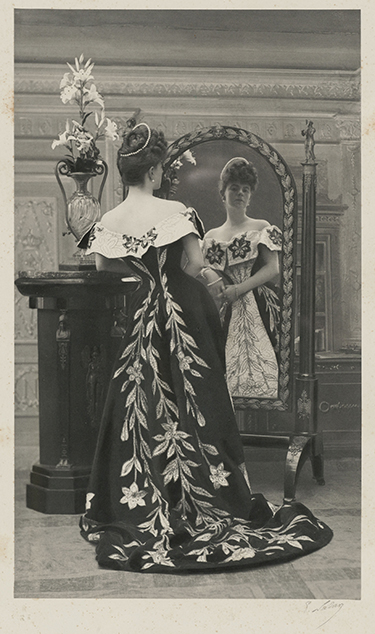
After the entirety of the exhibition, one can conclude that the Countess had remarkable impact, impeccable taste, and a vast amount of experience watching and participating in history based on the content. The Countess had casually gone to the Ballet Russes, danced as a flapper, embarked in the oriental motif, and the most notable, patronized Jean-Phillipe Worth, yet was “often the real creator of her dresses.” Therefore, her dresses were vast in shape, detail, and historical reference. She mostly enhanced herself with the colors of black, white, pink (youth), green (older), and maroon. The most successful detail in the exhibit also encompassed her variety. The angled-mirror box, a glass box with the dress flat and a mirror angled hovering over it, allowed a viewer to see the crucial pink silk taffeta with printed orchids upright and inlined with the viewer’s height. Yet more importantly, allowed one to draw closer to the silk chiffon and tailored details in the glass box. This display technique was peculiar since it was the only one in the room and was early on, however the functionality was successful.
In regards to information, the exhibit was rather simplistic. As the viewer read each information card, located elevated at the mannequin’s/dress form’s hand level, it was sparse in content or direct garment detail. Some of the cards only included a quote said by/spoken about the Countess, a detail normally decorated on a wall in most galleries. The meat of the information is actually duplicated onto the FIT Museum website, along with images of the majority of the garments. Due to the lack of context, the duration of experiencing the museum was short lived.
When asking a current FIT undergrad about the exhibit, she looked around and remarked how bare and disappointing this show was compared to the Fairy Tale Fashion Spring show. She enjoyed how that show “…was set up more interesting because there was more to look at. It was more story based.” The Proust’s Muse, The Countess Greffulhe exhibit could’ve easily followed in chronological order, and at times did, but due to the abrupt flow of the platforms and unclear entrance/exit, left large gaps of time in an exhibit where time was of the essence.
FIT’s fall/winter exhibit, Proust’s Muse, The Countess Greffulhe, praised and qualified the Countess as an extremely influential woman of her time through her attire. However, this show as a curatorial standpoint had many missed opportunities, ambiguity of purpose and functionality, and lower standards of previous shows. This left not only disappointment to the curious audience, but also to the high taste of the Countess herself.
Source:
http://exhibitions.fitnyc.edu/prousts-muse/
Your post is very helpful and information is reliable. I am satisfied with your post. Thank you so much for sharing this wonderful post.
Tracker S01 Lee Tergesen Leather Jacket