

The memoir project dealt with ideas of real and fake representations of myself. And I did several trails for different concepts.
First, I attempted to distinguish “real and fake me” using color. The original concept was everything could be a reflector (“mirror” in a broad sense). Facing what I like, it’s going to be a “real me” condition, which I wanted to use pure opaque color to represent the meaning of “true color” of me. On the opposite, “fake me” was corresponding to the same color (I chose blue #386091), which was, however, some kind of mutated for using the multiply effect. The reason of the choice of this effect was when I faced something I hated but I had to face, I could do nothing but adjust my color according to the surrounding to fit in better.
As for this version’s layout, I divided “real and fake me” both into two parts: one was for past and the other for future. In addition, from up to down, from outside to inside, I tried to use the original angles of view of these pictures to arrange and organize them, which failed to be obvious enough.
Then I moved on to a brand new idea. I wanted to use capitalized “E” to represent me (since it’s the first letter of my English name). Using various materials to make “E”s was the main idea. For example, I liked writing, then I could use pens or pencils to make a “real E”. Furthermore, as for “fake me”s, not only they would be made of things related to what I hate, but the images would be rotated. Final work would look like a special visual chart. I loved this idea actually, but I could hardly think of as many things as possible that were apparent enough to represent my hobbies and the opposite.
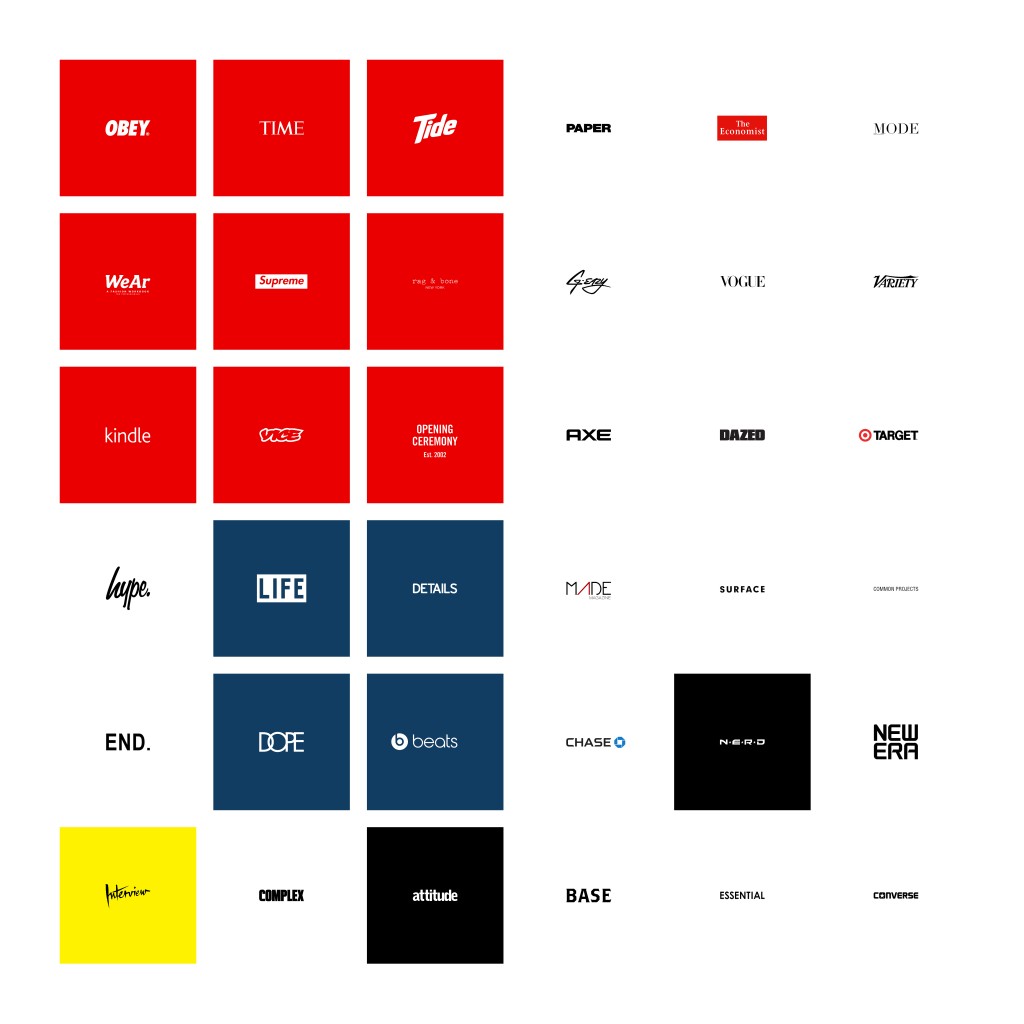
But this idea took me to the third concept, brand. Different brands represent different products, lifestyles, and even characters. Since some of their names contain the letter “E”, it should work in this version. I placed brands with similar typography together as my layout. In the end, this trial seemed not as successful as expected.
Afterwards, I learned from critique that people tend to combine these fragments into words or even sentences. Since it’s hard to make it, I decided to replace them by brands with original English meanings. But clear and coherent sentences or phrases were still difficult to form. I placed “fake me”s on the left in colorful background to indicate fake condition is always bright and flashy while real one should be original and unedited. Finally, I used black background to emphasize the theme of this work, and adjusted some pictures to make it more visually attractive, which also kind of broke my own rules.
This project gave me a great chance to do these trials, leaving me deeper understanding of real and fake.