The web has changed when it comes to typography. For the first twenty years we could specify only a few fonts.
In 2008, there were 18 fonts to use. The core fonts licensed by Microsoft are: Andale Mono, Arial, Arial Black, Comic Sans MS, Courier New, Georgia, Impact, Times New Roman, Trebuchet MS, Verdana, Webdings. Apple added a few more, like Helvetica and Times. That was it.
By 2011, there were thousands of fonts available. What a change.
It’s about time. The tools are now in place to bring out the inner typography artist, if not scientist, in you.
While typography’s been around for hundred’s of years, it has only been in the last hundred or so years that it’s become both an art and a science.
The art and science of typography forced typographers to ply their craft in the service of the end user who reads it. That makes them the original user experience designers, so take heed.
But the web is different from print. The user is in charge in a way that is foreign to print. The attention span is different, and the typography should facilitate the user experience as soon as they arrive on the page.
The typographic defaults that we take for granted took their shape from the years of experience in the print world, but that does not mean that you have to accept these defaults by which to express your content.
You will be required to deviate from the standard web fonts like Arial, Helvetica, Verdana and Georgia. These are a common set of fonts supplied by the operating system that have defined typography on the web for far too long. They are safe, legible and entirely predictable.
It is possible that legibility may suffer some, in favor of better expression of the content, but this is a brave new world, so please push the typography if you can. Besides, it has been documented that legibility isn’t all that its been cracked up to be when it comes to retaining information.
On the one hand, the legibility of a typeface is its invisibility, that is, just like the cuts in a movie and they are not supposed to draw attention to themselves but convey the content in service to the story. The typeface and the way it is laid out should transparently facilitate the content to the user, whose focus, after all, is on what is being said.
But if you want the delivery of the content to express something, it better have style. It’s possible to do both, and in the name of communication, you may even forgo some legibility, if that is what it takes.
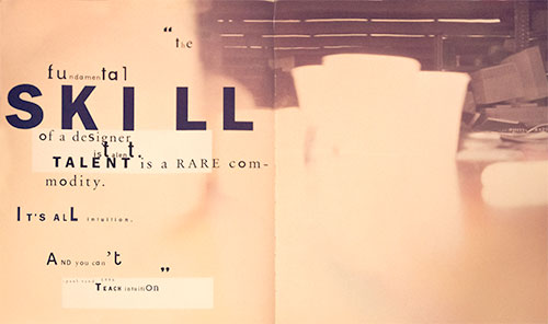
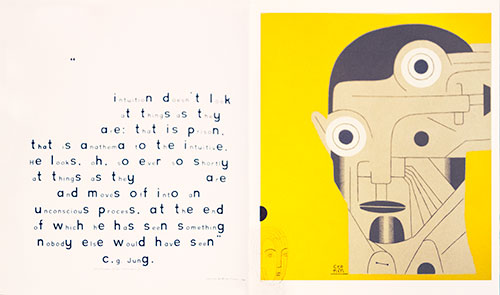
David Carson famously did this twenty years ago, designing, among other things, covers for HOW magazine which I was writing for. If we need an expanded vision to counterbalance all of the rules, we can visit his work, with the understanding that rules are meant to be broken, with intelligence and purpose, and if the content demands it.
Honor the content with your typography, so that it aids in the facilitation of that content. After all, it is only through reading the letterforms that the content can be transmitted. As a designer, you have the power to determine that gateway.
Balance function and beauty, or whatever emotion grabs you to fulfill that function with style. Be playful, lively, think your way through the problem, but let the solution be surprising, and just have fun! Having fun is contagious, and if you exhibit joyful creation, it is bound to be infectious.
Here’re two spreads on intuition from David Carson’s 2nd Sight, his influential book on graphic design after the end of print. There is a TED talk and another one of his creations in the homework. Let that get you started.