Midterm Rubric

Students: please help draft the rubric.

We are supposed to have a rubric so that you have an idea of how I grade these projects. While a lot of planning goes into developing the course so that everyone can fish for a lifetime, there have to be standards for accountability.

This is one such attempt. I would like for you to think about these categories and evaluation criteria, and give me feedback that would add or subtract or help me make them more clear.

Email me with suggestions.

Thanks, onno

Midterm Rubric

above expectations

at expectations

needs work

below expectations

Volume of work Additional pages or exquisitely done pages. Complete website Fully functional front page, product page and bio page. Pages are not fully functional and incomplete. Pages missing or too incomplete to be functional.
Technical Ability Is innovative and uses User Experience guidelines and clear site architecture to develop engaging web site. HTML is semantic and validates. Various CSS strategies are used to layout the website. Code has errors but still works. Code does not work.
Clean Design Design is consistent with clear design elements throughout; Design tied to meaning; Nothing irrelevant, everything has a purpose. Design satisfies the requirement. Communicates its intent and is clear Design is simplistic and does not add anything to the communication. Design hampers the communication.
Research The portfolio is well situated and targets all potential users. The portfolio is well thought out from the artist’s point of view. Additional research did not broaden the horizon. The portfolio demonstrates artist’s perspective, but lacks general appeal. Lack of research shows up in product that is not clearly defined for any audience.


6 & 13 Peer Review

Peer review is an important life skill. Do it effectively and with tact.

Constructive Criticism

Be positive, let your partner know what you liked. Praise, comment, and correct in that order. Make positive comments about the design, its execution and overall effectiveness of the site before explaining what does not meet with expectations. Look at the code to see if it is properly annotated, well organized and correct. If you can help the person achieve their goals, do that.

Critical Review Examples

Detailed critical review feedback can be found on Web Standards Sherpa, a website dedicated to constructive criticism, to highlight standards compliant solution that solve real world problems. You can see articles that review the headlines of the New York Times and there are many others, including a critique of their own site.

The goal of WebStandardsSherpa.com is to provide web professionals the opportunity to receive feedback, glean advice and learn best practices from experts in the field to help improve the quality of their own work. It’s very instructive to see professional and pedagogically useful critique at work.

Reacting to Criticism

You do not have to incorporate your classmate’s suggestions. Trust your own judgement about your design, determine which issues are most important, though pay attention to comments if they are made by more than one peer, and get another opinion if you aren’t sure about something.

User Testing

One way to get feedback is to user test your site. You will use the SilverBack application to record the user test. Download the application, which is free for 30 days.

Doing a user test is straight forward. Create a project, and create a session which will record the your peer review partner’s “user interaction” as they go through your website. When you are finished, export the files at 50% size and low resolution, which is still acceptable, and reduces the file size to around 4mb/minute.

Take notes as your peer review partner “user tests” your site. If you are doing the user testing, try to verbalize your reaction and decision making as you go through the site to make it easier for the site’s owner to note how the site user experience works, or what does not work.

Watch the video of your partner going through your site. I do not see these taking more than a minute or two, which can easily be compressed and emailed to me, or posted on your site. If you go over two minutes, you can place it on your server with a link so I can download it.

The user testing experience will not be under ideal and pristine conditions. Ideally, a user test is done the first time a user uses the site. That may not be possible at school. Set up Silverback as the first thing and do a user test with as few preconceived expectations as possible before revealing anything about your site except who its target audience is and what you are selling.

Though this is not a pristine user experience test — the video isn’t representative of an industry standard user test — it will be a good lesson in highlighting the role of testing user interactivity nonetheless.

Tasks your peer review partner should perform.

  1. Find the product/service/idea that is being sold on the site.
  2. Find out additional information about the product/service/idea.
  3. Contact the seller with a question.
  4. Check the entire site to for completeness.

Here is an example. To see it at full resolution, right -click to open the video in its own window:

Peer Review Check Lists

Two lists of questions. The first is a core list every review has to cover. Be constructive, not just “yes” or “no”. Everyone should go through the second list before handing in your final web site or publishing it on the web. I will use the same lists to check to see if you’ve dotted your “i”s and crossed your “t”s, so to speak.

Don’t worry about browser compatibility. That is included because it is a criteria the real world uses, but note that it is no longer of much consequence, as IE 6-8 usage is below 10%.

You use of the HTML5 boilerplate should make your site work for even the most prehistoric browsers, though they will miss the CSS3 goodness.

These lists are resources for you to ask pertinent questions. Use them to help formulate your critique. They are meant to be helpful to you and your partner.

I will use these lists as my measure for evaluating how well you analyzed your partner’s web site, as well as in grading your final project.

Help Your Partner

Everyone has learned a lot, but in this little time, not everyone will have learned everything equally well. You will have the opportunity of helping your partner fix at least three issues in their website where they may not have figured out the best way to do something.

We are in this all together, and being able to

Core Peer Review Questions

  • Intuitive reaction

    1. Take the five-seconds test. What’s your immediate response? Your split second intuition is often canny in its ability to present an accurate picture that can get lost in more deliberated responses.
    2. How dos the site make you feel?
  • Clarity of Communication

    1. Does the site convey a clear sense of its intended audience?
    2. Does it use language in a way that is familiar to and comfortable for its readers?
    3. Is it conversational in its tone?
    4. Is the experience seamless?
    5. Do the pictures and the design facilitate the communication?
  • Accessibility

    1. Is load time appropriate to content?
    2. Is there an easily discoverable means of communicating with the author or administrator?
    3. Is the HTML semantic (can screen readers to navigate the site)?
  • Consistency

    1. Does the site have a consistent and clearly recognizable “look-&-feel”?
    2. Does it make effective use of repeating visual themes to unify the site?
    3. Is it consistent even without graphics or external style sheet? (it can happen)
  • Navigation

    1. Are the links obvious in their intent and destination?
    2. Is there a convenient, obvious way to maneuver among related pages, and between different sections?
  • Design & maintenance

    1. Does the site make effective use of hyperlinks to tie related items together?
    2. Are there dead links? Broken scripts? Pages that are not completed or look unfinished?
    3. Is page length appropriate to site content?
  • Visual Presentation

    1. Is the site worthy of a design student in its communication?
    2. Does it use distracting animations?
    3. Does it provide feedback? Using Javascript frameworks can enhance user experience, or detract from it.
  • Code

    1. Is the code clean and well documented?
    2. Is it optimized for Search Engines (SEO)?
    3. Does it have Google’s Analytics code?
    4. Does the HTML validate? Use the Unicorn Unified Validator Service and Check the HTML and CSS. You are to report your findings in your conclusion.
  • HTML5 and CSS3 goodness

    1. List the CSS3 features used. Were they used to good effect?
    2. Explain how well the document followed a semantically correct HTML5 document structure.
    3. Is the website future proof? Do they use media queries? Does it work on the iPhone/Android?
  • Overall Assessment?

    A list of fixes, suggestions and possible solutions to any issue that came up when assessing the website using the aforementioned considerations.

    Send this report to your partner later today, if you need more time to write it up than class provides, and send a copy to me.

Detail Checklist

  1. All text free from spelling errors?
  2. Content has been placed consistently?
  3. Page & Content formatting has been tested?
  4. Meta data has been included and is appropriate?
  5. Page titles are descriptive and SEO friendly?
  6. Images have appropriate alt text?
  7. Title attributes are appropriate and SEO friendly?
  8. Favicon has been created and displays correctly?
  9. Footer includes copyright and link to site creator?
  10. HTML has passed validation?
  11. CSS has passed validation?
  12. There are no broken links?
  13. JavaScript is error free?
  14. Displays & functions correctly in ie6? 5% of market share.
  15. Displays & functions correctly in ie7? 10% of market share.
  16. Displays & functions correctly in ie8? 40% of market share.
  17. Displays & functions correctly in Firefox 4 (Mac & PC)?
  18. Displays & functions correctly in Chrome 11 (Mac & PC)?
  19. Displays & functions correctly in Safari 5 (Mac & PC)?
  20. Displays & functions correctly in Opera 11 (Mac & PC)?
  21. Tested on the iPhone?
  22. Tested at 1024 x 768 resolution?
  23. Tested at larger resolutions?
  24. Web Statistics package installed and operational?
  25. 404 page exists and informative?

06 homework

  1. Watch the the Don’t be Afraid video on Web Typography. Watch it, and take a good look at the finished file, including the CSS style sheet. You’ll learn a lot!
  2. A reference typography rules.
  3. Know when to break the rules, once, of course, you consistently implement them. Be inspired to push or break the rules for typography in web design. To help you in your inspiration, here is a work by David Carson on the end of print with William S. Burroughs reading from his own texts.
  4. David carson speaking about his own work.
  5. Create a poster utilizing your work using Illustrator or Photoshop, and then scale it down to a pamphlet size and code it for the web.
  6. Include a profound statement, a saying you are attracted to, or a poem on which to exercise your newfound web typography skills.
    • Untiled poem by ee cummings (for inspiration —you do your own thing):

       
      l(a
       
      le
      af
      fa
      ll
       
      s)
      one
      l
       
      iness

  7. The Type Poster is due in Two Weeks. The new typographic possibilities have to be reflected in your portfolio. No traditional fonts. The midterm is due next week for in-class presentation and critique.

06 Typography on the Web

Week 6
10/8

Official Midterm Assessment and Peer Review I will make rounds and provide feedback in class or through email.

QUIZ testing comprehension of CSS Layout Strategies.

Type has exploded on the web. Principles of typography, formatting text and using type for effective communication when designing for the web. Activity: Practice using Typefaces from different sources. Activity: Peer Review.

Homework

Send peer review comments to peer and to me. Due: ASAP so the peer review can be incorporated into the midterm. Watch the videos on and by Carson. Create typography assignment. Read chapter 13. Due: In two weeks.

Materials

Additional materials for this unit can be found by following these links (29 pages):

Goals

The goals of this unit are to:

  • To catch up if you are behind, or to help other catch up if you are beginning to feel that you know what you are doing.
  • Provide critique, guidance and help to finish your partner’s midterm portfolio site.
  • Extoll the roll of typography in communication.
  • Understand the basic rules of Typography.
  • Introduce embedded web fonts.
  • Be able to work the text and fonts in CSS.
  • To be inspired to push the Typographic boundaries in creating your own work.

Outcomes

At the end of this unit, students will have:

  • A better midterm portfolio site.
  • Be better prepared in showing their finished portfolio next week.
  • A working knowledge of typography for use on the web
  • Access to the many web fonts now available
  • The ability to set the type rather than rely on the defaults.
  • Be conscious of what makes type legible.
  • know how to follow the rules, and when to break them for effect.
  • Be inspired by Carson discussing his work.

Step-by-Step

30 Review homework and answer questions.
40 Quiz
5 Assessable Tasks and grading rubric used in the evaluating each student.
40 Peer Review
10 break
5 Typography: Using type to communicate
5 Type on the Web
10 Lecture/Demonstration: Formatting Text
10 Lecture/Demonstration: Web Fonts
5 Character Encoding and entities lookup

Talking Points

Topics covered in the reading:

Chapter 10: Formatting Text with Styles

  1. Choosing a Font Family 243
  2. Specifying Alternate Fonts 244
  3. Creating Italics 246
  4. Applying Bold Formatting 248
  5. Setting the Font Size 250
  6. Setting the Line Height 255
  7. Setting All Font Values at Once 256
  8. Setting the Color 258
  9. Changing the Text’s Background 260
  10. Controlling Spacing 264
  11. Adding Indents 265
  12. Setting White Space Properties 266
  13. Aligning Text 268
  14. Changing the Text Case 270
  15. Using Small Caps 271
  16. Decorating Text 272

Chapter 13: Working with Web Fonts

  1. What Is a Web Font? 354
  2. Where to Find Web Fonts 356
  3. Downloading Your First Web Font 358
  4. Working with @ font- face 360
  5. Styling Web Fonts and Managing File Size 365

Current Practices

A lot of websites deserve to be looked at as standard bearers for the web. Here are a few that will provide inspiration as you implement your own typography:

Midterm Rubric

Midterm Rubric

above expectations

at expectations

needs work

below expectations

Volume of work Additional pages or exquisitely done pages. Complete website Fully functional front page, product page and bio page. Pages are not fully functional and incomplete. Pages missing or too incomplete to be functional.
Technical Ability Is innovative and uses User Experience guidelines and clear site architecture to develop engaging web site. HTML is semantic and validates. Various CSS strategies are used to layout the website. Code has errors but still works. Code does not work.
Clean Design Design is consistent with clear design elements throughout; Design tied to meaning; Nothing irrelevant, everything has a purpose. Design satisfies the requirement. Communicates its intent and is clear Design is simplistic and does not add anything to the communication. Design hampers the communication.
Research The portfolio is well situated and targets all potential users. The portfolio is well thought out from the artist’s point of view. Additional research did not broaden the horizon. The portfolio demonstrates artist’s perspective, but lacks general appeal. Lack of research shows up in product that is not clearly defined for any audience.

Assessable Tasks

Assessable tasks are those core tasks required to create modern web design.

Tasks / Activities Date Requirements/Indicators
Marking-up Content Week 2 Is the markup valid and semantically correct HTML5?
Styling the Content Week 4 Is the CSS valid, clean, and using structural selectors when possible? Are various layout strategies used to construct the pages?
Constructing the Portfolio Site Week 6 Information Architecture Is the site logically laid out? Is it SEO friendly? Is it tracked using Google Analytics?
Is the web site Future Proof? Week 8 Is the website responsive to a change in viewport size, from an iPhone to the standard web browser?
Explore CSS3 and HTML5 Week 9-11 Are CSS3 & HTML5 being used to create the final website?
Modularity and Interactivity Week 12-14 Are PHP and Javascript being used in the final website?
Forms Week 12-14 Are forms being used in the final website?

Definitions

These are the terms that participants should be familiar with during this unit. Most of you have had typography, and they should be familiar, but if not, please check out the “12-fall/06-typographic-resource/”Basic Typography Resource for more.

Text Type

Designed to be legible and readable across a variety of sizes

Display Type

Designed to attract attention and pull the reader into the text. It can be more elaborate, expressive, and have a stylish look.

Legibility

Legibility describes the design of a typeface and how easy it is to distinguish different letters from one another.

Readability

How easy words, phrases, and blocks of text can be read. Readability describes how well a typeface works in practice. Good typography is transparent in the way it encourages the user to read the copy.

Alignment

Text can be centered, justified, left or right-justified.

Inter Paragraph Spacing

Should you indent a paragraph or use a line space? Whatever you do, do not rely on the default. Design that spatial relationship like any other.

The Length of a Line of Text

Long lines of text are hard to read and make it difficult to find the next line. An ideal length is somewhere around 65 characters.

Leading

line-heght is the distance between one baseline of text and the next.

Kerning

The space between specific character pairs. Some combinations require more or less distance than others to make the space appear uniform. Kerning pair information is stored in the font’s metrics.

Tracking

Like Kerning, it changes the letter space between characters, but it does do for a selected line of them. Large type can be tracked negatively, and very small type sometimes needs some extra space to be more easily readable.

Case

Type can be lowercase, uppercase, and mixed case. Lower case (with capitalization for grammar) is standard. All capitals can be hard to read for more than a few words.

Font Style and Font Weight

Roman face fonts are the easiest to read. true italic and bolding are better than the browser’s algorithm for turning a roman face bold or italic.

Color

When you squint your eyes and look at the type, it hopefully has an even grey look to it. If it is blotchy, the tracking, kerning and justification can be adjusted to control for that.

Contrast

How the color of the text works with the color of the background. Black against white is ideal, but that can be too start. Large type can handle lower contrast better than tiny type.

Number of different fonts:

Keep it simple! Each font takes as much time to download as a large picture, close to 100K, so be sparing for both design and resource reasons.

Typeface

Choose readability for the body copy, either serif or san-serif, and if you are going all out for style, do that with the Display face.

Serifs

Serifs supposedly help lead the eye along the line of type, but I’m not sure if that is true or not with type on the computer screen, as course as it is. Either way, make sure that the text type is legible and readable.

Font Size

Generally speaking, fonts are not used in isolation, and are usually in a hierarchy developed to lock in particular font size ratios. There is also a hierarchy of font width to consider, from thin to thick, and from condensed to expanded. Be consistent and use your best design judgement, and make sure you read the last section on web fonts, and use rems to size your type.

06 Homework

  1. Watch the the Don’t be Afraid video on Web Typography. Watch it, and take a good look at the finished file, including the CSS style sheet.
  2. I expect you to understand and use these basic typography rules.
  3. Can I repeat myself? I expect you to understand and use these fundamental rules!
  4. But then you also have to know when to break the rules, once, of course, you know them. Be inspired to push or break the rules for typography in web design. To help you in your inspiration, here is a work by David Carson on the end of print with William S. Burroughs reading from his own texts.
  5. David carson speaking about his own work.
  6. Create a poster utilizing your work using Illustrator or Photoshop, and then scale it down to a pamphlet size and code it for the web.
  7. Include a profound statement, a saying you are attracted to, or a poem on which to exercise your newfound web typography skills.
    • Untiled poem by ee cummings (for inspiration —you do your own thing):

       
      l(a
       
      le
      af
      fa
      ll
       
      s)
      one
      l
       
      iness

  8. The Type Poster is due in Two Weeks. The new typographic possibilities have to be reflected in your portfolio. No traditional fonts. The midterm is due next week for in-class presentation and critique.

06 Character Encoding

The Character Set

32
33 !
34
35 #
36 $
37 %
38 &
39
40 (
41 )
42 *
43 +
44 ,
45
46 .
47 /
48 0
49 1
50 2
51 3
52 4
53 5
54 6
55 7
56 8
57 9
58 :
59 ;
60 <
61 =
62 >
63 ?
64 @
65 A
66 B
67 C
68 D
69 E
70 F
71 G
72 H
73 I
74 J
75 K
76 L
77 M
78 N
79 O
80 P
81 Q
82 R
83 S
84 T
85 U
86 V
87 W
88 X
89 Y
90 Z
91 [
92
93 ]
94 ^
95 _
96 `
97 a
98 b
99 c
100 d
101 e
102 f
103 g
104 h
105 i
106 j
107 k
108 l
109 m
110 n
111 o
112 p
113 q
114 r
115 s
116 t
117 u
118 v
119 w
120 x
121 y
122 z
123 {
124 |
125 }
126 ~

If you see unexpected error marker in your writing it is because you are encoding it with ASCII, which was originally developed for a seven bit system back in the early 1960’s, and has 128 information points to represent characters, of which the first 33 are mostly obsolete control codes. The printable characters are listed below. If you want to use additional characters, called entities, you can look up the special codes below.

Because there are many more characters than 128 ASCII characters, a more capable unicode was introduced with over 100,000 characters. Because of issues related to how computers read information, the 8bit multibyte character encoding for Unicode is the most popular. It is called utfF-8.

Entities lookup for characters with special meaning in HTML

Entity E Number N Description
&amp; & &#38; & ampersand
&gt; > &#62; > greater-than sign
&lt; < &#60; < less-than sign
&quot; " &#34; " quotation mark = APL quote

Entities for punctuation characters

Entity E Number N Description
&cent; ¢ &#162; ¢ cent sign
&curren; ¤ &#164; ¤ currency sign
&euro; &#8364; euro sign
&pound; £ &#163; £ pound sign
&yen; ¥ &#165; ¥ yen sign = yuan sign
&brvbar; ¦ &#166; ¦ broken bar = broken vertical bar
&bull; &#8226; bullet = black small circle
&copy; © &#169; © copyright sign
&dagger; &#8224; dagger
&Dagger; &#8225; double dagger
&frasl; &#8260; fraction slash
&hellip; &#8230; horizontal ellipsis = three dot leader
&iexcl; ¡ &#161; ¡ inverted exclamation mark
&image; &#8465; blackletter capital I = imaginary part
&iquest; ¿ &#191; ¿ inverted question mark = turned question mark
&lrm; &#8206; left-to-right mark (for formatting only)
&mdash; &#8212; em dash
&ndash; &#8211; en dash
&not; ¬ &#172; ¬ not sign
&oline; &#8254; overline = spacing overscore
&ordf; ª &#170; ª feminine ordinal indicator
&ordm; º &#186; º masculine ordinal indicator
&para; &#182; pilcrow sign = paragraph sign
&permil; &#8240; per mille sign
&prime; &#8242; prime = minutes = feet
&Prime; &#8243; double prime = seconds = inches
&real; &#8476; blackletter capital R = real part symbol
&reg; ® &#174; ® registered sign = registered trade mark sign
&rlm; &#8207; right-to-left mark (for formatting only)
&sect; § &#167; § section sign
&shy; ­ &#173; ­ soft hyphen = discretionary hyphen (displays incorrectly on Mac)
&sup1; ¹ &#185; ¹ superscript one = superscript digit one
&trade; &#8482; trade mark sign
&weierp; &#8472; script capital P = power set = Weierstrass p
&bdquo; &#8222; double low-9 quotation mark
&laquo; « &#171; « left-pointing double angle quotation mark = left pointing guillemet
&ldquo; &#8220; left double quotation mark
&lsaquo; &#8249; single left-pointing angle quotation mark
&lsquo; &#8216; left single quotation mark
&raquo; » &#187; » right-pointing double angle quotation mark = right pointing guillemet
&rdquo; &#8221; right double quotation mark
&rsaquo; &#8250; single right-pointing angle quotation mark
&rsquo; &#8217; right single quotation mark
&sbquo; &#8218; single low-9 quotation mark
&emsp; &#8195; em space
&ensp; &#8194; en space
&nbsp;   &#160;   no-break space = non-breaking space
&thinsp; &#8201; thin space
&zwj; &#8205; zero width joiner
&zwnj; &#8204; zero width non-joiner

Entities for shapes and arrows

Entity E Number N Description
&crarr; &#8629; downwards arrow with corner leftwards = carriage return
&darr; &#8595; downwards arrow
&dArr; &#8659; downwards double arrow
&harr; &#8596; left right arrow
&hArr; &#8660; left right double arrow
&larr; &#8592; leftwards arrow
&lArr; &#8656; leftwards double arrow
&rarr; &#8594; rightwards arrow
&rArr; &#8658; rightwards double arrow
&uarr; &#8593; upwards arrow
&uArr; &#8657; upwards double arrow
&clubs; &#9827; black club suit = shamrock
&diams; &#9830; black diamond suit
&hearts; &#9829; black heart suit = valentine
&spades; &#9824; black spade suit
&loz; &#9674; lozenge
&#8984; command key
&#8997; option key
&#9774; Peace Symbol
&#9775; yin yang

Entities for accented characters, accents, and other diacritics from Western European Languages

Entity E Number N Description
&acute; ´ &#180; ´ acute accent = spacing acute
&cedil; ¸ &#184; ¸ cedilla = spacing cedilla
&circ; ˆ &#710; ˆ modifier letter circumflex accent
&macr; ¯ &#175; ¯ macron = spacing macron = overline = APL overbar
&middot; · &#183; · middle dot = Georgian comma = Greek middle dot
&tilde; ˜ &#732; ˜ small tilde
&uml; ¨ &#168; ¨ diaeresis = spacing diaeresis
&Aacute; Á &#193; Á latin capital letter A with acute
&aacute; á &#225; á latin small letter a with acute
&Acirc; Â &#194; Â latin capital letter A with circumflex
&acirc; â &#226; â latin small letter a with circumflex
&AElig; Æ &#198; Æ latin capital letter AE = latin capital ligature AE
&aelig; æ &#230; æ latin small letter ae = latin small ligature ae
&Agrave; À &#192; À latin capital letter A with grave = latin capital letter A grave
&agrave; à &#224; à latin small letter a with grave = latin small letter a grave
&Aring; Å &#197; Å latin capital letter A with ring above = latin capital letter A ring
&aring; å &#229; å latin small letter a with ring above = latin small letter a ring
&Atilde; Ã &#195; Ã latin capital letter A with tilde
&atilde; ã &#227; ã latin small letter a with tilde
&Auml; Ä &#196; Ä latin capital letter A with diaeresis
&auml; ä &#228; ä latin small letter a with diaeresis
&Ccedil; Ç &#199; Ç latin capital letter C with cedilla
&ccedil; ç &#231; ç latin small letter c with cedilla
&Eacute; É &#201; É latin capital letter E with acute
&eacute; é &#233; é latin small letter e with acute
&Ecirc; Ê &#202; Ê latin capital letter E with circumflex
&ecirc; ê &#234; ê latin small letter e with circumflex
&Egrave; È &#200; È latin capital letter E with grave
&egrave; è &#232; è latin small letter e with grave
&ETH; Ð &#208; Ð latin capital letter ETH
&eth; ð &#240; ð latin small letter eth
&Euml; Ë &#203; Ë latin capital letter E with diaeresis
&euml; ë &#235; ë latin small letter e with diaeresis
&Iacute; Í &#205; Í latin capital letter I with acute
&iacute; í &#237; í latin small letter i with acute
&Icirc; Î &#206; Î latin capital letter I with circumflex
&icirc; î &#238; î latin small letter i with circumflex
&Igrave; Ì &#204; Ì latin capital letter I with grave
&igrave; ì &#236; ì latin small letter i with grave
&Iuml; Ï &#207; Ï latin capital letter I with diaeresis
&iuml; ï &#239; ï latin small letter i with diaeresis
&Ntilde; Ñ &#209; Ñ latin capital letter N with tilde
&ntilde; ñ &#241; ñ latin small letter n with tilde
&Oacute; Ó &#211; Ó latin capital letter O with acute
&oacute; ó &#243; ó latin small letter o with acute
&Ocirc; Ô &#212; Ô latin capital letter O with circumflex
&ocirc; ô &#244; ô latin small letter o with circumflex
&OElig; Π&#338; Πlatin capital ligature OE
&oelig; œ &#339; œ latin small ligature oe
&Ograve; Ò &#210; Ò latin capital letter O with grave
&ograve; ò &#242; ò latin small letter o with grave
&Oslash; Ø &#216; Ø latin capital letter O with stroke = latin capital letter O slash
&oslash; ø &#248; ø latin small letter o with stroke, = latin small letter o slash
&Otilde; Õ &#213; Õ latin capital letter O with tilde
&otilde; õ &#245; õ latin small letter o with tilde
&Ouml; Ö &#214; Ö latin capital letter O with diaeresis
&ouml; ö &#246; ö latin small letter o with diaeresis
&Scaron; Š &#352; Š latin capital letter S with caron
&scaron; š &#353; š latin small letter s with caron
&szlig; ß &#223; ß latin small letter sharp s = ess-zed
&THORN; Þ &#222; Þ latin capital letter THORN
&thorn; þ &#254; þ latin small letter thorn
&Uacute; Ú &#218; Ú latin capital letter U with acute
&uacute; ú &#250; ú latin small letter u with acute
&Ucirc; Û &#219; Û latin capital letter U with circumflex
&ucirc; û &#251; û latin small letter u with circumflex
&Ugrave; Ù &#217; Ù latin capital letter U with grave
&ugrave; ù &#249; ù latin small letter u with grave
&Uuml; Ü &#220; Ü latin capital letter U with diaeresis
&uuml; ü &#252; ü latin small letter u with diaeresis
&Yacute; Ý &#221; Ý latin capital letter Y with acute
&yacute; ý &#253; ý latin small letter y with acute
&yuml; ÿ &#255; ÿ latin small letter y with diaeresis
&Yuml; Ÿ &#376; Ÿ latin capital letter Y with diaeresis

Entities for mathematical and technical characters (including Greek)

Entity E Number N Description
&deg; ° &#176; ° degree sign
&divide; ÷ &#247; ÷ division sign
&frac12; ½ &#189; ½ vulgar fraction one half = fraction one half
&frac14; ¼ &#188; ¼ vulgar fraction one quarter = fraction one quarter
&frac34; ¾ &#190; ¾ vulgar fraction three quarters = fraction three quarters
&ge; &#8805; greater-than or equal to
&le; &#8804; less-than or equal to
&minus; &#8722; minus sign
&sup2; ² &#178; ² superscript two = superscript digit two = squared
&sup3; ³ &#179; ³ superscript three = superscript digit three = cubed
&times; × &#215; × multiplication sign
&alefsym; &#8501; alef symbol = first transfinite cardinal
&and; &#8743; logical and = wedge
&ang; &#8736; angle
&asymp; &#8776; almost equal to = asymptotic to
&cap; &#8745; intersection = cap
&cong; &#8773; approximately equal to
&cup; &#8746; union = cup
&empty; &#8709; empty set = null set = diameter
&equiv; &#8801; identical to
&exist; &#8707; there exists
&fnof; ƒ &#402; ƒ latin small f with hook = function = florin
&forall; &#8704; for all
&infin; &#8734; infinity
&int; &#8747; integral
&isin; &#8712; element of
&lang; &#9001; left-pointing angle bracket = bra
&lceil; &#8968; left ceiling = apl upstile
&lfloor; &#8970; left floor = apl downstile
&lowast; &#8727; asterisk operator
&micro; µ &#181; µ micro sign
&nabla; &#8711; nabla = backward difference
&ne; &#8800; not equal to
&ni; &#8715; contains as member
&notin; &#8713; not an element of
&nsub; &#8836; not a subset of
&oplus; &#8853; circled plus = direct sum
&or; &#8744; logical or = vee
&otimes; &#8855; circled times = vector product
&part; &#8706; partial differential
&perp; &#8869; up tack = orthogonal to = perpendicular
&plusmn; ± &#177; ± plus-minus sign = plus-or-minus sign
&prod; &#8719; n-ary product = product sign
&prop; &#8733; proportional to
&radic; &#8730; square root = radical sign
&rang; &#9002; right-pointing angle bracket = ket
&rceil; &#8969; right ceiling
&rfloor; &#8971; right floor
&sdot; &#8901; dot operator
&sim; &#8764; tilde operator = varies with = similar to
&sub; &#8834; subset of
&sube; &#8838; subset of or equal to
&sum; &#8721; n-ary sumation
&sup; &#8835; superset of
&supe; &#8839; superset of or equal to
&there4; &#8756; therefore
&Alpha; Α &#913; Α greek capital letter alpha
&alpha; α &#945; α greek small letter alpha
&Beta; Β &#914; Β greek capital letter beta
&beta; β &#946; β greek small letter beta
&Chi; Χ &#935; Χ greek capital letter chi
&chi; χ &#967; χ greek small letter chi
&Delta; Δ &#916; Δ greek capital letter delta
&delta; δ &#948; δ greek small letter delta
&Epsilon; Ε &#917; Ε greek capital letter epsilon
&epsilon; ε &#949; ε greek small letter epsilon
&Eta; Η &#919; Η greek capital letter eta
&eta; η &#951; η greek small letter eta
&Gamma; Γ &#915; Γ greek capital letter gamma
&gamma; γ &#947; γ greek small letter gamma
&Iota; Ι &#921; Ι greek capital letter iota
&iota; ι &#953; ι greek small letter iota
&Kappa; Κ &#922; Κ greek capital letter kappa
&kappa; κ &#954; κ greek small letter kappa
&Lambda; Λ &#923; Λ greek capital letter lambda
&lambda; λ &#955; λ greek small letter lambda
&Mu; Μ &#924; Μ greek capital letter mu
&mu; μ &#956; μ greek small letter mu
&Nu; Ν &#925; Ν greek capital letter nu
&nu; ν &#957; ν greek small letter nu
&Omega; Ω &#937; Ω greek capital letter omega
&omega; ω &#969; ω greek small letter omega
&Omicron; Ο &#927; Ο greek capital letter omicron
&omicron; ο &#959; ο greek small letter omicron
&Phi; Φ &#934; Φ greek capital letter phi
&phi; φ &#966; φ greek small letter phi
&Pi; Π &#928; Π greek capital letter pi
&pi; π &#960; π greek small letter pi
&piv; ϖ &#982; ϖ greek pi symbol
&Psi; Ψ &#936; Ψ greek capital letter psi
&psi; ψ &#968; ψ greek small letter psi
&Rho; Ρ &#929; Ρ greek capital letter rho
&rho; ρ &#961; ρ greek small letter rho
&Sigma; Σ &#931; Σ greek capital letter sigma
&sigma; σ &#963; σ greek small letter sigma
&sigmaf; ς &#962; ς greek small letter final sigma
&Tau; Τ &#932; Τ greek capital letter tau
&tau; τ &#964; τ greek small letter tau
&Theta; Θ &#920; Θ greek capital letter theta
&theta; θ &#952; θ greek small letter theta
&thetasym; ϑ &#977; ϑ greek small letter theta symbol
&upsih; ϒ &#978; ϒ greek upsilon with hook symbol
&Upsilon; Υ &#933; Υ greek capital letter upsilon
&upsilon; υ &#965; υ greek small letter upsilon
&Xi; Ξ &#926; Ξ greek capital letter xi
&xi; ξ &#958; ξ greek small letter xi
&Zeta; Ζ &#918; Ζ greek capital letter zeta
&zeta; ζ &#950; ζ greek small letter zeta

06 Text Formatting


Text is how the characters are arranged in the flow. This includes writing direction to accommodate languages other than English, so that the inline progression of the text can orient its flow from left-to-right, right-to-left, or top-to-bottom. There are a lot of controls for writing other languages that are not necessary for writing in English. We are going to stick with English.

Many of the properties control flow. Properties such as white space, padding, margin and line hight are not text-properties, but inform how the text is to flow. Instead of using multiple<br> to add space before or after, you add padding or margin.


Paragraph Alignment and First Line Indent

To control the text’s alignment, use: text-align: (start, end, left, right, center, justify). As different text flow directions push what right and left can mean, there has been a move to adopt start and end as the nomenclature instead of left and right.

To specify the first line indent, use: text-indent: and supply a length or a percentage. It will be a negative indent if you supply a negative value.

CSS Code View

Paragraph Alignment and First Line Indent

You can change the alignment of this header, this paragraph and the attribution by changing the alignment property

— onno

Someday soon there will be more control over justified text, as the CSS3 specifications for that are already in place. You will then be able to specify how text is to be justified: text-justify auto, lose, distributed and how the last line will be justified: text-last-line auto, start, end, center, justify, but the browsers have yet to implement these justification controls.


The Text Overflow Property

When there is too much text for the box, it is possible to specify the text overflow mode — if, and only if the box also has the overflow property — text-overflow:clip, ellipsis, ellipsis-word. Try removing the overflow property and the text-overflow property breaks down.

CSS Code View

Hover over this line of text and the remaining text will appear blue.

Hover over this line of text and the remaining text will appear red


Text Spacing, Vertical Alignment and Leading

The ability to control the spacing between Letters, otherwise known as tracking, and words is easily accomplished, but know that the controls are a bit course for small text sizes. The increments are based on the character’s rendering, and that depends on the screen in use. Some of the high resolution displays will provide better controls than what are currently considered normal resolution displays.

The vertical alignment of characters, or superscript and subscript, is done with the vertical-align property, using the following values: baseline, sub, super, top, text-top, middle, bottom, text-bottom, percentage and length. Super and text-top are set to around 75% of the line-height. You can specify a percentage beyond that, but doing so will increase the leading for that line. Put in a value of 200% and you will see what I mean.

Leading is specified by either relative or an absolute measurement with the line-height property. Relative measurements are based on the em that has been specified for the type, while a height in pixels is absolute, and do not change with changes in the size of the text.

CSS Code View

Text Layout Properties

Change the text by applying different styles. Notice that when you make a mistake, the style reverts to the default style. The 1st element is h3. The 2nd and 3rd elements are p. The 2nd p element can be selected separately and given styling in addition to the style determined by the more general p selector.

Being able to select different elements is the key to using CSS. The roll of the selector is, for that reason, extremely important, but it usually takes a little while before students learning about CSS get a handle on just how they work. While it is easy enough to see in simple examples, the selectors, the cascade that determines them, and the inheritance of the different properties keeps web designers on their toes. Leave out one character and the whole thing can come crashing down.


Paragraph Spacing

Paragraph spacing is accomplished through padding and margins. Space before and space after is padding: 10px 0. The left margin is also controlled by padding or margins, and the right margin can be controlled by the paragraph width in addition to padding and margins.

CSS Code View

Paragraph spacing is accomplished through padding and margins. Space before and space after is . The left margin is also controlled by padding or margins, and the right margin can be controlled by the paragraph width in addition to padding and margins.

Paragraph spacing is accomplished through padding and margins. Space before and space after is . The left margin is also controlled by padding or margins, and the right margin can be controlled by the paragraph width in addition to padding and margins.

Do not forget the p + p rule, for subsequent paragraph behavior, and first line rule. and first character pseudo class selections.


Text Decoration, Text Transform, Text Shadow and Text Stroke

Though these properties affect the individual character more than the flow of characters, they belong to text and not font properties. The text-decoration: none; property/value combination is most often used to remove the default underline from links. Text decoration is used to add an underline, overlain or strike-through to the text.

CSS3 adds the ability to isolate the different parts of this property, and once it becomes adopted, will allow for individual adjustment of style, color and location of the line.

The text-transform property sets the text to lowercase or uppercase.

It is also possible to put a shadow on the text itself using the text-shadowproperty with the following value: length, length, length, color; where the first two values are the horizontal and vertical distance, the next value is the size of the blur and then comes the color.

Last but not least is the ability in CSS3 to add a text stroke. This is not yet supported by all browsers, but will soon be: text-stroke: width, color;

CSS Code View

Text Style Properties


White Space

White space processing and line feed behavior are ubiquitous defaults that determine the behavior of how text flows in an HTML document. The default behavior is to collapse multiple spaces into one space and to ignore returns. Some of the tags, like <pre> do make use of a change in whitespace, rendering the text as it is written, preserving multiple white spaces and line feeds. I use the <pre> in the CSS code view for that purpose, for example.

You can change the white space defaults by changing the value of the white-space-treatment property: ignore, preserve, ignore-if-before-linefeed, ignore-if-after-linefeed, ignore-if-surrounding-linefeed . The same is true of line feeds (or carriage returns, remember the type writer?) with the linefeed-treatment property: auto, ignore, preserve, treat-as-space, treat-as-zero-width-space, ignore-if-after-linefeed. The shorthand for white space processing is the white-space property and the values are: normal, pre, nowrap, pre-wrap, pre-lines.

CSS Code View

White Space and Line Return Demo

The space in default white-space collapses and returns are ignored. Change that default behavior. #space h3{ letter-spacing: .1em; word-spacing: .1em; } #space p { white-space: pre; }

Change the white-space from normal to pre or pre-wrap and you’ll see the text as it is in the HTML text editor, with soft-wrap off or, as in this example, on:

White Space and Line Return Demo

The space in default white-space collapses and returns are ignored. Change that default behavior. #space h3{ letter-spacing: .1em; word-spacing: .1em; } #space p { white-space: pre; }


Hyphenation and Justification

Hyphenation has arrived with CSS3, but Chrome does not support it. Safari and Firefox require prefixes. Manual hyphenation is accomplished by inserting a conditional soft hyphen U+00AD or &shy;.

In auto mode, words may be broken at appropriate hyphenation points as determined by the conditional soft hyphen character or automatically by the browser using a hyphenation resource.

CSS Code View

It is also possible to hyphenate text for improved justification using javascript. Download hyphenator.js and it can prepare your text for justification on the fly. For more information, read the List Apart article, The Look that Says Book.

Kerning Pairs & Ligatures

The text-rendering property improves kerning pairs & ligatures using text-rendering to optimize legibility.

CSS Code View

06 CSS3 Web Fonts


Fonts went from a handful to thousands seemingly overnight back in 2010. That was made possible by the introduction of @font-face in CSS3.

Embedded Web Fonts

The @font-face is a means to of linking to fonts on your server much like you would link to any other resource. The @font-face rule was actually part of CSS version 2.0 back in 1998, but it was dropped in CSS2.1, and is now back in CSS3, and as every browser supports them; its caught on like wildfire.

The real stumbling block was not the technology, but the licensing of fonts. Downloading an embedded font downloads the actual artwork itself, and font foundries were not about to give away their intellectual property. This was not a problem as long as fonts were served by the operating system that took care of the licensing.

CSS Code View

Time’s Up!

The time had come for the type foundries to figure a way out of the legal quagmire, for they were faced with the immanent release of CSS3 and @font-face, which would have opened up the floodgates to competing royalty free font services like Google Web Fonts. They, of course, found a way.

Just’n Time!

The most common manner in which type foundries control access to their font faces is by serving the fonts themselves. They do this in a number of ways. Linotype, the largest type foundry representing many thousands of fonts, runs fonts.com, a clearing house for a number of foundries.

The Good News

Thousands of their fonts are free to use below a certain threshold (25,000 hits per month). Once you set up an account, you create a project and can then select from many of their fonts, designating a selector that will link up the fonts to your document though a line of code that you put into your header. You can see the use of Smuts Clogged. They provide you with a line of code that you put into the header of your document. All that remains to be done is to create elements with an attribute that match the designated selectors, and their server takes care of the rest, in this case, Smutz Clogged for the header type and Century Gothic for the paragraph.

Another benefit is that these fonts are served up fast. After purging my cache in Safari, this page has 1020.61kb worth of fonts (compare that to 25.25kb for the document, 760.15kb for the stylesheets, 884b for the images and 375.62kb for the scripts, for a total page size of a 2.131mb) and yet the fonts took 1.93 seconds to load (compared that with 950ms for the document, 3.04s for the stylesheets. 1.85s for the images and 1.03s for the scripts, for a total of 4.82 seconds). As most of the CSS came from typekit.com, it may have contained a font as a stylesheet, but that speed is still impressive enough to not worry about the overhead of using interesting fonts.

The Bad News

The bad news really isn’t so bad. They place a fonts.com button on the side of your page. If you can live with that, you have world class fonts at your fingertips.

CSS Code View

Google Fonts

And then there is Google Web Fonts. There are only a few hundred fonts, not thousands, but that may get you close enough, and there is no button to put up with.

The library is growing very quickly, so expect that it will be a very robust source of web fonts in a few years. Google has created a very nice interface to try out your fonts and to style them, and it even lets you compile them into projects and you can bookmark them for later reference.

Wouldn’t you know it, but they even have a handy font previewer plugin for Chrome that lets you preview what a web page would look like in any one of their fonts, and generate the required code on the fly, so you can easily drop one of their fonts into your project.

CSS Code View

Adobe Edge Fonts

Adobe Edge Fonts is a free font service that provides access to a large library of fonts for your web site.

To use these fonts, add a JavaScript tag to the of your page, then reference a font-family in your stylesheet. There are currently about 500 font families to choose from. More if you pay.

Choice

There are other type foundries, such as TypeKit, which really pioneered the approach that commercial foundries now use, like Linotype above. They have since been bought up by Adobe. You can sign up for access to the fonts that they have, and like Linotype, for free they give you access to fewer fonts and you have to put up with their logo, but it partially covers the linotype logo, so that’s some consolation.

Too Few Fonts?

The bigger problem is that you are only allowed two font families at one time for free with Typekit, which may or may not be a problem, as that includes all of the different weights and styles. That makes the two font family limit much less of a problem. This is an example of the eight different styles: light and light italic, regular and regular italic, medium and medium italic, bold and bold italic.

@font-face

Using @font-face. The first CSS Code View shows the @font-face rules that connect the style sheet to the resources for three fonts, in the same way that an image would link. The second CSS Code View applies these fonts.

CSS Code View

CSS Code View

DIY @Font-Face

FontSquirrel provides the actual font resources so you can serve the fonts yourself using the @font-face. Instead of subscribing and letting the foundry serve your fonts, you download the fonts and make them available just as you would any other resource, like an image, for example. It comes as a package with font resources, a CSS style sheet and an example HTML file, so its easy to use and is pretty self explanatory.

If it looks a bit overwhelming, it is because there are five different formats that cover all browsers and devices. These will all be replaced with a single woff format sometime sooner than later, but till then, everyone is happy. I documented what the files are in the Gesso Font. Included is a bold variation of the Carto Gothic Standard font that can be activated by increasing the font-weight to 700.

Font Generator

FontSquirrel provides an online font generator as well, allowing you to turn your own hand-crafted fonts into the different web formats. This is a very powerful tool, just make sure that you obay all of the licensing issues so that you don’t step on anyone’s toes. This means that you could turn non-web fonts into web fonts as long as they provide a license for you to do so.

Other Foundries

There are other type foundries offering fonts for free and for a price, usually a yearly subscription fee, and I am sure that the number of fonts will grow: FontSpring, Exljbris, Typotheque, Font Shop, Font Deck, Webfonts.info.

What an embarrassment of riches after the starvation diet we lived on for so many years. Enjoy! The web is just waking up to this possibility, and its your for the taking. Visit Fonts in Use if you need more inspiration.

CSS Font Properties

Font Properties determine what the letterform of the character looks like. There are a number font properties that can be used individually (and many more waiting to be implemented by the browsers): font-style; font-variant; font-weight; font-size; line-height; font-family.

CSS Code View

These values are assigned by multiple individual properties.

The shorthand remains most popular font: , after which come values for the following properties in this exact order: font-style; font-variant; font-weight; font-size; line-height; font-family.

CSS Code View

These values are assigned by a single font shorthand property.

You add the values together with spaces, except for the font size/line height which has a slash, and the font-family, which separates the fonts with commas.

The line-height is to be specified along with the font size with a slash between, as in 1em/120%. Then comes the font family, which goes from the primary font to a backup font should the primary font be missing, to a generic serif or san-serif font if all else fails. Fonts with names of more than one word, like ‘Times New Roman’ require single or double quotations marks.

There are a number of peculiar conventions you have to observe: The family name has to come last, right before the size, and if you include the line height, you need to do that as shown, with a forward slash. Another anomaly is when you use a unit after the line height, it is a fixed value for inherited values. If you use no unit after the line height, the value is multiplied, and goes up and down with the size of the font in the children.

Complications when Sizing Fonts

The absolute way to set the size of a font is to set it in a fixed measurement, like pixels. Relative sizing of fonts is preferred, however, because of the flexibility in changing font sizes, and once upon a time, the ability to change the layout size, when the text and layout were not yet treated as one. Here is a demonstration where this flexible layout measurement based on the em runs into problems.

CSS Code View

A: parent of B.

B: parent of C/child of A.

C: parent of D/child of B.

D: Child of C.

These are four nested divs, with the text in each child being sized by 80%, or .8em, which is the same thing. Notice that this is cumulative, and that can cause problems keeping track of the font size when creating complicated layouts with multiple nested elements. Ideally you have a well defined hierarchy, where all the fonts are related in size, and this feature creates problems. What to do?

Recognizing this problem, CSS3 released the REM, a master flexible width, so to speak. Rem stand for root em, meaning a relative type unit that keeps its size based on the size defined for the root. Where the em unit is relative to its parent, meaning the type and the other elements kept getting smaller, the rem unit is relative to the root element, and keeps the same proportion, as demonstrated below.

CSS Code View

A: parent of B.

B: parent of C/child of A.

C: parent of D/child of B.

D: Child of C.

06 Typographic Resource

Definitions

Students should be familiar with general typographic considerations during this unit. Many of you will have had typography. If not, its best that you go through these definitions and explanations taken from Monotype Imaging. Everyone should watch the the Don’t be Afraid video on Web Typography.

Typographic Checklist

In today’s digital world, most graphic designers find themselves doing their own typesetting. In pre-digital times, typesetting was a totally separate, highly specialized craft worthy of apprenticeship and years of practice in the pursuit of mastery. Modern technology offers robust design software with myriad typesetting features. These enable previously unimaginable ease, flexibility and creativity – but are not in themselves a guarantee of typographic proficiency. Along with the opportunities come complexities, nuances, and, occasionally, frustrations. A typographic checklist is a surprisingly simple and valuable way to ensure that your typesetting is both professional and appealing.

Download this typographic checklist PDF, print it out, and use it before you hand in your assignments.

Eight Tips for Type on the Web
To be effective on a Web site, typography needs to be: clean, clear, appealing, and readable. Good typography can attract, engage, and keep your viewer on your site. Here are some tips to get you off on the right track.

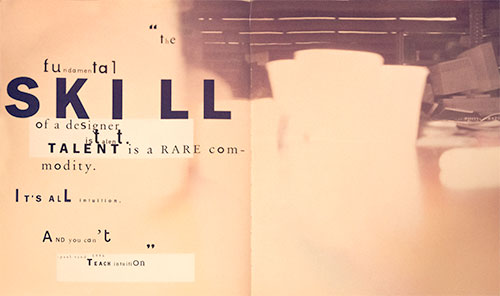
Establish – and then follow – good typographic hierarchy.
Use titles and subheads to create emphasis and get your point across before a viewer gets bored and clicks out of a page or a site. Also try using bold and italic versions, color, and case (caps, lowercase, or mixed case) to reinforce/emphasize content priority and maintain good flow.
Beware of small type.
Type size is one of the most important factors when designing with type on the Web. Small type is hard to read at the lower resolution of most screens and monitors. Go larger rather than smaller to ensure optimal reading on all monitors, as well as on smaller screens: laptops, iPads, and hand-held devices.
Avoid justified text
Justified text frequently leads to bad spacing, including the dreaded rivers of white space. What the viewer sees on the Web, typographically speaking, is dependent on several variables, including: browser, monitor settings, font style and size preferences, as well as platform (Mac or PC). This means that line breaks vary from computer to computer, which can lead to some truly awful spacing if text is justified. Stick with flush left or centered type.
Use smart punctuation
Smart punctuation including smart, or typographer’s quotes, as well as en and em dashes, rather than primes, double hyphens and other “dumb” typography. These professional typographic conventions are as appropriate on the Web as they are in print.
Use special effects sparingly.
You can create visual confusion by going overboard with gradients, shadows, and other special effects. Using them occasionally and wisely will go a long way toward emphasizing your type and creating pages that are engaging/attractive. Similarly, use a light hand with busy or cutesy icons, buttons, and starbursts.
Create high contrast
Create high contrast between the color of the type and the background. Achieve this by selecting light, neutral backgrounds for darker type (and the reverse). Avoid placing type on a busy background, which can make it hard to read.
Build in plenty of “white” space
Even when the white space is not white, around your type as well as in the overall design. Crowding type (as well as other elements) can make a Web page less inviting, more difficult to read, and just plain confusing.
Word Spacing

Determining the appropriate space between words in text type is more of an optical judgment call than an exact science. Several factors influence the decision, such as the overall width of a typestyle, the openness or tightness of the letter fit, the point size and, sometimes, even line spacing. A good starting point with text is to look at the width of the body of the lowercase ‘n’ or ‘o.’ Because word spacing should be proportionate with the typeface, wider designs require more space, and narrower ones require less. But don’t follow this guideline slavishly, as spacing might vary depending on the typeface and setting.

Word spacing in display type As type gets larger, its visual proportions change. Word spacing will occasionally look too open, especially if the typeface is intended for text settings. In addition, the word spacing often looks uneven due to the differing shapes of the characters surrounding the space. The best way to adjust the word spacing in display type is to use the kerning feature (yes, you can kern a space to a character!). This way you can customize each space depending on the characters surrounding it.

Finessing Typographic Details: Positioning Punctuation
Sometimes a subtle adjustment in a character’s position can make a big difference in the visual balance of your typesetting. Case in point: hyphens, en- and em-dashes, parentheses, braces and brackets will often look fine in lowercase settings, but can appear too low when set next to caps and lining figures. The larger the setting (in headlines, for example), the more noticeable this will be.

Why is this? During the production process, the position of punctuation marks is determined by the lowercase x-height of the font, since that’s the context in which these characters will most often be used. Unfortunately, this leaves them a little “depressed” when used within ALL CAP settings or with lining figures (keep an eye out for low-riding parentheses and hyphens in phone numbers, for example).

What to do about it? Use the baseline/shift feature of your layout program to slightly raise the offending character until it’s optically centered against the caps or lining figures.

Good Text Face Characteristics

What makes a good text typeface?

What makes a typeface good? With over 45,000 fonts on the market for print, and hundreds for use on the web, every designer should be asking this question – and learning how to answer it. Although some of the identifying characteristics of a good typeface are universal, others vary depending on whether the face is intended for text or display applications. This month we’ll discuss what makes a text typeface worth using.

Consistent design characteristics

A good text typeface will have consistent design characteristics throughout its full complement of characters. Check for consistency in cap and x-heights (including the overhangs of curved characters), character width, stroke width, ascenders, descenders, serif details (if any), as well as the individual nuances and idiosyncrasies of the design. Related fonts in a family should be similar in spirit, if not in actual design.

Legibility

Legibility is especially important in text typefaces, which are usually used at smaller sizes and for greater amounts of copy. Simply put, the legibility of a typeface is the ease with which it can be read. Legibility is a quality of the actual design of the typeface (as opposed to how the type is set). Factors which affect legibility include weight, character shapes, ascender and descender length, size of counters, stroke contrast, and character width.

Spacing

A typeface that is well-spaced looks neither too tight nor too open. Most importantly, it has even spacing overall between characters throughout the design (see kerning below for exceptions). NOTE: Those “free” fonts that you can find on the Internet are notorious for poor spacing, and are generally unsuitable for professional use.

Kerning

Even a typeface that is properly spaced will have specific character combinations that are too open or too tight (although a well-spaced design will have fewer of these than a more carelessly designed one). These awkward pairs can be improved with kerning, which is the addition or reduction of space between a particular combination of characters. High-quality typefaces have built-in kern pairs, which enhance an already well-drawn design.

Even color and texture

Even color and texture is probably the most important quality of a good text typeface. It’s the consequence of all of the above factors (a consistent and legible design, with good letter-spacing and built-in kerning) plus proper word spacing. You can tell that word spacing is correct when the typeface can be read easily, without the words either running together or getting separated by blocks of white space that interrupt the color and overall readability of the design. Clearly, there’s more to type design than the actual shapes of the characters. As you get in the habit of paying attention to these characteristics, your eye will get sharper. Soon, you’ll easily distinguish a well-designed text typeface from one that’s not worth your time and money.

Good Display Face Characteristics
The purpose of display type is first, to attract the reader’s attention, and second, to draw that reader into the text. To pull off this feat you need more than a good typeface – it has to be a good display typeface. Once you’ve chosen your type, you’ll still have to set your display text properly to maximize its effectiveness. The same typeface can have a markedly different “feel” and appearance when set at different sizes. That’s why, before selecting a typeface for display use, you should evaluate it at the size you’ll be using it. Here’s what to look for when choosing a display design. We’ll also discuss what simple adjustments you can make when setting your type that will help your display copy look and function at its best.

Design characteristics

A good display typeface should have a distinct, assertive personality. Whether it’s a decorative design with a flamboyant attitude (the “life of the party”), or a simple bold sans with minimal embellishments (the “strong, silent” type), a good display design makes a powerful and specific first impression. Consistency of design still matters in display faces. However, display applications may only consist of a few words or sentences. What’s more important than overall consistency is that the characters you’ll actually use in the headline look good and work well together to express the tone of the piece.

Legibility

Legibility in a display setting is only as important as your design objectives need it to be. This is a big difference between text and display settings. Think about it, though: smaller amounts of copy set at larger sizes make fewer demands on the reader. When choosing a display type, go for impact and expressiveness, rather than legibility alone.

Letter spacing

As type gets larger, the letter spacing tends to look more open. A typeface that was designed for display sizes might not need much in the way of letter spacing adjustments. However, if you’re working in large sizes with a typeface that was primarily intended for text, the letter spacing will probably appear too open. The solution? Use your design application’s tracking feature to tighten the letter spacing.

Word spacing

Like the space between letters, the space between words gets to be “too much” as type size scales upward. Reducing excess word spacing improves appearance and readability. How much is enough? Leave enough space to create a separation between the words, but not enough to create gaping white holes. This can most easily be accomplished by reverse kerning (yes, you can kern a space to a character!). The H&J (or justification) feature of your design software will let you make this adjustment as well.

Kerning

Kerning also changes with scale. A letter pair that seems perfectly kerned at a smaller size might look unbalanced and uneven when set larger. The bad news is that clumsy letter pairs will be all the more obvious at large sizes. The good news is, since there are fewer words in a headline setting, it’s easy to add your own custom kerns. Always look your display text over carefully and adjust any uneven combinations.

By choosing your display face carefully and then making the necessary adjustments to letter spacing, word spacing and kerning, you’ll be on your way to creating strong, effective display copy that will get your piece noticed.

Fine Typography Resource

Twenty-nine articles on Fine Typography. The difference between “just okay” typography and professional-level typography is usually in the details – like hyphenation. From fonts.com.

Hyphenation

Proper hyphenation is essential for optimum readability and getting your message across.

Hyphenated words are sometimes considered a necessary evil in typography, but proper hyphenation allows for a better-looking, tighter *rag – or, in the case of justified type, a more natural, even text color. Hyphenation also allows more words to be fit in a line, which saves space. Hyphenation is a CSS3 specification, and it is being implemented, otherwise, there are other solutions like Google’s hyphenator.js automatically hyphenates texts on websites if either the webdeveloper has included the script on the website or you use it as a bookmarklet on any site. It runs on any modern browser that supports JavaScript and the soft hyphen (&shy;). It automatically breaks URLs on any browser that supports the zero width space, and supports CSS3-hyphenation.

Hyphens, En-dashes and Em-dashes

Hyphens, en-dashes and em-dashes are frequently used punctuation marks that are just as frequently misunderstood. All three marks are essentially horizontal lines, though their lengths vary (as do, occasionally, their designs). However, these three different marks have very different purposes, and using a hyphen to do an m-dash’s job is just as much of a punctuation error as using a question mark in place of a comma.

  • A hyphen is the shortest in length of the three. It is used to divide words that break at the end of a line, or to connect parts of compound words such as go-between, ill-fated and run-of-the-mill. The hyphen is easily found on the keyboard to the right of the zero.
  • An em-dash is the longest of the three, and is used to indicate a break in thought — as illustrated in this sentence. It can also be used to separate a thought within a sentence — such as this one — which would then require an em-dash at the beginning and the end of the phrase.
  • The en-dash, which is shorter than an em-dash and longer than a hyphen, is used to indicate a range of values, such as a span of time or numerical quantities (similar to using the words “to” and “from”); for example, 9 AM – 5 PM, Monday – Friday or ages 5 – 8.
Type Sizes
What’s the point of a point system in which 24 points doesn’t always equal 24 points? It’s not pointless, but it does require some explanation!

What are points?

The point system is the standard unit of measurement for type. It originated centuries ago, when points referred to the size of the metal body that accommodated each character. Since each size of a typeface had to be cut individually, point size was determined by the distance from the height of the tallest ascender to the tip of the longest descender, plus a wee bit more.

The point system is still used today, although in digital type the original determining factors (ascenders and descenders) are not strictly adhered to. In print, 72 points equals about an inch. Does it then follow that all fonts set in 72 point look alike in size? Absolutely not! Here’s why: the actual appearance of a typeface at a particular size varies with the size of its ascenders, descenders and x-height. Therefore, a design with a tall x-height and/or short ascenders and descenders will usually look larger than one with opposite traits.

Choosing a point size

Because point size doesn’t tell you everything about how big a particular typeface will actually look, select type size optically. That is, let your eye guide you, not the numerical value of the font. Repeat the optical decision-making process every time you change typefaces, whether it’s for subheads, captions, lengthy quoted passages, or another reason. This is especially important in text sizes, where readability is strongly determined by point size.

Visual Alignment

Designers are used to being detail-oriented and mathematically precise, nudging things a point this way and a pixel that way until technical perfection is achieved. However, when it comes to typographic alignment, the mathematical approach to design doesn’t apply: it’s all in the eye of the beholder.

Visual alignment (also called optical alignment) means exactly that: using that high-tech tool, the human eye, to line up your text until it looks right.

Vertical alignment

Many designers are surprised to discover that using numerically consistent leading (or line spacing) does not assure visually consistent vertical spacing between lines of type. This is typically an issue when setting three or more lines of display type.

For example, if a line of type is all caps, it has no descenders. This creates more white space below it. An all caps line also has a taller height than lines with mostly lowercase characters, creating less white space above it. This is a perfect example of the need for visual alignment: adjust the spacing above and below all cap lines until it looks right, regardless of what the numbers say.

Similarly, in cases where lines with lots of ascenders and/or descenders are preceded or followed by lines with few or no ascenders and descenders, the lines will appear to have varying spacing even if the leading is exactly the same. Use visual alignment to adjust the leading between the lines until they look equidistant from each other.

Horizontal alignment

Visually “off” horizontal alignment can happen in both text and display type and is most easily apparent in flush left, flush right or justified copy. Why? Your computer aligns characters (including punctuation, figures and symbols) by the edge of the character plus its sidebearing (that’s the built-in space that surrounds a letter and is actually part of its design). The spacing of certain characters, such as a cap T or A or the numeral 1, as well as periods, commas, apostrophes, dashes and quotations marks, create a visual hole or indentation in the beginning or end of a line relative to the characters above and below.

This problem is most noticeable in larger settings such as headlines, subheads and initial letters. To solve it, move the line in or out until it visually aligns. (Depending upon your software, there are various ways to do this.) It’s helpful to look at your text from a slight distance when correcting problems, since it can be difficult to know how much of an adjustment is enough. When in doubt, less is more. Don’t try to adjust small-sized type or large blocks of text; it’s too time-consuming and the results are barely visible at text sizes.

Type And Color

When you think of type, what colors come to mind? Black type on white paper, right? It’s true that much of our daily contact with type is in books, newspapers and magazines, in which text is predominantly set in black ink on white (or light-colored) paper. Black type against a light background is the easiest combination to read. It’s also the least expensive to print. But don’t assume color and type don’t mix; on the contrary, color used well can add focus and energy to your message.

Why Use Color?

Color and typography work together in many ways. Color can attract attention to an element, help emphasize, contrast and organize content, reinforce impact and recognition, create a mood, strengthen an identity and even assist readability. Color and type interact dynamically in logos, packaging and product design, movie and video titles and credits, greeting cards, book covers, CDs and posters. Color can be critical in establishing powerful corporate identities and product branding.

The Internet has added another new dimension to the use of color and typography. Web sites aim to attract your attention quickly and keep it as long as possible, and color is a powerful tool for achieving this.

Succeeding With Color

Think of color as an accessory to a basic wardrobe, something to enhance an already strong foundation. Many designers actually design in black and white first, then add color as a separate step.

Readability should be your primary consideration when combining type and color. Contrast is the key: maintaining a high degree of contrast between type and background colors helps keep type readable, while reducing contrast reduces ease of reading.

Here are a few DOs and DON’Ts to help you make successful color choices:

  • DON’T tint type that has thin strokes.
  • DON’T drop out or reverse type that has very thin strokes.
  • DON’T set lengthy amounts of text on colored, tinted, or black backgrounds.
  • DO consider how web color will appear on all monitors.
  • DO maintain high contrast for optimal readability in all media (print and web).

While not a requirement for good typography, color is a fun, eye-catching element that can make a good design even better. The key is to use it tastefully and appropriately – as in all things typographic!

Smart Quotes
Smart quotes are usually curved in shape and have different opening and closing versions for use at the beginning and end of quoted material, respectively. Dumb (or straight) quotes are usually simple tapered vertical or angled marks. These are also referred to as “primes,” and should be used in numerical measurements to indicate inches (a double prime) and feet (a single prime). If you are using ascii to display your page, you need to supply the code, which is &ldquo; for the left double quote and &rdquo; for the right..

Apostrophes

Last but not least, don’t forget the apostrophes! Typographically speaking, an apostrophe is a closed single smart quote. Make sure to replace straight apostrophes with their smarter, curly cousins, code &risqué;

Rags, Widows & Orphans
Spacing and Kerning, Part 1

What makes a typeface look the way it does? The design of the letter shapes is a primary factor, but it’s by no means the only one. The spacing of a font has a large impact on how it looks when set, and should be a consideration when choosing and using a typeface.

Spacing

When we talk about a font’s spacing, or letter fit, we’re referring to the amount of space between the characters, which in turn gives the typeface its relative openness or tightness. A font’s spacing is initially determined by the manufacturer or designer and is somewhat size-dependent. Text designs tend to be spaced more openly than display faces. The reason? The smaller the point size, the more space is needed between letters to keep the characters legible. Conversely, as a typeface is set larger, a snugger fit between letters creates word-shapes that are easier to read.

Although spacing is dictated by personal taste as well as typographic trends (for example, seventies typefaces were fit more tightly than today’s fonts), the goal of good letter fit remains the same: to create even “color,” or visual texture, between all character combinations. It’s more difficult than it might seem, since the irregular shapes of many characters create some problematic letter combinations. This is where kerning comes to the rescue…

Kerning

Kerning refers to the adjustment of space between two specific characters, thus the term kerning pair. Most often, kerning implies a reduction of space, but it can also mean the addition of space. Kern pairs are created to improve the spacing between two letters when the normal spacing is less than ideal. A perfect example is the spacing between a cap ‘A’ and ‘V.’ Typically, both ‘A’ and ‘V’ would be spaced so the terminals of their diagonal strokes nearly touch the vertical stroke in the adjacent letter, like an ‘H.’ When a ‘A’ and ‘V’ are set next to each other, however, the spacing looks too open. Kerning adjusts the spacing to be optically correct.

Most fonts have between two hundred and five hundred built-in kern pairs. A high-quality font may have over a thousand kern pairs.

My font needs help!

If you have a favorite font but the spacing or kerning leaves something to be desired, don’t despair: you can do something about it. Today’s robust design programs have advanced type handling features that can make vast improvements to your typography

Spacing and Kerning, Part 2

Spacing (and tracking)

Fonts are spaced and kerned to look their best at certain sizes, but you might choose to set type that’s much smaller or larger. If the built-in spacing is not ideal for the way you use the font, try opening or closing the tracking. This will add or reduce the overall letter spacing in a selected block of text.

Tracking can be modified in design programs such as QuarkXPressâ„¢ by changing the “tracking value,” and in Adobe® Illustrator® by changing “desired letter spacing” in the Paragraph palette.

Kerning

The goal of kerning is to adjust the spacing between two characters that appear too open or too tight. Before you make any kerning adjustments in your document, make sure that kerning is turned on in the type preferences menu of your page-layout program. Note: Most word processing programs, as opposed to page-layout or design programs, don’t read kern pairs. If your goal is professional-looking type, invest in one of the more sophisticated page-layout applications.

Any serious design program has the capability of adjusting kerning manually (one pair at a time) in each document. There are often keyboard shortcuts for these functions, which are helpful when you’re making many adjustments.

In most cases, the kern changes you make apply only to the pair of letters you have highlighted, not the entire font. To keep your document consistent, don’t forget to search for all instances of that letter combination and kern them also. This is most important in headlines, where variances are obvious. Due to the difficulty of maintaining consistency, kerning large blocks of text should be kept to a minimum.

Learning to properly space and kern a font takes time, patience, and an experienced eye. A good rule of thumb is the old adage: “less is more.” Be conservative until you get the hang of it.

Emphasis: Italics and Boldface

Italics and Obliques

True-drawn italics (the ones that are an actual font, not just a computer-generated style) are angled typefaces, usually designed as adjuncts to a roman (or straight-up-and-down) design. Italics are usually quite distinct from their companion romans; they may have different design features and character widths, and often appear more calligraphic in style.

True-drawn obliques (again, not to be confused with computer-generated italics) are slanted versions of their roman companions, with few or no design changes. Both obliques and italics are used for emphasis in roman body text, but obliques offer much less contrast. While italics speak softly, obliques whisper.

Italics and obliques draw attention without making a major change in the color of the text. They’re ideal for creating subtle emphasis of words or phrases. Italics and obliques are also used to set off the titles of books, films, newspapers and periodicals, as well as foreign phrases. For maximum readability, use the same weight italic and roman (i.e: Book and Book Italic, not Book and Medium Italic). However, if a dramatic contrast is desired, try jumping two weights between roman and italic.

Boldface (or weight contrast) Boldface creates emphasis by contrasting lighter and heavier weights of the same typeface. Boldface is often used for captions, subheads and stand-alone words and phrases. Use boldface sparingly within text, and only where a strong emphasis is desired, because it creates a harsh visual interruption.

When setting boldface text with a typeface family that has gradual weight changes, try to jump at least two weights to create a meaningful contrast. A too-small weight contrast is ineffective and may even look like a mistake.

Justified Type
We’ve all seen newspapers, books, magazine articles and ads which use justified type; that is, type that is flush on both the left and right margins. Used well, justified type can look clean and classy. When it’s carelessly set, however, justified type can make your text look distorted and hard to read. Proper justification is a tricky technique to master, but it’s well worth the effort if high quality, professional-looking typography is your goal.

When type is justified, space is inserted between words and letters to expand a short line so that both margins align; conversely, in longer lines the space between words and characters is reduced to make them fit the margins. Some page layout applications have settings that will actually compress or expand the individual characters; don’t use these settings to justify text! This is the ultimate typographic taboo.

Too much additional space can create gaping holes between words, as well as rivers of white space flowing down your text. Too much compression makes type look cramped and squished, especially when compared to adjacent, generously spaced lines. All of this manipulation can severely degrade the color, texture and readability of your type.

With so many potential pitfalls, the wise designer will refrain from using justified type unless there’s a compelling reason to do so, and only when he or she has the time and flexibility to fine-tune the text.

Here are some tips for achieving smooth, readable justification:

  • The more words that fit on a line, the fewer problems you’ll have. Achieve this by making the line length a bit longer, or by reducing the point size of your type, even if only by a fraction.
  • If necessary, edit the text itself to fix lines that are too open or too tight. Try to reduce the number of lines with hyphenated endings, particularly if there are more than two in a row. It’s always possible to substitute short words for longer ones or trim convoluted sentences–your copywriter may welcome the chance to improve the writing, as well as the design!
  • Become familiar with your software’s hyphenation and justification (H&J) settings. You can usually adjust the word and character spacing parameters, as well as hyphenation preferences.
Creative Indents

Indenting the first line of every paragraph is a habit most of us acquired in grammar school. However, for those daring souls who have always insisted on coloring outside the lines, it’s time to consider using a different style paragraph indent. There are more options than you might have realized!

The purpose of an indent is to create a visual separation between paragraphs. The most commonly used indent is the first line indent. There’s no hard-and-fast rule about how much to indent your first lines, but make sure the space is proportionate to the size and column width of your text. Feel free to omit the indent from the first paragraph, since there is no need to separate the beginning of the copy from anything else.

If you have lots of space and lots of copy, try a hanging indent, or outdent. This dramatic technique is actually the opposite of an indent, in that the first line extends out to the left of the paragraph. It’s a useful trick to liven up body text, especially when there are few or no graphic elements, such as photographs or illustrations.

For small amounts of copy, try something more decorative: use a dingbat or any simple graphic element to separate the paragraphs. Do this in one of two ways: either run the paragraphs into each other with only the dingbat (and added space around it) separating them, or place a dingbat between two paragraphs which are separated by a line space.

When you have room to spare and want a cleaner, more open look, separate the paragraphs with an extra line space instead of an indent. This style is often used in correspondence, and works well in long blocks of text when saving space is not a consideration.

It’s About Legibility
Typographic clarity comes in two flavors: legibility and readability. What’s the difference? Legibility is a function of typeface design. It’s an informal measure of how easy it is to distinguish one letter from another in a particular typeface. Readability, on the other hand, is dependent upon how the typeface is used. Readability is about typography. It is a gauge of how easily words, phrases and copy can be read.

Type For The Web
Are there fonts which are better than others to overcome the drawbacks of low screen resolution? Are there fonts ideally suited to creating dynamic web graphics? You bet!

Scripts: A Type of Passion
Most typefaces, however beautiful or well-drawn, add merely the subtlest nuance to the words they compose. Scripts, on the other hand, bring something dramatic to typeset copy. Scripts are emotional, lyrical, even passionate communicators. Words that are set in script faces make an impact far greater than their literal meaning could convey.

Typefaces in digital format
With the advent of desktop publishing, type design and manufacturing entered a new era. Learn all about digital type.

WGL Fonts
WGL fonts contain a pan-European character set that supports Western, Central and Eastern European languages.

Font Glossary
An alphabetical glossary of typographic tems.

Anatomy of a Character
How do you tell one typeface from another? If you’re trying to distinguish Helvetica from Times Roman, the difference is obvious. In other cases the differences can be subtle and difficult for the less–experienced eye to see.

Small Caps

This little gem explains the novelties of “true-drawn” small caps and why they’re often a better solution than all caps.

Oldstyle Figures
Oldstyle figures are a style of numeral which approximate lowercase letterforms by having an x-height and varying ascenders and descenders. They are considerably different from the more common “lining” (or “aligning”) figures which are all-cap height and typically monospaced in text faces so that they line up vertically on charts. Oldstyle figures have more of a traditional, classic look. They are only available for certain typefaces, sometimes as the regular numerals in a font, but more often within a supplementary or expert font. The figures are proportionately spaced, eliminating the white spaces that result from monospaced lining figures, especially around the numeral one.

Initial Letters
An initial letter (or initial cap, as they are also called) is an enlarged letter that is used as the first character of a paragraph. It can sit above, below, to the left of, or even behind the body text, and can be set in a contrasting weight, style or color.

06 Web Typography

The web has changed when it comes to typography. For the first twenty years we could specify only a few fonts.

In 2008, there were 18 fonts to use. The core fonts licensed by Microsoft are: Andale Mono, Arial, Arial Black, Comic Sans MS, Courier New, Georgia, Impact, Times New Roman, Trebuchet MS, Verdana, Webdings. Apple added a few more, like Helvetica and Times. That was it.

By 2011, there were thousands of fonts available. What a change.

It’s about time. The tools are now in place to bring out the inner typography artist, if not scientist, in you.

While typography’s been around for hundred’s of years, it has only been in the last hundred or so years that it’s become both an art and a science.

The art and science of typography forced typographers to ply their craft in the service of the end user who reads it. That makes them the original user experience designers, so take heed.

But the web is different from print. The user is in charge in a way that is foreign to print. The attention span is different, and the typography should facilitate the user experience as soon as they arrive on the page.

The typographic defaults that we take for granted took their shape from the years of experience in the print world, but that does not mean that you have to accept these defaults by which to express your content.

You will be required to deviate from the standard web fonts like Arial, Helvetica, Verdana and Georgia. These are a common set of fonts supplied by the operating system that have defined typography on the web for far too long. They are safe, legible and entirely predictable.

It is possible that legibility may suffer some, in favor of better expression of the content, but this is a brave new world, so please push the typography if you can. Besides, it has been documented that legibility isn’t all that its been cracked up to be when it comes to retaining information.

On the one hand, the legibility of a typeface is its invisibility, that is, just like the cuts in a movie and they are not supposed to draw attention to themselves but convey the content in service to the story. The typeface and the way it is laid out should transparently facilitate the content to the user, whose focus, after all, is on what is being said.

But if you want the delivery of the content to express something, it better have style. It’s possible to do both, and in the name of communication, you may even forgo some legibility, if that is what it takes.

David Carson famously did this twenty years ago, designing, among other things, covers for HOW magazine which I was writing for. If we need an expanded vision to counterbalance all of the rules, we can visit his work, with the understanding that rules are meant to be broken, with intelligence and purpose, and if the content demands it.

Honor the content with your typography, so that it aids in the facilitation of that content. After all, it is only through reading the letterforms that the content can be transmitted. As a designer, you have the power to determine that gateway.

Balance function and beauty, or whatever emotion grabs you to fulfill that function with style. Be playful, lively, think your way through the problem, but let the solution be surprising, and just have fun! Having fun is contagious, and if you exhibit joyful creation, it is bound to be infectious.

Here’re two spreads on intuition from David Carson’s 2nd Sight, his influential book on graphic design after the end of print. There is a TED talk and another one of his creations in the homework. Let that get you started.

David Carson from 2nd Sight
The Fundamental Skill of a designer is talent. Talent is a rare commodity. It’s all intuition. And you can’t teach intuition. — Paul Rand
David Carson from 2nd Sight
Intuition doesn’t look at things as they are: that is prison, that is anathema to the intuitive. He looks, oh, so ever so shortly at things as they are and moves off into an unconscious process, at the end of which he has seen something nobody else would have seen — C.G. Jung