We will use an external style sheet. Create a folder called “CSS” and a file called “style.css” External style sheets are just blank files, filled with css rules attached to selectors that target the elements in the HTML document.
If we were to start adding rules, we would be adding our rules on top of the default rules of the browser. Since we do not want to depend on the rules of this or that browser, we neutralize them with a browser reset.
After the Browser reset, we begin by writing that this is where the user style sheets starts.
/*USER STYLES*/
We start by targeting the most general tags, and slowly work our way to more specific tags.
The most general tag is the <body> tag. Do we want to keep the white background? What fonts do we want, etc? How about:
body {
background: hsla(0,100%,70%,1);
font: 400 1.5em/1.6em "Times New Roman", Georgia, Serif;
}
Be careful with this font property, as it combines a number of properties, and you need to execute it exactly as it is here. 400 refers to the weight of the font. 400 is normal. 700 is bold. 1.5/1.6 provides us with both the font size and the line height. I then name the font family, were Times New Roman is requested, and if that is not available , Georgia, then any serif font. See Class 6 for more font information.
Since every other tag will be written inside the body tag, they will inherit some of these properties. The font property is inheritable, the background property is not.
The next strategy is to limit the width of the window when looking at the website on a computer screen, and to center it in the middle. We limit the width to 940px and place it in the middle by using the CSS property margin with value auto like so: margin: auto;.
The background of the section tag is only as large as the information inside of the tag. Right now it takes on the size of the picture. Let’s swap the picture with the text that one of you has written. The section expands to contain the new content.
The CSS reset has reset most properties, so we need to define all of our CSS. We start by providing the section tag with 40px padding. This keeps the content from hitting the edges of the section tag.
Save the document, make the browser window active by clicking on it and hit command-R to refresh the browser.
We can keep the top from touching the top of the window by giving it a positive top and bottom margin. This is done by adding 40px before the auto. margin: 40px auto;
CSS always starts on top, then goes clockwise, to the right, bottom, and finally left. If you only have one value, all sides take on that number. If you specify two numbers, the first signifies the top and bottom, the second the right and left sides. If there are three numbers, you can give different values to the top and bottom, and the sides stay the same. With four values all the sides are specified separately.
Let’s define the section by adding a #444 border. We can do that with a shortcut that allows us to specify width, kind and color at the same time; border: 3px solid #444;
The entire code for the section now looks like this:
What if I were to give the header a background color? If I color the header, it looks kind of clumsy, because of the padding I gave the section. I want to counteract that by giving the header negative margins for each side, but not the top or bottom. That is accomplished by margin: 0 -60px; Giving it a little extra makes it stick out over the section, and has the effect of raising the header above the rest of the document, which helps define its importance in the visual hierarchy. I also want a little space between the header and whatever comes next. 30px should do it. margin: 0 -60px 30px; I give it a border border: 1px solid #444; and 20px of padding to finish it off.
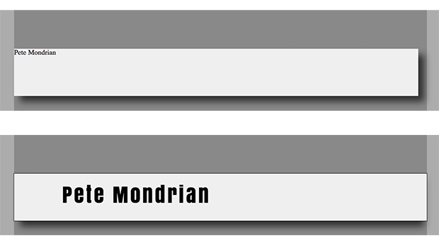
Next up is to style the h1 header. If we make it 2em (that is a size based on the width of an em dash). OK, that is not brash enough. Lets go with 4em. The serif font does not work and I change it to Helvetica. There are more interesting fonts available, but for now, lets keep it simple.
The navigation is a list. Lists items by default act like blocks. That means they go down like paragraph returns. We want them to go across, so we need to target the list items in the header and change the display from block to inline-block. With a little margin we can separate the menu items. We can go further, but lets leave that till class 5.
header li {
display: inline-block;
margin: 0 10px;
}
It is easy to have paragraphs display one below the other. It is more difficult to display them side by side. Going vertical is natural, going horizontal is what will give you your headaches.
To give us some practice, I will demonstrate the float technique to place items horizontally. This is the technique used by the NYTimes.com to create their layout. You can see this for yourself by installing the Plugin. Click on the bug that is installed to the right of your address bar, select outline in the pop-up and select outline frames. You will see almost every box in the layout light up.
The float technique was originally used for floating pictures, but five years ago it was adopted by the NYTimes to float layout elements. Tables were used for layout before that time.
The first step is to float an image to the right. Create a figure, img and figcaption and link to an appropriately sized picture. Since I may want to move pictures to the right more often, I create a class called pict-r, and use the class attribute in the figure class="pict-r" . A selector for the class is placing a period before pict-r in the CSS style sheet .pict-r . I also specify a smaller font for the caption, and align it to the right, and put a border on the image, though I offset it by 2px using padding.
The picture moves to the right. The caption is flush right. The picture has a border around it, and the text runs around that picture.
We use the same idea, but now we float a layout element to the left. THe layout element is created by introducing a div in the markup that encloses the text I want to float to the left.
This time I use an ID to target the div. An ID can only to used once on a page. The id attribute is placed in the div tag: id="left" and in the style sheet, a hashtag is used as the selector: #left
I used percentages as an easy way to figure out the width. It is always a percentage of the width of the parent element. I could have figured out the pixels values and done it that way as well.
When I decided to put a top and bottom holding line it, a problem arose, and I needed to push the last paragraph below the float. There is a CSS property to do this, called clear, meaning clear float. That allowed me to put the last paragraph below the two columns.
To finish it off, I gave the paragraphs a 13px spacing at the bottom.
If you have not yet completed all 7 steps of the previous assignment, please do so. Step 7 is a Photoshop comp. Please recreate this in HTML and CSS using an external style sheet.
I want to see the intermediary step, to check and see if all elements are selected. Turn the background of each element into alternating colors, i.e. background: red;, background: orange;, background: yellow;, so that it’s easy to see that all elements are selected. Try to select them using type selectors and being specific. Writing header nav li {} to target the list items in the navigation element that is in the header. If it is not possible to select it that way, try using pseudo selectors li:first-child{} for example, and if that is not possible, use a class. Avoid using id because it is very powerful, and in complicated style sheets, its overuse can lead to difficulties, requiring the use of the important! to override styles, which is really not something we want to do.
Save one page of the assignment in this state and link it to the portal.
Once you have your selectors in place, create rules using absolute positioning for each element and make the web page look like your photoshop comp. Don’t worry if you cannot get it to look exactly right.
Do the best you can. We will cover CSS layout strategies next week, and you will get a chance to do the exercise again.
Here is an example first created in Illustrator and then translated into HTML to start you off. Know that the project requirements have changed, but it gives you an idea.
This assignment uses some CSS3 properties which you will learn about later, but you can play with the CSS3 generators and use these properties now. Click on the picture to see the actual page in HTML/CSS.
Grading Criteria
I am looking to see if you are developing the CSS skills to present the content according to your own critical design directives. You need to develop good technique, not for the simple rule assignment you are now doing, but for more complicated rule assignments ahead, when the cascade rears its sometimes ugly head as you try to keep track of all the inheritance and selector issues.
This requires more than knowing the proper method, because the conflicts are not always so easy to manage. Experience will teach you, but that means you have to make mistakes. Try not to make the little mistakes, like leaving out a semicolon, or misspelling a value. Those are a lot like hitting a wall. To prevent from becoming lost, validate often, and you can catch the little mistakes before they compound into a full-blown mess.
You can see in the CSS demos the havoc that broken CSS code brings. One mistake and the whole thing fails to render, or renders incorrectly. This is why I put emphasis on learning to do it right from the beginning, for problems will only compound as the document tree and the number of CSS rules become more complicated.
As for the creative methodology: you are at Parsons. That means you enjoy conceptual and visual problem solving. Be clear and logical in identifying the problem and the solution, but move me in how you implement that. Show me.
I will be grading you on levels of confidence, consistency, creativity, innovation, precision, accuracy, efficiency and the ingenuity by which you are able to solve the problems.
Introduction to CSS (cascading style sheets). CSS is the design language for the web. The mechanics of how CSS integrates with HTML and the most-used properties. Activity: Highlight content using CSS selectors. Activity: Following your Photoshop comp, style markup.
Turn your Photoshop sketches into HTML and CSS wireframe. Test CSS selectors by targeting each element and change its background color. Develop your design, brand, written content and images to make your portfolio website. Read chapters 7-10. Due: The following week.
Materials
Additional materials for this unit can be found by following these links (46 pages):
Examples from the past two classes can be found by following these links. Use them for inspiration and reference, but do your thing. That is what I will be grading on.
Lynda.com is a resource for instructional videos. She has been at it for a long time, and there are a lot of videos on HTML (34) and CSS (36). They can be a great resource, and in addition to my performance in class, the class notes and portal, the good and the web itself, there are no reason for not knowing. That said, there are too many titles to intuitively know what to do, and this section will appear whenever there are supporting videos at Lynda.com
Cheat Sheets that list all of the different HTML5 and CSS3 tags you can use. Print them out, use them. explore. You will be able to use these during the quiz:
HTML5 Cheat Sheet all of the different tags and the attributes they can have.
CSS3 Cheat Sheet all of the different properties and all possible values or value types they take.
Install these Plug-ins for Firefox and Chrome. They will facilitate your web development. Do not forget to activate the Show Developer menu in menu bar under the Advanced tab in Safari’s Preferences.
rule or ruleset: A selector + braces combo, or an at-rule.
declaration block: A sequence of declarations.
declaration: A property + colon + value combo.
property value: The entire value of a property.
component value: A single piece of a property value. Like the 5px in text-shadow: 0 0 5px blue;. Can also refer to things that are multiple terms, like the 1-4 terms that make up the background-size portion of the background shorthand.
term: The basic unit of author-facing CSS, like a single number (5), dimension (5px), string ("foo"), or function. Officially defined by the CSS 2.1 grammar (look for the ‘term’ production)
outer <anything>: Refers to the margin box.
inner <anything>: Refers to the content box.
start/end/before/after: Refers to the logical directions, which are dependent on the ‘direction’ and ‘writing-mode’ properties. start and end are in the “inline” axis, the axis that a line of text is laid out in (horizontal in English text). Perpendicular to that, before and after are in the “block” axis, the axis that block elements are laid out in (vertical in English text).
simple selector: A single atomic selector, like a type selector, an attr selector, a class selector, etc.
compound selector: One or more simple selectors without a combinator. div.example is compound, div > .example is not.
complex selector: One or more compound selectors chained with combinators.
combinator: The parts of selectors that express relationships. There are four currently – the space (descendant combinator), the greater-than bracket (child combinator), the plus sign (next sibling combinator), and the tilda (following sibling combinator).
sequence of <anything> selectors: One or more of the named type of selector chained with commas.
The following terms are terms taken from w3.org CSS definition list. Many of these terms are technical, and for the sake of precision, these definitions obfuscate rather than clearly explores what they are saying, for most of them are really very basic. I though that exposure to the technical definitions would be a good idea:
Style sheet
A set of statements that specify presentation of a document.
The validity of a style sheet depends on the level of CSS used for the style sheet. All valid CSS1 style sheets are valid CSS 2.1 style sheets, but some changes from CSS1 mean that a few CSS1 style sheets will have slightly different semantics in CSS 2.1. Some features in CSS2 are not part of CSS 2.1, so not all CSS2 style sheets are valid CSS 2.1 style sheets.
A valid CSS 2.1 style sheet must be written according to the grammar of CSS 2.1. Furthermore, it must contain only at-rules, property names, and property values defined in this specification. An illegal (invalid) at-rule, property name, or property value is one that is not valid.
Source document
The document to which one or more style sheets apply. This is encoded in some language that represents the document as a tree of elements. Each element consists of a name that identifies the type of element, optionally a number of attributes, and a (possibly empty) content. For example, the source document could be an XML or SGML instance.
Document language
The encoding language of the source document (e.g., HTML, XHTML, or SVG). CSS is used to describe the presentation of document languages and CSS does not change the underlying semantics of the document languages.
Element
(An SGML term, see [ISO8879].) The primary syntactic constructs of the document language. Most CSS style sheet rules use the names of these elements (such as P, TABLE, and OL in HTML) to specify how the elements should be rendered.
Replaced element
An element whose content is outside the scope of the CSS formatting model, such as an image, embedded document, or applet. For example, the content of the HTML IMG element is often replaced by the image that its “src” attribute designates. Replaced elements often have intrinsic dimensions: an intrinsic width, an intrinsic height, and an intrinsic ratio. For example, a bitmap image has an intrinsic width and an intrinsic height specified in absolute units (from which the intrinsic ratio can obviously be determined). On the other hand, other documents may not have any intrinsic dimensions (for example, a blank HTML document).
User agents may consider a replaced element to not have any intrinsic dimensions if it is believed that those dimensions could leak sensitive information to a third party. For example, if an HTML document changed intrinsic size depending on the user’s bank balance, then the UA might want to act as if that resource had no intrinsic dimensions.
The content of replaced elements is not considered in the CSS rendering model.
Intrinsic dimensions
The width and height as defined by the element itself, not imposed by the surroundings. CSS does not define how the intrinsic dimensions are found. In CSS 2.1 only replaced elements can come with intrinsic dimensions. For raster images without reliable resolution information, a size of 1 px unit per image source pixel must be assumed.
Attribute
A value associated with an element, consisting of a name, and an associated (textual) value.
Content
The content associated with an element in the source document. Some elements have no content, in which case they are called empty. The content of an element may include text, and it may include a number of sub-elements, in which case the element is called the parent of those sub-elements.
Ignore
This term has two slightly different meanings in this specification. First, a CSS parser must follow certain rules when it discovers unknown or illegal syntax in a style sheet. The parser must then ignore certain parts of the style sheets. The exact rules for which parts must be ignored are described in these sections (Declarations and properties,Rules for handling parsing errors,Unsupported Values) or may be explained in the text where the term “ignore” appears. Second, a user agent may (and, in some cases must) disregard certain properties or values in the style sheet, even if the syntax is legal. For example, table-column elements cannot affect the font of the column, so the font properties must be ignored.
Rendered content
The content of an element after the rendering that applies to it according to the relevant style sheets has been applied. How a replaced element’s content is rendered is not defined by this specification. Rendered content may also be alternate text for an element (e.g., the value of the XHTML “alt” attribute), and may include items inserted implicitly or explicitly by the style sheet, such as bullets, numbering, etc.
Document tree
The tree of elements encoded in the source document. Each element in this tree has exactly one parent, with the exception of the root element, which has none.
Child
An element A is called the child of element B if and only if B is the parent of A.
Descendant
An element A is called a descendant of an element B, if either (1) A is a child of B, or (2) A is the child of some element C that is a descendant of B.
Ancestor
An element A is called an ancestor of an element B, if and only if B is a descendant of A.
Sibling
An element A is called a sibling of an element B, if and only if B and A share the same parent element. Element A is a preceding sibling if it comes before B in the document tree. Element B is a following sibling if it comes after A in the document tree.
Preceding element
An element A is called a preceding element of an element B, if and only if (1) A is an ancestor of B or (2) A is a preceding sibling of B.
Following element
An element A is called a following element of an element B, if and only if B is a preceding element of A.
Author
An author is a person who writes documents and associated style sheets. An authoring tool is a User Agent that generates style sheets.
User
A user is a person who interacts with a user agent to view, hear, or otherwise use a document and its associated style sheet. The user may provide a personal style sheet that encodes personal preferences.
User agent (UA)(otherwise known as a web browser)
A user agent is any program, for example, the web browser, that interprets a document written in the document language and applies associated style sheets according to the terms of this specification. A user agent may display a document, read it aloud, cause it to be printed, convert it to another format, etc.
An HTML user agent is one that supports one or more of the HTML specifications. A user agent that supports XHTML [XHTML], but not HTML is not considered an HTML user agent for the purpose of conformance with this specification.
Property
CSS defines a finite set of parameters, called properties, that direct the rendering of a document. Each property has a name (e.g., ‘color’, ‘font’, or border’) and a value (e.g., ‘red’, ’12pt Times’, or ‘dotted’). Properties are attached to various parts of the document and to the page on which the document is to be displayed by the mechanisms of specificity, cascading, and inheritance (see the chapter on Assigning property values, Cascading, and Inheritance).
The browser has a default style sheet, and if you do not neutralize it, you will be adding your styles on top of its styles. Worse, different browsers can have different style sheets, and individuals can personalize the browser’s style sheet. An example: Safari’s default style sheet. To counter this we implement a css reset. There are two to choose from.
The first is by Eric Meyer, who created the first popular reset in 2007, and recently released this second version:
The second reset is called Normalize. It is a more nuanced approach that tries to do as little as possible and attempts to harmonize the browser defaults instead:
/*! normalize.css 2011-09-22T17:42 UTC - http://github.com/necolas/normalize.css */
/* =============================================================================
HTML5 display definitions
========================================================================== */
/*
* Corrects block display not defined in IE6/7/8/9 & FF3
*/
article,
aside,
details,
figcaption,
figure,
footer,
header,
hgroup,
nav,
section {
display: block;
}
/*
* Corrects inline-block display not defined in IE6/7/8/9 & FF3
*/
audio,
canvas,
video {
display: inline-block;
*display: inline;
*zoom: 1;
}
/*
* Prevents modern browsers from displaying 'audio' without controls
*/
audio:not([controls]) {
display: none;
}
/*
* Addresses styling for 'hidden' attribute not present in IE7/8/9, FF3, S4
* Known issue: no IE6 support
*/
[hidden] {
display: none;
}
/* =============================================================================
Base
========================================================================== */
/*
* 1. Corrects text resizing oddly in IE6/7 when body font-size is set using em units
* http://clagnut.com/blog/348/#c790
* 2. Keeps page centred in all browsers regardless of content height
* 3. Prevents iOS text size adjust after orientation change, without disabling user zoom
* www.456bereastreet.com/archive/201012/controlling_text_size_in_safari_for_ios_without_disabling_user_zoom/
*/
html {
font-size: 100%; /* 1 */
overflow-y: scroll; /* 2 */
-webkit-text-size-adjust: 100%; /* 3 */
-ms-text-size-adjust: 100%; /* 3 */
}
/*
* Addresses margins handled incorrectly in IE6/7
*/
body {
margin: 0;
}
/*
* Addresses font-family inconsistency between 'textarea' and other form elements.
*/
body,
button,
input,
select,
textarea {
font-family: sans-serif;
}
/* =============================================================================
Links
========================================================================== */
a {
color: #00e;
}
a:visited {
color: #551a8b;
}
/*
* Addresses outline displayed oddly in Chrome
*/
a:focus {
outline: thin dotted;
}
/*
* Improves readability when focused and also mouse hovered in all browsers
* people.opera.com/patrickl/experiments/keyboard/test
*/
a:hover,
a:active {
outline: 0;
}
/* =============================================================================
Typography
========================================================================== */
/*
* Addresses styling not present in IE7/8/9, S5, Chrome
*/
abbr[title] {
border-bottom: 1px dotted;
}
/*
* Addresses style set to 'bolder' in FF3/4, S4/5, Chrome
*/
b,
strong {
font-weight: bold;
}
blockquote {
margin: 1em 40px;
}
/*
* Addresses styling not present in S5, Chrome
*/
dfn {
font-style: italic;
}
/*
* Addresses styling not present in IE6/7/8/9
*/
mark {
background: #ff0;
color: #000;
}
/*
* Corrects font family set oddly in IE6, S4/5, Chrome
* en.wikipedia.org/wiki/User:Davidgothberg/Test59
*/
pre,
code,
kbd,
samp {
font-family: monospace, serif;
_font-family: 'courier new', monospace;
font-size: 1em;
}
/*
* Improves readability of pre-formatted text in all browsers
*/
pre {
white-space: pre;
white-space: pre-wrap;
word-wrap: break-word;
}
/*
* 1. Addresses CSS quotes not supported in IE6/7
* 2. Addresses quote property not supported in S4
*/
/* 1 */
q {
quotes: none;
}
/* 2 */
q:before,
q:after {
content: '';
content: none;
}
small {
font-size: 75%;
}
/*
* Prevents sub and sup affecting line-height in all browsers
* gist.github.com/413930
*/
sub,
sup {
font-size: 75%;
line-height: 0;
position: relative;
vertical-align: baseline;
}
sup {
top: -0.5em;
}
sub {
bottom: -0.25em;
}
/* =============================================================================
Lists
========================================================================== */
ul,
ol {
margin: 1em 0;
padding: 0 0 0 40px;
}
dd {
margin: 0 0 0 40px;
}
nav ul,
nav ol {
list-style: none;
list-style-image: none;
}
/* =============================================================================
Embedded content
========================================================================== */
/*
* 1. Removes border when inside 'a' element in IE6/7/8/9, FF3
* 2. Improves image quality when scaled in IE7
* code.flickr.com/blog/2008/11/12/on-ui-quality-the-little-things-client-side-image-resizing/
*/
img {
border: 0; /* 1 */
-ms-interpolation-mode: bicubic; /* 2 */
}
/*
* Corrects overflow displayed oddly in IE9
*/
svg:not(:root) {
overflow: hidden;
}
/* =============================================================================
Figures
========================================================================== */
/*
* Addresses margin not present in IE6/7/8/9, S5, O11
*/
figure {
margin: 0;
}
/* =============================================================================
Forms
========================================================================== */
/*
* Corrects margin displayed oddly in IE6/7
*/
form {
margin: 0;
}
/*
* Define consistent border, margin, and padding
*/
fieldset {
border: 1px solid #c0c0c0;
margin: 0 2px;
padding: 0.35em 0.625em 0.75em;
}
/*
* 1. Corrects color not being inherited in IE6/7/8/9
* 2. Corrects alignment displayed oddly in IE6/7
*/
legend {
border: 0; /* 1 */
*margin-left: -7px; /* 2 */
}
/*
* 1. Corrects font size not being inherited in all browsers
* 2. Addresses margins set differently in IE6/7, FF3/4, S5, Chrome
* 3. Improves appearance and consistency in all browsers
*/
button,
input,
select,
textarea {
font-size: 100%; /* 1 */
margin: 0; /* 2 */
vertical-align: baseline; /* 3 */
*vertical-align: middle; /* 3 */
}
/*
* Addresses FF3/4 setting line-height on 'input' using !important in the UA stylesheet
*/
button,
input {
line-height: normal; /* 1 */
}
/*
* 1. Improves usability and consistency of cursor style between image-type 'input' and others
* 2. Corrects inability to style clickable 'input' types in iOS
* 3. Corrects inner spacing displayed oddly in IE7 without effecting normal text inputs
* Known issue: inner spacing remains in IE6
*/
button,
input[type="button"],
input[type="reset"],
input[type="submit"] {
cursor: pointer; /* 1 */
-webkit-appearance: button; /* 2 */
*overflow: visible; /* 3 */
}
/*
* 1. Addresses box sizing set to content-box in IE8/9
* 2. Addresses excess padding in IE8/9
*/
input[type="checkbox"],
input[type="radio"] {
box-sizing: border-box; /* 1 */
padding: 0; /* 2 */
}
/*
* 1. Addresses appearance set to searchfield in S5, Chrome
* 2. Addresses box sizing set to border-box in S5, Chrome (include -moz to future-proof)
*/
input[type="search"] {
-webkit-appearance: textfield; /* 1 */
-moz-box-sizing: content-box;
-webkit-box-sizing: content-box; /* 2 */
box-sizing: content-box;
}
/*
* Corrects inner padding displayed oddly in S5, Chrome on OSX
*/
input[type="search"]::-webkit-search-decoration {
-webkit-appearance: none;
}
/*
* Corrects inner padding and border displayed oddly in FF3/4
* www.sitepen.com/blog/2008/05/14/the-devils-in-the-details-fixing-dojos-toolbar-buttons/
*/
button::-moz-focus-inner,
input::-moz-focus-inner {
border: 0;
padding: 0;
}
/*
* 1. Removes default vertical scrollbar in IE6/7/8/9
* 2. Improves readability and alignment in all browsers
*/
textarea {
overflow: auto; /* 1 */
vertical-align: top; /* 2 */
}
/* =============================================================================
Tables
========================================================================== */
/*
* Remove most spacing between table cells
*/
table {
border-collapse: collapse;
border-spacing: 0;
}
This will have happened before many of you were born, though I remember it well. In the late 1980 and the early 1990’s desktop publishing was born with programs like PageMaker, a program whose reincarnation would be named InDesign.
What liberated the designers was the ability to put content anywhere. Be it text or pictures, the content is always contained in a box. PageMaker and Indesign can position these boxes anywhere on the page.
Those who knew how these programs worked would make sure that they used the numerical coordinates to accurately position the boxes, and not just rely on guides or to do it by eye. It was easy to see how many inches a box was from the upper left corner of the document that represented the default 0 point.
Each box in InDesign (or Illustrator, for that matter) has four numbers associated with it: the horizontal distance (x) from the point of origin, the vertical distance (y), the width and the height. This is the same for each element that is absolutely positioned in HTML and CSS. We are going to use that to layout the bio.
The Document’s Default Behavior
In the first homework assignment you marked up content using heads <h1>–<h6> and paragraphs <p>, added links <a> and images<img>, and grouped certain content together using the generic <div> or the more semantic HTML5 tags like <header>, <nav>, <section>, <article>, <figure> and <figcaption>.
At this time you did not nest too many tags inside of other tags, but know that every tag you created was already nested as a child of the body tag. As you develop the layout, you will increasingly nest tags inside of one another, usually to define and group an area of the layout, like the header, right column, main content, navigation or footer.
When you look at the first assignment, you see the browser’s default style at work. The content vertically lines up, one below another, while the text flows left to right.
To better understand this structure, change the embedded style included in the HTML5 template, which currently looks like this:
<style type="text/css">
.example {
}
</style>
To an embedded style that puts an outline or border on all elements, like this:
A red outline is put on the elements that are displayed according to the block mode and a green border is put on the elements that are displayed according to the inline mode.
Each element of the assignment now has an outline or border.
Take a moment and explore the way the red outlined block elements stack below one another. Each element’s width extends all the way out to the parent by default.
Inline elements with green borders styles the content (type) in block elements, flowing from insertion point to the end of the box. It then start over on the next line. Not all languages flow horizontally or left to right, though english does, so we can say that type starts left and flows horizontally.
The default display of the content is that the block elements flow down one below the other from the top of the page The absolute display mode radically changes this by completely removes elements from the default document flow.
There is no need to keep this style, so you can remove it by commenting it out using the CSS commenting convention: /* comments */. That way it is still there is you ever want to see the block elements outlined in red.
It is also possible to just break a property inside a CSS rule by misspelling it, as it will just be ignored. Insert a special letter combination, and be consistent in your used of it, like -break-, as in out-break-line: 2px solid red;. It is the possible to quickly searched for -break- and find them. This is handy when stylesheets become big and need to be more carefully managed.
Styling the Elements
I use an embedded style sheet for this example, but you should use an external style sheet. You then need to write selectors that select all the elements on the page. You could do this by giving each element an id or class, but we want to be more efficient, and so first try to select the elements using type and pseudo selectors if possible.
The best selectors to use are type selectors. They select the element by its type, i.e. p for selecting all paragraphs. You can combine them to get more specific, like article div p, which targets only those paragraphs in the div in the article. If that doesn’t work, you can use the pseudo class selectors like :nth-child(N) or use class selectors if you want to target certain elements.
Avoid using ids, as they are much stronger than classes and tend to dominate the cascade hierarchy. To great a reliance on ids takes away a lot of the flexibility built into the CSS cascade.
Select each of the elements in the document and change the background color to know that you have successfully targeted that element with a CSS rule.
Altering the Default Layout Order
The block elements are like a child stacking playing blocks one on top of the other, only upside down, starting from the top with one box below the other. This is the normal document flow mode, and it is similar to how a word processor works. The difficulty of laying out a document using the normal document flow is that you have to build your way to every part of the document. The benefit is that if one thing changes, everything else adapts, if it’s done right.
Most Design students layout their documents using Indesign (Illustrator, or even Photoshop). The activity of creating and moving design elements where you want them is what layout is all about.
Forget the normal document flow! Click on an object and move it to where you want it to be.
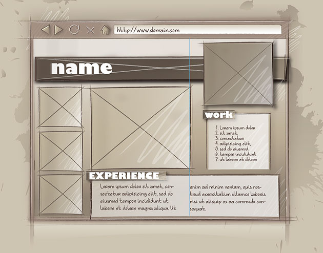
A What You See is What You Get editor can do that, but the code it creates is messy. The best way to do this is coding the layout by hand. Go through the creative process, with thumbnails, mood boards etc., and develop a Photoshop comp before starting to code the layout.
There is not much spontaneity in coding the layout, but then, there is little spontaneity in prepping an Indesign document for print. The creativity and spontaneity of web design happens in the early planning stages. To encourage that I ask you to show me your creative development in the worksheet. After that it’s mostly creative problem solving as you execute the layout. You are ahead of the game if you can see this as a puzzle to be solved.
Homework Assignment Using Absolute Positioning
To get started, we want to remove all of the background properties from the selector demo, so we can start with a clean slate.
Next, we want to center the layout in the middle of the window. That forces us to use a relatively positioned element as the containing element that wraps the website. So much for using only absolute positioning.
The way to horizontally center an element in CSS is to set the right and left margins on auto , and by giving the element a width. The width is subtracted from the width of the parent element, and whatever is left over is split into two so that equal side margins automatically center the element in the middle.
Absolute Position based on Relatively Positioned Parent
We also position this element as relative. This is an important step, for a page element with relative positioning gives you the control to absolutely position children elements inside of it. If we were to skip this step, the absolutely positioned elements would position itself to the body element, and not the automatically centering element just created.
The section element is made 960 pixels wide, and if the window is bigger than that, the margins are evenly divided, centering it in the window, or viewport, as it is technically called.
The absolutely positioned elements inside of the section element will all stay centered in the window. This has the effect of grouping all of the enclosed elements. We will continue to use this technique to simplify our layout into the main HTML5 divisions, each one of which will be turned into a group: header, nav, aside, article and footer.
Header
All of the elements inside of the header element function as a group, allowing me to move them all by moving the header element.
Overlapping Elements
There is a shadow under the header element, but unlike most shadows, it does not stick out on one side. If it were to stick out, it would flatten the overall look by unifying the background and the page. I didn’t want that, so I made the element with the shadow property shorter. But that does not look right either.
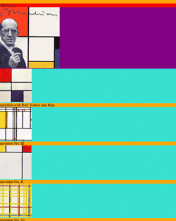
To solve the problem I covered up the header element which has the shadow. The div inside of the header extends beyond its boundaries and covers up the shadow on the right side, as this picture demonstrates.
There is no need to position the div element, since it is already where it is suppose to be. It has to be made the same height and just a little longer. To calculate the length of the div, add the 112px of padding on the left to the 848px in length. I took out the 1 px border on the sides, but left it in on the top and bottom. That makes it 960px wide, or 20 pixels longer than the header.
To calculate the height, add the 20 pixels of padding to the 90px in height, in addition to the 1px border on top and on the bottom. The div’s padding is what positions the title, which is then 112 pixels from the left and 20 pixels from the top of the header element.
Google Fonts are used, and the link to them has to be included in the header.
The picture of Piet is placed via absolute positioning from the right of the header div, its parent, and not the left. Since it sticks out above the header, it requires negative number for the top position. Here is the CSS:
That takes care of the header as a group. If we were to move it up or down, we could do so by changing only the header values.
Aside
The pictures on the left side make up the aside. The aside is pretty straight forward, as the pictures, which are 160px wide, fall into place once a width of 160px is specified. The figcaptions align up below the pictures. The HTML is as follows:
The navigation is absolutely positioned from the top of the page to just below the header picture. Though nothing was obstructing its view, the links were not working. Using the z-index property to raise it just off of the default layer exposed the link’s functionality. The anchor elements, or links, are displayed as block elements, and styled accordingly. The CSS:
The article is composed of one large picture and a div element that contains two columns. The figure falls into place. The figure is given extra padding on the bottom to push the div down. The div is given a background color, height, and padding to push the text of the first column both down and to the left. The width of the column is defined by the paragraph.
The second column is absolutely positioned so it sits beside the first. The title is given the same treatment as the nav title above.
<article>
<figure>
<img src="images/BroadwayBoogie.jpg" alt="Broadway Boogie Woogie" />
<figcaption>Broadway Boogie Woogie</figcaption>
</figure>
<div>
<div class="column1">
<h2 class="shadow_2">EXPERIENCE</h2>
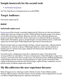
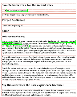
<p><a href="http://www.lipsum.com/">Lorem ipsum</a> dolor sit amet, consectetur adipiscing elit. Proin nec mi vitae arcu euismod sagittis eget vitae nunc. Integer eu mi felis. Nullam eleifend tincidunt magna. Cras ultrices est vel metus fermentum molestie. Maecenas ante elit, varius sollicitudin placerat nec, tempor sit amet dui. Nulla facilisi. Nam ac justo quis eros eleifend molestie in eget purus. Nulla facilisi. Sed dapibus, justo eu semper feugiat, eros turpis lobortis dolor, a malesuada sapien arcu sit amet sapien. Nulla aliquet lectus eget mauris molestie placerat.</p>
</div>
<div class="column2">
<p>Cras dolor metus. Proin diam nibh, sodales in hendrerit non, laoreet a dui. Proin tristique, sapien et mattis vestibulum, mi ante lobortis neque, in ultricies neque enim et diam.</p>
<p>Etiam id magna at arcu scelerisque iaculis vehicula ut tortor. In hac habitasse platea dictumst. Mauris a purus vitae lacus dictum, mi arcu porttitor velit, in aliquet tortor orci sed est. Mauris fringilla adipiscing dui, a pharetra odio porta in.</p>
<p>Etiam id magna at arcu scelerisque iaculis vehicula ut tortor. In hac habitasse platea dictumst. Mauris a purus vitae lacus dictum, mi arcu porttitor velit, in aliquet tortor orci sed est. Mauris fringilla adipiscing dui, a pharetra odio porta in.</p>
</div>
</div>
</article>
Footer
All that is left is the footer. Because absolutely positioned elements do not interact with the document flow, the footer cannot be positioned by the content itself. The last element is absolutely positioned, just like all the rest. The CSS:
<footer>
	<p> <a href="http://validator.w3.org/check?uri=referer"> Validate your page.</a> </p>
</footer>
The finished product. Absolute position of the elements works for print, because once the printed page is determined, the size no longer changes. That is not true of web design, and the next period will introduce a number of additional strategies to deal with layout out pages for the web.
CSS, or cascading style sheets, describe the presentation of web pages, including colors, layout, and fonts. It does this through properties that style the HTML tags.
Think form and content. CSS is the form, HTML is the content.
CSS is separate from the content, allowing it to adapt the presentation to different types of devices, such as large screens, small screens, or printers.
The separation of HTML from CSS makes it easier to maintain sites, share style sheets across pages, and tailor pages to different environments.
CSS is deceptively easy to apply when it is done inline. That means you write the code right into the HTMl tags using the style attribute. You write these locally applied rules like this: style="inline CSS rules go here". The addition of the code style="color: red" to the paragraph tag <p > looks like <p style="color: red">, and colors the following paragraph red.
Changes are seen as soon as you update the browser. This immediacy and the simplicity of the syntax makes CSS appear easy, which it is when there is no cascade or style sheets to worry about.
It is possible to write all of your presentation in the tags themselves, but you would find that to be highly inefficient. It is generally frowned upon to write CSS locally, as that defeats the purpose.
What is CSS?
CSS gets its power from inheritance, the style sheets and the cascade. It is called CSS, or cascading style sheets. With that power comes the responsibility of keeping track of all the sectors that target the html element, and that makes CSS difficult.
Not all properties are inheritable, but those that are can be set in the html or body tag, and every child tag will inherit these properties.
The cascade describes how the CSS rules in the style sheet are globally applied. The style sheet is a list of rules prefaced by one or more selectors. These rules are placed in the header of the page or are in an external style sheet, in which case, a link to that style sheet is placed in the header of the page.
Selectors provide the link between the rules in the style sheet and the HTML elements that receive the rule. The browser parses the document, figures out every element in the document tree, heals any errors it may find, and tracks all of the selectors used by the style sheet to target the different tags so that it can assign the rules of properties and their values to each element, so that the page ends up looking the way it does.
</div>
Inheritance
Every element is a child of the html element. If you target the html, or the body element, many properties will be inherited, but not all.
For example, a child element inherits the font property of its parent, but it will not inherit the background property. Other properties that are automatically inherited. Some of these properties are: color, font (and related properties), letter-spacing, line-height, list-style (and related properties), text-align, text-indent, text-transform, visibility, white-space and word-spacing.
Properties not automatically inherited are: background (and related properties), border (and related properties), display, float and clear, height and width, margin (and related properties), min- and max-height and -width, outline, overflow, padding (and related properties), position (and related properties), text-decoration, vertical-align, z-index. There are more, but this gives you an idea.
Inheritance prevents certain properties from having to be declared over and over again in a style sheet, allowing the developers to write less CSS and the users to view faster-loading pages.
Inheritance plays a large roll in CSS, but it’s not overtly visible. Be aware that it’s constantly determining what the elements on the page look like. In the cascade, inherited properties lose out to any properties provided by a selector.
CSS Selectors
Central to this process is the selectors that connect the CSS properties to the element when the properties are no longer written in the element itself.
There are many kinds of selectors, and W3C has a whole list of them, I have a reduced set of them below. It is best to keep things simple, and start with the type selector.
You can select all paragraphs in a document by using the type selector, like this: p {css: rule;}.
An interactive demonstration can be of great help in conveying the information. What follows is the first of many such interactive demos.
Interactive CSS Selectors Demo
The following demonstration selects all of the text contained by <p> in this document. You can change the font, the type color and the type size (or anything else if you write in the rule).
Words inside of /* */ are comments there to help you come up with values that match the properties, for example, /*green, #123456*/ are suggestions to replace black with green in color: black.
Without all of the suggestions, all that is being specified is p { font-family: Georgia, serif; color: black; font-size: 1em;}
Your changes could render the document unreadable. To reset the document, refresh the page. The selector <p> selects all paragraph elements.
If you find something you like (this concerns the other demos), then copy the definitions and use them in your document.
CSS Code View
If you colored the text green, you will notice that the paragraph above that was originally colored red is still colored red. Why did the color not change? The same is true of the font-family.
We will explore this in much greater detail, but know for now that there is a cascade determining which rule wins out over all the other rules that are targeting the element.
You can overpower the cascade order by using !important, which is inserted right after the value and before the semicolon. Try inserting !important in the demo, and you will see that the global CSS rules now override the local inline rules in the cascade.
The problem with using !important is that it quickly destroys the cascade, and it will make your CSS unusable, so it is not recommended unless you have no other options.
Specificity and Grouping Selectors
It’s not always desirable to select all the paragraphs in the document. We usually want to select very specific paragraphs, or elements, in the document. This paragraph or that paragraph, but not all of them. This is achieved by nesting selectors.
Selectors can be nested to achieve greater specificity. In the following demonstration, each line is targeted individually by nesting the selectors. That means using a space “” between the selectors to specifically select the child element inside of the parent element:
Selectors can also be grouped to share the same rules. That means using a comma “ ,” between the selectors to include all of the selectors to which the rule will be applied. This is the case with the last two selector in the demonstration:
CSS Code View
Header in div
Paragraph in div
Item 1 of list in div
Item 2 of list in div
The blue div has the 120% applied twice, and is larger than all other text in this demonstration. Another example of the cascade at work. Play around with the demo to see how specificity is able to narrow the targeted section to exactly the element that you want to style.
The HTML code for this example is:
<div id="example0">
	<h2>Header in <span>div</span></h2>
	<p>Paragraph in <span>div</span>
	<ol>
		<li>Item 1 of list in <span>div</span>
		<li>Item 2 of list in <span>div</span>
	</ol>
CSS Rule Placement
There are three places where you can put your style definitions.
Inline Style definitions
CSS styles can be written in the tag itself, called inline styles, in the head of the document, called embedded styles and in an external style sheet:
You can write the style directly in the tag itself as we have been doing:
<p style="color: red">
Embedded Style definitions
The next easiest place to put the CSS is in the <head> of the document between <style> and </style> tags. Using a p selector it’s possible to target all the paragraphs in the document with the embedded style.
<style type="text/css">
p { color: red}
</style>
The rules are now enclosed in brackets, and in front of the bracket is a selector that targets which element will be affected by these rules. The rule has been severed from the element itself, which allows it to be applied to many elements, but it increases the complexity, as different selectors with conflicting style rules can target the same element. Who will win out to style the element? That is the question.
This is were it can get difficult, as several rules can target the same element, and when that happens, the browser has to select which rule wins out in what’s called the cascade.
Embedding the styles is more efficient than writing them inline in each paragraph element, it’s still not ideal, since it only targets the tags in the page, and websites almost always consists of multiple pages.
External Style Sheets
The most efficient place for styles is in an external style sheet. The external style sheet is a simple text file with nothing but CSS rules on it styled. They can be written in any way, as spaces, returns and tabs are ignored by the browser. Start out by separating all of the properties in their own line, as in the following example, so that they are easy to read:
p {
	color: red;
	background: white;
	width: 400px;
	padding: 20px;
	border: 2px solid green;
	margin: 20px auto;
}
Just so you know, it is also possible to write the declarations in one line:
p {color: red; background: white; width: 400px; padding: 20px; border: 2px solid green; margin: 20px auto;}
There is no difference, as all the white space is collapsed.
The file is saved with a .css extension, often in its own folder called CSS, in case there are more than one external or imported style sheets. Each HTML page in the site then refers to that style sheet by linking to it. To do that you need to include the following code in the header of each document:
You can copy this into your pages, though I have already included it in the HTML5 template.
It’s possible to link to or import several style sheets and some think it’s a good organizing principle to break the styles into several style sheets like the CSS reset, typography, navigation, layout and alternate styles for IE 6.5, 7 and 8.
The downside to all this organization is that each stylesheet requires a server request, that is, your browser has to ask the server for one more file to complete the page, and the lag time involved in asking the server for each style sheet can take more time than the actual loading of the stylesheet itself. Because of this, a more common approach is to put all the styles into a single style sheet.
Browser’s Default Style Sheet
Even if you do not write any CSS, the HTML has formatting applied, so that an <h1> tag looks different from an <h2> or a <p> tag. Where do these styles come from?
Every browser has a default style sheet, called the user agent style sheet, like this one from Safari, that formats the markup.
From W3C:
User Agent styles
are the default style sheet the browser uses, which are modifiable by an end user. Author styles are the ones that you create when you design the page. There are also user styles, which is style information specified by the user apart from the default style sheet. We will not concern ourselves with that.
If you look at Safari’s default style sheet, you will see that it determines how the p element is to be displayed:
When you see a paragraph in an HTML document that has not yet been styled, it looks as specified by the browser style sheet. If you start styling the elements with your own styles in an author style sheet, they will be built on top of the styles specified in the user agent style sheet. That may lead to problems when the page is looked at in a different browser.
Resetting the Browser Default Style Sheet
To counteract the possibility that your author styles change with different browsers, you need to neutralize the default user agent style sheet the browser uses.
To counter this we implement a CSS reset. The CSS reset was initiated by Eric Meyer, and he recently released a second version. Take the following code and place it at the beginning of your style sheet, and it will neutralize the default styles of the browser style sheet.
There is a pattern here. The styles in the author style sheet override the styles in the user agent style sheet. In the order in which CSS rules are compiled, subsequent declarations override previous ones.
If you repeat the same property twice, the second one will style the element. {color: green; color: red} The type will be colored red, and not green.
This is also true of the three places where you can place the rules. If the same rule is found in the user agent style sheet, the author’s style sheet and any other imported external style sheets, the embedded or internal style sheet and repeated once again inline, that is, in the element itself, guess which rule wins out?
The inline rule wins out. The rule of thumb is that the closer to the style definition is to the element being styled, the more likely it is to triumph over all the other rules, and style the element. The insight that we are left with is that the order in which the browser concatenates the various style sheets is as given above, with the default style sheet first, then external style sheets, then the internal style sheet and finally it arrives at the elements themselves.
That the last style definition wins is part of the cascade:
The Cascade
CSS stands for cascading style sheets. The cascade describes the way selectors target their elements.
CSS rules can be written in a number of places. It is, therefore, possible that an element can be targeted by several rules — from inline rules to embedded rules to external rules, to user stylesheets. When there are several rules targeting the same property with different values, only one of these rules will win out. Figuring out which rule ends up styling the element is very important, and that is what the cascade is all about.
For example, <span style="color: red">red</span> this text’s inherited default color of black is overridden by the inline style that colors the type red. That tells you that the inline style trumps the inherited style.
The browser needs to figure out which rule to use when there are multiple conflicting values for a property. The cascade refers to the selection process in which these styles are evaluated so that only one value ends up styling the element.
Generally speaking, the closer a style definition is to the tag, the more likely it wins out. The inline style wins out over the embedded style, the embedded style trumps a linked or imported style sheet which in turn wins over the browser’s default style sheet, and they all trump inherited styles.
The cascade takes the selector’s specificity into its calculation. One selector will trump all other selectors. A formula determines the cascade. It prioritizes ids over classes, for example. Classes win out over structural tags, and structural tags trump typed tags.
You can pull out the big gun and place !important after a rule if you absolutely want it to be the case no matter what.
Be very judicious in your use of classes, ids and especially !important, as you can easily make a document unmanageable. The rule of thumb is to use as low a cascade value as possible to select an element.
The Elements of a CSS Rule
CSS has a simple syntax and uses a number of English keywords to specify the names of various style properties. A style sheet consists of a list of rules. Each rule or rule-set consists of one or more selectors, and a declaration block. A declaration-block consists of a list of declarations in braces. Each declaration itself consists of a property, a colon (:), and a value. If there are multiple declarations in a block, a semi-colon (;) must be inserted to separate each declaration.
The CSS rule describes what an element should look like, and when combined with a selector to select the element, you have a complete CSS statement.
The CSS Rule
The CSS rule contains both the selectors and the declarations. Example: h1 {font-size:1.5em; font-weight: 700; color: #333; }
The Declaration
The declaration is a property-value pair, and is part of the rule that describes how the selector will style the element. When the style sheet is embedded in the document, convention is to follow each declaration inline: Example: h1 { font-size:1.5em;font-weight: 700;color: #333;}
While in an external style sheet, convention is the put each delectation on a new line with a tab in front: Example: h1{ font-size:1.5em; font-weight: 700; color: #333;
}
The Declaration Box
These are all the declarations that determines how the selector will style the element. it’s always bookended by { } (curly braces). Example: h1 { font-size:1.5em; font-weight: 700; color: #333;}
Properties
A property describes an aspect of an elements’s presentation, such as color, font-size or border-width. The property is always followed by a value, and the two are always separated by a : (colon). There are a lot of properties, so it’s best to have a place where you can look them up, though frequent usage will acquaint you with the ones you need. Example: h1 {color: #356590; padding: 3px 16px;}
Values
A value describes a specific appearance, such as a specific width, the name of a color, or some set value, such as for text-decoration: none; which removes the underline from text, often used to remove the underline that the browser’s default stylesheet gives a link. The value commences the declaration statement, and you signify that to the computer by using a ; (semicolon). While it’s not necessary to tell the browser that there are no more declarations in the declaration box, it’s a good practice to close the last declaration as well. Example: h1 {color:#356590; padding: 3px 16px;}
Selectors
Selectors are patterns that match the elements of a document that will then have the declarations applied to them.
There are four categories of selectors: ID rules, Class rules, Tag rules and Universal rules. IDs carry more weight than classes, which carry more weight than Tag rules, which carry more weight than the universal rules.
The most immediately understandable selector is the type selector, in which p selects the paragraph element: <p>. example of simple type selector: p { }
There are many more precise ways of selecting just the element you want, as there will probably be a lot of p elements in the document, and selecting the right one takes more precision. As a matter of fact, there are 45 different kinds of selectors, to be exact, but that is more than we need to comprehend here.
Structural Selectors and Pseudo Classes
Then there are structural and pseudo class selectors, which take advantage of the natural structural properties of the nested markup to select elements, like the #example ol li:first-child { }, which selects the first list item in the ordered list. You can see that this over-rides the type selector, even hough the type selector comes later on in the code.
Id’s and Classes
If none of these methods work and you still cannot select an element, you can always create a class or an id to link up a CSS rule with elements that are the given the class or id properties with the same name.
CSS Selectors
Selectors are patterns that match the elements of a document that will then have the declarations applied to them. The easiest selector to understand is the type selector, in which p selects the paragraph element: <p>. example of simple type selector: p { }
The type selector selects the element by the tag itself: Type: p { }
The universal selector selects all elements: Universal: * { }
Example of an attribute selector that selects all image tags with an attribute of “alt”: Attribute: img[alt] { }
Another example of an attribute selector that selects all links to pdf files. Attribute: a[href$=”.pdf”] {color: #45a2f4;}
Example of a class selector that selects any element with a class=”example”: Class: .example { }
Example of a ID selector that selects any element with an id=”container”: ID: #container { }
Example of a pseudo selector that selects any link and creates a hover class: Pseudo Class: a:hover { }
To make matters more precise, selectors can be combined by using a space , a greater than sign > for limiting that combination to a child of the selected parent, a plus sign + for selecting directly adjacent elements and the tilde ~ for selecting indirectly adjacent selectors. Space: article p { } selects all <p> elements in <article>. Greater Than: article>p { } selects only the <p> elements that are children of the <article>. Adjacent: article+p { } selects only the <p> elements adjacent to the <article>. Tilde: article~p { } selects all indirectly adjacent <p> elements to the <article>.
When several selectors share the same declarations, they can be grouped into a comma-separated , list: example: h1, p, img, nav { }
The last selectors are a number of useful structural pseudo classes. What a mouthful, right? They allow the first, last or alternate lines to be selected, for when you want to alternate the color in a set of links, for example: First Child: tr:first-child { } Last Child: tr:last-child { } Nth Child: p:nth-child(2) { }
Ids and Classes
HTML uses the Id and Class attributes for general naming of the elements. This is used by Javascript as well as CSS to select these elements.
An id is to be assigned only once per page, while classes can be assigned multiple times per page. That difference gives ids more weight than classes when it comes to the CSS cascade.
Ids and Classes so obviously connect the rule with the element that they were over-used in the past when other selectors could have worked just as well. If it were a screaming contest, it was an outright cacophony. That particular affliction, along with the overuse of the generic div element, is called divitis and classitis. It is best to be as quiet as possible, and not jump to using classes and ids unless necessary.
In the markup the id uses a hash mark # before the name in the style sheet and the HTML code looks like <div id="this">, while the class uses a period . before the name in the style sheet and the HTML code looks like <div class="that">.
Pseudo Classes
Pseudo classes create a class of an element that already exists, but where there is no predetermined class. You can select a link, the anchor tag, but there is no class to select the hover state of that link. This pseudo-class selector creates a pseudo class that can be styled as the link’s hover state. Many of these pseudo classes are structural, meaning that they use information that lies in the document tree to select different elements.
here is a list of the pseudo classes:
:nth-child(N)
matches elements on the basis of their positions within a parent element’s list of child elements (N here stands for the number of the element, but it can also support odd and even, as in li:nth-child(odd))
:nth-last-child(N)
matches elements on the basis of their positions within a parent element’s list of child elements
:nth-of-type(N)
matches elements on the basis of their positions within a parent element’s list of child elements of the same type
:nth-last-of-type(N)
matches elements on the basis of their positions within a parent element’s list of child elements of the same type
:last-child
matches an element that’s the last child element of its parent element
:first-of-type
matches the first child element of the specified element type
:last-of-type
matches the last child element of the specified element type
:only-child
matches an element if it’s the only child element of its parent
:only-of-type
matches an element that’s the only child element of its type
:empty
matches elements that have no children
:target
matches an element that’s the target of a fragment identifier in the document’s URI
:checked Pseudo-class
matches elements like checkboxes or radio buttons that are checked
:not(S)
matches elements that aren’t matched by the specified selector
Pseudo Classes: not
A collapsable guide to the layout modes. All of the work is being done by the last CSS rule using the pseudo class not, as in not target or hover li:not(:target):not(:hover) .
CSS Code View
Live Demo
Here you will find links to the layout modes article, including the document flow, the positioning of the elements within the document flow and display, z-index and overflow properties.
Pseudo Elements
CSS can create markup where there is none. These are called Pseudo Elements, and you can style them as if they existed.
For Example, if you wanted to style the first letter of a paragraph, you can target it even though there is no markup. There are four pseudo elements all together: first letter, first line, before and after. All of them are written using another selector, two colons :: and the pseudo element, as in p::first-letter {} (The double colon is new, so a single colon is also accepted).
There are many CSS properties. You do not have to memorize them all. You will remember the ones you use most often, and the other ones you can always look up. I’ve separated many of the properties into a number of interactive demos so that you can try them out. Spend some time in this sandbox, change the values of the properties or add new properties. This is where you can play and learn while it is still fun.
Because many CSS values are measurements, we go over absolute and relative measurement units first.
Measurement Units
Measurements are used everywhere, so you might as well get used to specifying both relative and absolute measurements. Absolute measurements use a fixed size, while relative measurements are based on the size of the parents or determined by the size of the viewport (window or device size).
Absolute Measurements
Most of the time, you will want to specify a width in pixels, such as 300px How long this is depends on the resolution of the screen. Other fixed measurements are pica pc, point pt, millimeter mm, centimeter cm and inch in.
Keyword values are also common, like bold and bolder for the font-weight property. Other value for font weight are from 100 through 900 in multiples of 100. Font weights not available will map onto the closest available font.
Interactive CSS Selectors Demonstrations
In each of these demonstrations, the CSS is live, meaning that the example will change in real time as you change the values, or type in new properties. It does not always work when copy and pasting, so you need to type the changes out. If you like what you end up with, copy the CSS and use it. If you copy the entire declaration rule, be aware that you will need to change the selector to match the HTML in your document. Have Fun.
CSS Code View
Live Demo
Width in:
pixels (px)
points (pt)
picas (pc)
inches (in)
centimeters (cm)
Relative Measurements
The most common relative measurement is to use percentage %, which will be the percentage of the parent element.
When a property takes a length value, that length can be expressed in em units, which is the width of the “m” of the font in question. This can get you into trouble when you specify the em of an em of an em. For that reason, they came out with an root em, or rem, which is based on the size given to the body tag. The beauty of this is that the entire site can be set to the default font size. If the default font size is changed, because the device has changed, the measurements stay relative to the device.
You can also express the length in the x-height of the font: ex. Both of these measurements are relative to the font size, but can be used to specify the entire site.
There are other relative ways to specify the measurement of an element: px for pixels (Yes, pixels are relative based on the screen resolution, which changes all of the time in web design), vw for viewport width (this is the width of the window),vh is for viewport height, vm is for viewport minimum and ch is for character. These relative values should be used where the devices may change.
1vw is 1% of viewport width, 1vh is 1% of viewport height, 1vmin is 1vw or 1vh, whatever is smallest and 1vmax is 1vw or 1vh, whatever is largest.
Compare Measurements
Relative sizes are based on the live demo width of 60% of the parent main element, or a font-size of 22px for the body element.
This font-size is unusually large so as to make the text easier to read in class. Usual font-size is 16px. If you change it, the em, x-height based width will change accordingly. The fonts in the document also change.
If you change the window size, the last two, viewport width and viewport height, will change, as they are a percentage of the window size.
CSS Code View
Live Demo
Width in:
reference em (rem)
em (em)
x-height (ex)
percentage (%)
% of the viewport width (vw)
% of the viewport height (vh)
The last two values, based on the viewport, will update if the window is resized. The em and x-height widths change with the body font-size.
Color
Color is always RGB. That is how computers work. These are additive colors, you can call them by name or RGB value, both by percentages, decimal number or hexadecimal shorthand (Hexadecimal is base 16, or 1,2,3,4,5,6,7,8,9,a,b,c,d,e,f ), which is the most common form, introduced by a # hash mark, and allows each value (red, green and blue) to be represented by two Hexadecimal values, like #000000 is black or #ff0000 is red, #00ff00 is green and #0000ff is blue. Can you guess what the value of white is? If you guessed #000000, you are correct!
Here are the names of the colors, with their Hexadecimal and decimal numbers as an example:
Color
Color name
Hex rgb
Decimal
aliceblue
#f0f8ff
240,248,255
antiquewhite
#faebd7
250,235,215
aqua
#00ffff
0,255,255
aquamarine
#7fffd4
127,255,212
azure
#f0ffff
240,255,255
beige
#f5f5dc
245,245,220
bisque
#ffe4c4
255,228,196
black
#000000
0,0,0
blanchedalmond
#ffebcd
255,235,205
blue
#0000ff
0,0,255
blueviolet
#8a2be2
138,43,226
brown
#a52a2a
165,42,42
burlywood
#deb887
222,184,135
cadetblue
#5f9ea0
95,158,160
chartreuse
#7fff00
127,255,0
chocolate
#d2691e
210,105,30
coral
#ff7f50
255,127,80
cornflowerblue
#6495ed
100,149,237
cornsilk
#fff8dc
255,248,220
crimson
#dc143c
220,20,60
cyan
#00ffff
0,255,255
darkblue
#00008b
0,0,139
darkcyan
#008b8b
0,139,139
darkgoldenrod
#b8860b
184,134,11
darkgray
#a9a9a9
169,169,169
darkgreen
#006400
0,100,0
darkgrey
#a9a9a9
169,169,169
darkkhaki
#bdb76b
189,183,107
darkmagenta
#8b008b
139,0,139
darkolivegreen
#556b2f
85,107,47
darkorange
#ff8c00
255,140,0
darkorchid
#9932cc
153,50,204
darkred
#8b0000
139,0,0
darksalmon
#e9967a
233,150,122
darkseagreen
#8fbc8f
143,188,143
darkslateblue
#483d8b
72,61,139
darkslategray
#2f4f4f
47,79,79
darkslategrey
#2f4f4f
47,79,79
darkturquoise
#00ced1
0,206,209
darkviolet
#9400d3
148,0,211
deeppink
#ff1493
255,20,147
deepskyblue
#00bfff
0,191,255
dimgray
#696969
105,105,105
dimgrey
#696969
105,105,105
dodgerblue
#1e90ff
30,144,255
firebrick
#b22222
178,34,34
floralwhite
#fffaf0
255,250,240
forestgreen
#228b22
34,139,34
fuchsia
#ff00ff
255,0,255
gainsboro
#dcdcdc
220,220,220
ghostwhite
#f8f8ff
248,248,255
gold
#ffd700
255,215,0
goldenrod
#daa520
218,165,32
gray
#808080
128,128,128
green
#008000
0,128,0
greenyellow
#adff2f
173,255,47
grey
#808080
128,128,128
honeydew
#f0fff0
240,255,240
hotpink
#ff69b4
255,105,180
indianred
#cd5c5c
205,92,92
indigo
#4b0082
75,0,130
ivory
#fffff0
255,255,240
khaki
#f0e68c
240,230,140
lavender
#e6e6fa
230,230,250
lavenderblush
#fff0f5
255,240,245
lawngreen
#7cfc00
124,252,0
lemonchiffon
#fffacd
255,250,205
lightblue
#add8e6
173,216,230
lightcoral
#f08080
240,128,128
lightcyan
#e0ffff
224,255,255
lightgoldenrodyellow
#fafad2
250,250,210
lightgray
#d3d3d3
211,211,211
lightgreen
#90ee90
144,238,144
lightgrey
#d3d3d3
211,211,211
lightpink
#ffb6c1
255,182,193
lightsalmon
#ffa07a
255,160,122
lightseagreen
#20b2aa
32,178,170
lightskyblue
#87cefa
135,206,250
lightslategray
#778899
119,136,153
lightslategrey
#778899
119,136,153
lightsteelblue
#b0c4de
176,196,222
lightyellow
#ffffe0
255,255,224
lime
#00ff00
0,255,0
limegreen
#32cd32
50,205,50
linen
#faf0e6
250,240,230
magenta
#ff00ff
255,0,255
maroon
#800000
128,0,0
mediumaquamarine
#66cdaa
102,205,170
mediumblue
#0000cd
0,0,205
mediumorchid
#ba55d3
186,85,211
mediumpurple
#9370db
147,112,219
mediumseagreen
#3cb371
60,179,113
mediumslateblue
#7b68ee
123,104,238
mediumspringgreen
#00fa9a
0,250,154
mediumturquoise
#48d1cc
72,209,204
mediumvioletred
#c71585
199,21,133
midnightblue
#191970
25,25,112
mintcream
#f5fffa
245,255,250
mistyrose
#ffe4e1
255,228,225
moccasin
#ffe4b5
255,228,181
navajowhite
#ffdead
255,222,173
navy
#000080
0,0,128
oldlace
#fdf5e6
253,245,230
olive
#808000
128,128,0
olivedrab
#6b8e23
107,142,35
orange
#ffa500
255,165,0
orangered
#ff4500
255,69,0
orchid
#da70d6
218,112,214
palegoldenrod
#eee8aa
238,232,170
palegreen
#98fb98
152,251,152
paleturquoise
#afeeee
175,238,238
palevioletred
#db7093
219,112,147
papayawhip
#ffefd5
255,239,213
peachpuff
#ffdab9
255,218,185
peru
#cd853f
205,133,63
pink
#ffc0cb
255,192,203
plum
#dda0dd
221,160,221
powderblue
#b0e0e6
176,224,230
purple
#800080
128,0,128
red
#ff0000
255,0,0
rosybrown
#bc8f8f
188,143,143
royalblue
#4169e1
65,105,225
saddlebrown
#8b4513
139,69,19
salmon
#fa8072
250,128,114
sandybrown
#f4a460
244,164,96
seagreen
#2e8b57
46,139,87
seashell
#fff5ee
255,245,238
sienna
#a0522d
160,82,45
silver
#c0c0c0
192,192,192
skyblue
#87ceeb
135,206,235
slateblue
#6a5acd
106,90,205
slategray
#708090
112,128,144
slategrey
#708090
112,128,144
snow
#fffafa
255,250,250
springgreen
#00ff7f
0,255,127
steelblue
#4682b4
70,130,180
tan
#d2b48c
210,180,140
teal
#008080
0,128,128
thistle
#d8bfd8
216,191,216
tomato
#ff6347
255,99,71
turquoise
#40e0d0
64,224,208
violet
#ee82ee
238,130,238
wheat
#f5deb3
245,222,179
white
#ffffff
255,255,255
whitesmoke
#f5f5f5
245,245,245
yellow
#ffff00
255,255,0
yellowgreen
#9acd32
154,205,50
Change the Color of the Background
CSS Code View
Live Demo
Font Properties
Basic properties that style the font. Children inherit these properties from parents.
CSS Code View
Live Demo
Font Style Properties
More stylistic properties to change the appearance of fonts.
CSS Code View
Live Demo
Font Style Properties
Text Layout Properties
These properties have to do with the inline flow of the characters. The children inherit all of these properties from their parents. I have created three selectors, one for the header h3., one for the body text p and one for the superscript inside the body text.
CSS Code View
Live Demo
Text Layout Properties
Change the text by applying different styles. Notice that when you make a mistake, the style reverts to the default style. The 1st selector is an h3. The 2nd selector is a p. The 3rd selector is a span acting like a superior (sup) tag and the 4th selector selects an actual sup tag and colors it red.
Box Properties
Each HTML element is a box. The size of this box is determined by its inheritance, the content, or by a CSS rule. By default, the width of the box is inherited from the parent and the height is determined by the content. That makes the box is as wide as its parent, or the width of the window when the parent element is the body tag.
The box remains invisible unless it has a border or a background.
The box has four sides. You can target each side’s margin, border and padding at once padding: 10px; the vertical and horizontal sides separately padding: 0 auto or each side independently, starting at the top and moving clockwise: top, right, bottom and left padding: 0px 30px 60px 90px;.
CSS Code View
Each element is a box. The size of the box is determined by the parent element, or if CSS is used, the box can have a width, height, padding, border and margins. Padding and the border is added to the size of the content.
Border Properties
The border usually uses a shorthand where the width, color and style are given in this order: border: 10px solid #f68;. Leaving any one of these out breaks the border. Here is a list of the styles:
none: No border. Color and width are ignored (i.e., the border has width 0 unless the border is an image.
hidden: Same as none, but has different behavior in the border conflict resolution rules for border-collapsed tables.
dotted A series of round (square?) dots.
dashed: A series of square-ended dashes.
solid: A single line segment.
double: Two parallel solid lines with some space between them.
groove: Looks as if it were carved in the canvas.
ridge: Looks as if it were coming out of the canvas.
inset: Looks as if the content on the inside of the border is sunken into the canvas.
outset: Looks as if the content on the inside of the border is coming out of the canvas.
CSS Code View
Live Demo
You can change the border attributes including the style yourself.
Margin and Padding Properties
These properties belong to the box model, and are similar, in that they create or subtract space from the sides of the box. I created two elements to show how border collapse works when two margins overlap and only the largest margin is used.
CSS Code View
Live Demo
BOX 1: The margin is set for 20px auto, meaning that the box has 20 pixels of margin on top and bottom, and the left and right margins are automatically adjusted to center the box, possible only because the box has a declared width
BOX 2: Notice that even though both boxes have a 20px margin, that margin collapses between the boxes. If you play around with the numbers, you will see that it collapses the smaller margin into the larger margin.
List Properties
Lists are used for any element that acts like a list. Many elements are styled as lists, and when that happens, its important to take control over the list element, so that the items styled take on the look that does not necessarily look like a list. Menus are a great example of this, but many other items are also considered candidates for being styled as lists. If the list-item-style is turned to one of the automatically incrementing counters, the un-ordered list is automatically turned into an ordered list.
CSS Code View
Live Demo
List Item
List Item
List Item
List Item
List Item
The HTML for the unordered list
<ul>
<li> List Item </li>
<li> List Item </li>
	<ul>
		<li> List Item </li>
		<li> List Item </li>
		<li> List Item </li>
	</ul>
</li>
</ul>
Live Demo
Have numbers span ordered lists by using the attribute start="3"
Tables used as tables are part of the HTML/CSS landscape. Tables used for layout purposes are to be banished. That said, if you want to style a table, its best to create as many hooks in it as possible. This means that a table can have table header, a table footer and multiple table bodies. It is also possible to style columns. The code and an explanation of how the table works is reproduced below:
CSS Code View
The Caption Holds the Title of the Table
Head 1
Head 2
Head 3
table cell item
table cell item
table cell item
table cell item
table cell item
table cell item
table cell item
table cell item
table cell item
table cell item
table cell item
table cell item
table cell item
table cell item
table cell item
table cell item
table cell item
table cell item
table cell item
table cell item
table cell item
table cell item
table cell item
table cell item
The Footer is a Place for Information About the Table.
The HTML code for the table can be divided into parts, and each can be styled separately. There are table headings, footers, data cells and captions and rows, all of which can be styled. The even and odd table rows are styled using pseudo selectors. If you look at the code, you can see that the table caption comes first, then the table header, two table bodies that contain the table rows and the table data cells and finally a table footer. The row tags allow the three rows to be styled individually, though that too could be handled by pseudo selectors.
Pseudo Classes
Pseudo classes are additional classes that belong to the same element. They are most frequently applied to the link element for navigation, where hover and click or visited states can be applied to that link, though any element can have hover states applied:
A collapsable guide to the layout modes. All of the work is being done by the last CSS rule using the pseudo class not, as in not target or hover li:not(:target):not(:hover) .
CSS Code View
Live Demo
Here you will find links to the layout modes article, including the document flow, the positioning of the elements within the document flow and display, z-index and overflow properties.
HTML
  <nav>
    <ul>
      <li id="nav-about"><a href="#nav-about">Layout Modes</a>
        <ul>
          <li><a href="#layoutModes" target="_blank">Layout Modes</a>
          <li><a href="#block" target="_blank">Block Display</a>
          <li><a href="#inline" target="_blank">Inline Display</a>
        </ul>
      <li id="nav-projects"><a href="#nav-projects">Positioning</a>
        <ul>
          <li><a href="#positioning" target="_blank">Normal</a>
          <li><a href="#relative" target="_blank">Relative</a>
          <li><a href="#absolute" target="_blank">Absolute</a>
          <li><a href="#fixed" target="_blank">Fixed</a>
          <li><a href="#floats" target="_blank">Floats</a>
          <li><a href="#tables" target="_blank">Tables</a>
        </ul>
      <li id="nav-interact"><a href="#nav-interact">Other</a>
        <ul>
          <li><a href="#display" target="_blank">Display</a>
          <li><a href="#zindex" target="_blank">Z Index</a>
          <li><a href="#over-flow" target="_blank">Overflow</a>
        </ul>
    </ul>
  </nav>
  <div>
   Here you will find links to the <a href="http://a.parsons.edu/~dejongo/04-the-layout-modes" target="_blank">layout modes</a> article, including the document flow, the positioning of the elements within the document flow and display, z-index and overflow properties.
  </div>
</div>
Pseudo Elements
Pseudo classes add elements to existing elements, in CSS rather than in the document. They can be first letter and line in an inline element and the before and after a block element.
CSS Code View
Live Demo
Pseudo Elements
A pseudo element I use often is the first-line pseudo element.
But other pseudo elements, particularly the before and after, are powerful, as you can see in this posted notes look complete with a page curl above right, created by the before element on the div above, without additional elements in the HTML. Quotes as in <q>quotation marks</q>can be given quotation marks using the before and after pseudo elements.
See more such wizardry in the creation of 84 icons, using nothing but such CSS tricks.
The trick with the folded corner is a really thick border that surrounds the empty content between the quotes of the css content property. The corners of the border meet at a 45° angle, and when the content is nothing, all four corners meet at the middle in a sharp point. Put two such corners together and you get the triangle used to shape the page curl. All you have to do is fill those two sides with the color of the page curl, and fill the other two sides with the background color to block out the corner of the note, which would otherwise stick out.
Cursor
Give the user feedback. Changing the cursor is an instruction away. Roll over the square to see the change.
CSS Code View
Live Demo
Roll the cursor over this square to see it change to a little hand with a pointing finger cursor. Change the cursor in the CSS view to check out all of the cursors.
CSS or Cascading Style Sheets makes life easy for you.
The Bright Side
It is possible to avoid the cascade by writing all the CSS rules inline. That would be painful, and even more painful if you were to revise the site. It is possible to embed styles in the head of the HTML document. This is great for writing a style definition once, and applying it many times throughout the page. If there is more than one page, however, it is better to separate the styles out of the document into an external style sheet. A link in the head to that stylesheet keeps all the pages synched to the same style definitions. Imagine updating your whole site by changing only one rule. That is the power of CSS!
Using a single stylesheet is a boon for consistency.
A reduction in file size.
By separating form from content, the content can be repurposed so it works on iPhones, tablets and computer screens. This is called responsive web design.
Build fantastically complex web pages with relative ease.
Ease of making changes to the layout.
CSS allows for better Search Engine Optimization. You can put the most important info first no matter where it is on the page. Content remains readable compared to using tables for layout purposes.
The Darker Side
The cascade can become confusing as the number of style definitions grow.
Forget one character and the whole thing can break down. More usually, only the declaration breaks down, but watch out for errors.
Primitive layout tools (update is in progress but not yet ready for prime time).
Implementation in different browsers are similar, but not necessarily the same.
The latest and the greatest features are not always supported by all the browsers.
The web is a design language, and more of you are not Parsons’ students, it become clear that some students need to know something about principles of design.
Much visual literacy on the web is standardized, so you can copy your way, without knowing exactly what you are copying.
Visual literacy goes beyond how something looks. It makes communication more effective.
Visual literacy is used to solve problems in communication. This is a lot like structuring an argument in the academic essay, where reason supplants opinion. Instead of finding causes and reasons why, or a genealogy, bringing visually literate structuring to the communication makes the message more engaging, apparent and clear.
To that end, I’ve assembled a number of links to help develop visual literacy.
Use the following resources to explore your site design. Be inspired — copy, borrow, steal — but make sure that whatever you take, you make your own. The top priority is to effectively communicate the content.
The last frontier of web design has been typography. Typography remains elusive for many, so I’ve gleaned useful links to explain the basics in the following typographic resource.