Flash used to dominate this domain, which was used primarily for ads, but was pushed out after stepping foul of Apple’s QuickTime and the popularity of the iPhone. Who wants to pay for ads that wealthy iPhone owners cannot see?
That left a vacuum that CSS3, HTML5 and Javascript are supposed to fill. CSS, HTML and Javascript are not Flash, and as you can see, even creating basic animation is challenging.
To solve this, both programs provide a drag-and-drop, easy-to-use user interface for creating animation and interactivity using HTML, CSS and JavaScript. Adobe wants to recapture the Flash market, and Google wants people to create ads, because that is where Google makes its money. Google is an expert at the commercialization of good will.
Though we have access to both programs, I like the way Google Designer allows me to switch to code view and edit the parameters directly. Adobe Edge Animate requires Edge Code to look at the underlying code, and may be more ambitious in the long run, but it is not nearly so interesting and useful for us as Google’s Web Designer.
Google Web Designer
Download a copy and use it to do your animatic or motion enabled ad. Instructions on how to use the program can be found on the original download page. Google Web Designer tutorials
Pushing the boundaries of the original specification, these new CSS3 features can radically change the appearance of your HTML.
Filters
CSS Filters has its origin in a SVG (Scalable Vector Graphics) feature for applying image processing effects to vector graphics. Robert O’Callahan figured out how to apply the filters effects to HTML content via CSS.
How Filters Work
Before the rendered page loads, the filter takes a snapshot of the page as a bitmap. The effects are then applied to the HTML elements, which are rendered and composited into a finished page. There are many filters.
It is possible to animate the effects as well, as you can see in the following demo. Filter values are mostly between 0 and 100%, or 0 to 1.0, some go higher.
blur(0px) A unit number to determines the amount of gaussian blur.
brightness(0-1-10) 0 darkens the picture to black, 1 is normal and up to 10 increased the brightness.
contrast(0-1-10) where 0 is solid grey, 1 is normal and up to 10 increased the contrast.
drop-shadow(15px 15px 20px silver)
grayscale(0-1) Reduce chroma gradually to none at all.
hue-rotate(0- 360deg) Rotate the hue through all the colors.
invert(0-1) Inverts the colors, .5 is solid grey.
opacity(0-1) Where 0 is transparent and 1 is opaque, and everything in between is translucent.
saturate(0-1-10) Saturates the colors, where 0 is greyscale, 1 is normal saturation and up to 10 increases the saturation
sepia(0-1) Increase in sepia toning of the print;
CSS Code View
Taiyo in the Snow
Anyone familiar with Tompkins Square Park will know that this great tree has been cut down. It was deemed a safety hazard.
Blending Modes
The CSS composting and blending modes feature lets us blend an element’s background layer with another background layer, to blend between background images, gradients, and background colors, or to blend one element with another element.
How Blend Modes Work
Just like in Photoshop, two layers are usually added, with the top layer replacing the bottom layer. The blend modes lets you specify other mathematical relations between the two layers. For example, the multiply mode multiplies the two layers together, with the result that is darker than either layer.
Background blending blends the layers within a background. This is useful for blending a picture with a background color.
The following blending modes are implemented in webkit and follow those found in Photoshop:
normal
multiply
screen
overlay
darken
lighten
color-dodge
color-burn
hard-light
soft-light
difference
exclusion
The following blending modes are not yet implemented by webkit
hue
saturation
color
luminosity
CSS Code View
This is a more complicated example, with multiple layers composed up of blends. You can change the blending mode of each background, with varying results.
CSS Code View
Blending Elements
Blending between background layers is all very fine, but blending between HTML elements is accumulative, that is, the blend blends the blending associated with each element in the element stack.
There are four elements in the following demo, once container and three children. The blend of each child plays a roll in the final outcome. You can play with the stacking order z-index or change the blending modes to see how these elements interact
CSS Code View
bla bla bla bla bla bla bla bla bla bla bla bla bla bla bla bla bla bla bla bla bla bla bla bla bla bla bla bla bla bla bla bla bla bla bla bla bla bla bla bla bla bla bla bla bla bla bla bla bla bla bla bla bla bla bla bla bla bla bla bla bla bla bla bla bla bla bla bla bla bla bla bla bla bla bla bla bla bla bla bla bla bla bla bla bla bla bla bla bla bla bla bla bla bla bla bla bla bla bla bla bla bla bla bla bla bla bla bla bla bla bla bla bla bla bla bla bla bla bla bla bla bla bla bla bla bla bla bla bla bla bla bla bla bla bla bla bla bla bla bla bla bla bla bla bla bla bla bla bla bla bla bla bla bla bla bla bla bla bla bla bla bla bla bla bla bla bla bla bla bla bla bla bla bla bla bla bla bla bla bla bla bla bla bla bla bla bla bla bla bla bla bla bla bla bla bla bla bla bla bla bla bla bla bla bla bla bla bla bla bla bla bla bla bla bla bla bla bla bla bla bla bla bla bla bla bla bla bla bla bla bla bla bla bla bla bla bla bla bla bla bla bla bla bla bla bla bla bla bla bla bla bla bla bla bla bla bla bla bla bla bla bla bla bla bla bla
Title
Title
Masks
Masks allow you to use an image or a polygon clip path to reveal only part of an element. Just like in Photoshop, the white areas display and the black areas do not.
peace
remove the <nav> and <ul> so only the <header> and <h1> are left.
Enter “CSS3 Exercise” in h1
Remove the <p> and <figure> <img> and <figcaption> from the <article> tag.
remove the <footer> tag.
We will manipulate the HTML using only CSS styling. Remove the .example {} in the embedded style sheet.
Give the section —the holding container — 100px margins on top and left to push the content away from the ends, and position it relative, in case you want to use absolute position at a later date.
Give the header a 60 pixel margin at the bottom.
The article will be given the style that will change as we move the window. The default style is a 200px square with a background color and a 1px border, positioned absolutely.
Include a div element inside of the article element. Make sure you close the div. This div will be targeted by the transition from one picture to the other.
We want to annotate what we are doing and will use the pseudo element header:after to tack on the word plain and set it below the header using relative positioning.
Now comes the fun part. We are going to make this responsive, so that as we pull it past 400px, the style of the <article> element and the description in the title will change.
First we make the @media block set to trigger at a window with greater than 400px: @media all and (min-width: 401px) {
}
Inside the @media block, we change the article using border radius to 50%. That turns a square into a circle.
article {border: 20px solid #666; border-radius: 50%;}
We want to change the description from plain to “border radius” header:after {content:”border radius”;}
and finally, place a number 1 in front of “CSS Exercise” header to keep track of the number that we complete.
h1:before {content:”1. “;}
Go back to your document and move the page width beyond the 400px threshold, and you should see the square change.
You are now where you were in last week’s exercise, with the additional div element placed inside of the article element. This week we apply transitions, transformations and animation.
You can get the different properties for the demonstrations on the website.
The procedure remains the same, with an incremental 100px jump with each new media query.
Notice that there is no need to repeat properties if they are already defined. There is only a need to overwrite properties that will change.
The next media query looks like @media (min-width: 500px) {
}
article {background: purple; -webkit-transition: all 2s ease-in-out;background-size: cover;}
CSS3 part 2. Detailed examination of more CSS3 properties: 2-D transforms, transitions, animations and multicolumn layout. Activity: Use these properties in class. Activity: In-class Workshop.
1) For the class: Using the new CSS3 properties to create a simple animatic for your final project. Animate elements created in the previous homework. 2) For the final: Finish wireframe and Photoshop Comp for final. Read chapter 14. Due: The following week.
Materials
Additional materials for this unit can be found by following these links (14 pages):
Your worksheet needs to reflect your final project, and it is due today (the work-sheet, not the final, with research, wireframe, comp and user experience profiles, including links where necessary).
Create a mockup and develop a look that sells your project. This can build upon the CSS3 assignment from last week.
Translate the structure of the comp into a wireframe
Develop coherent user experience profiles.
Homework for the Unit
Using these new CSS3 properties, create an animatics or animated page that sells your project.
It’s possible to animate the elements created in the previous homework.
Make sure that you use at least two transforms, transitions and an animation.
Ideally you animate everything by hand, but I will understand if you use Adobe Edge.
A link to this promotional material has to be on the work-sheet.
Apple’s Webkit team has introduced a number of technologies, one of which is CSS Animations, which allow an author to modify CSS property values over time. This is an evolving specification. Expect lots of changes as time goes by.
The good news is that animations are hardware accelerated. The computer’s graphic chip will be doing the heavy lifting, and not the CPU. This should speed animations up from the start.
Involved animations are complicated, and I’m sure that the future will develop all kinds of tools that will help facilitate building more complicated animations. To that end, there are several programs targeting the creation of CSS animations, primarily targeting the building of ads without using Flash, including Sencha’s Animator, Adobe’s Edge and andyclarke. Be aware that most of these solutions rely on javascript for their animations, but since the program is writing the code, all you need to deal with is a timeline interface.
@Keyframe
You have seen these @ rules used before, in @media, @font-face and @import. At-rules are instructions or directives to the CSS parser. The @keyframe contains the keyframes of the animation. The way to write it is:
In between the brackets are the rule sets, which always start with the start and stop keyframes: from or 0% and to or 100%. The entire keyframe at rule looks like:
@-webkit-keyframes name-for-animation {
   0% /* from */{
   }
   100% /* to */ {
   }
}
All other reframes come between the start and end, and you can use from and to, or 0% and 100% keyframes. To make it work, however, you also need to include the animation name as a quality of the animation property.
In the demo below, the div with and id of “ani-1” contains the animation property shorthand that calls up the keyframe at rule. Within this property we’re specifying the name of the animation animation-name: name-for-animation, to specify which keyframes to use, the duration, animation-duration: 10s, the timing function: animation-timing-function: linear and the number of times to repeat the keyframes animation-iteration-count: infinite. There is also a direction property animation-direction: normal, and the possibility to set a delay animation-delay: 0.
You can change the animation, but to get the demo to register the changes, you need to temporarily change the keyframe name in the animation property, and then change it back, and it will recognize any changes you’ve made to the keyframes, otherwise it will continue on its previously determined course. The animation is set up for webkit only.
CSS Code View
Animation is in its infancy, and the specification will evolve and probably change several times before it settles down, but it’s actively being implemented by all major browsers, so its here to stay. If you want to pursue CSS animations, check out CSS3 Animator for a great resource.
CSS Animations first made their appearance in Surfing Safari, the blog devoted to Apple’s Webkit browser. I had to have the most recent nightly build to see the animation, and was, of course, amazed to see leaves fall or basic shape animation (these demos only work in Webkit browsers).
That was two years ago. Since then the standards compliant browsers have picked this up and it has since been submitted as a standard.
Since the release, the transformations have been offloaded to the computer’s graphic chip, meaning that they are smoother and faster than CPU driven animation using Javascript.
Transitions between Pseudo Classes of the Same Element
Transitions describe how CSS properties can be made to change smoothly from one value to another over a given duration. By default, this duration for pseudo classes is instantaneous, as demonstrated by the change when hovering over this element. The change in appearance is the difference between the element’s description and the pseudo class :hover. It goes from background: purple; to background: blue; as soon as the mouse hovers over the element.
Instead of making this change instantaneously, a transition gives this change a duration. You can see that the transition property is specified as a change in the background color, with a duration of 4 seconds. The before and after states are determined by the differences in the element’s description and the description of its hover state.
CSS Code View
When you hover over the div, the transition from purple to blue takes 4 seconds.
A good use for this transition effect is to animate the opacity between two pictures.
CSS Code View
Adjusting the Rate of Change
The transition velocity can be controlled. In addition to the default transition timing function, there are a number of other timing functions based on 5 predefined cubic bézier curves that control the rate of change during the transition function. Each box below has the same transformation, but as you roll over the example, it demonstrates the different transition timing functions, as labeled.
You can create the rate of change curve yourself by specifying the x and y coordinates of the two bézier control handles associated with the starting and end points. In the last example, it is -webkit-transition-timing-function: cubic-bezier(0,1,1,0);. An ease-in curve would be defined as cubic-bezier(0.42, 0, 1, 1); and an ease-out curve would be defined as cubic-bezier(0, 0, 0.58, 1), the first brings the curve down while the second pushes it over the linear progression of (0, 0, 1, 1). You can try this yourself by changing the numbers below and hovering over the demo above:
CSS Code View
default »
linear »
ease-in »
ease-out »
ease-in-out »
cubic-bezier »
This injects a bit of AfterEffects into web presentations, though it is much more limited in scope. There is much more promise of that with CSS3 animations.
What Attributes can be changed?
The W3 has the following list of properties that can be changed in a transition.
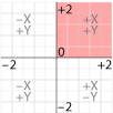
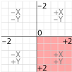
The web browser lays out the page according to a coordinate system that, by default, is expressed in pixels and has the X and Y Zero point in the upper left hand corner of the parent object, like InDesign. Illustrator places it on the lower right hand corner, the way you learned it in geometry.
2D Transform
The transform property modifies this coordinate space, so that elements can be translated, rotated and scaled in this two dimensional space. When you create a value for the transform property, a new local coordinate system is established by which the position of the element is calculated. The 2D transforms add up, meaning that if you rotate the parent element, and then rotate the child element, the child will be rotated in addition to the parent’s rotation. The coordinate system then calculates the cumulative transformation matrix (CTM) for the element.
You can apply two different transforms to the X and Y axis with the transform property values transform: <transform-function for X> <transform-function for Y>; where the 2D transform functions are listed in length or percentages and angles in degrees, grads, radians or turns (according to the CSS3 values and units):
matrix(number, number, number, number, number, number)
Matrix specifies a 2D transformation in the form of a transformation matrix of six values. matrix(a,b,c,d,e,f) is equivalent to applying the transformation matrix [a b c d e f].
translate(value for x, value for y)
translate specifies a 2D translation by the vector [tx, ty], where tx is the first translation-value parameter and ty is the optional second translation-value parameter. If <ty> is not provided, ty has zero as a value.
translateX(value)
Translate X specifies a translation by the given amount in the X direction.
translateY(value)
Translate Yspecifies a translation by the given amount in the Y direction.
scale(value for x, value for y)
Scale specifies a 2D scale operation by the [sx,sy] scaling vector described by the 2 parameters. If the second parameter is not provided, it is takes a value equal to the first.
scaleX(value)
Scale X specifies a scale operation using the [sx,1] scaling vector, where sx is given as the parameter.
scaleY(value)
Scale Y specifies a scale operation using the [1,sy] scaling vector, where sy is given as the parameter.
rotate(angle)
Rotate specifies a 2D rotation by the angle specified in the parameter about the origin of the element, as defined by the transform-origin property.
skewX(angle)
Skew X specifies a skew transformation along the X axis by the given angle.
skewY(angle)
Skew Y specifies a skew transformation along the Y axis by the given angle.
skew(angle, angle)
Skew X and Y specifies a skew transformation along the X and Y axes. The first angle parameter specifies the skew on the X axis. The second angle parameter specifies the skew on the Y axis. If the second parameter is not given then a value of 0 is used for the Y angle (ie. no skew on the Y axis).
If your object is small, it is not a problem to establish its position on the default coordinate system, and tweaking its relative position if need be, but for some objects, it is better that you control the point of the transformation, which by default is the midpoint of the object.
You can set the 0,0 point to determine the point of transformation using percentage, length, or keyword like left, center and right for the X axis and top, center and bottom for the Y axis: transform-origin: left top
If only one element is is specified, the second value is assumed to be center.
Transform can be used locally or global. First, it is a local way of turning objects that does not involve the structure of the layout itself. The second way is to transform large parts of the document, and since the children inherit the parent’s transforms, all the children will take on that transformation.
Local Transforms
CSS Code View
The content (children) of the transformed element inherit the altered coordinate space, and transform with it, such as this text and image.
global Transforms
Here you will transform the entire content element on this page from the center, with everything on it. Every child element gets transformed with the parent.
Change the values for both the transform origin and the transform scale, rotate, transform and skew. Careful, for you can lose the ability to edit this if you make too radical a change, and will need to refresh the page to reset it. Try rotating the element by 90°, 180° or 360 degrees.
CSS Code View
Front End Interfaces
A lot of activity is happening with these tools, and you can expect Illustrator-like drawing programs at the front end that use CSS and HTML as the backend language. Check out this text on a path generator.
ImaginethatthisisonlyHTMLmarkupstyledwithCSS!
3D Transform
Add to the X and Y axis a z axis, and you go from 2D to 3D. There are a number of additional 3D functions addressing the 3D space:
matrix3d(number, number, number, number, number, number, number, number, number, number, number, number, number, number, number, number)
Matrix 3D specifies a 3D transformation as a 4×4 homogeneous matrix of 16 values in column-major order.
translate3d(value for x, value for y)
Translate 3D specifies a 3D translation by the vector [tx,ty,tz], with tx, ty and tz being the first, second and third translation-value parameters respectively.
translateZ(value)
Translate Z specifies a 3D translation by the vector [0,0,tz] with the given amount in the Z direction.
scale3d(value for x, value for y, value for z)
Scale 3D specifies a 3D scale operation by the [sx,sy,sz] scaling vector described by the 3 parameters.
scaleZ(value)
Scale Z specifies a 3D scale operation using the [1,1,sz] scaling vector, where sz is given as the parameter.
rotate3d(value for x, value for y, value for z, angle)
Rotate 3D specifies a 3D rotation by the angle specified in last parameter about the [x,y,z] direction vector described by the first three parameters. A direction vector that cannot be normalized, such as [0,0,0], will cause the rotation to not be applied. Note that the rotation is clockwise as one looks from the end of the vector toward the origin. rotateX(angle) is the same as rotate3d(1, 0, 0, angle). rotateY(angle) is the same as rotate3d(0, 1, 0, angle). rotateZ(angle) is the same as rotate3d(0, 0, 1, angle), which is also the same as rotate(angle).
perspective(value)
Perspective specifies a perspective projection matrix. This matrix scales points in X and Y based on their Z value, scaling points with positive Z values away from the origin, and those with negative Z values towards the origin. Points on the z=0 plane are unchanged. The parameter represents the distance of the z=0 plane from the viewer. Lower values give a more flattened pyramid and therefore a more pronounced perspective effect. For example, a value of 1000px gives a moderate amount of foreshortening and a value of 200px gives an extreme amount. The value for depth must be greater than zero, otherwise the function is invalid.
Change the perspective on the example to 200 and see how extreme it becomes, or 500, which is much more normal. Change the rotation, and see the browser render the element as if it were in 3D space.
CSS Code View
The content (children) of the 3D transformed element inherit the altered coordinate space, and transform with it, such as this text and image.
Working in 3D is inherently complex, and to do it right requires some calculation and knowledge of 3D. For a better primer check out understanding CSS3D transforms and Natural Object Rotation in 3D by Eleqtiq, who also gave us the CSS3 Text Warping used above. For additional demos and tutorials, visit Net Magazine’s 20 3D Transforms article. That should get you started.
In the mean time, more browsers are supporting transforms, so it looks like you can use it sooner than later, as long as your design falls back to something presentable on older browsers.
Pong. Remember Pong? I’m sure that most of you only know it as a museum piece. It has been resurrected by Alex Walker as a strictly HTML and CSS3 (no javascript) exercise that almost works.
Apple’s Webkit team introduced a number of technologies, one of which is CSS Animations, which allow an author to modify CSS property values over time. This is an evolving specification. Expect lots of changes as time goes by.
The good news is that animations are hardware accelerated. The computer’s graphic chip does the heavy lifting, and not the CPU. This speeds animations up from the start.
Involved animations are complicated, and I’m sure that all kinds of tools will be developed to facilitate building more complicated animations, or to export animations from After Effects like the following (which only works in Webkit browsers)
To that end, there are several programs targeting the creation of CSS animations, primarily targeting the building of ads without using Flash, including Sencha’s Animator, Adobe’s Edge and Google’s Google Web Designer . Be aware that most of these solutions rely on javascript to help with the CSS3 animations, but since the program is writing the code, all you need to deal with is a timeline interface.
@Keyframe
You have seen these @ rules used before, in @media, @font-face and @import. At-rules are instructions or directives to the CSS parser.
What follows are two brackets, and all the code is entered inside. This is referred to as the “code block.”
The @keyframe code block contains the keyframes of the animation. The way to write it is:
In between the brackets are the rule sets, which always start with the start and stop keyframes: from or 0% and to or 100%. The entire keyframe at rule looks like:
@-webkit-keyframes name-for-animation {
   0% /* from */{
   }
   100% /* to */ {
   }
}
All other reframes come between the start and end, and you can use from and to, or 0% and 100% keyframes. To make it work, however, you also need to include the animation name as a quality of the animation property.
Now to assign the keyframes. In the demo below, the div with and id of “ani-1” contains the animation property shorthand that calls up the keyframe at rule.
Within this property we’re specifying the name of the animation animation-name: name-for-animation, to specify which keyframes to use, the duration, animation-duration: 10s, the timing function: animation-timing-function: linear and the number of times to repeat the keyframes animation-iteration-count: infinite.
There is also a direction property animation-direction: normal, and the possibility to set a delay animation-delay: 0.
You can change the animation, but to get the demo to register the changes, you need to temporarily change the keyframe name in the animation property, and then change it back, and it will recognize any changes you’ve made to the keyframes, otherwise it will continue on its previously determined course. The animation is set up for webkit only.
CSS Code View
The animation could have been optimized. I could have used the transform property, rather than top and left, which is suppose to be faster, and use sub pixel rendering to create a more fluid experience.
Animation is in its infancy, and the specification will evolve and change several times before settling down, but it’s actively being implemented by all major browsers and here to stay. If you want to peruse CSS animations, check out Lea Veroa’s Animatable for inspiration.
Interactive Stories/Ads
Digital storytelling — Designing this Interactive HTML5 Storybook is explained in detail at the end of the story.
Flash used to dominate this domain, which was used primarily for ads, but was pushed out after stepping foul of Apple’s QuickTime and the popularity of the iPhone. Who wants to pay for ads that wealthy iPhone owners cannot see?
That left a vacuum that CSS3, HTML5 and Javascript are supposed to fill. CSS, HTML and Javascript are not Flash, and as you can see, even creating basic animation is challenging.
To solve this, both programs provide a drag-and-drop, easy-to-use user interface for creating animation and interactivity using HTML, CSS and JavaScript. Adobe wants to recapture the Flash market, and Google wants people to create ads, because that is where Google makes its money. Google is an expert at the commercialization of good will.
Though we have access to both programs, I like the way Google Designer allows me to switch to code view and edit the parameters directly. Adobe Edge Animate requires Edge Code to look at the underlying code, and may be more ambitious in the long run, but it is not nearly so interesting and useful for us as Google’s Web Designer.
Google Web Designer
Download a copy and use it to do your animatic or motion enabled ad. Instructions on how to use the program can be found on the original download page.