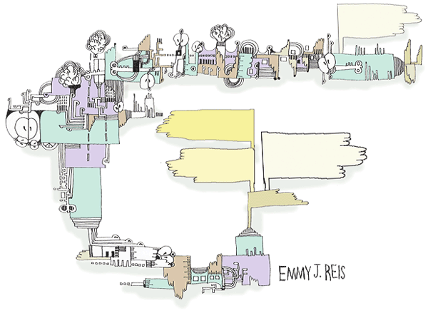
HTML5 Element Index. Once you click on the tag you want to investigate, click on the code snippet for code you can use or the W3 to go to the specification.
Grouping
HTML5 Element Index. Once you click on the tag you want to investigate, click on the code snippet for code you can use or the W3 to go to the specification.
CSS2.1 provided basic layout modes, from inline and block and tables to positioned layout, which is either based on normal flow or a relative position from that flow, or absolute and fixed positioning, which avoids the flow all together. Add floats and the ability to change the display mode of objects, and that was what designers had to create their pages.
CSS3 adds a number of layout modules, but most are still in the process. Check the Can I Use? website and make sure the properties are well supported before using. Some of these layout strategies are Positioned Floats, Exclusions, Grid Alignment/Grid Layout, Template Layout Module and Regions, which has recently been proposed by Adobe. These new CSS modules will significantly change the Layout and Design landscape for the better.
This property is mostly supported with the exception of the break before, break inside and break after properties. Mozilla is not able to span columns and it is not supported on the older IE browsers, most significantly, IE 9.
It is easy enough to create multi-column layouts using the new CSS3 multiple columns property. The document flow runs though any number of columns inside a box. In the demo, you can change the property to show a number of columns, depending on the size of the screen. A good use of multiple columns is in media queries, where small screens get one column, tablets get two and computer monitors get three columns.
“I’ll know it when I see it.”
As designers, we get a lot of similarly elusive adjectives from clients, as they tell us what they want their sites to be: “The site needs to be ‘cool,’” “It should be ‘exciting,’” “I want it to ‘pop.’” When we ask them to clarify, the answer we get back sounds a lot like “I can’t tell you what it is, but I’ll know it when I see it.”
“Fun” is a particularly difficult concept to define. And we’re starting to hear it a lot more from clients as we design for different contexts of use.
So what’s a designer to do?
Where multiple columns is a one trick pony for layout, flex box is a serious problem solver. It automatically adjusts boxes to fit horizontally or vertically. It is almost ready for prime time. There are issues with Webkit but time will iron this out.
Flexbox is a module. That means it relies on a relationship, in this case, of a parent box and sibling boxes. Flex controls how the children behave as they align along the two axis. Depending on the direction, the main axis is horizontal or row, and the secondary axis is perpendicular to that.

This box is both vertically and horizontally centered. Even if the text in this box changes to make it wider or taller, the box will still be centered. Go ahead, give it a try. Just click to edit the text.
CSS3 part 1. An examination of new CSS3 properties: color, opacity, box shadow, border radius, multiple backgrounds, picture borders and gradients. Activity: Use these properties in class.
1) For the class: Use the CSS3 properties covered in a collateral piece for your project. It can be a sales poster, an online brochure, or an email advertisement. 2) For the final: Research, brand and position the final project in terms of its target audience, write the copy and develop a look that incorporates the CSS3 properties covered this week. Due: The following week.
Additional materials for this unit can be found by following these links (33 pages):
The goal of this unit is to:
At the end of this unit, students will have:
| 20 | Review homework and answer questions. |
| 10 | Lecture: Graceful Degradation |
| 40 | Demo: CSS3 Basics. |
| 10 | Break |
| 50 | Demo: Background and Borders |
| 10 | Efficient use of background images |
| 10 | Lecture: Brand Development |
Topics covered in the reading:
Chapter 14: Enhancements with CSS3
CSS3 is all over the web. Many of these sites also make use of jQuery, which is all the rage. We will learn more about that in a few weeks:
Sources of information that will enrich your knowledge about web design and will help you to stay current now and in the future:
These are the terms that participants should be familiar with during this unit:
Internet marketing, also known as web marketing, online marketing, webvertising, or e-marketing, is referred to as the marketing (generally promotion) of products or services over the Internet. Internet marketing is considered to be broad in scope[citation needed] because it not only refers to marketing on the Internet, but also includes marketing done via e-mail and wireless media. Digital customer data and electronic customer relationship management (ECRM) systems are also often grouped together under internet marketing.
Internet marketing ties together the creative and technical aspects of the Internet, including design, development, advertising and sales. Internet marketing also refers to the placement of media along many different stages of the customer engagement cycle through search engine marketing (SEM), search engine optimization (SEO), banner ads on specific websites, email marketing, mobile advertising, and Web 2.0 strategies.
Homework for the Final
Homework for the Unit
Visit this Design Festival article to get you started.
We start with the safest and best supported CSS3 additions: HSL color, transparency, rounded borders and box shadow. You can be introduced to the properties here, pursue them in the exacting details of the W3.org specification itself or just use CSS3 generator to create the code for you.
The first specification to be widely implemented, CSS3 color, includes opacity and the hue, saturation and luminance (HSL) color space.
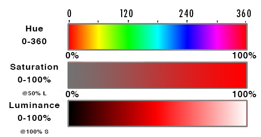
HSL takes three values: Hue is a degree on the color wheel from 0 to 360, where 0 is red, 180 is green and 240 is blue and 360 is red again. So is 720, or any other multiple of 360 — the colors repeat.
Saturation is a percentage value: 100% is full saturation and 0% is no saturation. Saturation works in conjunction with luminance.
| Hexadecimal | Percent |
|---|---|
| #000 | 0% |
| #111 | 7% |
| #222 | 13% |
| #333 | 20% |
| #444 | 27% |
| #555 | 33% |
| #666 | 40% |
| #777 | 47% |
| #808080 | 50% |
| #888 | 53% |
| #999 | 60% |
| #aaa | 67% |
| #bbb | 73% |
| #ccc | 80% |
| #ddd | 87% |
| #eee | 93% |
| #fff | 100% |
Luminance is also a percentage; 0% is dark (black), 100% is light (white), and 50% allows for full chroma before it is made lighter or darker. The table on the right gives percentages of grey translated from hexadecimal, or base 16, with middle grey being #808080.
Connecting up the color with the degree is the least intuitive part of this more intuitive way to think about color, but it is preferred over the RGB method of specifying a color. With HSLa it is easy to increase the saturation or luminance for a particular hue, something that is not at all intuitive using RGB.
CSS3 also added the alpha property transparency, or opacity, or alpha, which can be combined with color to change RGB to RGBA and HSL to HSLA. The value range is from 0 to 1, with 0 being transparent and 1 being opaque. That makes .5 half way transparent. color: hsla(0,50%,50%,.5 You can make any element transparent by using the opacity property.
To help you see the relation between the HLS and opacity, change the numbers in this demo. I’m sure you have a favorite color or color combination. Try changing some of these colors to your favorite colors:
Mother-effing hsl() by Paul Irish
Rounded corners was one of the most requested features and was released early, as the work around was complicated and inflexible. We used to create rounded corners by placing a picture of a rounded corner in each of the four corners. No Fun!
Using only one value, every corner is rounded an equal amount. Using four values, each corner can be given its own unique border. Using eight values, or two values for each corner, its it possible to create asymmetric, or oval corners.
The individual border-radius property can accept either one or two values, expressed as a length or a percentage (percentages refer to the corresponding dimensions of the border box). The individual corner are: border-bottom-left-radius, border-bottom-right-radius, border-top-left-radius and border-top-right-radius.
When two values are defined, they determine the horizontal and vertical radii of a quarter ellipse separately, which in turn determines the curvature of the corner of the outer border edge. When only one value is supplied, the horizontal and vertical radii are the same. If either value is zero, the corner will be square, not round. It is possible to go beyond 100%, but that begins to eat into the border itself. I pushed the number to distort the border in Safari/Chrome as an example. It looks slightly different in Firefox. Play with it, and see how it works for you.
The border-radius shorthand property can be used to define all four corners simultaneously. If you want to define both horizontal and vertical radii separately for each corner, you can do that by first specifying the horizontal for each corner, separating them with a slash / and then specifying the vertical radii. For example: border-radius: 30px 80px 30px 80px / 80px 30px 80px 30px; Don’t forget that the shorthand code can be further compacted if the values are the same, for example: border-radius: 30px 90px / 110px;
Another place that CSS3 has removed the need for additional images is the drop shadow. The browser will handle multiple shadows on both the inside and the outside of the box. The property box-shadow: takes up to five values, one each for x-offset, y-offset, blur radius, spread distance and color.
By default, the value for box-shadow is none. If only one number is supplied, it determines a drop shadow with the same horizontal and vertical offset and the default color which is black. You can specify the horizontal and vertical distances separately, add an optional blur distance and a spread distance, as well as the color: box-shadow: 0px 0px 15px 5px #966;.
Additional shadows can be added by using a comma ,. By default, the shadows are on the outside of the box, but it’s possible to place them on the inside of the box by specifying inset. The code for the 3D looking ball then looks like this: box-shadow: 40px 40px 50px -20px #444, inset -40px -40px 50px 25px #666; .
It used to be that you worked hard to get a web site to look the same in all browsers, and if that was not possible, every effort was made to achieve that end, or to make the failure appear as graceful as possible, so that even older browsers could have well designed web pages. For the standards based community, this required a lot of extra effort on the part of Internet Explorer 6.5.
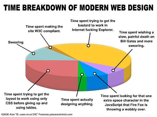
No one here uses IE 6.5, but there are a host of incompatibilities that can make life for the web developer a living nightmare, and the following depiction of what a chore it used to be is accurate.
This is no longer the case. Progressive enhancement has replaced graceful degradation. The attitude is that the user should upgrade to the latest browser, or eat dog food.
The strategy is the reverse of graceful degradation. A document is created and styled for the latest browser, and as long as that basic document is readable on older browsers, that’s good enough.
Internet Explorer 6.5 no longer holds web design hostage, partly because few people use it anymore, and I must say, it feels quite liberating. Internet Explorer 10 is out and standards compliant, unfortunately, it only works in windows 7 or 8, meaning that the many people still using a previous Windows environment continue to use outdated browsers.
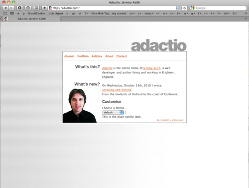
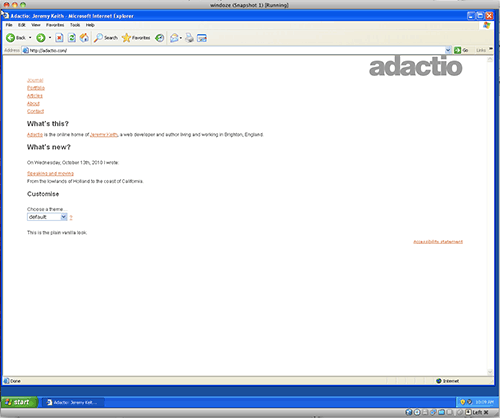
Progressive Enhancement is about using the new HTML5 and CSS3 goodness to create web sites that, when displayed on non-compliant browsers, break down, sometimes significantly, but such that the information is still conveyed, so that what is important is still communicated. The following two pictures demonstrate this difference from http://adactio.com/
What is the current status of browser support for HTML5 and CSS3? The answer is a moving target: can I use is a website that is dedicated to continually updating this information. Here it checks the CSS3 color module:
All of the properties covered today are supported by current browsers. They will not work in Internet Explorer 6, 7 or 8. Here is a list with links to the specifications.
As you can imagine, there needs to be a mechanism to facilitate the development of new properties as they are introduced. This has led to vendor specific version of properties that are not yet stable. Those properties can be accessed by using a vendor prefix, with the idea that eventually, the prefix can be dropped as the kinks are worked out.
Each of the major browsers has its own prefix:
The more experimental properties are prefaced with a prefix. To target all of the browsers, the declaration has to be written five times, one for each browser and the last one without, for when the property achieves acceptance.
This started out as an attempt to avoid the proprietary wars experience between IE and Netscape, but the ubiquitousness of mobile browsing upended the process as developers were writing only for the webkit engine. This left other browsers out in the cold, and they started to read webkit prefixes to render pages as a result.
Even Opera dumped its own rendering engine for Safari.
Oh Well.
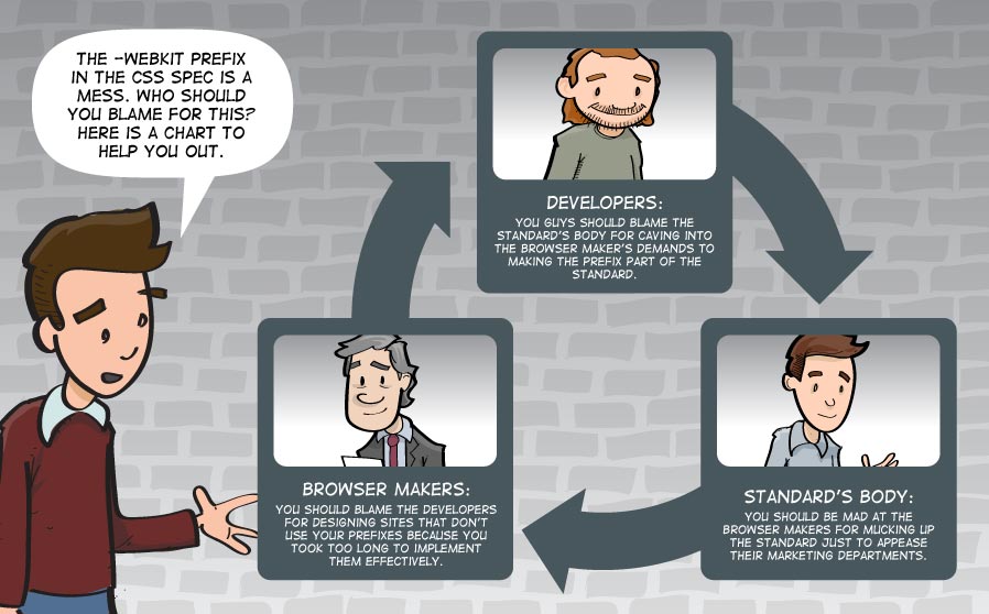
That is not the end of the story. Google is introducing its own “blink” rendering engine. The Google / Apple rivalry has erupted at the core of the browser rendering engine. This will be interesting to watch. Google says competition is good, and that Apple’s rendering pipeline is not modern enough.
Opera enthusiastically jumped on board.
Mozilla is creating a new rendering engine called
Posted in 09 CSS3 1
Whatever you are selling, your final web site needs a persuasive design and brand development, meaning that you need to think about positioning your site in the marketplace. Google loves brands because they embody user trust.
You need a marketing approach that seeks to separate your product or service from the similar products in that segment of the marketplace that your are aiming for. Target your audience and relate to them — their interests, personality and characteristics — for maximum exposure.
That is where persuasion comes in. A brand is the collection of feelings, thoughts, emotions and experiences (negative or positive) a person has about your product, service or company. A good brand accounts for a lot.
You must stand for something and differentiate yourself in a way that allows customers to admire, recognize and incorporate the brand into their personal identity, interests and business requirements in today’s over-crowded, over-done and over-the-top marketplace.
You need to guide your audience on how to think, feel and do about your brand in a way that best for what you have to offer them. Everyone develops a brand identity, even when they neglect to do it. Spend the time to do it right. Think over the following questions before you lock yourself in. Who are your targets? Where are the spaces in your industry/category that allow you to be first, seen, heard and remembered for strategic competitive advantage? How can we take an outside-in approach that helps us understand what our customers actually think, feel and do?
Everyone starts with an inside-out approach. That is only natural. You have ideas of what you want to sell, and how to sell it. We do not have time for test marketing the web site, but stand in your target audience’s shoes. Would they buy it? Build meaning into your brand… How do you talk about it? What do you say about it? What does it look like and what do you stand for? What can you say about it in 30 seconds? Why and how does your organization really benefit your customer? What is the reason for your existence? How do you deliver the brand? What consistent parameters do you place around it. What ways can you leverage it? What media and channels best supports it? your organizations problems, strengths, weaknesses, opportunities, threats and goals your competitors positioning to identify their weaknesses for strategic advantage your target audience, community and potential industry/category channels qualitative (interviews, insights or information) or quantitative (web metrics, trends, industry data) the potential areas of white space that allows your product, service or company to be first, seen, heard and remembered the compelling evidence and vision that makes your product, service or company unique your product, service or company to make your claim credible, trustworthy and reliable the messages that will accurately communicate and resonate with your targets strategic design tactics to attract, acquire and retain the brand through internal employee alignment and adoption, customer touch-points, external media, marketing and sales objectives The backgrounds and borders module covers the background and border of the box element: In the official language of the W3.org; when elements are rendered according to the CSS box model, each element is either not displayed at all, or formatted as one or more rectangular boxes. Each box has a rectangular content area, a band of padding around the content, a border around the padding, and a margin outside the border. (The margin may actually be negative, but margins have no influence on the background and border.) The background properties deal with the decoration of the border area and with the background of the content, padding and border areas. They can be potentially multi-layered, meaning that they can layer a number of elements on top of one another, which each layer having a number of controls to determine how that element is presented. Be careful in creating complicated backgrounds, as one mistake can render the entire background property null and void. multiple background images are “,” separated. You can set all of the values associated with each background image in the same way, by a repeat use of “,” to separate each value. For Example If you have selected a color in addition to the background images, it is rendered as the bottom layer. The The position of the background element places it in relation to the box, with the default being center. If there are two values, the first represents the X (horizontal) Axis and the second represents the Y (vertical) axis. You can also use percentages or pixel values: It is possible that the background peeks out from the border. To keep this from happening, use the When you supply a value of padding-box, the background is clipped relative to the upper left corner of the padding edge. With border-box it’s clipped relative to the upper left corner of the border, and content-box means the background starts from the upper left corner of the box’s content. Resizing background images requires only one percentage value if the image scaled proportionately, and two percentage values if the image needs to be distorted: The background image attaches to the content of the element, the element or to the viewport. The initial value is If the background picture is fixed to the viewport, the element is like a window upon it. The picture will move around if the widow is resized. Change the background attachment to local, and the picture will move with the text. Both It is possible to write all of these at one time (‘background-position’, ‘background-size’, ‘background-repeat’, ‘background-origin’, ‘background-clip’ and ‘background-attachment’) but if you do try to write a more complicated background, be careful, as one mistake can keep the background from showing. Each background image layer can have the following: Gradients are not part of the background specification yet. They were introduced by Apple in 2008, and since then, the way that you write out the values for the gradient property has changed, so as to make writing them simpler, and will likely change again. Right now, all browsers are standardized on the way that Mozilla writes the values, and that is how they are written here. That means you need Chrome 11 or Safari 5.1 to see them. The older versions of Apple based browsers use the older value style. You also need to use vendor specific prefixes to use this property. There are linear gradients and radial gradients, and the syntax is similar.
A gradient is a transition between a start color and one or more stop colors that has a direction, and optionally, can repeat. If there is no repeat, the last color on either side continues out to the edge of the box, otherwise, the gradient repeats. Here are some examples
Simple gradient with the color being spread out evenly over the colors: Adding left changes the direction: Adding a percentage to the stop specifies where the color is located. If two colors share the same location, the result is a sharp color change. Radial blends requires the keyword Repeating Gradient Example: The gradient uses the The value of a simple linear gradient like the one on the right is written as The direction is specified by the key-word Blends are background images and are layered in the same way as multiple background images, by using a comma to separate the layers. By adding transparency to the color stop it’s possible to show one gradient through another gradient. The following demo shows two superimposed linear gradients, separated by a comma If linear gradients follow a single direction, think of radial gradients as all directions emanating out of a single point. The issue is then the location of the center point. The distance from the center then determines the stops. If the distance of the stops are all the same, the shape of the radial gradient is a circle. It is also possible to have an ellipse where the dimensions of the box determined the shape of the ellipse.
You can specify the position of the radial gradient in the same way as you can position anything, using the x and y coordinates, and keywords work just as well: By default, the radial gradient covers the whole box, but its possible to specify its size by using keywords that determine the size from its center to the edge or corner that is nearest or furthest from it. That gives us four possible keywords: After the location, shape and size come the color stops. You have to specify a starting color and one or more stop colors, and if you what the blend to be other than evenly distributed, the percentage from the center, similar to how the linear blend is specified. The last stop will determine the color that fills the box if the blend is smaller than the box. Its also possible to use length values like pixels or em units to specify the distance. It is possible to repeat the blend instead of extend the color of the last stop to the edge of the box. This is done through the keyword The possibility of repeating multiple gradients in one You can construct your own gradients, and with the interactive code view, its easy to demonstrate and create exactly what you want, but given the visual immediacy of a gradient generator, its sometimes more convenient to use them to help you make the gradient. Here are two: Ultimate CSS Gradient Generator for linear gradients and Western Civilizations’s Radial Gradient. Use the New Style to make your gradients, and not the version that Webkit itself has discontinued.
All in all, gradients are a great leap forward, and support among modern browsers is ok now and will be a sure thing soon enough. All four sides of a border can be treated with one definition or you can specify the definition for any one side: top, right, bottom, left. The border usually uses a shorthand where the width, color and style are given in this order: You can also specify different width, color and style for each side of the box, as well as target each side individually. This is most often done to create a horizontal rule somewhere in the design: So you want to use an image for the border. This is not only possible, but powerfully implemented. The code is As a box has four corners and four sides, a referenced picture is divided into 8 parts (the ninth part, which is discarded by default, represents the fill). This is the picture used for the border, and it is 60px by 60px. The image was divided into thirds with 20 pixels for each corner and 20 pixels for the center section. Blue dividing lines are for demonstration and are not in the border image. If this seems complicated, there is an border image generator to help you prepare your border images.
Here is an example from a student to replace a picture. I first determined the width of the repeating section to be 34px, created a square, combined 9 squares into a finished image and positioned the parts accordingly, copying the bottom from the top and rotating it 180°. That way I could keep the value at 34. Had I calculated each of the borders, I could have set the top and sides. It is possible to repeat the middle image, as above, or to stretch it, as here. There is also a value called round, where the image is repeated to fill the area, and if it does not fill the area with a whole number of tiles, the image is rescaled so that it does. The value space is similar, only it distributes the extra space around the tiled middle. The corners remain the same.
Just for fun. CSS3 with a little javascript thrown in.
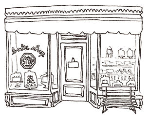
Beyond the standard inclusion of images in many web sites, I have not seen many web-sites where the illustration or photography itself drives the design. Those of you that are illustrators and photographers might want to consider such an ideal, using your ability to illustrate and take pictures to design the whole user experience. Incorporation the images into the design will develop a signature look that can be used to sell a product, which by its very nature will stand out from similar in the design itself increases its attractiveness for commercial use. The most common approach is to place one large illustration on a page with a few links. While this is the most expedient way to use one’s illustration, it does not make for good web design. Good web design has to be much more flexible than one large image, and that flexibility is gained by breaking the illustration up into many modular parts. The strategy is to take these parts and use them in the background of the elements that make up the design.
Take a front end store design. This is an illustration that can easily be divided up into a classic three column layout with a header.
Great! Then all you have to do is create areas in each column where there is content. The menu could go into the header and the two windows and the door could contain all kinds of products.
Or is it that great? What happens if there’s more text than can easily fit into the required space? Is the design flexible enough to adapt to the additional content?
What happens to the design if it is seen on an iPhone or a 30inch monitor?
It quickly feels like it’s not flexible, and that is missing the point of designing for the web. Being flexible is a key component of web design. You have to design with this flexible nature in mind, using your illustrations or photographs in a more modular fashion. The first step is to place your image in the background. That’s simple enough! Use the background property and specify the url() as in the Be careful with how you write the css, because it’s not tolerant of mistakes. If it turns out that you are not able to see your image, simplify the code till you see it working, and then add in the x and y positioning properties. One misplaced character and the background disappears. Once you become familiar with placing background images, it’s easy to imagine that you’ll do it often.
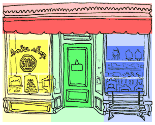
It turns out that the penalty for initiating the connection that retrieves each image from the server is greater than the penalty it takes to actually retrieve the image. So if you have a lot of images, it’s recommended to turn each of your images into a sprite. This means to combine them into one file, with a lot of empty space around each picture, and to call them up by using the x and y coordinates.
This would be a cumbersome if it were not for Sprite Cow (and similar web applications). We used it earlier in the article on Styling the Navigation. It provide you with the coordinates and the size for each picture within the page of pictures, and this is then called a sprite.
If your images are small, you can use the 24bit png format, which includes a nice alpha channel that allows you to layer background images on top of one another. The size of the image grows pretty quickly, however, and if you are not going to layer the images, use jpeg compression. The “Pick Background” button in Sprite Cow will isolate the background. Note that compression quality under 60% will add noise to the edges of your sprite, which has to be adjusted for when you use it.
After placing all of your images in photoshop in separate layers, moving them to individual locations and saving the file for the web, you load it into Sprite Cow. Click on each image. If several images belong to one sprite, drag the pointer over them to select them all.
The code for the sprite appears at the bottom left hand side. Copy this code and paste it into your stylesheet, update the location of the image, and you have a background sprite ready to use in the layout. Do this for each sprite, and that’s how to gang up lots of pictures into one image, greatly saving on the time it would take to load all of the pictures individually. A layout can be thought of as boxes stacked one below the other, and then however many to the right of one another. This down and across movement is how to build out the layout of the web page in the word processor like environment of the default document flow.
Chances are the layout is developed in Photoshop or Illustrator, where it’s easy enough to figure out where the boxes should be to hold the graphics, text and other design elements. Develop those boxes first, and that becomes your wireframe. Plugging in your picture, or multiple pictures is then as easy as assigning the code produced by Sprite Cow to any box. Working with sprites is all great when working on a single layout, but what about responsive layouts? This can be a little more complicated. Responsive design means that you have to develop several photoshop comps to represent what the web page will look like on the iPhone or Android and tablet, where it can appear either horizontally or vertically, or a small to large computer monitors, which tend to stay horizontal.
All of this means that the website has to be scaled from the 320 pixel standard of the original iPhone to windows in excess of 1920 pixels wide, usually in a number of increments, typically including 480, 600, 768, 992 and 1382 pixels. The design stage in Photoshop makes it clear that the 320 pixel version will need to condense and collapse a lot of the information. Chances are that the background images will likely appear smaller, or be eliminated all together from the iPhone layout.
Some of this can be handled by creating several sets of images, depending on the device. That way the iPhone does not attempt to download images the the iPhone layout might not even use. But even if we were to duplicate the images into three sizes, it still might be desirable to shrink images between the 320 pixel vertical layout and the 480 pixel horizontal layout. That’s a 1.5 difference in size when you turn the phone’s orientation.
Changing the background image is easy enough, using the CSS property One way to make this easier is to place the images on a grid of even intervals so the coordinates can be easily multiplied. If each image is on a grid of 300 pixels, its easier to calculate this difference. But know that it is a very inflexible way to approach the problem, and its probably better to ignore making sprites till the very end of the process if you plan on changing the sizes of the background images.
I hope to have an example up so you can see this process for yourself. but know that this entire responsive layout business is too new to have best practices associated with it.09 Positioning Your Final
Developing the brand
Developing the Identity for your final product
BRAND POSITIONING
BRAND MEANING
BRAND DELIVERY
IDENTIFY
AUDIT
UNDERSTAND
GATHER
UNCOVER AND INNOVATE
PLACEMENT
DIFFERENTIATE
CREATE
IMPLEMENT
DELIVER
09 Backgrounds and Borders
The Box Element
Background Properties
Layering Multiple Background Images
background: url(#), url(#), url(#);
	background-repeat: repeat-x, repeat-x, repeat-x,;
	background-position: bottom, top, right;
	background-offset: 20px, 20px, 10px;
CSS Code View
This div has multiple backgrounds
Background Repeat
background-repeat property is used to repeat the background image.You can use the actual property, repeat-style:, but it is usually tagged on to the end of background: with the values: repeat-x, repeat-y, repeat , no-repeat, and values that will be supported in the future, space and round.
CSS Code View
Background Position
background-position: top, center, bottom, left, center, right
CSS Code View
Background Clip
background-clip property, which clips the background to one of the following values: background-clip: border-box, padding-box, content-box
CSS Code View
Background Resize
Background-size:, length in px or %, auto, cover, contain. The value cover automatically scales the image so the longest side fits inside of the object, while contain scales the image so that the shortest side fits inside of the object, completely filling the background. The background size property works in conjunction with the background attachment property.Background Attachment
scroll, meaning that the background is attached to the element. It could also be local, meaning that it scrolls with the content inside the element, or it can be fixed, meaning the background is fixed to the viewport, or window.
fixed and local will change the size of the picture to fit either the viewport or content:
CSS Code View
These
words
are
here
to
check
out
the
background-attachment
value
of
local.Background Shorthand
background: bg-image, bg-position, repeat-style, attachment, background-origin, background-clip and the final (bottom) layer can add background-color.Gradients
background: -webkit-linear-gradient(red, green, blue);
background: -webkit-linear-gradient(left, red, green, blue);
CSS Code View
radial
background: -webkit-radial-gradient(circle, white, black);
background: -webkit-repeating-radial-gradient(75% 19%, circle closest-side, #0000ff 2%,#ff00ff 18%);
background property, but instead of fetching an image, the computer uses the controls given in the value to calculate a background image, which is then used to fill the background.Linear Gradients
linear-gradient(top, #eff6fb, #d3e4f3 68%). It is specified as a linear gradient, that has direction that starts from the top with the color #eff6fb, and proceeds to the last stop, with the color #d3e4f3 occurring at 68% from the top of the element. Its also possible to use length values like pixels or em units to specify the distance. Since the gradient is not repeated, the last stop carries on to the other side of the box.
top. All of the sides can be used, top,right,bottom,left, and they can be used in combination, as in top left in the example above. It is also possible to determine the direction by degrees, as in 0deg(left), 90deg(bottom), 180deg(right), 270deg(top).Adding Transparency
, with transparency from the Hue, Saturation and Luminance Alpha (hsla)color, so that the one shows through the other:
CSS Code View
Radial Gradients
right 100% means that the horizontal placement is all the way on the right and the vertical placement is all the way on the bottom. It is possible to go beyond the box, and make it 120% 120%, for example. It defaults to the center of x or y if either one is missing, and if both are missing, the radial gradient is centered in the box.
closest-side, closest-corner, farthest-side, farthest-corner, but they add two more for good measure: contain and cover, which mean the same as closest-side and farthest-corner. The browsers have not implemented it yet, but one day it may also be possible to specify the size numerically.
Repeating Gradients
repeating at the beginning of the value, for example: background: repeating-linear-gradient(top, #EFF6FB, #d3e4f3 10%). use the same value at both the beginning and the end if you want a smooth transition as the blend repeats.
CSS Code View
Gradients Repeated
backgrounddeclaration opens up an incredible vista for patterns and other uses. Take a look at the next two demonstrations, take from the fantastic patterns created by Lea Veroa. Many of these patterns depend on the use of multiple background layers and use transparency to great effect, and a very careful use of positioning so that one layer sticks out behind the other. You can see how these are constructed by commenting-out or changing one line at a time, or read the article she wrote to explain her methods.
CSS Code View
CSS Code View
Animated Gradients
Gradients the Easy Way
Border Properties
Standard Border
border: 10px solid red;. Leaving any one of these out breaks the border. Here is a list of the styles:
none: No border. Color and width are ignored (i.e., the border has width 0 unless the border is an image.
dotted A series of round (square?) dots.
dashed: A series of square-ended dashes.
solid: A single line segment.
double: Two parallel solid lines with some space between them.
groove: Looks as if it were carved in the canvas.
ridge: Looks as if it were coming out of the canvas.
inset: Looks as if the content on the inside of the border is sunken into the canvas.
outset: Looks as if the content on the inside of the border is coming out of the canvas.
CSS Code View
You can change the border attributes including the style yourself.
Specifying Each Side Individually
CSS Code View
Change Me
Image Border
border-image: url('image.gif') 20 30 40 20 repeat stretch. where the url fetches the image, the next four numbers signify pixel values. Don’t ask me why percentages get the percent sign but the pixel values do not get px added in behind the number. The last signifies the mode in which the middle section is treated.”
border-image: url(09-border.png) 28 34 repeat; It is possible to set each side, top, right, bottom and left with different settings.
The image border is 6K, 1/25 the size of the original, and much more flexible.
CSS Code View

Gradient Borders
-moz-border-bottom-colors: #555 #666 #777 #888 #999 #aaa #bbb #ccc;

	-moz-border-top-colors: #555 #666 #777 #888 #999 #aaa #bbb #ccc;

	-moz-border-left-colors: #555 #666 #777 #888 #999 #aaa #bbb #ccc;

	-moz-border-right-colors: #555 #666 #777 #888 #999 #aaa #bbb #ccc;
09 background image strategy
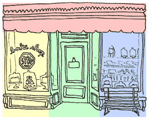
Attaching the art to the background
h2 above that’s targeted by this demonstration. It uses the illustration at the top of the page. Change the padding on the top and bottom to show more of the image. Move the image around by changing the x and y positions or use left, center, right, top, center and bottom keywords. Ad in the same image more than one. The second image is positioned so the bottom of the illustration shows up on top of the header.
CSS Code View
Sprites
Using Background Images
Adapting Background Images for Responsive Layouts
background-size: 66%; for the vertical and background-size: 100%; for the horizontal layout. But this means that the entire sprite is sized, and the original coordinates need to be multiplied by 1.5 to locate the image on the sprite.