FINALIZING IDEAS
Here is the edited project proposal, which I is what worked from in the end:
CONCEPT: midlife crisis time -> IDENTITY CRISIS: COLLEGE EDITION
I’m a sophomore and I have become increasingly dissatisfied with my choice of major (fashion design). I want to switch to game design (I would have to start from scratch but hopefully I would be okay). I’m not sure if I should. I asked a lot of seniors in Design and Technology and Fashion Design about it and got conflicting answers leaning toward the “yes, switch!!! be happy!!!” side, which I am now also leaning toward.
This project will be about my internal struggle between the safe choice to stay on the fashion track and the unknown choice to switch majors.
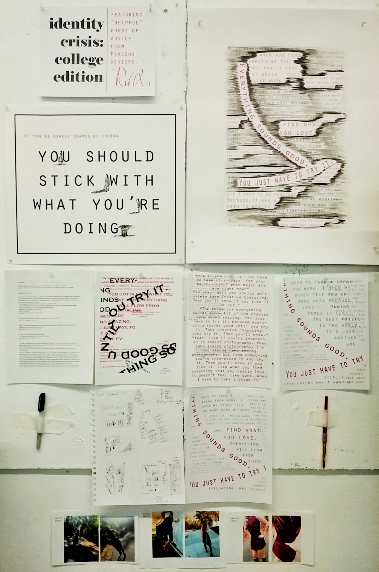
A series of two contrasting panels with an additional title panel depicting my current situation and my uncertain future, including text of advice verbatim that I have received from older students.
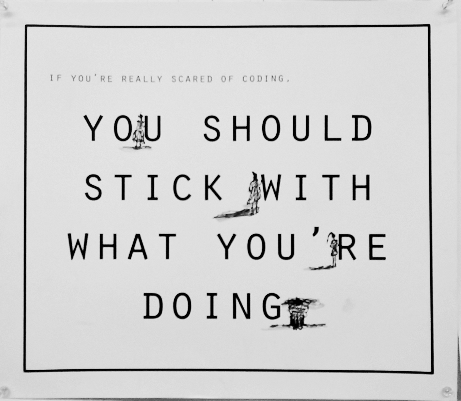
ME NOW: desolation, emptiness, monochrome existence. Square panel, tabloid size but cut off excess.
Strong lines. Black and white with some pops of color – strong reds, blues. Pen ink, marker hand drawn illustrations of outfits I made in studio class standing/sitting/leaning on individual letters. Probably use fashion illustration style – angular, unrealistic proportions. The period can be a small drawing of me in the fetal position.
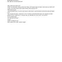
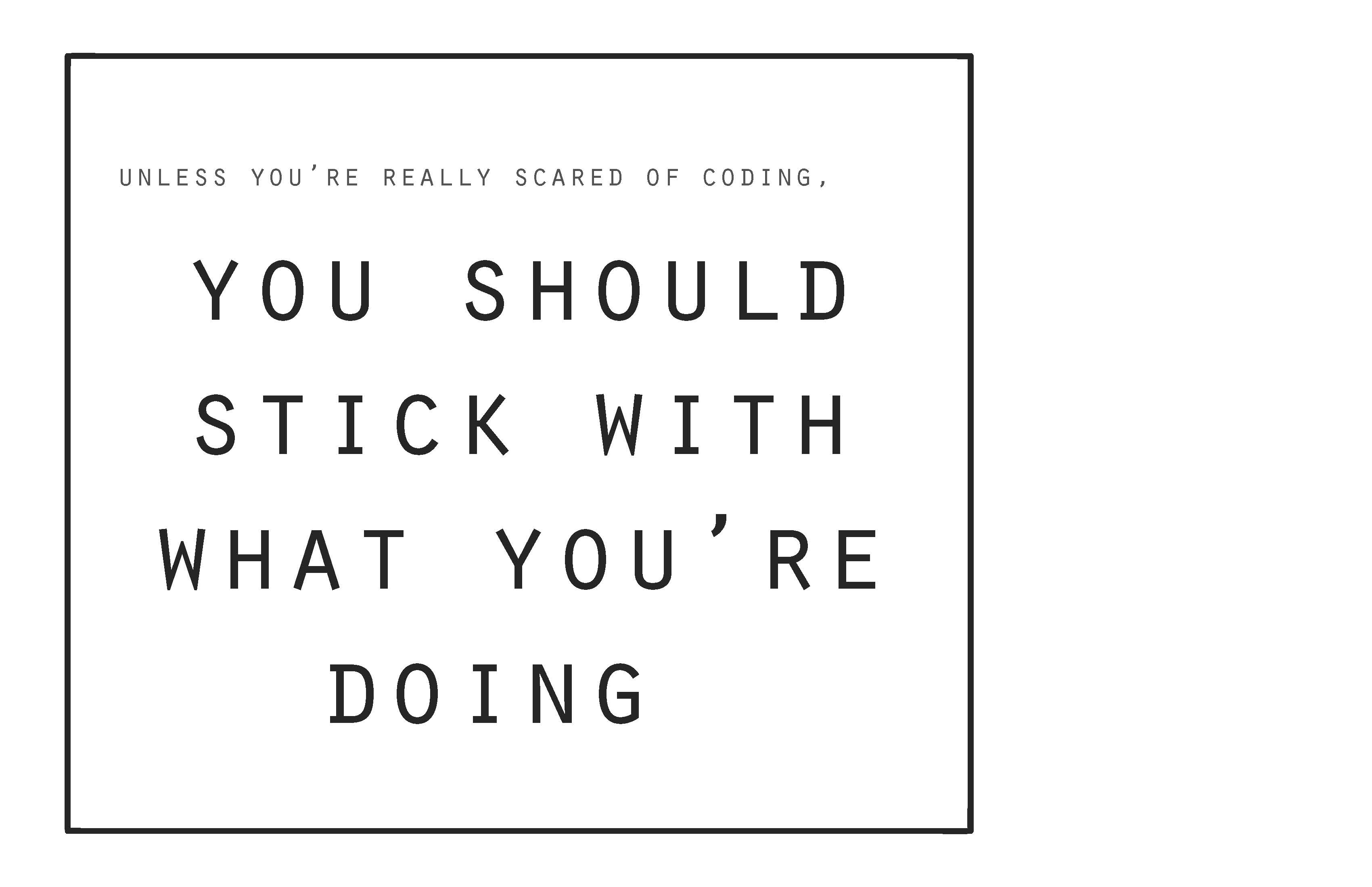
In black thin sans serif: “If you’re really scared of coding, you should stick with what you’re doing.”
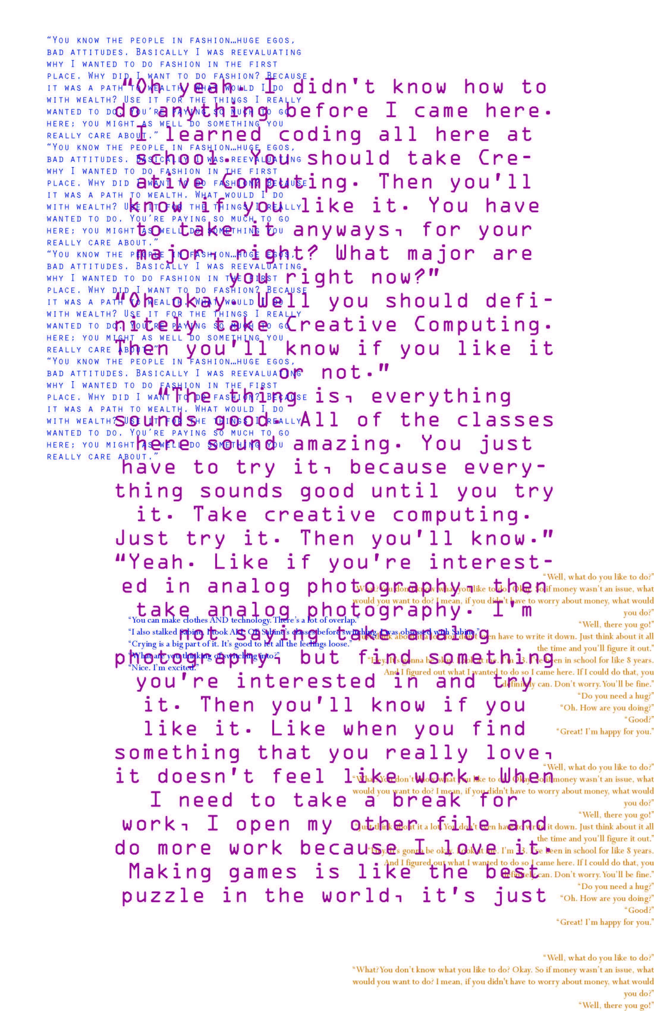
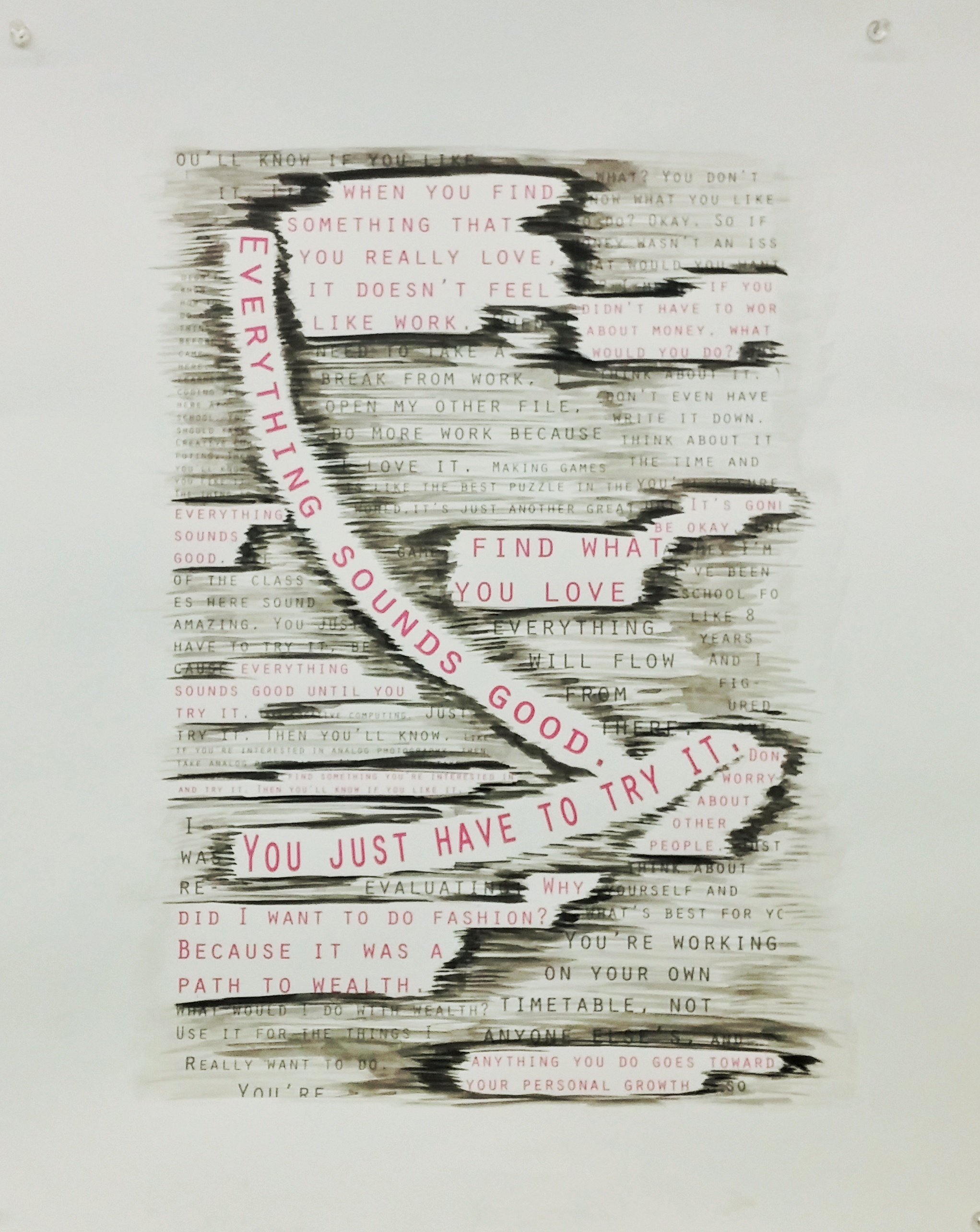
UNCERTAIN FUTURE: abstract, magenta and grey text, busy, full composition. Vertical panel, tabloid size. Print on bristol paper in 2W 13th.
Non-representational shapes filled with text (advice encouraging me to switch) resembling my blisters from pushing pins into mannequins all day.
Watercolor and/or black ink wash. Maybe some charcoal?
Readability not a priority.
Use thick, chunky fonts. Use hierarchical scale based on importance/impact. Biggest should be: “Everything sounds good. You just have to try it.”
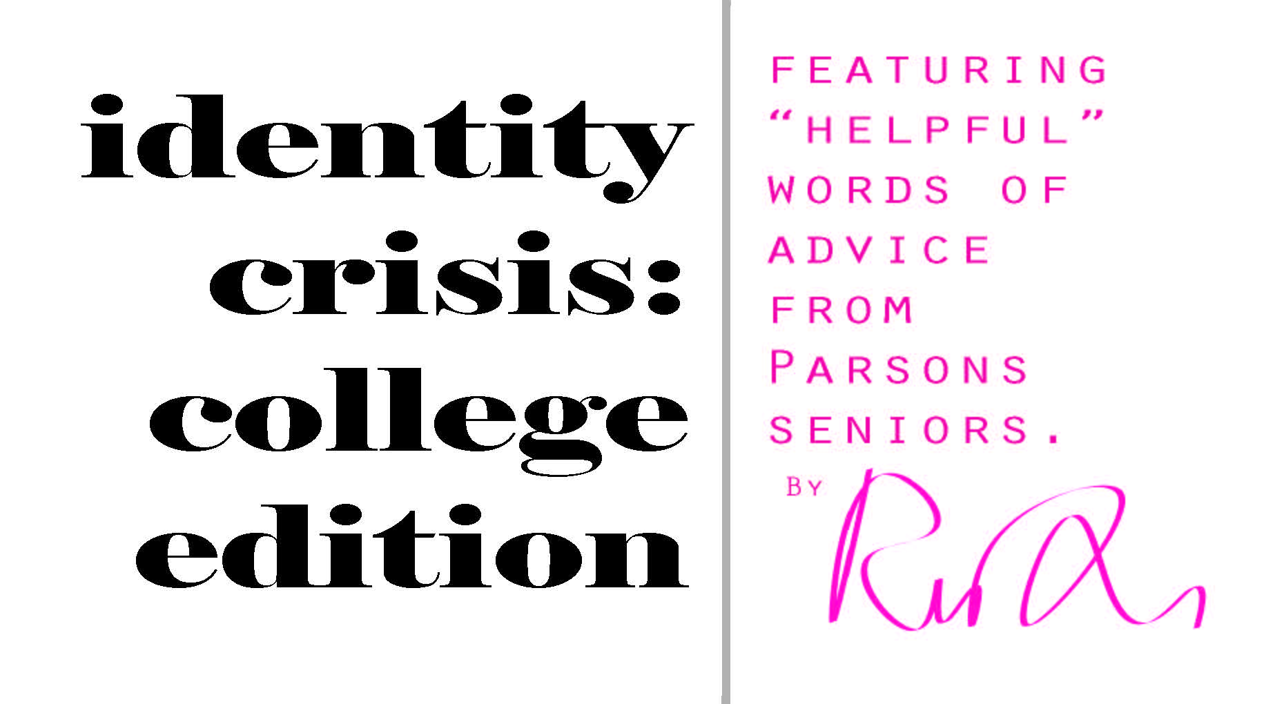
TITLE CARD: simple, small, letter size, text only. Displays title and basic info.
Lapse-lock “identity crisis: college edition” in black with a serif font.
Put my signature/logo on it with basic info in magenta and a contrasting font.
MATERIALS:
Illustrator for text. Bristol paper to print on in the 10th floor of 2 W 13th St. Markers, Sharpies, watercolor paint, india ink, micron pens.
THUMBNAIL SKETCHES:
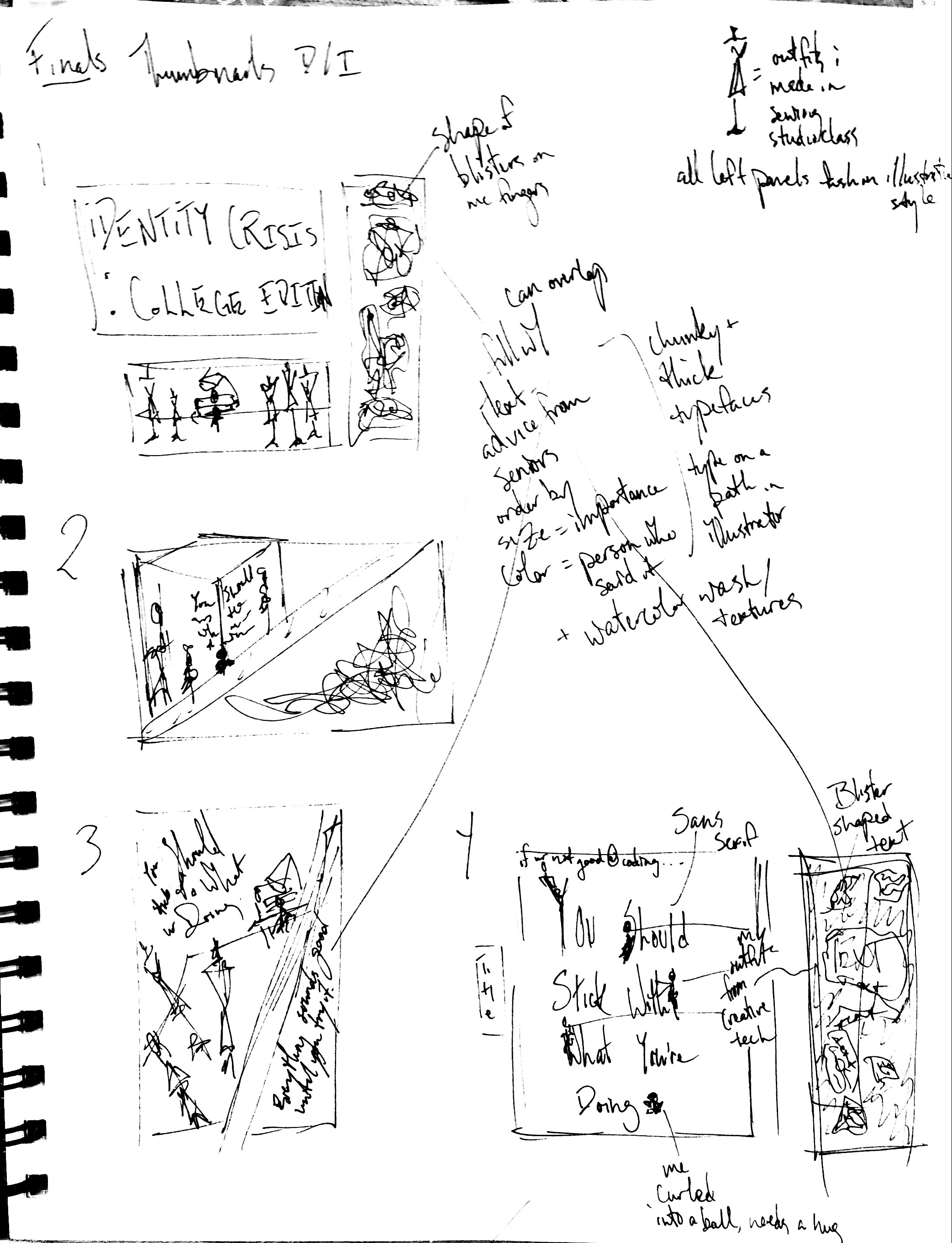
I am using the fourth composition in the bottom right corner of the sheet. I put my attempts in the google drive folder titled “Final Project.”
RESEARCH:
I will use my own photos as references for the ME NOW panel, which will resemble the angular, sparse, distorted look of fashion illustration.
The UNCERTAIN FUTURE panel will be influenced by the visual style and colors of Perfume’s Sweet Refrain music video (https://www.youtube.com/watch?v=CYL3DnyA4e0) and album cover (http://i2.w.yun.hjfile.cn/doc/201311/bb67cac70311486bbfa5a9d49cf1cc2f.jpg).
CLASS REFERENCE:
I will use figures in space, figure studies, watercolor painting, ink, color, Illustrator, and possibly charcoal for UNCERTAIN FUTURE panel.
FINAL PRESENTATION:
The three panels will be arranged side by side, not touching, on a wall.
MAKING THE PROJECT
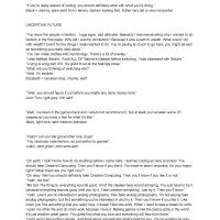
I started by writing down all the advice verbatim I could remember from my conversations with other people about switching majors. Most of them were with seniors majoring in Design and Technology, which is what I would like to switch to, so that was incredibly helpful. Here is a link to all of the advice I remember with exact wording:
https://docs.google.com/document/d/1-K_vBg14ts-e1jk1SE9ypM9CcZNOE-PSmEr73Y5_xZg/edit
And here are photos, for brevity’s sake:
Some words made more of an impact on me than others did. I wanted to enlarge those to emphasize their importance. Since the assignment is to do a series connected by a theme, I made one piece encouraging me to stay with my major (ME NOW) and one piece encouraging me to switch (UNCERTAIN FUTURE). The content and composition of the two reflect the amount of people contributing to each side; ME NOW has one thought on it, as only one person told me a few things that made me think it would be best if I did not switch, while UNCERTAIN FUTURE is full with text, as many people told me many things that make me want to switch.
DIGITAL WORK
I think I started making the ME NOW panel first. I sat in the DT building working on the digital part of this project for seven hours on Thursday…
I did not change it much from the original thumbnail sketch. I did add the text on top, “Unless you’re really scared of coding,” to add context. I also left a space in lieu of a period so that I could draw myself as the period, although that is also in the thumbnail sketch. Initially, I thought a “fashiony” font like a very thin sans serif with slightly curved corners would be fitting, as this is the panel where I stay a fashion major. But this one reminds me of the guy who said the quote, and the box around the text makes it look like a graphic on a sweatshirt or a label tag. I will print it out and draw figures wearing the outfits I made for Creative Technical Studio in the letters later. They will be in a fashion illustration style with markers and pen ink.
Later I noticed that I wrote “Unless” instead of “If” and fixed that.
The UNCERTAIN FUTURE panel gave me SO MUCH trouble. I wanted to fill the page with text both because I received so much advice with this viewpoint and because business represents my overwhelming confusion. Additionally, a full page contrasts with the other panel.
I wanted to make blister-like shapes because I have so many blisters from pushing pins into mannequins. My first attempt at this with the curvature tool was very messy. I tried writing on a path in Illustrator and filling in the area, but the composition was an unpleasant mess and I wasn’t able to manipulate the lines the way I wanted them to go.
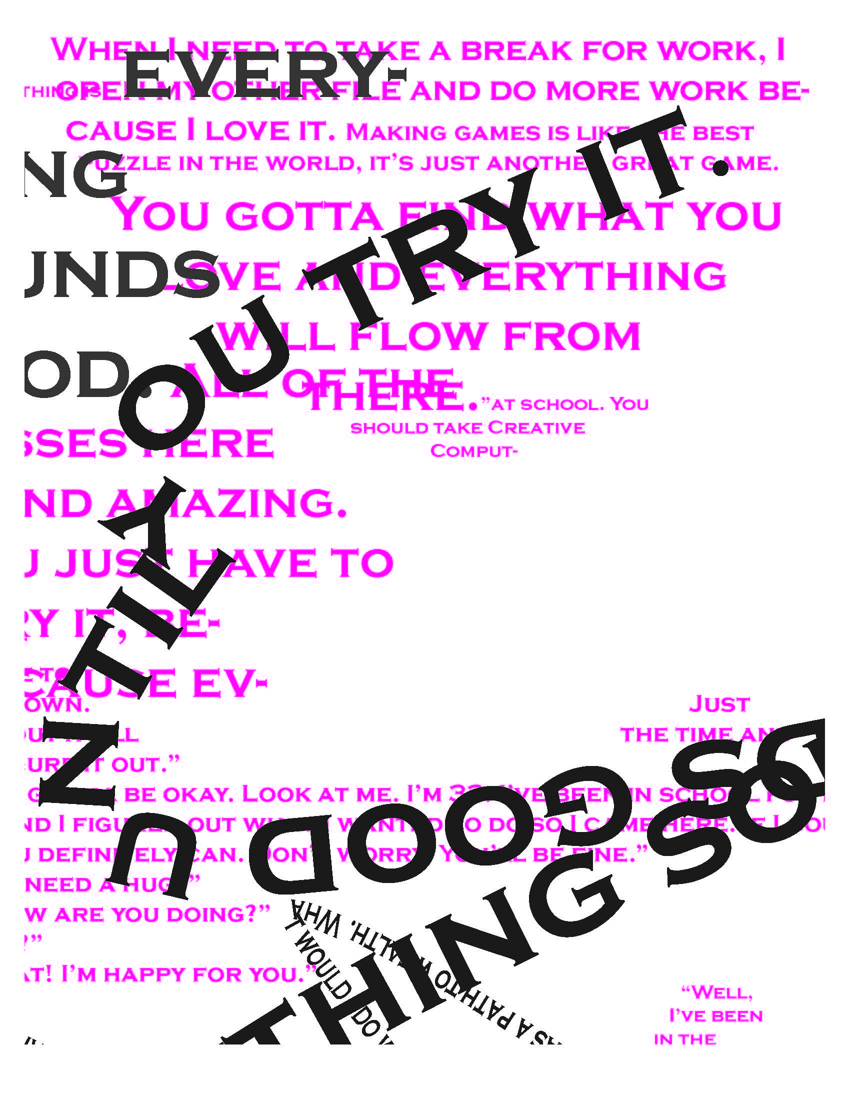
I gave up and started another version that was meant to look very layered and organized in a way that is hard to read, but that turned out unsatisfying as well.
The different colors were meant to indicate who said what. This version didn’t look good either.
I was frustrated and tired of working on that panel, so I went to do something else. That ended up being the title card. I am not sure why the image looks squashed down when I insert it into this blog post.
Most work in museums and galleries have a little plaque stating the piece’s title, the artist, and a basic background or meaning. Including one makes my series easier to understand, as it is about a very specific, personal matter that not everyone can immediately identify. The title adds a little humor as well.
Neither panels use a fat, full serif typeface, so the one used here makes a good contrast. All the other text is capitalized as well, so keeping the title in lapse-lock marks its importance.
I chose the color palette through making the title card. At this point I remembered that simple is best when dealing with graphics, so I simplified the color palette of the text, limiting it to only black, grey, and magenta because I love magenta, and to match with my logo which I made with the curvature tool. In the context of the piece, the bright pink looks hopeful.
I also changed the description text a little bit. It used to be “with ‘helpful’ words of advice from various seniors at Parsons,” which is too wordy. “Featuring ‘helpful’ advice from Parsons seniors” is tighter and more succinct. I added the grey line as a separator too, because grey is incorporated in the text of the other panels. This establishes the color palette.

After making the title card, I went back to the UNCERTAIN FUTURE panel.
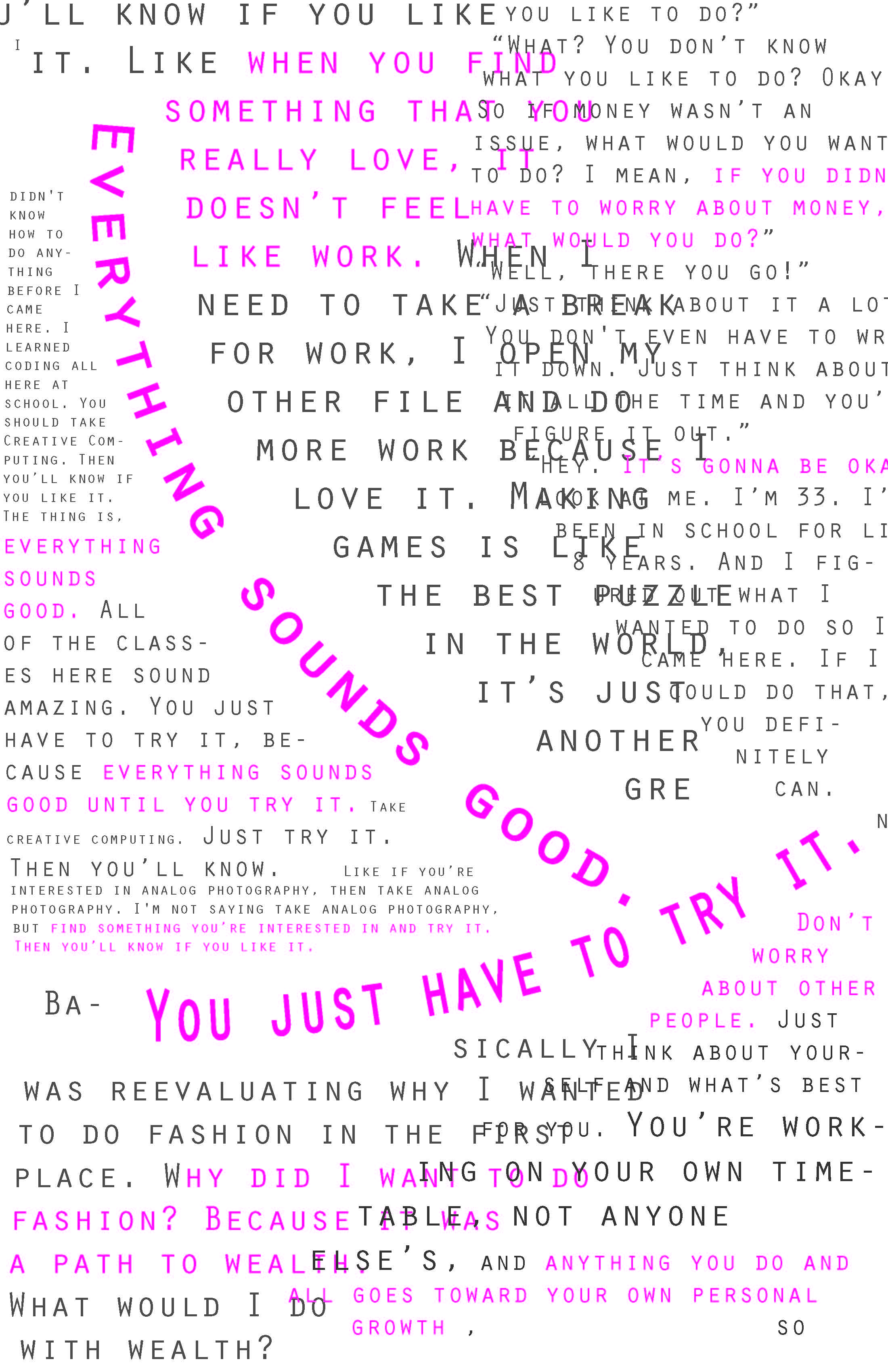
The title card reminded me that simplicity is best. I laid down “Everything sounds good. You just have to try it,” first. That phrase stuck in my mind the most, so it is the focal point of the composition.
Who said what does not matter in the end, since all of their advice points me toward switching. So most of that text is grey. Pink is used as a highlight for the most insightful comments, as is size. I stuck with one font for simplicity’s sake. This font looks a little less fashion and a little more technology. And I used the type in an area tool. The overlapping comes from the blister idea I had at first. Their advice overlaps in my head, too, so that is fitting.
I asked my Visual Communication Studio/second year drawing teacher for suggestions and he mostly said to consider spacing and sizes, so I tweaked both of those a bit. He also said that I should just do something if I’m thinking of doing it. Go crazy! I will do that.
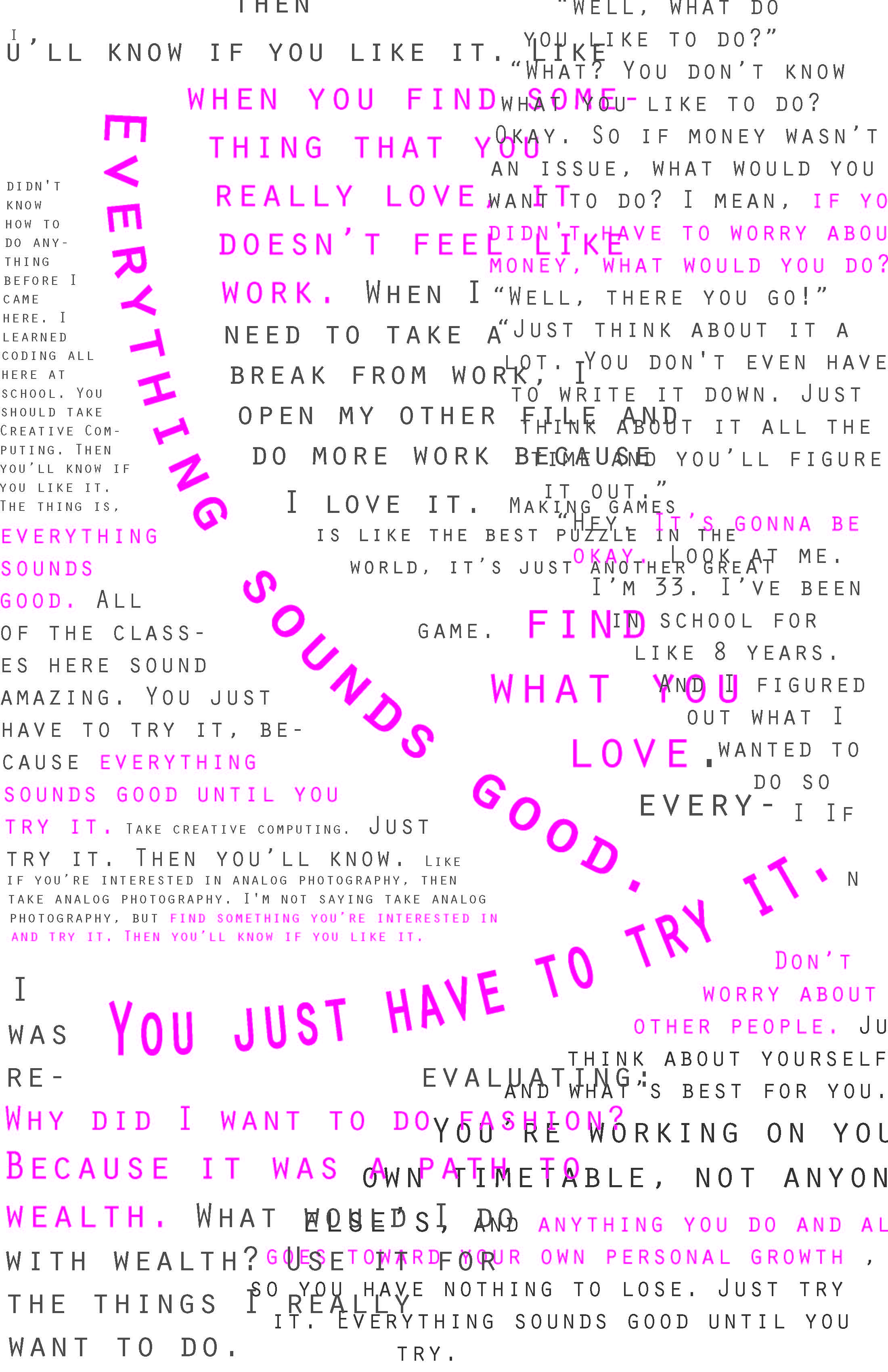
Then I went to print. Unfortunately, the printer was kind of dirty? so there are some stains on the UNCERTAIN FUTURE panel, but I can cover those with the hand drawing component, which I will start on Monday or over the weekend. It also did not print as vibrant. The pink looks more maroon on paper. I used this print out to experiment with mark making, a little with red acrylic paint and marker, but mostly with india ink. I went with india ink.
I asked Alaiyo for advice and she said to get rid of the overlapping. so the end print out looked like this:

Simple is best, so the texture I made with the ink was just straight lines layered on top of each other to emphasize the pink quotes. It still looks busy and full, but not too busy, and makes a good contrast with the other panel.
This panel did not need much imagery on it because the focus is on the worlds and sparse desolation, so I just added some sketches of garments I made for my Creative Technical Studio class this semester, and a little figure of me acting as the period in fine point Sharpie ink.
I displayed this series at Open Studios on Wednesday, December 14th.
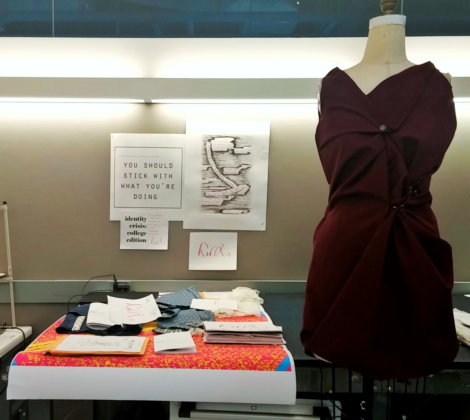
Here is a photo of the final presentation: