For the photoshop montage project, students first created watercolor compositions inspired by an object. Each respective composition would encapsulate one of three themes: edible, audible, or narrative. Students subsequently compiled five or more high-resolution images that tied into their chosen themes; these images could be photographs, artwork, patterns/textures, personal images, or found images. After completing the watercolor composition and compiling images, students then placed the work into photoshop and created a digital “collage” or “montage” of sorts that encapsulated one of the aforementioned themes.
For my photoshop montage project, I chose to explore the audible theme. For the past few months, I have been working on an in-depth research project exploring the intersection of fashion and the Grateful Dead. The project combines my two greatest passions, and it has inevitably consumed my life (only in the best way possible, of course). My mind has been in a full-fledged Grateful Dead zone since February, so as soon as Alaiyo introduced this project to the class, I knew I wanted to continue to explore that world, but in a new format.
My watercolor composition is inspired by a photograph of Jerry Garcia, the frontman for the Grateful Dead, taken during the band’s 1972 European tour. I found this photograph on one of the pages of a booklet that was tucked into my copy of the Grateful Dead’s Europe ’72 live album. This particular album has a great deal of significance to me. Europe ’72 was the first Grateful Dead album my dad ever heard. He was thirteen years old at the time, and one of his friend’s older brothers sort of forced it on him. That was forty-six years ago, and not a day goes by where my dad doesn’t listen to the Dead. I feel fortunate enough to have inherited his love for this music; our shared passion for the Grateful Dead has engendered such an incredible, indescribable bond between the two of us, and it’s something I hold very close to my heart.
On my second day in New York, I spent the afternoon wandering the East Village. I stumbled upon a modest record store on east 12th street, and although I walked in there with no intention whatsoever of buying any records, I walked out with my own copy of Europe ’72 (I’d managed to snag a few of my Dad’s records and bring them with me to New York, but he refused to let me take his copy of the aforementioned album). The man at the record store sold me the copy for just five dollars, after we engaged in what must have been a forty-five minute long conversation about the Grateful Dead. My copy of Europe ’72 will always remind me of the very first friend I made in New York: the man at Academy Records.
While I was working on my watercolor portrait of Jerry, I was listening to my all-time favorite Grateful Dead show: Raceway Park, Englishtown, New Jersey, September 3rd, 1977. I’ve always felt strongly that this show boasts the best version of “Eyes of the World,” a divine ode that never fails to transport me to a place I can’t even begin to describe in words. When I listen to “Eyes of the World” from Englishtown, I see colors — deep purples, blues, and hints of green. At certain points in the thirteen-minute long jam, I see flashes of just one color; at other points all of the colors converge, creating cosmic spirals and configurations. I wanted my portrait of Jerry to pull from the mental color palette I involuntarily invoke any time I listen to the Englishtown version of “Eyes.” This color palette subsequently acted as a source of inspiration for my project as a whole.
Aside from being inspired by a particular color palette, I was also inspired by the experience of being a “Deadhead” (this is a term commonly used in reference to fervent followers of the Grateful Dead). The live show experience is such an integral component of the Deadhead subculture, so I wanted to embody that through photography from shows, ticket stubs, and handwritten setlists. In essence, I wanted my montage to encapsulate the lyrics and imagery from “Eyes of the World,” the colors I see when I listen to the Englishtown version of the song, and the experience of being a Deadhead during the band’s thirty years of touring.
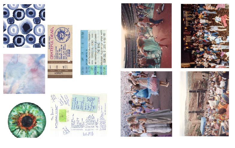
The photo that occupies most of the composition was taken on July 27th, 1982 in Morrison, Colorado at the famous Red Rocks Ampitheater. This is one of my favorite crowd photos; I love the colorful nature of the crowd and the beautiful landscape that envelopes the ampitheater. I have a vast collection of Grateful Dead-related photos on my computer, so I decided to peruse my own personal archive for more inspiration. I have quite a few photos of dancing Deadheads saved, and I knew I wanted to incorporate some of those, as well. I’m so inspired by the sense of movement captured in these photographs; I think it’s a true testament to the free-spirited nature of Deadheads and the collective willingness to completely immerse oneself in the live music. I found a few dancers whose clothing matched my desired color palette, so I ultimately chose to include them in my composition. I wanted to essentially turn these figures into patterns by duplicating them and playing with scale. I love the way that aspect of the montage turned out.
I superimposed ticket stubs and a setlist from a 1976 show at the Orpheum as documented by a fan. The Grateful Dead played 2,318 shows in their thirty years together, and miraculously, no two setlists were the same. Because of this, it was not uncommon for fans to write down the setlists during the shows. In fact, whenever I see any Grateful Dead incarnation, I always bring a notebook/sketchbook so that I can write down the setlist as well.
All of my chosen images refer to a different era of the Grateful Dead, from the 1976 setlist, to the 1995 ticket stub from the Grateful Dead’s final live performance before the tragic passing of Jerry Garcia just one month later. My collage is a testament to the vastness of this music and its respective subculture.
For my montage, I employed a few different Photoshop techniques. In order to remove figures from their backgrounds, I used the direct selection tool and created layer masks. I played around quite a bit with opacity; I not only wanted the setlist/ticket stubs to blend in with the “background” image, if you will, but I also wanted them to mimic the sheer nature of the dancer’s dress on the left side. I played around with gradients and the feathered edge tool as well. I think I’m most pleased with the way I was able to cut out the sky from the Red Rocks photograph and replace it with two beautiful watercolor compositions I found online. I can wholeheartedly imagine being at that show and looking up and seeing a watercolor sky. The loose, somewhat indefinite nature of watercolor is not unlike the fluid nature of the Grateful Dead’s sound.
Ultimately, I am pleased with the outcome of my montage. I feel strongly that it captures the essence of the Deadhead experience, and I love the way the colors interact with each other within the composition. My only regret with this project lays in the fact that I could not effectively incorporate my watercolor composition into the montage. I’m quite proud of my Jerry portrait; I posted it in one of the Deadhead facebook groups that I’m apart of, and people even asked me if I would put it on a t-shirt! That being said, I couldn’t find a way to make my portrait work with my composition. I think if I had chosen my images first and then created the watercolor, the two would’ve worked better together.
Below: My final montage

Below: My watercolor painting of Jerry Garcia c. 1972, in all of his four-and-a-half-fingered glory.

Below: Contact sheet featuring all of the images I included in my montage.