DRAWING/IMAGING FINAL PROJECT: What I Wore, & When, & Why

For the final project in Drawing/Imaging, students were given the freedom to create their own concept/project, so long as the proposal incorporated both analog and digital elements.

After being tasked with this assignment, I knew almost immediately that I wanted to create some sort of fashion illustration. I’ve always enjoyed creating fashion illustrations by hand, but after taking Alaiyo’s class, I learned how to create digital illustrations by way of Illustrator. Of all of the tangible skills I’ve learned during my first year at Parsons, mastering Illustrator has been by far the most rewarding and exciting for me. After a conversation with Alaiyo, I ultimately decided that I would create two separate shoe illustrations — one analog, and one digital. The two illustrations would depict two different pairs of shoes that I identify strongly with.

As someone who wants to pursue a career in the fashion industry, I’ve always been frustrated by the trivialization of what it means to enjoy and appreciate clothing. I once had a family “friend” say to me, “you want to go into fashion? What, was engineering too difficult for you?” No, I’m not kidding. That literally happened, and three years later, I still replay that condescending remark in my head over and over and fantasize about the snarky responses my young self had to bite her tongue to refrain from uttering out loud. Admittedly, there is nothing I hate more than when I am looked down on or perceived as superficial for demonstrating an interest in fashion. I have always felt strongly that one’s clothing should tell a story about the person who wears them. Clothes should function as an extension of one’s values, beliefs, and character. Andy Warhol once cleverly quipped, “I am a deeply superficial person.” In one of my favorite fashion documentaries, The First Monday in May, Andrew Bolton (the chief curator of the Costume Institute at the Met) suggests that Warhol’s proclamation also applies to fashion, and I think he’s absolutely correct. Fashion, in and of itself, is deeply superficial; in a literal sense, it consists of what exists only on the surface. But clothing, when presented and accumulated in the right manner, is a way for us to tell the world about ourselves without actually saying anything at all.

My sartorial preferences (especially when it comes to shoes) are, in many ways, an extension of my character. I consider my shoe drawings to be much more than just fashion illustrations; I consider them to be self portraits.

I also consider fashion a form of storytelling. One of my long-term goals is to one day create a book that addresses the relationships I have with pieces in my wardrobe and how these pieces function as tangible reminders of specific moments or periods in my life.  I wanted the two illustrations for my final project to function as preliminary exercises in how to one day approach my book. The working title for my book is What I Wore, and When, and Why. The title is inspired by my all-time favorite poem, “What My Lips Have Kissed, and Where, and Why” by Edna St. Vincent Millay. I discovered this poem during a trip to the Whitney Museum a few years ago, and it’s resonated with me ever since.


ANALOG DRAWING:

In an effort to merge my passion for drawing and writing, I decided to create accompanying text below my analog drawing. When I envision my book, I see pages and pages filled with my illustrations, along with text below the illustrations to contextualize each illustration. Some of the texts will include humorous anecdotes, others will be more serious. In the case of this particular shoe, the anecdote is a bit of both; more than anything else, however, it reinforces the notion that what I wear is, in a larger sense, a reflection of who I am.

The analog drawing depicts my absolute favorite pair of shoes that I own: my satin Prada pumps. They are incontestably ridiculous, vibrant, and loud, and that’s precisely why I love them so much. I’ve had countless people stop me on the streets to tell me how much they love these shoes (and can I blame them?!), but more importantly, they make me feel utterly confident, which is an incredibly powerful feeling for someone who’s struggled with an overwhelming sense of self doubt for most of her life. When I look at this particular pair of shoes, I see the woman I strive to be and the woman I feel that I’m slowly (but surely) becoming. And that’s liberating, isn’t it?

In terms of my process, I worked from online photographs of the shoe, as well as the physical pair that I own. I decided to use micron pen for the illustration; it’s the medium that’s most comfortable and familiar to me, and the extremely fine tip of the pen allows me to include extreme details in my work (and as a self-identifying detail-oriented freak, this is of the utmost importance to me). When it comes to analog drawings, I rarely apply color (especially after my mother  “borrowed” my  beloved Sakura Koi travel watercolor kit!), but I felt that for a final composition, it would be a mistake not to include some element of color (and how could I effectively capture the essence of such an obnoxiously colorful shoe without incorporating color?!) . And so, I ultimately decided to incorporate color by applying a teal-ish acrylic paint to the body of the shoe (I already had this paint in my possession, and it’s pretty close to the actual color of the satin). Admittedly, I had a feeling this would turn out, well, terrible, but to my surprise — it didn’t! But after applying the teal paint, I felt that the composition still did not have enough color, so I decided to cut out my illustration and paste it onto a sheet of bright pink paper (which conveniently matches the color of the oversized button on the shoe strap). I love the idea of pairing two colors that technically shouldn’t go together, yet still somehow making them work. Normally, the combination of teal and bright pink feels dangerously reminiscent of my great aunt who resides in Florida and drinks too many margaritas, but in this particular context, I think the combination just works (sorry, Linda).

Stylistically, I didn’t deviate too much from my normal approach to illustration, but the final composition is a lot brighter and, in my humble opinion, far more exciting than my typical approach, which is usually just pen and ink on ivory paper. Given how innately fun the actual shoes are, it’s only fair that the composition is just as exciting. And, beyond that, now I’m considering the possibility of including colored pages in the final version of my book.

ILLUSTRATOR DRAWING:

For my illustrator composition, I chose to draw a pair of shoes that, lamentably, I do not own, but I still identify strongly with nonetheless. Originally, these shoes would’ve made up one of the pages within the book, and the aforementioned pair would’ve gone on the cover, but I ultimately decided to reverse the roles of the two. These bright pink feathered heels are the sister shoe to the teal pair in that they’re both from Miuccia Prada’s F/W 2018 collection for her eponymous label. Like the teal pumps, these shoes scream impracticality, which is kind of what I’m all about (in every aspect of my life). I also just have an unquestionable penchant for anything fluffy, feathered, or tasseled, so these shoes really speak to me. I am wholeheartedly convinced that Miuccia hacked into my brain and designed these shoes specially for me, and I’m also wholeheartedly convinced that I will one day acquire them (although the amount of money in my bank account suggests otherwise).

For this illustration, I worked from a drawing I created in my sketchbook. I subsequently scanned the drawing into Illustrator and traced over it. After my first Illustrator assignment for Alaiyo’s class, I learned so many amazing ways to use the technology of the program to create digital illustrations that mimic a lot of what I create in my analog drawings. I played around a lot with line width and width profile (I have become addicted to that one width profile that’s shaped a bit like a grain of rice, with the tapered edges, and in turn I’ve become repulsed by the sight of a uniform line). Working with Illustrator may be the only context in which having a Dell is truly an advantage; I use the touchscreen technology to apply strokes with my fingertips, which is truly a lifesaver because it gives me so much more control over my lines. I played with opacity as well to create shadows, and, for maybe the first time ever, I paid very close attention to my layers (I had a color layer, skintone layer, line layer, text layer, and so on).

With this particular illustration, I tried something brand new in Illustrator: calligraphy/typography/fontmaking (?)

I am unbelievably particular when it comes to typography/fonts, and I’ve found that none of the available fonts in Photoshop/Illustrator really work well with the style of my drawings. I effectively combated this issue by creating my own font, if you will. For the book title, which I placed at the top of the composition, I used the pencil tool, along with the touchscreen technology, to create a calligraphic font that sort of mimics the movement of the feathers on the shoe. I wanted there to be a font distinction between the title and my name, so I wrote out my name on the bottom of the page in my typical all-caps handwriting, working with the pen tool to create smooth, straight lines.

My original plan was to simply present my illustrator document on a tabloid-sized sheet of paper. My analog drawing would be presented as is, on the 8 1/2″ x 11″ sheet. However, after a conversation with Alaiyo, we agreed that it would make more sense for me to present my illustrator drawing (the cover page) on an actual book to get a sense of how this would look as a book cover. Unfortunately, I made a very stupid mistake in my process: I made my illustrator composition on a pretty massive artboard (I could’ve sworn it was tabloid sized, but even then, shrinking it down to the 9 1/2″ x 6 1/2″ book cover would’ve been an issue). When I attempted to reduce the size of my composition, the drawing became severely distorted. The line widths and such that I originally implemented worked perfectly with the artboard size I originally used, but when I resized the artboard and subsequently scaled down the composition, everything looked extremely out of place and awkward (the lines were too thick, and colors spilled over lines).

If/when I have the time, I do intend to re-work my illustrator piece so that it works for the prospective size of my book, but for now, I have to simply work with it as is. I’m really pleased with the outcome of both of my compositions, but hopefully I can continue to work with them and make them better suited for an actual book.

REFERENCE PHOTOS:
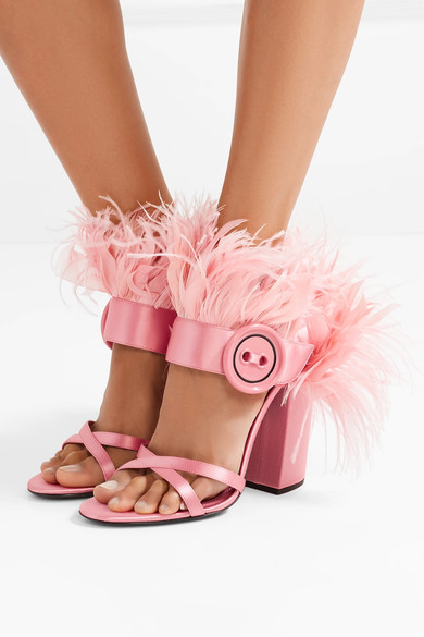
Image result for prada pink feather heels

Below: Original drawing of pink feathered heel.Image result for prada teal satin beaded pumps

DRAWING/IMAGING: PHOTOSHOP MONTAGE

For the photoshop montage project, students first created watercolor compositions inspired by an object. Each respective composition would encapsulate one of three themes: edible, audible, or narrative. Students subsequently compiled five or more high-resolution images that tied into their chosen themes; these images could be photographs, artwork, patterns/textures, personal images, or found images. After completing the watercolor composition and compiling images, students then placed the work into photoshop and created a digital “collage” or “montage” of sorts that encapsulated one of the aforementioned themes.


For my photoshop montage project, I chose to explore the audible theme. For the past few months, I have been working on an in-depth research project exploring the intersection of fashion and the Grateful Dead. The project combines my two greatest passions, and it has inevitably consumed my life (only in the best way possible, of course). My mind has been in a full-fledged Grateful Dead zone since February, so as soon as Alaiyo introduced this project to the class, I knew I wanted to continue to explore that world, but in a new format.


My watercolor composition is inspired by a photograph of Jerry Garcia, the frontman for the Grateful Dead, taken during the band’s 1972 European tour. I found this photograph on one of the pages of a booklet that was tucked into my copy of the Grateful Dead’s Europe ’72 live album. This particular album has a great deal of significance to me. Europe ’72 was the first Grateful Dead album my dad ever heard. He was thirteen years old at the time, and one of his friend’s older brothers sort of forced it on him. That was forty-six years ago, and not a day goes by where my dad doesn’t listen to the Dead. I feel fortunate enough to have inherited his love for this music; our shared passion for the Grateful Dead has engendered such an incredible, indescribable bond between the two of us, and it’s something I hold very close to my heart.

On my second day in New York, I spent the afternoon wandering the East Village. I stumbled upon a modest record store on east 12th street, and although I walked in there with no intention whatsoever of buying any records, I walked out with my own copy of Europe ’72 (I’d managed to snag a few of my Dad’s records and bring them with me to New York, but he refused to let me take his copy of the aforementioned album). The man at the record store sold me the copy for just five dollars, after we engaged in what must have been a forty-five minute long conversation about the Grateful Dead. My copy of Europe ’72 will always remind me of the very first friend I made in New York: the man at Academy Records.

While I was working on my watercolor portrait of Jerry, I was listening to my all-time favorite Grateful Dead show: Raceway Park, Englishtown, New Jersey, September 3rd, 1977. I’ve always felt strongly that this show boasts the best version of “Eyes of the World,” a divine ode that never fails to transport me to a place I can’t even begin to describe in words. When I listen to “Eyes of the World” from Englishtown, I see colors — deep purples, blues, and hints of green. At certain points in the thirteen-minute long jam, I see flashes of just one color; at other points all of the colors converge, creating cosmic spirals and configurations. I wanted my portrait of Jerry to pull from the mental color palette I involuntarily invoke any time I listen to the Englishtown version of “Eyes.” This color palette subsequently acted as a source of inspiration for my project as a whole.

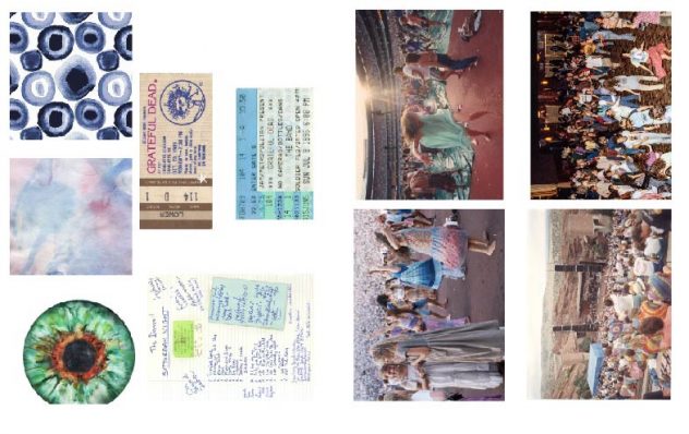
Aside from being inspired by a particular color palette, I was also inspired by the experience of being a “Deadhead” (this is a term commonly used in reference to fervent followers of the Grateful Dead). The live show experience is such an integral component of the Deadhead subculture, so I wanted to embody that through photography from shows, ticket stubs, and handwritten setlists. In essence, I wanted my montage to encapsulate the lyrics and imagery from “Eyes of the World,” the colors I see when I listen to the Englishtown version of the song, and the experience of being a Deadhead during the band’s thirty years of touring.


The photo that occupies most of the composition was taken on July 27th, 1982 in Morrison, Colorado at the famous Red Rocks Ampitheater. This is one of my favorite crowd photos; I love the colorful nature of the crowd and the beautiful landscape that envelopes the ampitheater. I have a vast collection of Grateful Dead-related photos on my computer, so I decided to peruse my own personal archive for more inspiration. I have quite a few photos of dancing Deadheads saved, and I knew I wanted to incorporate some of those, as well. I’m so inspired by the sense of movement captured in these photographs; I think it’s a true testament to the free-spirited nature of Deadheads and the collective willingness to completely immerse oneself in the live music. I found a few dancers whose clothing matched my desired color palette, so I ultimately chose to include them in my composition. I wanted to essentially turn these figures into patterns by duplicating them and playing with scale. I love the way that aspect of the montage turned out.


I superimposed ticket stubs and a setlist from a 1976 show at the Orpheum as documented by a fan. The Grateful Dead played 2,318 shows in their thirty years together, and miraculously, no two setlists were the same. Because of this, it was not uncommon for fans to write down the setlists during the shows. In fact, whenever I see any Grateful Dead incarnation, I always bring a notebook/sketchbook so that I can write down the setlist as well.


All of my chosen images refer to a different era of the Grateful Dead, from the 1976 setlist, to the 1995 ticket stub from the Grateful Dead’s final live performance before the tragic passing of Jerry Garcia just one month later. My collage is a testament to the vastness of this music and its respective subculture.


For my montage, I employed a few different Photoshop techniques. In order to remove figures from their backgrounds, I used the direct selection tool and created layer masks. I played around quite a bit with opacity; I not only wanted the setlist/ticket stubs to blend in with the “background” image, if you will, but I also wanted them to mimic the sheer nature of the dancer’s dress on the left side. I played around with gradients and the feathered edge tool as well. I think I’m most pleased with the way I was able to cut out the sky from the Red Rocks photograph and replace it with two beautiful watercolor compositions I found online. I can wholeheartedly imagine being at that show and looking up and seeing a watercolor sky. The loose, somewhat indefinite nature of watercolor is not unlike the fluid nature of the Grateful Dead’s sound.

Ultimately, I am pleased with the outcome of my montage. I feel strongly that it captures the essence of the Deadhead experience, and I love the way the colors interact with each other within the composition. My only regret with this project lays in the fact that I could not effectively incorporate my watercolor composition into the montage. I’m quite proud of my Jerry portrait; I posted it in one of the Deadhead facebook groups that I’m apart of, and people even asked me if I would put it on a t-shirt! That being said, I couldn’t find a way to make my portrait work with my composition. I think if I had chosen my images first and then created the watercolor, the two would’ve worked better together.

Below: My final montage

Below: My watercolor painting of Jerry Garcia c. 1972, in all of his four-and-a-half-fingered glory.

Below: Contact sheet featuring all of the images I included in my montage.


Falling in Love with Myself

I remember Saturday afternoons in high school. I would spend most of my free time in Boston, hiding in a café and drawing for hours, until I would force myself out the door so that I could make one of the late night 442 buses. In cafés, I generally kept to myself, but as I sat on a Blue Line train, still diligently working on disturbing portraits of decaying faces, I would notice fellow passengers staring intently at my work (I can’t blame them; I too would stare if I saw a teenage girl sitting on the train drawing disturbing portraits of deteriorating faces). On occasion, a stranger’s sheer curiosity would lead to conversation. Often the conversations revolved around my drawings, and almost always ended (or in some cases, began) with the same question: “are you an artist?”

My response was almost always something to the effect of, “I don’t know.” Initially, I struggled with the question only because of my age. Throughout high school, strangers often assumed I was much older (which, of course, in every context except for that moment of inquiry, I really enjoyed). When asked if I was an artist, I knew what most people were trying to get at; a more appropriate phrasing of the question would have been, “are you an artist? As in, are you an adult with a real job who gets paid real money for your art?” The answer was of course, no. It felt disingenuous to answer the question with “yes”, even if the definition of “artist” is not limited to those who create things professionally. I continued to receive the same question over and over, and concurrently I was beginning to fall out of love with my practice.The question of whether or not I was an artist was no longer simply difficult to answer; I began to resent the question so much that I actively rejected that title or any title, for that matter. Artist, writer, designer I wasn’t any of these things. At first, the titles just felt limiting. But as time went on, they didn’t even feel like me.

I came to New York City with a very clear answer to the question, “are you an artist?” The answer was no. I wasn’t an artist. I didn’t feel like an artist. I hated most of the work I created and suffered from very brief bouts of inspiration. I bear a really frustrating tendency to get over-excited about an idea and dedicate a lot of time and effort into its primitive stages, but I ultimately lose momentum once the project is about 75% done. Either because of non-negotiable deadlines or my own frustration with  working on the same project for too long, I would inevitably abandon my projects or severely compromise the final product. To no longer identify as an artist probably didn’t seem very appropriate for someone who was about to spend a great deal of money to attend an art and design school, which was precisely my issue. I came to this city (and to this school) feeling absolutely terrified because I no longer saw myself as an artist, but would be expected to assume that exact role for the next four years.

I adamantly pursued the role of the Non-Artist for the first month or so of school. In hindsight, I can see that I absolutely used my titular rejection as an excuse. To not identify as an artist meant that I didn’t need to try so hard in certain classes. “This isn’t me. I’m not here to be an artist,” I would remind myself constantly. I wasn’t an artist because I had no intention of making art for a living. I had effectively tricked myself into believing that I wasn’t the one thing everyone loved to label me as. I liked to pretend that I felt empowered by my fierce rejection of such descriptions, but I know I only renounced them because of deep-seated insecurities. I suffered from a crippling sense of self-doubt, triggered by an experience that stripped me of any sense of self-assuredness I once had. I resented the title of “artist” only because I didn’t feel worthy of it. My insecurities made me feel as though I wasn’t worthy of anything. Abject loneliness, however, forced me to reconsider the self-doubt I had carefully and clandestinely tucked into a suitcase and carried with me to New York.

What they don’t tell you about moving to a brand new city that boasts over 8.5 million people is that it is incredibly lonely. I never imaged making friends would be so hard. In high school, I spent a lot of time by myself, but my solitude was always voluntary. I had a handful of wonderful friends, but I often chose to partake in unaccompanied affairs. I spent countless Saturdays aimlessly wandering the cobblestone streets of Beacon Hill or feeding into my materialistic tendencies by frequenting shops on Newbury Street. I enjoyed these companionless activities because I chose to be on my own. In this brand new city, however, I have no other option but to engage in solitudinous affairs. I’ve found that it’s the absence of choice that makes involuntary solitude so much worse. That being said, I don’t necessarily view abject loneliness as an inherently bad thing. Loneliness has forced me to befriend the one person I never really liked: myself. Loneliness has forced me to become my own best friend. Loneliness has forced me to spend so much time with myself, my thoughts, and ideas, to the point where I think I’ve fallen madly in love with them. Whereas before, I felt such a disconnect from my own self that I couldn’t even identify with my creative tendencies, I now feel more connected than ever to my work. Taking the things that exist within the confines of my mind and putting them down on paper makes me feel a little less lonely. My thoughts and ideas are my friends. My drawings and my writing are my best friends. I am my own best friend.  

In a world that has felt so unfamiliar, so uncertain, and quite frankly, so lonely, my drawings and my words often feel like my only friends. I have no one but myself, and as painful as it is sometimes, it has also allowed me to fall madly in love with my work. And at this point, everything I do is for me. Is that inherently selfish? Perhaps. But I don’t feel guilty. I’m creating work on my own terms for me. I don’t create with the expectation that my thoughts and ideas may not appeal to other people. I create entirely for myself. I don’t allow the prospective judgement of others to dictate the markings on my pages. Every word, every letter, every mark it’s all for me. In high school, I created work that I thought was deeply personal, but it only ever scratched the surface. Now, I’m creating work that embraces my own vulnerabilities. Instead of creating detailed renderings of unfamiliar faces, I’m drawing my own face, with all of its strangely wonderful imperfections. In high school, I physically could not bring myself to draw my own self, so I looked beyond myself for creative inspiration. Now, I know I only need to look within.

Last month, I had an all too familiar encounter in Washington Square Park. On one particularly melancholy night, I fled my dorm room, seeking refuge in the park. I sat at a bench with a sketchbook, mindlessly marking the pages of my leather-bound book with stylized self portraits. An older man sitting beside me jolted me out of my daydream state, asking me if I could kindly help him figure out how to respond to an email. We began talking. Our conversation spanned from our shared technological inabilities, to him informing me that I am “absolutely Jewish” and “just don’t know it yet.” Soon enough, however, the conversation shifted to the seemingly inevitable question. Noting the pen and sketchbook in my hands, he asked if I was an artist. I thought about the question before responding with, “I don’t know.”

One might assume that since I’ve learned to love my work, I would now have an answer to the question I never quite knew how to answer, but the truth is, I still don’t. Perhaps responding to the question with “I don’t know” makes me sound unsure of myself, but that couldn’t be further from the truth. “I don’t know” no longer comes from a place of uncertainty, but rather, from a place of complete and utter confidence. I no longer feel the need to reject these identifiers, but I also no longer feel the need to have a definitive answer to the question, “are you an artist?” I may not know whether I am an artist, but I do know that I am madly in love with what I do. And isn’t that liberating?


INT. STUDIO: FASHION IS DEAD PROTOTYPE

Over the past week, I have continued to develop and test my “FASHION IS DEAD” project in various ways. Last week, I joined several Deadhead facebook groups and published posts in said groups explaining my concept and my need for a model. Although I received a fair amount of positive feedback in the form of “likes” and comments, I did not discover any prospective or willing models. By Saturday, I was beginning to feel pretty defeated. I wondered if I had taken on a project that was too ambitious or unrealistic, or perhaps one that simply involved too many elements that were out of my control.


On Wednesday, during class, I scoured the internet for Grateful Dead cover bands playing in or near New York sometime in the following week. I figured, if I had no success in the facebook groups, I could find a model at a cover band gig. Lamentably, most Grateful Dead cover bands play in upstate New York — but I did rediscover an event that was happening right in Manhattan: “Ship of Fools,” a three hour cruise around Manhattan featuring the music of the Grateful Dead. I remember very excitedly discovering this event several months ago, only to realize it was a 21+ event. This time, however, I decided that I wasn’t going to let an age restriction stop me from attending this event. I knew I had to be there. And so, I reached out to the event coordinator and explained my situation to him — and, to my surprise, he granted me permission to attend!


I arrived at 23rd street and FDR Drive at 6:45, and was immediately welcomed by the sight of dozens of Deadheads, clad in their usual attire — thank goodness! As I reached the front of the line, a man holding a multi-page list asked for my name. Before I could even respond, I glanced very briefly at the list in his hands and exclaimed, “Oh my God!”


“Are you high?” He asked me.

“No, of course not–”

“I don’t care if you are, I’m just wondering,” he replied.


But really, I wasn’t! Rather, I’d let out a very dramatic gasp because I spotted an all-too-familiar name on the aforementioned list: Jim Daley!


Jim is the very first person I interviewed for this project, back in March when I conducted on-site interviews at Radio City. That night, Jim handed me a wallet-sized card that contained information regarding the book he’d recently published recounting his experience taping 150+ Dead shows through the eighties. He told me to check out his book on Amazon. I made a mental note to purchase it later, and subsequently added his book to my list of sources for my research paper. Two weeks later, I made a trip out to Port Chester to see Phil Lesh at the Capitol Theatre. Towards the end of the second set, as the band launched into a particularly upbeat “I Know You Rider”, I spotted a familiar face sifting through the crowd: Jim from Radio City! I immediately tapped his shoulder and reminded him who I was/how I knew him. I told him I was using his book in my research, and that I’d written about him in my sketchbook (which I coincidentally had with me that night). Jim was dumbfounded, and proceeded to tell me that he’d come to the show that night with ten copies of his book; he’d sold nine of the ten copies, and wanted to give his very last copy to me. He told me to find him during intermission. And so, during intermission, Jim brought me out into the hall and handed me a copy of his book, not before signing it and wishing me the best of luck with my project. We hugged each other for a long time before parting ways again. Shortly thereafter, a man approached me and told me that he knew he was “witnessing a very special moment” between Jim and I; he was a photographer and captured the moment between Jim and I (unbeknownst to either of us). The moment felt, for lack of a better word, completely serendipitous.

To run into Jim at the Capitol Theatre was completely fortuitous. To see his name on the list at this event, one month later, was a sign: he had to be my model.

As soon as I boarded the boat, I kept an eye out for Jim. I watched him stroll down the dock no more than twenty minutes later. I immediately waved at him; he looked astonished. I approached him almost immediately and explained that I’d spotted his name on the list, and how excited I was to see him. I told him I had something important to ask him, and so we walked over to a quieter area, and I explained the final facet of my project to him. I told him that I’d come to the event that night in search of a model, and that as soon as I saw his name on the list, I knew it had to be him. Jim repeatedly told me how humbled he was by this whole experience; he told me he would do “absolutely anything” for my project.


So, there you have it! I’ve found my model — and I couldn’t have picked a better one.


Beyond my interaction with Jim, I’ve also been communicating with other Deadheads through the facebook groups to get a sense of how to reapproach my t-shirt design. I was told to add more color (my preliminary design was a simple black-and-white composition), and I’ve had Deadheads suggest lyrics to include in my design that, for them, encapsulate what it means to be a Deadhead. I’ve been texting/e-mailing Jim, too, and asked for his feedback as well. After receiving suggestions from the community, I came up with some new iterations (as seen below):


At this point, I am confident that I will employ lyrics from the Grateful Dead’s “Terrapin Station” in my design. The lyrics from this song resonate with me the most of any Dead song, and the line “things we’ve never seen will seem familiar” truly epitomizes my journey and experience as a Deadhead. For me, the Grateful Dead’s discography is its own macrocosm; each song represents a different part of this much larger structure. Terrapin Station is the lifelong journey through this seemingly limitless universe.

Jim suggested lyrics from “Fire on the Mountain”:

“The more that you give

The more it will take

To the thin line line beyond which you really can’t fake.”


When I posted in one GD facebook group asking about words/lyrics/phrases that encapsulate the experience of being a Deadhead, I received a number of responses. One woman — an artist named Jen — suggested lyrics from the Grateful Dead’s “Days Between”:

“Walked halfway around the world

On promise of the glow.”

Right now, I’m deciding between Jim’s suggested lyric and Jen’s lyric for the back of the shirt (although I may end up using both, and simply place one on the sleeve).


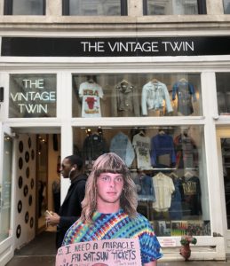
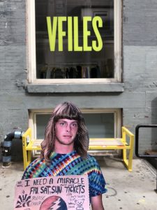
Earlier today, I also decided to test out some of the sites I intend to photograph Jim in front of in two weeks. I felt it wouldn’t make sense to simply photograph the sites as is, so I printed out one of my favorite Deadhead portraits and held it out in front of the various spaces to get a sense of how this shoot may go with Jim. I only received a few (judgmental) stares as I photographed my little cut-out, but I’d imagine that when I do the shoot with Jim, I might receive more puzzled reactions.

Drawing/Imaging: Tracing Perspective Project

For the tracing perspective assignment, students went on a field trip to the New York Public Library and created a one-point perspective drawing based off of the architectural elements of the library. Using a sharpie and acetate, students found a place in the library that demonstrated the characteristics of a one-point perspective composition and subsequently traced what they saw onto the acetate. After completing the “traced” acetate compositions, students transferred the composition onto drawing paper. At this stage in the project, students had to hone in on the accuracy of the composition, using tools like a t-square, ruler, and compass to create straight, even lines and perfectly rounded arches. During the preliminary critique, Alaiyo had students “check” the accuracy of their respective drawings by using a string of yarn to ensure that all vertical lines converged at the vanishing point. After this critique, students returned to their compositions and made any necessary revisions to their line work, once again focusing on creating accurate/precise compositions. The final facet of the project involved the implementation of a chosen medium; students were allowed to apply a medium (or multiple) of their choosing to the perspective drawing. It was at this stage in the project where one’s creative tendencies and artistic identity came out in the composition.For the tracing perspective assignments, students went on a field trip to the New York Public Library and created a one-point perspective drawing based off of the architectural elements of the library. Using a sharpie and acetate, students found a place in the library that demonstrated the characteristics of a one-point perspective composition and subsequently traced what they saw onto the acetate. After completing the “traced” acetate compositions, students transferred the composition onto drawing paper. At this stage in the project, students had to hone in on the accuracy of the composition, using tools like a t-square, ruler, and compass to create straight, even lines and perfectly rounded arches. During the preliminary critique, Alaiyo had students “check” the accuracy of their respective drawings by using a string of yarn to ensure that all vertical lines converged at the vanishing point. After this critique, students returned to their compositions and made any necessary revisions to their line work, once again focusing on creating accurate/precise compositions. The final facet of the project involved the implementation of a chosen medium; students were allowed to apply a medium (or multiple) of their choosing to the perspective drawing. It was at this stage in the project where one’s creative tendencies and artistic identity came out in the composition.

When Alaiyo first announced this project to the class, I was admittedly less than thrilled. I have never particularity enjoyed architectural drawings of any sort; architectural drawings, of course, involve a great deal of math and measuring, and while I wouldn’t say I’m inherently bad at math, I am probably the worst measurer in the entire world (and that simply is not an exaggeration). I’m also notoriously bad at drawing straight lines (even with the help of a ruler), so of course, I was mildly terrified by the prospect of creating a perspective drawing (which I hadn’t done in several years). When we took our trip to the public library, I took my time wandering through the seemingly boundless edifice, carefully observing the incredible architecture. I wanted to approach this project very strategically; I may not enjoy drawing straight, rigid lines, but I absolutely love drawing intricate and ornate details, so I wanted to select a space within the library that followed the guidelines of the project, but would also allow me to have some fun with the replication of delicate and opulent details. With that in mind, I directed my attention towards the McGraw Rotunda, a magnificent, open space within the NYPL.
I became very frustrated with the process of tracing onto the acetate simply because drawing onto a piece of paper that is being held out in front of me with no support felt incredibly foreign. My composition turned out rather messy, but I mentally assured myself that I could easily clean it up once I’d traced it onto my final paper.
Spoiler alert: I could not easily trace my acetate composition. In fact, I essentially had to do away with the acetate and start anew on my drawing paper, using my acetate and my photograph as rough guides. It was at this point that my frustration with the project came out in full force; I felt overwhelmed by the sheer number of elements I would have to include in my composition. As I returned to the photograph for reference, everything began to blur together; was I looking at four arches? Eight? Had I already drawn /that/ arch? I couldn’t make sense of what I was seeing, and if I couldn’t make sense of the photograph, how could I possibly replicate it myself?
Ultimately, I decided to simplify my composition. After a talk with Alaiyo in class, I learned that my composition did not have to look /exactly/ like the photograph; I could add or subtract elements to my liking, so long as the lines maintained a sense of accuracy and precision. Once this information was presented to me, I felt a lot less overwhelmed by the project. I allowed myself to take things slowly and simply get the most important elements of the composition onto the paper before moving onto the details (saving the best for last, of course!) Once I had effectively recreated the converging lines, the walls, and, of course, the (godforsaken) arches, I allowed myself to move onto the best part: the details. I genuinely enjoyed replicating and subsequently reinterpreting the wonderful details in the McGraw Rotunda, and I especially enjoyed placing people into my composition. The composition felt devoid of any sense of character before I added in any people; once I filled the space with various characters, I felt that my drawing actually captured the essence of such a busy, populated space like the New York Public Library. I chose pen and ink as my medium because it’s the medium I’m most comfortable with, and I felt it was important for me to use a familiar medium when working on a drawing I wasn’t so comfortable (or familiar) with.
Overall, I am  relatively content with the final outcome of my composition. I recognize that my drawing is by no means perfect, but it is reflective of my own artistic styles, creative tendencies, and my penchant for details. Even though this project was characterized by a great deal of frustration and self-doubt, I think it was an inherently valuable (and necessary) project. Sometimes, it’s good to abandon one’s comfort zone — and that I most certainly did.

Below: Final composition (left), acetate drawing (right)


INT. SEM 2: IN-CLASS PEER REVIEW REFLECTION AND EXERCISE

Today’s in-class peer review exercise left me with a stronger, more defined sense of how to approach my research in a manner that still permits for an in-depth, holistic account of my topic, but in a more concise, digestible format. At this point in my writing process, I have demonstrated the extent of my research through a highly detailed historical account of the Grateful Dead and its respective subculture. That being said, my claim becomes lost in the pages and pages of contextual analysis. I have focused too heavily on the notion of how and why Deadheads can be considered a cultural group, and have consequently neglected the reason this matters in the context of the fashion industry’s appropriation of said culture. I knew coming in today that I had an incomplete essay; I felt that my historical outline of the Grateful Dead/Deadheads was complete, and that I simply needed to further expound upon the fashion element of my thesis (I came in with short, disparate paragraphs pertaining to the fashion component)). I’d written this paper in a highly unconventional manner; over the past few weeks, I’ve jotted down thoughts, ideas, and short paragraphs in various documents and had to attempt to put them together into a unified paper. Although I have yet to achieve that sense of unification in my paper, I feel strongly that I can effectively tackle this over the next week or so. That being said, after receiving feedback from my peers, I do wonder if it’s absolutely necessary for me to expound upon the cultural analysis of the Grateful Dead in such extreme detail. I want to cover all bases in my research, but perhaps it is true that my argument becomes lost amongst as a result of my tendency to write so extensively.


Moving forward, I’m going to finish writing my paper, continuing with my initial approach: to write in extreme detail, covering all aspects of the subject. After I have effectively completed this task, I intend to go back into my research and refine the details so that my paper maintains the interest of the reader throughout. 

FASHION IS DEAD: PROJECT PROPOSAL

For the final facet of my semester-long research project, I intend to design my very own Grateful Dead-inspired long sleeve men’s shirt. This shirt will have similar design elements to other Dead-inspired garments currently on the market, but my intentions are different; I want this garment to accurately and effectively encapsulate the essence of the very subculture it is being designed for — Deadheads. Although I do intend to incorporate the Dead’s iconography into my design, these symbols will not be the only elements of the design. They will be supported by language that further reinforce the nature of what it truly means to be a Deadhead. My frustration with the fashion industry’s sudden investment in and adoption of Deadhead culture lays in the fact that there is an abject lack of authenticity. The designs currently on the market offer no sense of what it means to be a Deadhead; they fail to capture the essence of this subculture and the incontestably powerful music of the Grateful Dead. My frustration with Deadhead culture is that, for the most part, it lacks any sense of aesthetic value or integrity. Deadheads have the spirit, transcendent values, and sincerity, and the fashion industry has the aesthetic integrity — as someone who is involved in both of these worlds, I want to merge these elements in a way that is genuine, authentic, and ultimately tasteful. I feel that what separates me from other designers who have attempted to create Dead-inspired designs is my intent. Because I am actively involved in both of the aforementioned worlds, I have an understanding of, access to, and leverage over both of these systems. I essentially want to reclaim Deadhead culture and return this iconography to the people who have interacted with it in a genuine manner for decades.


After finalizing my design and having it screen printed onto a long-sleeve, I will call upon a true Deadhead to model it for me. I have already reached out to members of various New York-based Deadhead Facebook groups, and I intend to subsequently contact some of the contacts I made at Radio City just last month. I don’t want my garment being worn or modeled by someone who bears no understanding of the rich culture and history of the Grateful Dead; I want my garment worn by someone who is apart of that culture and has participated in it for decades. After all, I am designing this garment for Deadheads. I envision a photoshoot that takes place in front of the brick and mortar space of some of-the-moment brand or boutique (ideally one that has appropriated this culture), perhaps Off-White, VFILES, The Vintage Twin, What Goes Around Comes Around, or BAPE (or all of the above!) By placing my model in front of such spaces, I am making a statement: this iconography belongs to the people who actively participate in this culture. Designers may continue to adopt elements of Deadhead culture, but what’s important (and what I am aiming to do with my work) is to consider the origins of this iconography, and to ensure that these designs are accessible to the people who understand the implications on a profound level.


BELOW:

A preliminary design consideration. I do wish to incorporate the iconography, but that I also wish for my design to extend beyond just the symbols associated with the Dead. Through lyricism and language, I want my design to capture the true essence of the Grateful Dead and its respective subculture. It is important to note that the design pictured below is only my very first attempt. I want my finalized design to be informed by Deadheads; I intend to communicate with members of this community and get their feedback on what they’d like to see in a design, while also pulling from my own aesthetic values and instincts. The most crucial element of this project is the notion of participation from members of the Deadhead community. I want them to be as involved in this process as possible!


FASHION IS DEAD: RESEARCH QUESTION AND THESIS

Research Question:

IF DEADHEADS  ARE IN MANY WAYS THEIR OWN DISTINCT CULTURAL GROUP WITH A SHARED SET OF VALUES AND IDEALS, IS THE FASHION INDUSTRY’S SUDDEN ADOPTION OF GRATEFUL DEAD ICONOGRAPHY A MILD FORM OF APPROPRIATION?


Thesis:

Deadheads  — the name commonly used in reference to ardent followers of the Grateful Dead — behave as their own distinct cultural group with a shared set of values and ideals. Deadheads, however, have long been stigmatized and stereotyped by the public due to their supposed collective rejection of societal norms. Because Deadheads exist as their own subgroup, the fashion industry’s disingenuous investment in and adoption of various facets of this culture — driven by the industry’s inherent capitalist motives — incontestably functions as a mild form of cultural appropriation.

POSSIBLE FUTURES (Part Three): FASHION IS DEAD

The peace sign: one of the most recognizable symbols. Everyone is familiar with its form as well as the connotations; it is, as the name suggests, an emblem of peace. But how many people are familiar with the origins of the peace sign? Moreover, how many people who have at any point used the peace sign — in any context — are familiar with the original intent of this symbol?
The peace sign, as we know it today, was designed and developed by Gerald Holtom for the British Campaign for Nuclear Disarmament in 1958. The central vertical line is representative of the flag semaphore signal for the letter D; diagonal lines on either side of the aforementioned line represent the semaphore signal for the letter N. In this case, the “N” and “D” stand for nuclear disarmament. According to Holtom, the symbol was also originally intended to represent despair; the central lines arguably form “a human with its hands questioning at its sides against the backdrop of a white Earth.” It is said that Holtom originally considered using a Christian cross but ultimately decided against this due to its association with the Crusades. Instead, he sought a symbol that would solicit a more universal appeal.
I can openly admit to the fact that I had to search the internet for the origins of the peace sign. I, for one, am someone who has, on multiple occasions, employed the symbol, but I have never considered its original meaning or intent. This is typical of iconography. Over time, symbols often become removed from their original meaning or purpose, and while they may one point have represented something more concrete (like a campaign for nuclear disarmament), they often evolve into a symbol of something more abstract or intangible.
Imagine then, that 150 or so years from now, the music of the Grateful Dead — once considered one of the most iconic rock bands in American history —  has faded into obscurity. Because of the technological advancements of today and the future, the Grateful Dead’s discography still exists and can be accessed, but the music industry has become so saturated in the 200+ years since the Dead formally came to an end, that very few 22nd century people still bother listening to this dated, 20th century music.
Although the auditory facet of the Grateful Dead has lost most of its relevance, somehow, the visual components of the band and its respective subculture have survived. It is important to note, however, that these symbols that were once directly connected to the Grateful Dead now exist independently from the music. This iconography has been stripped of its original meaning(s) and connotation(s), and now exists as symbols of something much more abstract — they have become symbols of liberation.
One of the most prominent symbols of the Grateful Dead is the so-called “stealie”. The stealie is, in essence, a skull, cracked and divided by a lightning bolt that divides the head into two hemispheres—most typically blue and red, with the lower portion of the skull in white.
 Designed in 1969, the aforementioned symbol was created by Owsley Stanley—an audio engineer — and artist Bob Thomas. According to Owsley, his initial source of inspiration was a freeway sign he happened to pass by. This sign consisted of a round shape divided into an orange half and a blue half by way of a bold white line. The general shape and colors of the sign stood out to Owsley, who held the conviction that a similar design — a blue and red circle with a lightning bolt in the center, respectively — would make for an eye-catching logo. Owsley subsequently reiterated this idea to Thomas. With Owsley’s permission, Thomas drafted a plan for this design.
The original design did not include the skull face that would eventually become an integral component of the logo; the initial design was simply a circle divided by the lightning bolt. The skull face was added on a few days later, as a means of symbolizing the “Grateful Dead”.
The Grateful Dead first used the logo as an identifying mark on their musical equipment, and later the symbol appeared on the inside album jacket of the self-titled album The Grateful Dead. The logo subsequently made an appearance on the cover of the album Steal Your Face. From then on, the symbol was referred to as the Steal Your Face symbol (in informal Deadhead jargon, it is more commonly referred to as a “stealie”).
But what does this logo symbolize in a broader sense? Well, of course, that depends on who you speak to. The most agreeable conclusion, however, is that this is an emblem of transformation and enlightenment. Perhaps it is the lightning bolt in the cranial region that most effectively signifies those ideals — transformation, enlightenment, and the supposedly “raw powers of nature”. This imagery is juxtaposed with the facial region of the skull, which seems wildly disproportionate to the cranial region; the face almost seems as though it is being crushed by the overwhelming size of the cranium. This imagery perfectly aligns with the Grateful Dead’s music, the respective scene, and the overall philosophy of this subculture (which was informed and inspired by the music, of course). Followers of the Grateful Dead were undoubtedly transformed by the music. According to one Grateful Dead forum, fan’s “everyday masks were ‘cracked’ by the honesty, the openness and “realness” of the Grateful Dead culture, and their mundane, limited identities were left behind.” The live concert experience —  undoubtedly the most vital ingredient to the success of the Grateful Dead — contains two major themes: the loss of self and the expansion of consciousness (or, “a loss of the personal but a gain of the universal”, as one Deadhead put it). The skull and lightning symbol just happens to to perfectly symbolize and encapsulate this idea; the power of the music transforms the mind, which becomes far more powerful and expansive than the “mask” (or individual identity) assumed by the mind-bearer.  This explanation is best understood by someone who has directly experienced this phenomenon; a follower of the Grateful Dead whose mind was transformed by the boundless, tantalizing nature of the music. Such a person, however, does not exist in the 22nd century. All first-generation Deadheads are long gone. This symbol is all that remains. And, while 22nd-century people may not demonstrate a fully realized understanding of the stealie, they do still perceive it as a symbol of transformation, transcendence, and enlightenment.
Over the course of 150 years, the “stealie” has maintained its general structure (as previously explained), however, it is now devoid of its original colors. 22nd century people who interact with this symbol do not necessarily associate any particular colors with it.
 The year now is 2184. In celebration of the 200 year anniversary of the Birkin bag, Hermès reissues the cult classic. The luxury fashion house, however, has decided to put a spin on the original; the general structure of the Birkin remains the same, but Hermès has decided to commission several artists to paint on the bags, which will be subsequently reproduced and sold in limited quantities.
One of the commissioned artists has decided to employ the stealie symbol on the Birkin bag. According to his/her/their description, the symbol — which, again, is a highly recognizable and mainstream symbol in the 22nd century — aligns with the ethos of 22nd century fashion. This symbol is an emblem of transformation and liberation — and isn’t that exactly what fashion stands for? Isn’t that what every designer strives to achieve through her own designs? The artist understands that the symbol was formed at around the same time as the Birkin bag, so it is in many ways a quiet nod to the 350 year old fashion house’s rich history. The application of the symbol on this iconic bag is a suggestion that the brand should, of course, hold onto its traditions, but it should concurrently transform itself and its respective identity as the world continues to evolve.
In this particular context, the “stealie” now exists completely independently from its original identity and subculture. With very few self-identifying Deadheads left in the world (and no first-generation Deadheads left at all), there is no one to defend this symbol — it has been released from its subculture and is now property of the mainstream. In the 21st century, when fashion designers began appropriating Grateful Dead iconography, such tendencies could be framed as a mild form of appropriation because the subculture still existed. With no Deadheads left to claim this symbol as their own, it is free to exist on its own and take on a new life. It will continue to manifest in various forms, and perhaps this was always the plan. The subculture will inevitably fade out, but the iconography will resurrect itself over and over, taking on new identities along the way.
Below: Image of the Stealie Birkin with its respective packaging.
Below: Different product/packaging possibilities. I knew I wanted to infuse the stealie symbol into the classic Hermès orange packaging. For the box top, I chose to superimpose the Hermès logo onto the stealie pattern.

PATTERN MAN PROJECT (Drawing & Imaging)

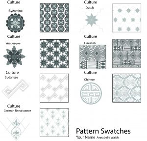
The purpose of this assignment was to continue mastery of figure drawing and develop a stronger and more holistic understanding of Illustrator. Students began by completing a forty minute figure drawing of a male model who came into the class. Concurrently, they were asked to research seven different cultures and complete a pattern study for the respective cultures in their sketchbooks. The figure drawing, coupled with the pattern studies, would then be transferred into illustrator and combined to create a “pattern man”. With regards to the patterns, students were asked to experiment once again with varying line weights, brush strokes, and values. The patterns began were subsequently converted into swatches. These swatches would be applied to the drawing of the aforementioned model, who was originally clad in his own patterned and layered garments.

The first “pattern man” composition would consist of a grayscale, while the second composition would employ color. For the second composition, students were asked to create a color group that would then be applied to the seven cultural patterns. For the second composition, students could either create a colored version of the pattern man, or they could work from an entirely new composition (while still maintaining the original seven patterns).

My Adobe Illustrator process was originally characterized by a great deal of frustration. Due to my lack of familiarity with the programming, I initially had a hard time navigating the software; I became easily frustrated (and defeated) by very trivial issues that I simply did not know how to work around. If my initial difficulties with Illustrator were any indication of how this project would pan out for me, I was wholeheartedly convinced that the project would end in one mild disaster (and maybe some tears). I was lucky enough, however, to receive a great deal of assistance from both Alaiyo and my classmate, Sophia, who guided me through the processes that I couldn’t quite navigate on my own. Creating the patterns was a serious challenge for me, and they took much longer to create than I would like to admit. After Sophia so kindly guided me through the process of creating swatches, however, it was relatively smooth sailing from there on out. After our previous project, I’d become comfortable with the process of tracing scanned-in drawings with the pen tool, so recreating my figure drawing in Illustrator was a relatively painless endeavor. Once I’d effectively traced him, I began to experiment with different facets of the program (more or less out of curiosity); I tried out different stroke styles (after being introduced to them by Alaiyo), played with line weight and opacity, and even experimented with different brush strokes (I used a watercolor brush to create the pattern man’s beard). During this phase of the project, I really pushed myself to experiment with the programming, reminding myself that, unlike with a tangible ink drawing, anything I tried and didn’t like could be easily deleted. Once it was time to add our patterns to the composition, I encountered some mild difficulties at first (I couldn’t quite figure out how to effectively use the blob brush tool), but once I overcame these issues, I ended up having a lot of fun with the project. Not only do I feel that I created a technically strong composition, but I also feel that I was able to maintain my own artistic style even in a digital composition (which is of course a very new creative territory for me). When it came time to complete the colored composition, I felt so comfortable with (and excited about!) the program/the project that I decided to create an entirely new composition. I’ve always been interested in fashion illustration, but I’ve never had the chance to digitize my illustrations — I felt that this project was the perfect entry point into digital fashion illustrations. With that in mind, I decided to employ a sketchbook drawing I’d done of a pair of my shoes (side note: one of my long-term goals is to create an illustrated book of my favorite clothing/shoes and the stories behind them, so I figured that if this endeavor was successful, I could one day use it in my book). I really enjoy this composition, and I love that even though it may look like a simple illustration of a pair of shoes, it is actually deeply personal for me. These are the shoes I wore on New Year’s Eve two years ago — the night I met my first boyfriend. The shoes were two sizes too big, but I bought them anyways simply because I loved the pom pom adornments (I’ve always held this incredibly delusional conviction that if you love a pair of shoes enough, the size is irrelevant — you can and will make them fit). I feel quite strongly that it’s absolutely no coincidence that I wore an ill-fitting pair of shoes the night I met the aforementioned boyfriend, because he turned out to be a terrible fit for me as well. (And now that I’ve effectively gone off on an irrelevant tangent about shoes and boys, back to the main point…)

Creating my shoe composition was by far the most exciting part of the project for me! At this point, I felt very comfortable with Illustrator, and I think that is, to some extent, reflected in my final composition. I loved working with such a fun composition and making it even more playful by way of the colorful patterns.  That was really the most important thing for me throughout this entire project — I needed to have fun (and I absolutely did). I spent so much time last semester getting stressed out and frustrated by my assignments (particularly assignments that incorporated any sort of Adobe program), that it just felt absolutely liberating to be in a position where I was actually having fun with a program that I’ve been deeply challenged by in the past. 

Overall, I’m very satisfied with the outcome of my patterns, my pattern man, and my shoe illustration. I think these compositions stand as a testament to just how far I’ve come since the beginning of the semester and how much I’ve learned in just this class alone. Whereas last semester, I was in a perpetual state of frustration due to my technological inabilities, I admittedly can’t get enough of Illustrator now. I feel fortunate to be in a position right now where all I want to do is create, and the long but rewarding journey of this project most certainly engendered that sense of excitement over the prospect of learning and creating new things.