INT. STUDIO: FASHION IS DEAD PROTOTYPE

Over the past week, I have continued to develop and test my “FASHION IS DEAD” project in various ways. Last week, I joined several Deadhead facebook groups and published posts in said groups explaining my concept and my need for a model. Although I received a fair amount of positive feedback in the form of “likes” and comments, I did not discover any prospective or willing models. By Saturday, I was beginning to feel pretty defeated. I wondered if I had taken on a project that was too ambitious or unrealistic, or perhaps one that simply involved too many elements that were out of my control.


On Wednesday, during class, I scoured the internet for Grateful Dead cover bands playing in or near New York sometime in the following week. I figured, if I had no success in the facebook groups, I could find a model at a cover band gig. Lamentably, most Grateful Dead cover bands play in upstate New York — but I did rediscover an event that was happening right in Manhattan: “Ship of Fools,” a three hour cruise around Manhattan featuring the music of the Grateful Dead. I remember very excitedly discovering this event several months ago, only to realize it was a 21+ event. This time, however, I decided that I wasn’t going to let an age restriction stop me from attending this event. I knew I had to be there. And so, I reached out to the event coordinator and explained my situation to him — and, to my surprise, he granted me permission to attend!


I arrived at 23rd street and FDR Drive at 6:45, and was immediately welcomed by the sight of dozens of Deadheads, clad in their usual attire — thank goodness! As I reached the front of the line, a man holding a multi-page list asked for my name. Before I could even respond, I glanced very briefly at the list in his hands and exclaimed, “Oh my God!”


“Are you high?” He asked me.

“No, of course not–”

“I don’t care if you are, I’m just wondering,” he replied.


But really, I wasn’t! Rather, I’d let out a very dramatic gasp because I spotted an all-too-familiar name on the aforementioned list: Jim Daley!


Jim is the very first person I interviewed for this project, back in March when I conducted on-site interviews at Radio City. That night, Jim handed me a wallet-sized card that contained information regarding the book he’d recently published recounting his experience taping 150+ Dead shows through the eighties. He told me to check out his book on Amazon. I made a mental note to purchase it later, and subsequently added his book to my list of sources for my research paper. Two weeks later, I made a trip out to Port Chester to see Phil Lesh at the Capitol Theatre. Towards the end of the second set, as the band launched into a particularly upbeat “I Know You Rider”, I spotted a familiar face sifting through the crowd: Jim from Radio City! I immediately tapped his shoulder and reminded him who I was/how I knew him. I told him I was using his book in my research, and that I’d written about him in my sketchbook (which I coincidentally had with me that night). Jim was dumbfounded, and proceeded to tell me that he’d come to the show that night with ten copies of his book; he’d sold nine of the ten copies, and wanted to give his very last copy to me. He told me to find him during intermission. And so, during intermission, Jim brought me out into the hall and handed me a copy of his book, not before signing it and wishing me the best of luck with my project. We hugged each other for a long time before parting ways again. Shortly thereafter, a man approached me and told me that he knew he was “witnessing a very special moment” between Jim and I; he was a photographer and captured the moment between Jim and I (unbeknownst to either of us). The moment felt, for lack of a better word, completely serendipitous.

To run into Jim at the Capitol Theatre was completely fortuitous. To see his name on the list at this event, one month later, was a sign: he had to be my model.

As soon as I boarded the boat, I kept an eye out for Jim. I watched him stroll down the dock no more than twenty minutes later. I immediately waved at him; he looked astonished. I approached him almost immediately and explained that I’d spotted his name on the list, and how excited I was to see him. I told him I had something important to ask him, and so we walked over to a quieter area, and I explained the final facet of my project to him. I told him that I’d come to the event that night in search of a model, and that as soon as I saw his name on the list, I knew it had to be him. Jim repeatedly told me how humbled he was by this whole experience; he told me he would do “absolutely anything” for my project.


So, there you have it! I’ve found my model — and I couldn’t have picked a better one.


Beyond my interaction with Jim, I’ve also been communicating with other Deadheads through the facebook groups to get a sense of how to reapproach my t-shirt design. I was told to add more color (my preliminary design was a simple black-and-white composition), and I’ve had Deadheads suggest lyrics to include in my design that, for them, encapsulate what it means to be a Deadhead. I’ve been texting/e-mailing Jim, too, and asked for his feedback as well. After receiving suggestions from the community, I came up with some new iterations (as seen below):


At this point, I am confident that I will employ lyrics from the Grateful Dead’s “Terrapin Station” in my design. The lyrics from this song resonate with me the most of any Dead song, and the line “things we’ve never seen will seem familiar” truly epitomizes my journey and experience as a Deadhead. For me, the Grateful Dead’s discography is its own macrocosm; each song represents a different part of this much larger structure. Terrapin Station is the lifelong journey through this seemingly limitless universe.

Jim suggested lyrics from “Fire on the Mountain”:

“The more that you give

The more it will take

To the thin line line beyond which you really can’t fake.”


When I posted in one GD facebook group asking about words/lyrics/phrases that encapsulate the experience of being a Deadhead, I received a number of responses. One woman — an artist named Jen — suggested lyrics from the Grateful Dead’s “Days Between”:

“Walked halfway around the world

On promise of the glow.”

Right now, I’m deciding between Jim’s suggested lyric and Jen’s lyric for the back of the shirt (although I may end up using both, and simply place one on the sleeve).


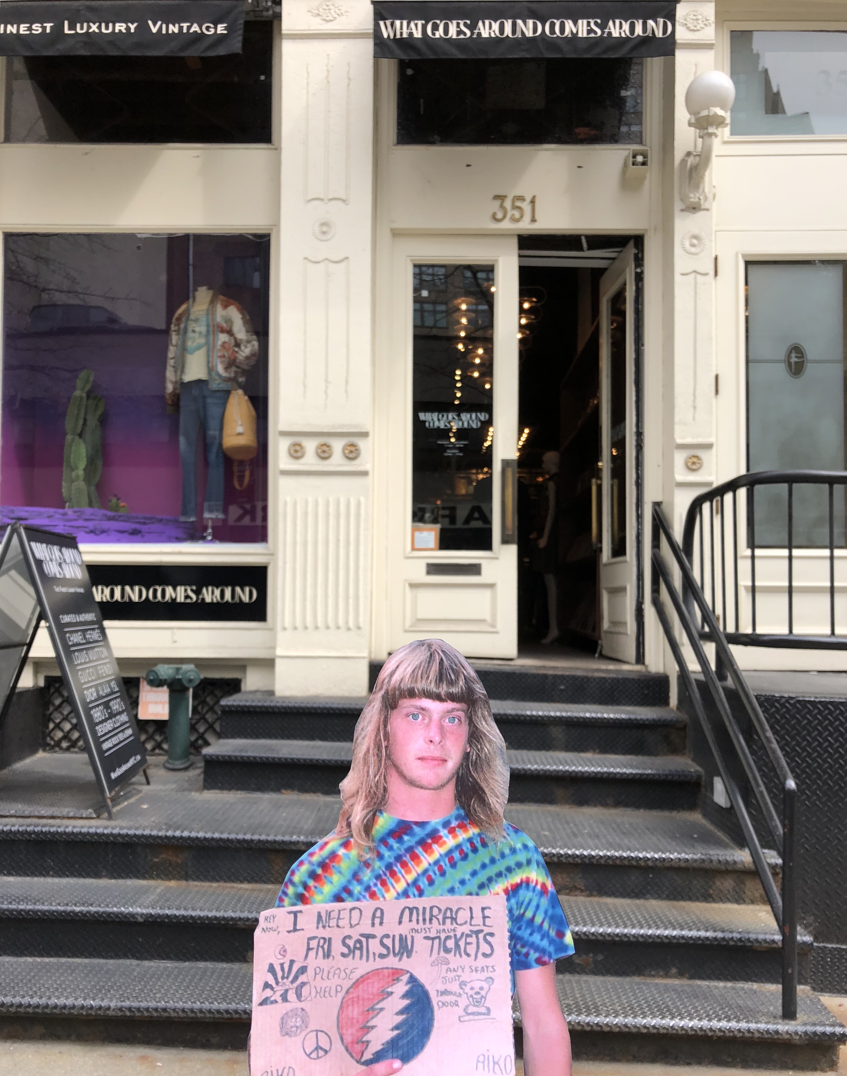
Earlier today, I also decided to test out some of the sites I intend to photograph Jim in front of in two weeks. I felt it wouldn’t make sense to simply photograph the sites as is, so I printed out one of my favorite Deadhead portraits and held it out in front of the various spaces to get a sense of how this shoot may go with Jim. I only received a few (judgmental) stares as I photographed my little cut-out, but I’d imagine that when I do the shoot with Jim, I might receive more puzzled reactions.

FASHION IS DEAD: PROJECT PROPOSAL

For the final facet of my semester-long research project, I intend to design my very own Grateful Dead-inspired long sleeve men’s shirt. This shirt will have similar design elements to other Dead-inspired garments currently on the market, but my intentions are different; I want this garment to accurately and effectively encapsulate the essence of the very subculture it is being designed for — Deadheads. Although I do intend to incorporate the Dead’s iconography into my design, these symbols will not be the only elements of the design. They will be supported by language that further reinforce the nature of what it truly means to be a Deadhead. My frustration with the fashion industry’s sudden investment in and adoption of Deadhead culture lays in the fact that there is an abject lack of authenticity. The designs currently on the market offer no sense of what it means to be a Deadhead; they fail to capture the essence of this subculture and the incontestably powerful music of the Grateful Dead. My frustration with Deadhead culture is that, for the most part, it lacks any sense of aesthetic value or integrity. Deadheads have the spirit, transcendent values, and sincerity, and the fashion industry has the aesthetic integrity — as someone who is involved in both of these worlds, I want to merge these elements in a way that is genuine, authentic, and ultimately tasteful. I feel that what separates me from other designers who have attempted to create Dead-inspired designs is my intent. Because I am actively involved in both of the aforementioned worlds, I have an understanding of, access to, and leverage over both of these systems. I essentially want to reclaim Deadhead culture and return this iconography to the people who have interacted with it in a genuine manner for decades.


After finalizing my design and having it screen printed onto a long-sleeve, I will call upon a true Deadhead to model it for me. I have already reached out to members of various New York-based Deadhead Facebook groups, and I intend to subsequently contact some of the contacts I made at Radio City just last month. I don’t want my garment being worn or modeled by someone who bears no understanding of the rich culture and history of the Grateful Dead; I want my garment worn by someone who is apart of that culture and has participated in it for decades. After all, I am designing this garment for Deadheads. I envision a photoshoot that takes place in front of the brick and mortar space of some of-the-moment brand or boutique (ideally one that has appropriated this culture), perhaps Off-White, VFILES, The Vintage Twin, What Goes Around Comes Around, or BAPE (or all of the above!) By placing my model in front of such spaces, I am making a statement: this iconography belongs to the people who actively participate in this culture. Designers may continue to adopt elements of Deadhead culture, but what’s important (and what I am aiming to do with my work) is to consider the origins of this iconography, and to ensure that these designs are accessible to the people who understand the implications on a profound level.


BELOW:

A preliminary design consideration. I do wish to incorporate the iconography, but that I also wish for my design to extend beyond just the symbols associated with the Dead. Through lyricism and language, I want my design to capture the true essence of the Grateful Dead and its respective subculture. It is important to note that the design pictured below is only my very first attempt. I want my finalized design to be informed by Deadheads; I intend to communicate with members of this community and get their feedback on what they’d like to see in a design, while also pulling from my own aesthetic values and instincts. The most crucial element of this project is the notion of participation from members of the Deadhead community. I want them to be as involved in this process as possible!


DRAWING/IMAGING: MUSEUM TRIPTYCH PROJECT

For the museum triptych assignment, students were first asked to collect four or five objects that bear some degree of significance in the student’s life. After a field trip to the Brooklyn Museum, students were also asked to pick one artifact from the museum that he or she was drawn to, which would be subsequently incorporated into the corresponding drawing assignments. The student would then bring the chosen objects into class (as well as a photograph of the museum artifact) with the intent of creating a contour line composition of the objects arranged in an interesting and/or meaningful manner. Students were encouraged to experiment with line weight, size and scale, and overall arrangement. The second phase of the project dealt with digital drawing as opposed to analog drawing. Using Illustrator, students were tasked with creating one positive-negative composition and a corresponding negative-positive composition using the same objects from the previous contour drawing assignment. The final phase of the triptych project also involved Illustrator, except this time, students would use the pathfinder tool to fuse their respective objects with a series of geometric shapes in order to experiment with value. After printing the finalized composition, students would subsequently add multi-media to the piece; students were allowed to employ one color beyond the gray scale and could work with any medium of their choosing. This multifaceted projected served many purposes; by urging students to employ objects in their compositions that bear meaning to them, the project offered symbolic and representational value. But beyond that, it also forced students to experiment and interact with a confluence of critical drawing and image-making skills, from contour drawing to value scales.

My process for this three-part project was distinctly different for each of the three respective stages. Before I could even begin creating my pieces, however, I had to carefully select my objects. I bear a tendency to fixate a lot on the meaning and symbolic value behind my work, so in choosing my objects, I wanted to ensure that I carefully selected items that I felt accurately represented who I am.


I ultimately selected five objects in total: a bottle of Chanel no. 5 perfume, a Dolce & Gabbana heel, an Aquamarine ring that once belonged to my great-grandmother, a gold necklace with two charms, and a dried rose given to me by mother. Each of these objects function not only as tangible representation of who I am and what I value, but they also function as palpable reminders of all of the most important women in my life. The bottle of perfume, which I wear on a daily basis, will always remind me of my grandmother, who wore the same scent. The Dolce & Gabbana heel was a gift from one of my aunts my first pair of designer shoes, which was of course a very big deal for a self-identifying sartorialist. The aforementioned ring was a gift given to me on my eighteenth birthday. The ring once belonged to my grandmother, for whom I am named after. This ring has become a part of me, so much so that I quite literally cannot function properly when I’m not wearing it. The gold necklace was a graduation present from another one of my aunts. One of the charms is a gold locket with my graduation date inscribed inside. The other charm was a gift from my best friend, Olivia. Finally, the dried rose is one of many roses given to me by my mother. For every birthday, Valentine’s day, and any other major event, my mother buys me roses. I always keep at least one rose from the bouquet and stash it in my memory box. I am an inherently sentimental person, so all of these objects mean a great deal to me. Not only that, but they’re all distinctly feminine a true testament to the importance of the women in my life and my penchant for anything seemingly sophisticated or “ladylike”, if you will.


For my museum object, I chose one of six of Rodin’s men from his famous Burghers of Calais sculpture. I was immediately thrilled to learn that the Brooklyn Museum housed a Rodin collection, as I studied his work rather intensely in both my studio art and art history classes in high school. I felt compelled to draw this sculpture in particular, however, because I spent a great deal of time studying this piece in my art history class. Rodin’s sculpture will never not remind me of my art history instructor, Shirley Huller-White, who, like the other aforementioned women, played a huge role in my life. I would not have had the confidence to apply to Parsons if not for her. To draw one of Rodin’s burghers felt like a subtle nod to the woman who gave me the confidence to pursue my dreams. Beyond that, I also really enjoy the musculature of the figure, and I love drawing the human form, with all of its organic lines and intricate details.


For the contour drawing (phase one of the project), I chose to arrange my objects into somewhat of a timeline, based on when I acquired each of the items and thus how they each represent distinct phases of my life. Because I am an extremely detail-oriented person, I was pleased with my somewhat subconscious decision to select such ornate objects. I was able to add a lot of details to my composition while still complying with the restrictions of it being a contour drawing. At first, I wasn’t sure how I would effectively include my museum artifact; its form — so distinctly masculine — felt antithetical to my otherwise feminine objects. In a symbolic sense, it would work, but compositionally, it would feel out of place. After explaining my predicament to Alaiyo, she suggested that I create a separate composition for the burgher. After drawing the figure on a separate sheet of bristol board, I decided that the composition felt a bit empty and uninteresting, so I ultimately added another contour drawing of the burgher from an alternate angel that I would layer under the original drawing. In order to create a sense of cohesion between my two compositions, I drew rectangular frames around the objects, with some objects protruding out of the frame. I’m really pleased with the way these two compositions turned out, and I’m especially pleased with how they look together with the corresponding frames.


Admittedly, I found the second phase of the project incredibly daunting. I have a great deal of experience with analog drawing, so the first phase of the project felt comfortable and familiar to me. However, prior to this project, I had never used Illustrator, and given how much I struggled with learning Photoshop last semester, I was really worried that I would not be successful in this phase. That being said, I’m really pleased with the outcome (especially after the changes I made after the critique). From a compositional standpoint, I knew I wanted my objects to overlap and interact with each other in an interesting manner. I tried to imagine that the objects were laying inside of my memory box and how they might look when viewed from above as opposed to head-on. The process of translating my hand-drawn composition onto Illustrator was met with much frustration and confusion, and quite frankly took me much longer than it should have. I felt incredibly relieved to have eventually figured out how to create the positive-negative composition on the program, even if it was ultimately flawed. Alaiyo’s suggestions (as well as the feedback from my peers during the critique) really helped me get a sense of what I could’ve done better with my compositions. That being said, I understood the feedback, but I just didn’t know how to apply the suggestions given my minimal understanding of the program. After meeting individually with Alaiyo, however, I was able to make the appropriate adjustments to my piece, and now I couldn’t be happier with the outcome. Not only do I think the compositions function as a testament to my increased understanding of Illustrator, but I also think the placement of my objects works really well. There’s not too much negative space, and again, the objects are interacting with each other in a way that makes the composition feel united.

The third and final phase of the project was similar to the second phase in that it was met with a great deal of frustration and confusion on my end. The frustration and confusion once again stemmed from my limited knowledge of and experience with Illustrator. I understood what the objective was for the assignment, I just didn’t know how to carry out the intended mission. After receiving help from a far more experienced classmate (Sophia), who offered me one-on-one help with using pathfinder, I felt like I was in a much better position to complete this composition. Despite a few technical errors, I was still pleasantly surprised with the outcome. This composition felt so distinctly different from my original contour drawing, which is more realistic and detail-oriented. This composition is much more abstract; the objects are still identifiable, but they’re slightly obscured by the implementation of shapes and a range of values. The objects are devoid of any detail, which would normally frustrate me, but because this composition is so drastically different from that of my typical style, I actually enjoy it. I came to Parsons to experiment and push myself out of my comfort zone, and this facet of the project was most certainly an exercise in experimentation. Once I printed out the composition and was in a position where I could begin to add multi-media, I wasn’t entirely sure what I wanted to do, but I knew that I wanted to remain consistent with the minimal nature of the composition. I ultimately decided that whatever I would add to the print needed to inform the composition; if there were parts that required greater emphasis or clarification, how could I use lines to reinforce those parts? Using acrylic paint (in white and a shade of blue-green that’s similar to the color of my ring), I added lines to the composition to reinforce some of the shapes, while making a concerted effort to not go overboard. I added a detail of the shoe that would otherwise not be seen, I used the blue-green acrylic paint to trace the chain of the necklace, and I outlined various parts of objects, especially in places where the two adjacent values were similar. I also decided to use a cutout from a Chanel ad from the latest issue of T Magazine; when I came across the ad, I was struck by how similar the blue font was to the color I initially imagined myself using for this phase of the project (again, a shade of blue that would be similar to the aquamarine stone from my ring). In addition, I was initially frustrated at the beginning of of this project because I so desperately wanted to include the Chanel label on the perfume bottle in my contour drawing, but knew that I could not because it did not occupy its own plane. By pasting the namesake label onto my final piece, I finally got to effectively pay homage to the brand I so deeply admire.

Overall, I’m satisfied with the outcome of this project. By being forced to work with Illustrator, I feel like I have a much better sense of how the program operates, and I have the confidence to use it accordingly. I’m also pleased with the fact that I was able to inject so much meaning into my compositions. All of my work tends to be deeply personal, and this project is certainly no exception. I feel strongly that if a stranger were to look at what I’ve created, they would get a pretty accurate sense of who I am and what I value just by observing my creations.

Below: the various parts of this multifaceted project, from the objects themselves, to the contour drawings, to the positive/negative, and finally, pathfinder/multi-media.


Above: my chosen objects. I ultimately omitted the rose from the final two phases of the project simply because I felt the shape of the object would not translate well without showing the various petals and planes of the flower.

Above: Rodin’s Burghers of Calais. The figure in the front of the photograph is the one I chose to draw, simply because I was most drawn to his particular stance and dramatic expression.

Above: my contour drawing of Rodin’s Burghers of Calais. This is before I added the frame to the composition.

Above: my contour drawing of my chosen objects. This photo was taken prior to the addition of the frame.

Above: Negative/positive and positive/negative compositions (revised).


Above: Digital rendering of the original composition for my pathfinder piece. I originally intended to include the details shown in this rendering in my final piece, but I ultimately omitted them in exchange for a more minimalist composition.

Above: Pathfinder composition (prior to adding multi-media)


Above: Pathfinder composition, printed with multi-media applied.