DRAWING/IMAGING FINAL PROJECT: What I Wore, & When, & Why

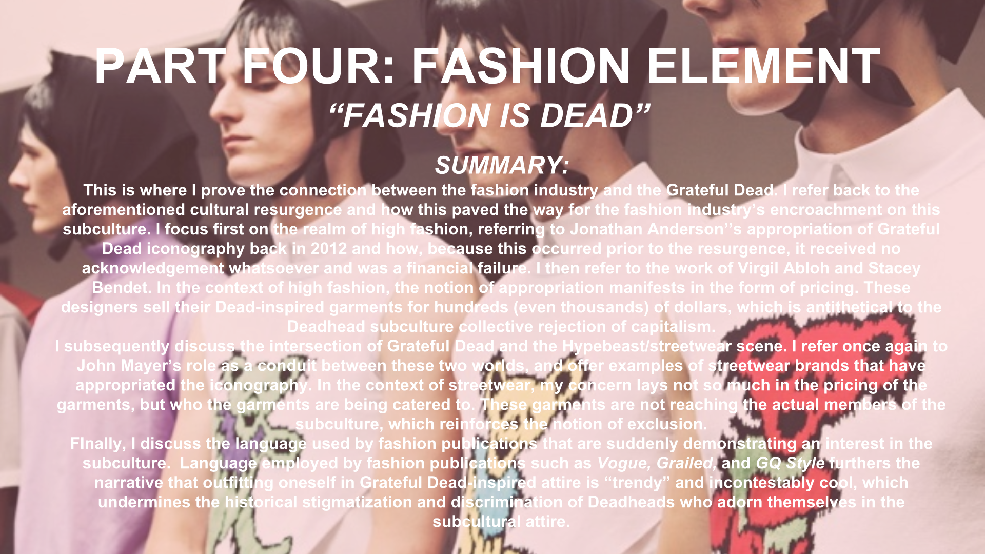
For the final project in Drawing/Imaging, students were given the freedom to create their own concept/project, so long as the proposal incorporated both analog and digital elements.

After being tasked with this assignment, I knew almost immediately that I wanted to create some sort of fashion illustration. I’ve always enjoyed creating fashion illustrations by hand, but after taking Alaiyo’s class, I learned how to create digital illustrations by way of Illustrator. Of all of the tangible skills I’ve learned during my first year at Parsons, mastering Illustrator has been by far the most rewarding and exciting for me. After a conversation with Alaiyo, I ultimately decided that I would create two separate shoe illustrations — one analog, and one digital. The two illustrations would depict two different pairs of shoes that I identify strongly with.

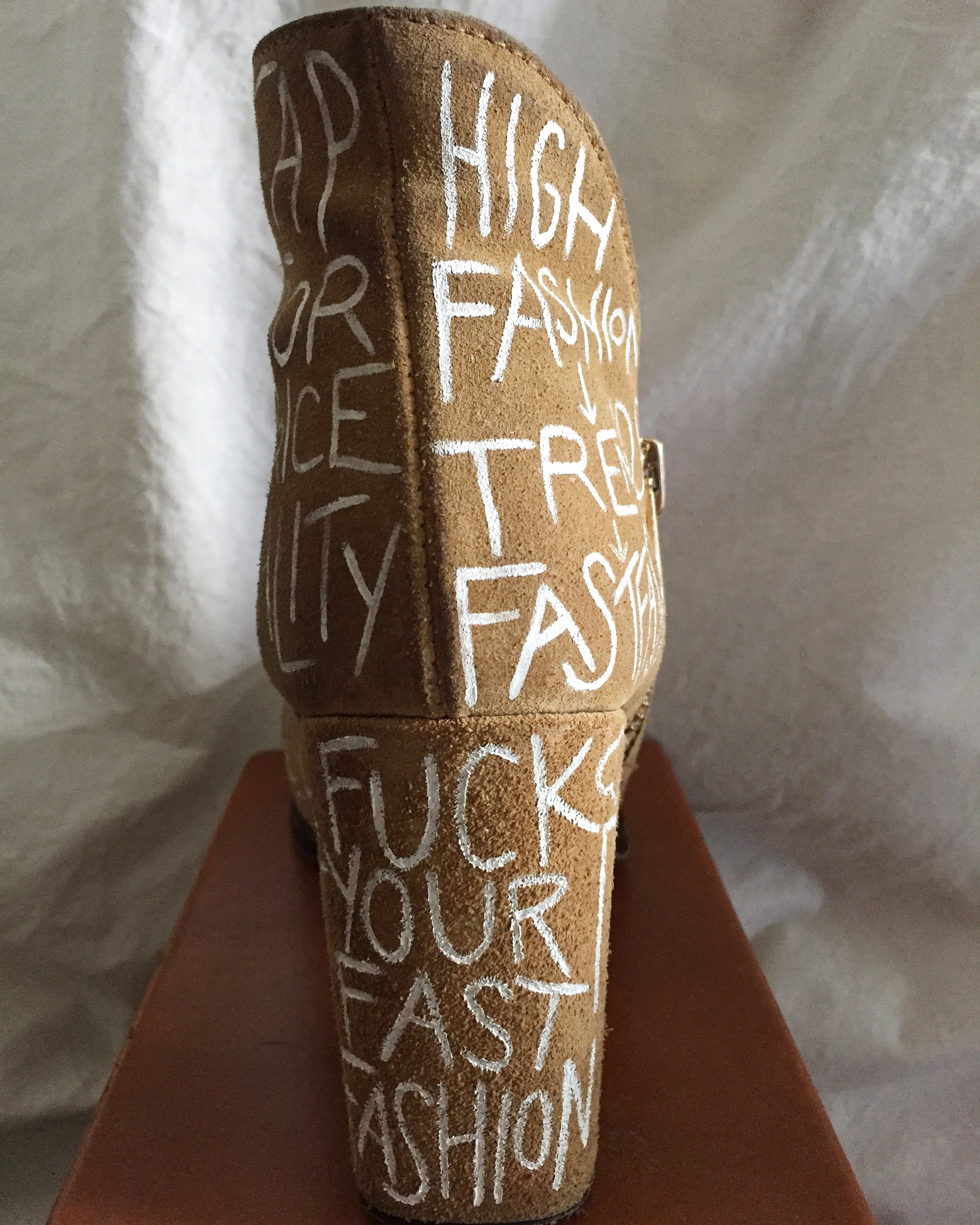
As someone who wants to pursue a career in the fashion industry, I’ve always been frustrated by the trivialization of what it means to enjoy and appreciate clothing. I once had a family “friend” say to me, “you want to go into fashion? What, was engineering too difficult for you?” No, I’m not kidding. That literally happened, and three years later, I still replay that condescending remark in my head over and over and fantasize about the snarky responses my young self had to bite her tongue to refrain from uttering out loud. Admittedly, there is nothing I hate more than when I am looked down on or perceived as superficial for demonstrating an interest in fashion. I have always felt strongly that one’s clothing should tell a story about the person who wears them. Clothes should function as an extension of one’s values, beliefs, and character. Andy Warhol once cleverly quipped, “I am a deeply superficial person.” In one of my favorite fashion documentaries, The First Monday in May, Andrew Bolton (the chief curator of the Costume Institute at the Met) suggests that Warhol’s proclamation also applies to fashion, and I think he’s absolutely correct. Fashion, in and of itself, is deeply superficial; in a literal sense, it consists of what exists only on the surface. But clothing, when presented and accumulated in the right manner, is a way for us to tell the world about ourselves without actually saying anything at all.

My sartorial preferences (especially when it comes to shoes) are, in many ways, an extension of my character. I consider my shoe drawings to be much more than just fashion illustrations; I consider them to be self portraits.

I also consider fashion a form of storytelling. One of my long-term goals is to one day create a book that addresses the relationships I have with pieces in my wardrobe and how these pieces function as tangible reminders of specific moments or periods in my life.  I wanted the two illustrations for my final project to function as preliminary exercises in how to one day approach my book. The working title for my book is What I Wore, and When, and Why. The title is inspired by my all-time favorite poem, “What My Lips Have Kissed, and Where, and Why” by Edna St. Vincent Millay. I discovered this poem during a trip to the Whitney Museum a few years ago, and it’s resonated with me ever since.


ANALOG DRAWING:

In an effort to merge my passion for drawing and writing, I decided to create accompanying text below my analog drawing. When I envision my book, I see pages and pages filled with my illustrations, along with text below the illustrations to contextualize each illustration. Some of the texts will include humorous anecdotes, others will be more serious. In the case of this particular shoe, the anecdote is a bit of both; more than anything else, however, it reinforces the notion that what I wear is, in a larger sense, a reflection of who I am.

The analog drawing depicts my absolute favorite pair of shoes that I own: my satin Prada pumps. They are incontestably ridiculous, vibrant, and loud, and that’s precisely why I love them so much. I’ve had countless people stop me on the streets to tell me how much they love these shoes (and can I blame them?!), but more importantly, they make me feel utterly confident, which is an incredibly powerful feeling for someone who’s struggled with an overwhelming sense of self doubt for most of her life. When I look at this particular pair of shoes, I see the woman I strive to be and the woman I feel that I’m slowly (but surely) becoming. And that’s liberating, isn’t it?

In terms of my process, I worked from online photographs of the shoe, as well as the physical pair that I own. I decided to use micron pen for the illustration; it’s the medium that’s most comfortable and familiar to me, and the extremely fine tip of the pen allows me to include extreme details in my work (and as a self-identifying detail-oriented freak, this is of the utmost importance to me). When it comes to analog drawings, I rarely apply color (especially after my mother  “borrowed” my  beloved Sakura Koi travel watercolor kit!), but I felt that for a final composition, it would be a mistake not to include some element of color (and how could I effectively capture the essence of such an obnoxiously colorful shoe without incorporating color?!) . And so, I ultimately decided to incorporate color by applying a teal-ish acrylic paint to the body of the shoe (I already had this paint in my possession, and it’s pretty close to the actual color of the satin). Admittedly, I had a feeling this would turn out, well, terrible, but to my surprise — it didn’t! But after applying the teal paint, I felt that the composition still did not have enough color, so I decided to cut out my illustration and paste it onto a sheet of bright pink paper (which conveniently matches the color of the oversized button on the shoe strap). I love the idea of pairing two colors that technically shouldn’t go together, yet still somehow making them work. Normally, the combination of teal and bright pink feels dangerously reminiscent of my great aunt who resides in Florida and drinks too many margaritas, but in this particular context, I think the combination just works (sorry, Linda).

Stylistically, I didn’t deviate too much from my normal approach to illustration, but the final composition is a lot brighter and, in my humble opinion, far more exciting than my typical approach, which is usually just pen and ink on ivory paper. Given how innately fun the actual shoes are, it’s only fair that the composition is just as exciting. And, beyond that, now I’m considering the possibility of including colored pages in the final version of my book.

ILLUSTRATOR DRAWING:

For my illustrator composition, I chose to draw a pair of shoes that, lamentably, I do not own, but I still identify strongly with nonetheless. Originally, these shoes would’ve made up one of the pages within the book, and the aforementioned pair would’ve gone on the cover, but I ultimately decided to reverse the roles of the two. These bright pink feathered heels are the sister shoe to the teal pair in that they’re both from Miuccia Prada’s F/W 2018 collection for her eponymous label. Like the teal pumps, these shoes scream impracticality, which is kind of what I’m all about (in every aspect of my life). I also just have an unquestionable penchant for anything fluffy, feathered, or tasseled, so these shoes really speak to me. I am wholeheartedly convinced that Miuccia hacked into my brain and designed these shoes specially for me, and I’m also wholeheartedly convinced that I will one day acquire them (although the amount of money in my bank account suggests otherwise).

For this illustration, I worked from a drawing I created in my sketchbook. I subsequently scanned the drawing into Illustrator and traced over it. After my first Illustrator assignment for Alaiyo’s class, I learned so many amazing ways to use the technology of the program to create digital illustrations that mimic a lot of what I create in my analog drawings. I played around a lot with line width and width profile (I have become addicted to that one width profile that’s shaped a bit like a grain of rice, with the tapered edges, and in turn I’ve become repulsed by the sight of a uniform line). Working with Illustrator may be the only context in which having a Dell is truly an advantage; I use the touchscreen technology to apply strokes with my fingertips, which is truly a lifesaver because it gives me so much more control over my lines. I played with opacity as well to create shadows, and, for maybe the first time ever, I paid very close attention to my layers (I had a color layer, skintone layer, line layer, text layer, and so on).

With this particular illustration, I tried something brand new in Illustrator: calligraphy/typography/fontmaking (?)

I am unbelievably particular when it comes to typography/fonts, and I’ve found that none of the available fonts in Photoshop/Illustrator really work well with the style of my drawings. I effectively combated this issue by creating my own font, if you will. For the book title, which I placed at the top of the composition, I used the pencil tool, along with the touchscreen technology, to create a calligraphic font that sort of mimics the movement of the feathers on the shoe. I wanted there to be a font distinction between the title and my name, so I wrote out my name on the bottom of the page in my typical all-caps handwriting, working with the pen tool to create smooth, straight lines.

My original plan was to simply present my illustrator document on a tabloid-sized sheet of paper. My analog drawing would be presented as is, on the 8 1/2″ x 11″ sheet. However, after a conversation with Alaiyo, we agreed that it would make more sense for me to present my illustrator drawing (the cover page) on an actual book to get a sense of how this would look as a book cover. Unfortunately, I made a very stupid mistake in my process: I made my illustrator composition on a pretty massive artboard (I could’ve sworn it was tabloid sized, but even then, shrinking it down to the 9 1/2″ x 6 1/2″ book cover would’ve been an issue). When I attempted to reduce the size of my composition, the drawing became severely distorted. The line widths and such that I originally implemented worked perfectly with the artboard size I originally used, but when I resized the artboard and subsequently scaled down the composition, everything looked extremely out of place and awkward (the lines were too thick, and colors spilled over lines).

If/when I have the time, I do intend to re-work my illustrator piece so that it works for the prospective size of my book, but for now, I have to simply work with it as is. I’m really pleased with the outcome of both of my compositions, but hopefully I can continue to work with them and make them better suited for an actual book.

REFERENCE PHOTOS:

Image result for prada pink feather heels

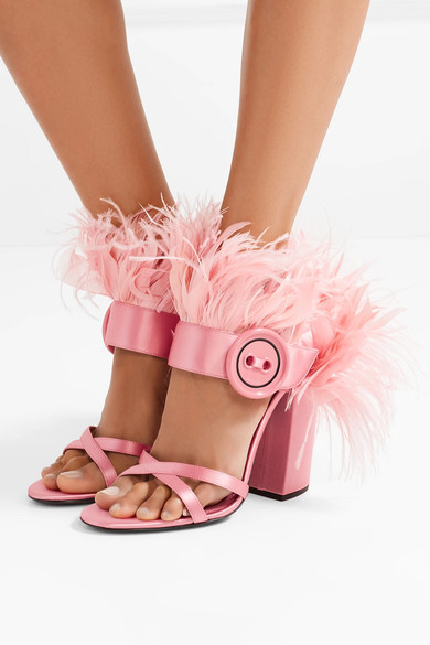
Below: Original drawing of pink feathered heel.Image result for prada teal satin beaded pumps

INTEGRATIVE SEMINAR II: RESEARCH PAPER FINAL PRESENTATION AND REFLECTION


FASHION IS DEAD Research Reflection


My research project informally began two years ago. I was scrolling through Facebook and came across a targeted ad for Alice & Olivia’s Grateful Dead-inspired capsule collection.I remember being struck by the absurdity of this — to see a high-end label deriving inspiration from my favorite band made very little sense to me at the time. Up until that very moment, I viewed these two worlds — fashion and the Grateful Dead, that is — as two diametrically opposed worlds. Since then, however, I’ve seen this relationship transpire in so many forms and instances. Even six months ago, I still couldn’t quite make sense of it (why was this happening?), but I became determined to discover an answer. The original “Grateful Dead” formed in 1965 and continued to tour until 1995, when front man Jerry Garcia tragically died of a heart attack at age 53. So then, if the band broke up over 20 years ago, what engendered this sudden cultural resurgence of the Grateful Dead, particularly in the realm of fashion?

As I began to formally research the intersection of fashion and the Grateful Dead, I noticed myself becoming highly critical of what was going on. Growing up, I always wanted to find a way to merge these two worlds, and now that it was finally happening right before my eyes, I couldn’t bring myself to feel totally supportive of the intersection. I felt that there was still such a huge disconnect between Deadheads and the realm of fashion. More than anything else, I wanted to find a way to restructure the relationship so that it felt more authentic and inclusive to Deadheads; the relationship felt very one-sided. When given the opportunity to take all of my research and present it in the form of a research paper, I knew I wanted to take on a strong (and, to some degree, controversial) opinion in the form of thesis. I wanted to see if I could effectively find a way to frame this phenomenon as a mild form of cultural appropriation.  

Because I am the first person to assume this particular position on this phenomenon, the research process was not always easy. I had to take what I knew and what I understood to be true about the historical stigmatization of Deadheads and subsequently relate that to the fashion industry’s current obsession with Deadhead culture. I had no scholarly articles or essays I could pull from to support this particular facet of my argument; I could rely only on information regarding the stigmatization of Deadheads, and information regarding the resurgence of the Grateful Dead. I had to find a way to merge these two topics on my own.

I can recognize that my position on the subject is not objectively true, but I also recognize that it doesn’t have to be. At the very least, I think I’ve allowed my readership to consider a brand new position that hasn’t been presented before, and I’ve been fortunate enough to engage in countless stimulating debates on the subject matter in the past few months. Through dialogue and discussion, I’ve become exposed to brand new viewpoints, and I’ve been acquainted with aspects of the subject that I had not considered before. I’m writing about this phenomenon as it’s unfolding, which is largely why I don’t feel as though I’m done with this topic. I intend to continue my research, and I hope to write several more iterations of my paper in the future.

Admittedly, I’m not completely satisfied with the outcome of my paper, only because I don’t feel as though I’m done with this project; I still feel as though I have so much more to say, and that I still have so much more research to conduct in order to strengthen and solidify my argument of appropriation. That being said, I’m proud of myself for taking on such a challenge. I covered a topic that has not been covered before in an academic paper, and, to my knowledge, I am the first person to make the argument about cultural appropriation with regards to fashion and the Grateful Dead.


Cross-Course Reflection

My name is Annabelle Walsh, and I am a first-year student at Parsons School of Design, majoring in strategic design & management. My interests include (but most certainly are not limited to) illustration, marketing/advertising, writing, styling, art history, and, perhaps, most importantly — daydreaming. It’s also worth noting that I have a penchant for impractical footwear, anything gingham, and the Grateful Dead. I am a self-identifying sartorialist who enjoys making (often ridiculous) predictions about prospective fashion trends.

If you’re wondering what kind of career I intend to pursue, you won’t find an answer here; I will, however, present you with a Diane von Furstenberg quote that would’ve been my high school yearbook quote had I not resented the idea of being memorialized in a platitudinous record:

“I didn’t always know what I wanted to do, but I always knew the kind of woman I wanted to be.”

I thought that by the end of my first year at Parsons, I would have a clear idea of what I wanted to do, but as my freshman year comes to an end, I can say with complete and utter confidence that I’m just as (if not, more) unsure as I was on the first day.

However, I don’t view this as an inherently bad thing. I’ve discovered a lot over the course of my first year at Parsons — I’ve discovered the things I really, really dislike, and a lot of new things I never would’ve expected myself to enjoy. I’ve tried a lot of new things, and while I’m not madly in love with every project I’ve worked on, I’m exceptionally proud of the amount of time and effort I’ve put into every assignment. From a visual standpoint, my work tends to vary; not everything I’ve produced is exceptionally strong or well-executed, but the common thread woven throughout all of my work is the extent of research, planning, and attention given to the concept/backstory. More often than not, I feel more proud of the process than the final outcome.

I’m not interested in writing just for the sake of writing, or designing just for the sake of making something pretty. I’m interested in telling a story.

I didn’t learn how to make beautiful work at Parsons. I entered this school with the expectation that I would acquire new techniques and skills — and, to some extend, I did —  but more than anything else, I learned how to foster concepts and ideas. I learned how to think critically. In my first-semester studio class, I didn’t create a single piece of work that I’d want to show off to my friends or family, but I created work that’s conceptually stronger than anything I’ve ever made before. The most powerful thing that I learned during my first year is something that seems incredibly obvious, but I didn’t discover it until my second semester: if you can find a way to inject your own values and interests into your work —  even the projects that don’t seem to allow for that —  the work won’t feel so much like work; projects and papers are opportunities for exploration and expansion.

Admittedly, my first semester at this school was absolutely miserable, and that’s strongly rooted in the fact that I felt limited by my assignments and projects. I felt that I wasn’t allowed to reinterpret my assignments to my liking. I felt confined, and as a creatively inclined person, that’s undoubtedly the most frustrating feeling in the world. As soon as I realized that I could push the limitations of my assignments and inject my own interests, inquiries, and passions, I became genuinely excited about everything I was doing. I no longer viewed my assignments as schoolwork; they became extensions of my self.

When I reflect on my first year at Parsons, I think I’ll always refer back to the personal essay I wrote at the end of my first semester. The essay effectively encapsulates my personal journey during my first four months in New York City; it is an honest account of my experiences and realizations. Admittedly, this essay is probably the project I had to spend the least amount of time on, but I honestly believe that’s only because the story had already written itself prior to my putting it down on paper. This essay didn’t require extensive amounts of research, but it did require lots of time spent by myself, mulling over my thoughts, concerns, insecurities, and fears.

Below: My personal essay, “Falling in Love With Myself” 

“I remember Saturday afternoons in high school. I would spend most of my free time in Boston, hiding in a café and drawing for hours, until I would force myself out the door so that I could make one of the late night 442 buses. In cafés, I generally kept to myself, but as I sat on a Blue Line train, still diligently working on disturbing portraits of decaying faces, I would notice fellow passengers staring intently at my work (I can’t blame them; I too would stare if I saw a teenage girl sitting on the train drawing disturbing portraits of deteriorating faces). On occasion, a stranger’s sheer curiosity would lead to conversation. Often the conversations revolved around my drawings, and almost always ended (or in some cases, began) with the same question: “are you an artist?”

My response was almost always something to the effect of, “I don’t know.” Initially, I struggled with the question only because of my age. Throughout high school, strangers often assumed I was much older (which, of course, in every context except for that moment of inquiry, I really enjoyed). When asked if I was an artist, I knew what most people were trying to get at; a more appropriate phrasing of the question would have been, “are you an artist? As in, are you an adult with a real job who gets paid real money for your art?” The answer was of course, no. It felt disingenuous to answer the question with “yes”, even if the definition of “artist” is not limited to those who create things professionally. I continued to receive the same question over and over, and concurrently I was beginning to fall out of love with my practice.The question of whether or not I was an artist was no longer simply difficult to answer; I began to resent the question so much that I actively rejected that title  or any title, for that matter. Artist, writer, designer I wasn’t any of these things. At first, the titles just felt limiting. But as time went on, they didn’t even feel like me.

I came to New York City with a very clear answer to the question, “are you an artist?” The answer was no. I wasn’t an artist. I didn’t feel like an artist. I hated most of the work I created and suffered from very brief bouts of inspiration. I bear a really frustrating tendency to get over-excited about an idea and dedicate a lot of time and effort into its primitive stages, but I ultimately lose momentum once the project is about 75% done. Either because of non-negotiable deadlines or my own frustration with  working on the same project for too long, I would inevitably abandon my projects or severely compromise the final product. To no longer identify as an artist probably didn’t seem very appropriate for someone who was about to spend a great deal of money to attend an art and design school, which was precisely my issue. I came to this city (and to this school) feeling absolutely terrified because I no longer saw myself as an artist, but would be expected to assume that exact role for the next four years.

I adamantly pursued the role of the Non-Artist for the first month or so of school. In hindsight, I can see that I absolutely used my titular rejection as an excuse. To not identify as an artist meant that I didn’t need to try so hard in certain classes. “This isn’t me. I’m not here to be an artist,” I would remind myself constantly. I wasn’t an artist because I had no intention of making art for a living. I had effectively tricked myself into believing that I wasn’t the one thing everyone loved to label me as. I liked to pretend that I felt empowered by my fierce rejection of such descriptions, but I know I only renounced them because of deep-seated insecurities. I suffered from a crippling sense of self-doubt, triggered by an experience that stripped me of any sense of self-assuredness I once had. I resented the title of “artist” only because I didn’t feel worthy of it. My insecurities made me feel as though I wasn’t worthy of anything. Abject loneliness, however, forced me to reconsider the self-doubt I had carefully and clandestinely tucked into a suitcase and carried with me to New York.

What they don’t tell you about moving to a brand new city that boasts over 8.5 million people is that it is incredibly lonely. I never imaged making friends would be so hard. In high school, I spent a lot of time by myself, but my solitude was always voluntary. I had a handful of wonderful friends, but I often chose to partake in unaccompanied affairs. I spent countless Saturdays aimlessly wandering the cobblestone streets of Beacon Hill or feeding into my materialistic tendencies by frequenting shops on Newbury Street. I enjoyed these companionless activities because I chose to be on my own. In this brand new city, however, I have no other option but to engage in solitudinous affairs. I’ve found that it’s the absence of choice that makes involuntary solitude so much worse. That being said, I don’t necessarily view abject loneliness as an inherently bad thing. Loneliness has forced me to befriend the one person I never really liked: myself. Loneliness has forced me to become my own best friend. Loneliness has forced me to spend so much time with myself, my thoughts, and ideas, to the point where I think I’ve fallen madly in love with them. Whereas before, I felt such a disconnect from my own self that I couldn’t even identify with my creative tendencies, I now feel more connected than ever to my work. Taking the things that exist within the confines of my mind and putting them down on paper makes me feel a little less lonely. My thoughts and ideas are my friends. My drawings and my writing are my best friends. I am my own best friend. 

In a world that has felt so unfamiliar, so uncertain, and quite frankly, so lonely, my drawings and my words often feel like my only friends. I have no one but myself, and as painful as it is sometimes, it has also allowed me to fall madly in love with my work. And at this point, everything I do is for me. Is that inherently selfish? Perhaps. But I don’t feel guilty. I’m creating work on my own terms — for me. I don’t create with the expectation that my thoughts and ideas may not appeal to other people. I create entirely for myself. I don’t allow the prospective judgement of others to dictate the markings on my pages. Every word, every letter, every mark  it’s all for me. In high school, I created work that I thought was deeply personal, but it only ever scratched the surface. Now, I’m creating work that embraces my own vulnerabilities. Instead of creating detailed renderings of unfamiliar faces, I’m drawing my own face, with all of its strangely wonderful imperfections. In high school, I physically could not bring myself to draw my own self, so I looked beyond myself for creative inspiration. Now, I know I only need to look within.

Last month, I had an all too familiar encounter in Washington Square Park. On one particularly melancholy night, I fled my dorm room, seeking refuge in the park. I sat at a bench with a sketchbook, mindlessly marking the pages of my leather-bound book with stylized self portraits. An older man sitting beside me jolted me out of my daydream state, asking me if I could kindly help him figure out how to respond to an email. We began talking. Our conversation spanned from our shared technological inabilities, to him informing me that I am “absolutely Jewish” and “just don’t know it yet.” Soon enough, however, the conversation shifted to the seemingly inevitable question. Noting the pen and sketchbook in my hands, he asked if I was an artist. I thought about the question before responding with, “I don’t know.”

One might assume that since I’ve learned to love my work, I would now have an answer to the question I never quite knew how to answer, but the truth is, I still don’t. Perhaps responding to the question with “I don’t know” makes me sound unsure of myself, but that couldn’t be further from the truth. “I don’t know” no longer comes from a place of uncertainty, but rather, from a place of complete and utter confidence. I no longer feel the need to reject these identifiers, but I also no longer feel the need to have a definitive answer to the question, “are you an artist?” I may not know whether I am an artist, but I do know that I am madly in love with what I do. And isn’t that liberating?”

Writing with such honesty can be, quite frankly, terrifying, but putting my experience down on paper was an incredibly cathartic experience. I felt that after writing this paper, my perspective shifted dramatically. I came back to New York in January with a brand new mindset. I felt ready to take on second semester, and create work that was deeply personal and important to me.

My long-term research project chronicling the intersection of fashion and the Grateful Dead is undoubtedly the highlight of the latter half of my first year. I am unbelievably proud of the amount of time and research I put into this project. It really became apart of me, and I know for a fact that this project won’t be over for me when the semester comes to an end. This is something I want to continue to pursue. I’ve found a way to inject my own passions and interests into my work, and I’ve found a way to effectively merge my two greatest passions.

I began extensively researching the intersection of fashion and the Grateful Dead about six months ago. I remember talking to my friend, Gabriel, on the phone, and telling him how badly I wanted to turn my observations and research into something tangible. I was desperate for an opportunity to discuss this phenomenon in greater detail because, to me, it was so important and so obvious, and yet, nobody was talking about it. When the opportunity to explore and research a topic of my choosing presented itself in my studio/seminar classes, I immediately took advantage of it.

I conducted on-site interviews, read countless articles and books, watched documentaries and videos, spoke to family members, reached out to designers and editors  —  and all of this I did because I genuinely wanted to, not because I necessarily had to. I learned so much about two worlds that I’ve always considered myself apart of, and now my position in these worlds feels so much more meaningful. I’ve considered so many different approaches to the subject matter, I’ve discovered flaws within both systems that I was previously blind to, and I’ve had so many powerful, meaningful conversations and realizations regarding my chosen topic.

Again, this long-term project is an example of work that goes beyond the surface. I’m exceptionally proud of the physical objects I made and the papers I wrote, but I’m even prouder of  the extent of my research. I know that I can do something with this research  — I’m not entirely sure what that “something” is yet, but I know I’ll figure it out soon enough.


Looking forward, I know I want to continue to pursue my “FASHION IS DEAD” project. I cannot imagine abandoning this project so soon. I still have so many questions I want to find answers to. I still have so many ideas and prospective projects I want to try out. For me, this topic is so expansive and far-reaching; I could very easily integrate it into my work for the next three years, and I am absolutely determined to make that happen. I know I have the conceptual, research, and critical thinking skills.

Several years ago, during a conversation with my father, I said something to the effect of,”I wish I could find a way to merge fashion and the Dead. I would love to create Grateful Dead-inspired clothing.” At the time, the idea seemed like a far-fetched fantasy. At this point, it seems like the inevitable next step.


DRAWING/IMAGING: MUSEUM TRIPTYCH PROJECT

For the museum triptych assignment, students were first asked to collect four or five objects that bear some degree of significance in the student’s life. After a field trip to the Brooklyn Museum, students were also asked to pick one artifact from the museum that he or she was drawn to, which would be subsequently incorporated into the corresponding drawing assignments. The student would then bring the chosen objects into class (as well as a photograph of the museum artifact) with the intent of creating a contour line composition of the objects arranged in an interesting and/or meaningful manner. Students were encouraged to experiment with line weight, size and scale, and overall arrangement. The second phase of the project dealt with digital drawing as opposed to analog drawing. Using Illustrator, students were tasked with creating one positive-negative composition and a corresponding negative-positive composition using the same objects from the previous contour drawing assignment. The final phase of the triptych project also involved Illustrator, except this time, students would use the pathfinder tool to fuse their respective objects with a series of geometric shapes in order to experiment with value. After printing the finalized composition, students would subsequently add multi-media to the piece; students were allowed to employ one color beyond the gray scale and could work with any medium of their choosing. This multifaceted projected served many purposes; by urging students to employ objects in their compositions that bear meaning to them, the project offered symbolic and representational value. But beyond that, it also forced students to experiment and interact with a confluence of critical drawing and image-making skills, from contour drawing to value scales.

My process for this three-part project was distinctly different for each of the three respective stages. Before I could even begin creating my pieces, however, I had to carefully select my objects. I bear a tendency to fixate a lot on the meaning and symbolic value behind my work, so in choosing my objects, I wanted to ensure that I carefully selected items that I felt accurately represented who I am.


I ultimately selected five objects in total: a bottle of Chanel no. 5 perfume, a Dolce & Gabbana heel, an Aquamarine ring that once belonged to my great-grandmother, a gold necklace with two charms, and a dried rose given to me by mother. Each of these objects function not only as tangible representation of who I am and what I value, but they also function as palpable reminders of all of the most important women in my life. The bottle of perfume, which I wear on a daily basis, will always remind me of my grandmother, who wore the same scent. The Dolce & Gabbana heel was a gift from one of my aunts my first pair of designer shoes, which was of course a very big deal for a self-identifying sartorialist. The aforementioned ring was a gift given to me on my eighteenth birthday. The ring once belonged to my grandmother, for whom I am named after. This ring has become a part of me, so much so that I quite literally cannot function properly when I’m not wearing it. The gold necklace was a graduation present from another one of my aunts. One of the charms is a gold locket with my graduation date inscribed inside. The other charm was a gift from my best friend, Olivia. Finally, the dried rose is one of many roses given to me by my mother. For every birthday, Valentine’s day, and any other major event, my mother buys me roses. I always keep at least one rose from the bouquet and stash it in my memory box. I am an inherently sentimental person, so all of these objects mean a great deal to me. Not only that, but they’re all distinctly feminine a true testament to the importance of the women in my life and my penchant for anything seemingly sophisticated or “ladylike”, if you will.


For my museum object, I chose one of six of Rodin’s men from his famous Burghers of Calais sculpture. I was immediately thrilled to learn that the Brooklyn Museum housed a Rodin collection, as I studied his work rather intensely in both my studio art and art history classes in high school. I felt compelled to draw this sculpture in particular, however, because I spent a great deal of time studying this piece in my art history class. Rodin’s sculpture will never not remind me of my art history instructor, Shirley Huller-White, who, like the other aforementioned women, played a huge role in my life. I would not have had the confidence to apply to Parsons if not for her. To draw one of Rodin’s burghers felt like a subtle nod to the woman who gave me the confidence to pursue my dreams. Beyond that, I also really enjoy the musculature of the figure, and I love drawing the human form, with all of its organic lines and intricate details.


For the contour drawing (phase one of the project), I chose to arrange my objects into somewhat of a timeline, based on when I acquired each of the items and thus how they each represent distinct phases of my life. Because I am an extremely detail-oriented person, I was pleased with my somewhat subconscious decision to select such ornate objects. I was able to add a lot of details to my composition while still complying with the restrictions of it being a contour drawing. At first, I wasn’t sure how I would effectively include my museum artifact; its form — so distinctly masculine — felt antithetical to my otherwise feminine objects. In a symbolic sense, it would work, but compositionally, it would feel out of place. After explaining my predicament to Alaiyo, she suggested that I create a separate composition for the burgher. After drawing the figure on a separate sheet of bristol board, I decided that the composition felt a bit empty and uninteresting, so I ultimately added another contour drawing of the burgher from an alternate angel that I would layer under the original drawing. In order to create a sense of cohesion between my two compositions, I drew rectangular frames around the objects, with some objects protruding out of the frame. I’m really pleased with the way these two compositions turned out, and I’m especially pleased with how they look together with the corresponding frames.


Admittedly, I found the second phase of the project incredibly daunting. I have a great deal of experience with analog drawing, so the first phase of the project felt comfortable and familiar to me. However, prior to this project, I had never used Illustrator, and given how much I struggled with learning Photoshop last semester, I was really worried that I would not be successful in this phase. That being said, I’m really pleased with the outcome (especially after the changes I made after the critique). From a compositional standpoint, I knew I wanted my objects to overlap and interact with each other in an interesting manner. I tried to imagine that the objects were laying inside of my memory box and how they might look when viewed from above as opposed to head-on. The process of translating my hand-drawn composition onto Illustrator was met with much frustration and confusion, and quite frankly took me much longer than it should have. I felt incredibly relieved to have eventually figured out how to create the positive-negative composition on the program, even if it was ultimately flawed. Alaiyo’s suggestions (as well as the feedback from my peers during the critique) really helped me get a sense of what I could’ve done better with my compositions. That being said, I understood the feedback, but I just didn’t know how to apply the suggestions given my minimal understanding of the program. After meeting individually with Alaiyo, however, I was able to make the appropriate adjustments to my piece, and now I couldn’t be happier with the outcome. Not only do I think the compositions function as a testament to my increased understanding of Illustrator, but I also think the placement of my objects works really well. There’s not too much negative space, and again, the objects are interacting with each other in a way that makes the composition feel united.

The third and final phase of the project was similar to the second phase in that it was met with a great deal of frustration and confusion on my end. The frustration and confusion once again stemmed from my limited knowledge of and experience with Illustrator. I understood what the objective was for the assignment, I just didn’t know how to carry out the intended mission. After receiving help from a far more experienced classmate (Sophia), who offered me one-on-one help with using pathfinder, I felt like I was in a much better position to complete this composition. Despite a few technical errors, I was still pleasantly surprised with the outcome. This composition felt so distinctly different from my original contour drawing, which is more realistic and detail-oriented. This composition is much more abstract; the objects are still identifiable, but they’re slightly obscured by the implementation of shapes and a range of values. The objects are devoid of any detail, which would normally frustrate me, but because this composition is so drastically different from that of my typical style, I actually enjoy it. I came to Parsons to experiment and push myself out of my comfort zone, and this facet of the project was most certainly an exercise in experimentation. Once I printed out the composition and was in a position where I could begin to add multi-media, I wasn’t entirely sure what I wanted to do, but I knew that I wanted to remain consistent with the minimal nature of the composition. I ultimately decided that whatever I would add to the print needed to inform the composition; if there were parts that required greater emphasis or clarification, how could I use lines to reinforce those parts? Using acrylic paint (in white and a shade of blue-green that’s similar to the color of my ring), I added lines to the composition to reinforce some of the shapes, while making a concerted effort to not go overboard. I added a detail of the shoe that would otherwise not be seen, I used the blue-green acrylic paint to trace the chain of the necklace, and I outlined various parts of objects, especially in places where the two adjacent values were similar. I also decided to use a cutout from a Chanel ad from the latest issue of T Magazine; when I came across the ad, I was struck by how similar the blue font was to the color I initially imagined myself using for this phase of the project (again, a shade of blue that would be similar to the aquamarine stone from my ring). In addition, I was initially frustrated at the beginning of of this project because I so desperately wanted to include the Chanel label on the perfume bottle in my contour drawing, but knew that I could not because it did not occupy its own plane. By pasting the namesake label onto my final piece, I finally got to effectively pay homage to the brand I so deeply admire.

Overall, I’m satisfied with the outcome of this project. By being forced to work with Illustrator, I feel like I have a much better sense of how the program operates, and I have the confidence to use it accordingly. I’m also pleased with the fact that I was able to inject so much meaning into my compositions. All of my work tends to be deeply personal, and this project is certainly no exception. I feel strongly that if a stranger were to look at what I’ve created, they would get a pretty accurate sense of who I am and what I value just by observing my creations.

Below: the various parts of this multifaceted project, from the objects themselves, to the contour drawings, to the positive/negative, and finally, pathfinder/multi-media.


Above: my chosen objects. I ultimately omitted the rose from the final two phases of the project simply because I felt the shape of the object would not translate well without showing the various petals and planes of the flower.

Above: Rodin’s Burghers of Calais. The figure in the front of the photograph is the one I chose to draw, simply because I was most drawn to his particular stance and dramatic expression.

Above: my contour drawing of Rodin’s Burghers of Calais. This is before I added the frame to the composition.

Above: my contour drawing of my chosen objects. This photo was taken prior to the addition of the frame.

Above: Negative/positive and positive/negative compositions (revised).


Above: Digital rendering of the original composition for my pathfinder piece. I originally intended to include the details shown in this rendering in my final piece, but I ultimately omitted them in exchange for a more minimalist composition.

Above: Pathfinder composition (prior to adding multi-media)


Above: Pathfinder composition, printed with multi-media applied.

INT. STUDIO 2: WHAT’S MISSING, PART ONE

INT. STUDIO BOOK (1)-2l3qoq7

For part one of the “What’s Missing” assignment, I chose to examine the relationship between two separate (but inherently connected) systems: the fashion industry and the music industry. More specifically, I wanted to examine this relationship through the lens of the Grateful Dead and the band’s seemingly sudden influence on the world of fashion. As of recently, I have been paying close attention to the fashion industry’s sudden appropriation of Grateful Dead iconography. Fashion and the music of the Grateful Dead are undoubtedly the two biggest parts of my life; growing up, I hoped to one day bridge the gap between my two worlds. I often dreamt of becoming a fashion designer, creating garments that employed Grateful Dead imagery — a subtle nod to a band that’s had a resounding impact on my life. Within the past year, however, I’ve observed somewhat of an explosion of Grateful Dead-inspired garments, everywhere from the runways at men’s fashion week, to the streets of New York. I couldn’t help but wonder, what spawned this sudden relationship these seemingly antithetically cultural facets?


I began conducting research on this subject about a month ago, first by going through Grateful Dead image archives and examining the sartorial decisions of “Deadheads” (the name given to fans or followers of the band). I subsequently examined the iconography of the band; throughout their thirty years as a band, Grateful Dead had a handful of prominent symbols, such as the “stealie” (from their 1976 Steal Your Face live album), the thirteen-point bolt (a design element extracted from the “stealie”), the “Bertha skeleton” (from the cover of their eponymous 1971 live album), and the well-known Dancing Bears (a design element extracted from the back-cover of the 1973 live album History of the Grateful Dead or Bear’s Choice). The aforementioned elements and icons came to symbolize the band and its respective culture, often appearing on tour merchandise and promotional posters. I then drafted out a basic history of the band, noting that the original “Grateful Dead” formed in 1965 and continued to tour until 1995, when front man Jerry Garcia tragically died of a heart attack at age 53. So then, if the band broke up over 20 years ago, what engendered this sudden cultural resurgence of the Grateful Dead?

Even though “Grateful Dead” ceased to exist after the death of Garcia, the remaining band members continued to play together and form various new bands under new names, such as Furthur, The Dead, Ratdog, and so on. The music and spirit of Grateful Dead remained intact as countless cover bands continued to pay homage to the extensive discography of the Grateful Dead. Furthermore, in 2015, the remaining members of the band announced a five-show reunion to celebrate 50 years since the inception of the Dead. This reunion tour, dubbed Fare Thee Well, was originally marketed as a formal end to the Grateful Dead, but it marked the beginning of a new age. Shortly thereafter, members Bob Weir, Bill Kreutzmann, and Mickey Hart announced that they would continue to tour, with the help of musicians John Mayer, Oteil Burbridge, and Jeff Chimenti. This newly formed group would be known as “Dead & Company”.


The Fare Thee Well shows and the birth of Dead & Company in 2015 are what I would consider the catalyst for this resurgence of the Dead. I point to the crucial role of John Mayer, specifically, in the cultural resurgence as well as the sudden tie to the fashion industry. Mayer’s role in Dead & Company brought exposure to a whole new demographic of particularly young people who presumably would not have otherwise heard of the Grateful Dead. Mayer is also well known for his interest in fashion. He’s participated in collaborations with luxury brands like Chanel and Louis Vuitton. I consider John Mayer the true catalyst for the sudden integration of these two systems. As Dead & Company continued to embark on global tours every other season, the fashion industry made a concerted effort to insert itself into this very niche culture of Deadheads. Young designers like Jeremy Dean, Josh Balick, Elijah Funk and Alix Ross worked alongside Mayer and independently to reinterpret the decades-old iconography of the Grateful Dead and create a new, modernized aesthetic for the band. High fashion, too, has borrowed from the rich cultural archives of the Dead, with designers like Virgil Abloh off Off-White, Stacey Bendet of Alice & Olivia, and Jonathan Anderson all effectively integrating the iconography into their own unique designs. Soon enough, high fashion caught wind of this phenomenon too and followed suit. More recently, Vogue and GQ published articles featuring sartorial inspiration for and from the Dead & Company shows.

I wanted to catalog all of this extensive research in my book by breaking up my visual research into four phases:

Phase One: Playing in the Band  — looking at the Grateful Dead’s image archives and analyzing the sartorial decisions of “First Generation Deadheads”. How are contemporary designers drawing (or not drawing) inspiration from the originals? I looked specifically at the photography of Bob Minkin, an esteemed photographer in the Deadhead community.


Phase Two: The Music Never Stopped — examining the post-Grateful Dead era and how the subsequent musical endeavors of the remaining members (and listeners) allowed the music and the culture to maintain relevancy.


Phase Three: Image Analysis — examining the Grateful Dead’s iconography and imagery and analyzing how these symbols inform the design decisions of contemporary creators who have sought to create their own reinterpretations


Phase Four: Fashion Is Dead — finally, looking at examples of designs that employ Grateful Dead imagery


INT. STUDIO 2: EVERYDAY SYSTEMS (PART TWO) – THE CONSUMER PARADOX

For the second phase of my everyday systems project, I chose to continue to investigate the fashion/retail industry, but in creating a tangible representation of my system, I chose to focus specifically on the concept of “fast fashion”. I sought to construct a three-dimensional object that alludes to the way clothing is manufactured in a modern context. With my original system mapping (part one of the project), I assumed a historical perspective, and so instead of identifying physical or tangible “nodes” within the system, I essentially created a timeline that chronicles the development of fast fashion. For my visualization, I wanted to consider tangible nodes that exist within the system as well, but because “fast fashion” is more a less a concept, I did have to rely still on some intangible facets.

Admittedly, I initially struggled to come up with an idea for how to visually demonstrate my system. After much cogitation, however, I decided there would be no better way to demonstrate fast fashion than through an object that is a product of that system. After digging through my wardrobe, I found an old pair of boots from Zara, one of the most notorious fast fashion retailers. Even after selecting the shoe, I still wasn’t entirely sure how I would convey any sort of information about my system through my chosen object. I decided to refer back to my notes in my sketchbook and do some more drafting in order to come up with a concept.

Below: sketchbook outline

I determined that the most effective way to communicate information was to simply write on the shoe. As aforementioned, the capitalist system is incredibly multifaceted, and even a subset of that system that is as specific as fast fashion has so many parts and layers. I felt a bit overwhelmed by the sheer amount of information relating to my system. How could I effectively communicate all of this information on a single shoe? I concluded that it wasn’t absolutely necessary to employ every element of the system; instead, I should focus on the parts that I felt were most important, while taking a clear position on the nature of the system. I assumed the role of a consumer who demonstrates a paradoxical relationship to fast fashion. I wanted to view this system from the perspective of someone who recognizes the inherently problematic nature of fast fashion, but still contributes to the system by buying into its commodities. I wanted my piece to clearly outline different parts of the system, while also expressing clear disappointment in a system that so many of us blindly submit to.

The front of my shoe outlines the producer-consumer relationship and how this relationship perpetuates a never-ending cycle of waste and pollution. As long as fast fashion retailers continue to churn out new and trendy clothing styles, consumers will continue to buy into these trends, grow tired of them after a season or so, and subsequently buy new garments the following season. This system keeps the retailers in business and creates a cycle with no foreseeable ending.

On one side of the shoe, I demonstrated the retailer’s general approach to the construction and manufacturing of garments. First, brands outsource labor, relying on workers from countries like Bangladesh or Cambodia, who work for extremely low profits. A reliance on cheap labor allows brands to sell watered-down runway trends to consumers at an appealingly low price point (although it’s worth noting that these price points are still marginally higher than the cost of production per garment). Because these garments are sold at a low price point, brands can get away with compromising the quality of the garments. Such garments do not need to be made with the finest materials anyways, because they’re essentially made only to last until the following season.

On the opposite side of the shoe, I mapped out the relationship between high fashion and fast fashion. Essentially, high fashion (luxury brands and fashion houses) determines the overarching trends for each season, and fast fashion retailers make note of these trends and subsequently generate cheap iterations of the trends.

On the rear side of the shoe, I decided to write out a blatant message that contains a clear reaction to the problematic nature of fast fashion:

“FUCK YOUR FAST FASHION”.

The irony, however, lays in the fact that this message is inscribed on an object that would cease to exist without fast fashion. This is the consumer paradox.

BELOW: Photographs of shoe from various angles.


INT. SEM 2: RESEARCHING PAST WORK

Last semester, in my studio class, I was tasked with creating a fictitious twitter profile and subsequently generating some sort of three-dimensional object that functions as a tangible reflection of the online persona. The aforementioned personas were not intended to function as representations of the student/maker or any pre-existing public figure. Instead, students were encouraged to embody someone or something else. After generating a fake twitter persona, students were then asked to engage and interact with each other’s profiles and ultimately publish (at least) 50 tweets. A successful twitter persona should not represent the student/maker, should not be treated entirely as a joke, and should demonstrate a holistic approach to avatar-making. The object was intended to reveal something about the character that is not formally or blatantly addressed through the character’s twitter profile.

I conducted pretty extensive research for both phases of this multifaceted project, first with the conception of my twitter persona, Mila Petrossian. I derived inspiration from various sources, but all of the traits I chose to demonstrate in my persona were products of my own interests. For example, I decided to create a character who is functions as a heightened exaggeration of many of the perceived stereotypes of a wealthy Upper East Side woman. Although I do not personally identify with this demographic, I’ve always been intrigued by the stereotypes of educated, upper-class women. I pulled a great deal of inspiration from one of my favorite television shows, Odd Mom Out, a Bravo series created by writer and actress Jill Kargman. The show chronicles the trials and tribulations of Jill Weber (played by Kargman), a spunky Upper East Side mom who faces an internal conflict of whether or not to conform to the stereotypes demonstrated by her fellow UES dwellers. The attitude and demeanor of Jill’s sister-in-law, Brooke Von-Weber (played by Abby Elliott) functioned as a crucial source of inspiration in developing my character. Although Mila Petrossian is intended to reflect the stereotypes of an Upper East Side woman, I also wanted her to be multidimensional, functioning as a holistic persona. Again, I referred to my own interests in the character development process, relying on my knowledge and interest in fashion and luxury goods to inform Mila’s character. As much as I detest when fashion is trivialized, I also really enjoy and appreciate something that I refer to as “sartorial satire” (highlighting the flaws and absurdities of the industry through humor). Mila’s twitter profile is a testament to my own sense of humor when it comes to fashion, except that with Mila, her seemingly satirical assertions and declarations about fashion are intended to be taken seriously. I also pulled from my knowledge and interest in astrology to develop a persona for Mila. She is supposed to embody the perceived or expected traits of a Virgo, demonstrating sharp analytical skills and a blunt (sometimes seemingly apathetic) demeanor. Furthermore, I decided to employ my interest in religion — something I’m intrigued by, but have only a superficial understanding of. In order to incorporate religious themes or ideas into Mila’s persona, I had to conduct some research on Christianity (and Catholicism in particular). After conducting my research, I decided that Mila would act as a personification of three of the seven deadly sins: lust, greed, and pride. With all of this information in mind, I was able to construct an intricate background story on Mila that would subsequently inform the way she presented herself on twitter.

Below: an excerpt from my original blog post about this project, which offers some context into Mila’s background

“Mila was born and raised in Fairfield County, Connecticut. She was born into an affluent family; her parents could afford to send her to expensive private schools and invest a considerable amount of money into her education. However, Mila was also raised in a devoutly Catholic household. As an adolescent, she never identified with the religion, and when she finally graduated high school, she fled to New York City to attend Barnard College, a women’s liberal arts school. Due to the resentment she felt towards growing up in an “oppressive” Catholic household, Mila cut ties with her immediate family and has not spoken to her parents or sister since graduating from Barnard. As a direct result of her resentment towards her Catholic upbringing, Mila (unknowingly) became an embodiment of three of the “Seven Deadly Sins” attributed to the Catholic faith; Mila is a personification of lust, greed, and pride. The “lust” is best exemplified by her views regarding marriage; she claims to love her husband, but she also spends her fair share of time on Raya, an elitist dating app. The bible essentially suggests that (at least) three forms of greed exist: an obsessive desire for ever more material goods and the attendant power; a fearful need to store up surplus goods for a vaguely defined time of want; a desire for more earthly goods for his or her own sake. All three descriptions of greed fit Mila perfectly. Lastly, Mila presents herself as extremely proud and arrogant. All of these “sinful” characterizations manifested as a result of Mila’s attempt to reject the religion that was forced upon her as a child.”

After developing a multidimensional character and subsequently generating a sufficient number of tweets on “her” twitter profile, I was ready to construct an object that would represent Mila Petrossian. By this point in the project, I had already conducted most of the necessary research, however, I did have to conduct some visual research in order to construct my object: a shoe. I chose to construct a shoe as a testament to Mila’s inherently materialistic tendencies and penchant for luxury goods. I wanted my design decisions to serve as subtle reflections of Mila’s most prominent traits — her analytical tendencies and her bluntness — while also alluding to a side of Mila that was not displayed on her twitter profile (her relationship to her religion). I decided to design a shoe that would mimic the architecture of a Catholic confessional, the box/booth often found within churches that a priest will sit in to hear the confessions of penitents.

Below: an excerpt from my original blog post, explaining the thought process behind the decision to incorporate design elements that mimic that of a confessional.

“The subtle replication of the design of the confessional is not only a quiet nod to [Mila’s] upbringing, but it is also intended to evoke a sense of irony; penitents flock to the confessionals to repent for their sins, but Mila is ignorant to the fact that she embodies several sins. If she did become aware of this, surely she would remain unaffected and wouldn’t feel compelled to change her ways.”

Below: Mapping out my research process (notes taken for Seminar 2)

Below: Examples of tweets


Below: Drafting my object (draft created for original studio assignment)

INT. STUDIO 2: EVERYDAY SYSTEMS (PART ONE)

For our first assignment of the semester, students were asked to identify a system that they are apart of and subsequently investigate it. To effectively investigate the system, each student should document how his or her respective system is changing, failing, succeeding, affecting other systems or relationships, and the like. Additionally, students were asked to identify the individual nodes of the system and diagram the relationships that exist between the various nodes.

For my system, I chose to investigate the retail industry, specifically in the context of clothing manufacturing and consumption. This broad and multifaceted system is essentially a subset of a much larger and even more pervasive system — the capitalist system. I chose this system because, as a consumer, I participate in this system on a regular basis. Additionally, I have worked in retail (albeit not in fashion), and I bear a fascination with the inner workings of the system; I want to understand its structure and how it has evolved over time. In the process of mentally dissecting this system, I found myself fixated on two key aspects: the concept of “fast fashion”, and the role of technology in the context of retail/fashion. Essentially, I sought to diagram the way clothing is manufactured and the way we as consumers acquire our clothing, and how both of these constructs have changed over time. I assumed a historical perspective in mapping out my system, and so instead of identifying physical or tangible “nodes” within the system, I essentially created a timeline that maps out the shifts of the two aforementioned constructs.

If I were to do this assignment again, I would try to look at his system from less of an abstract/historical perspective, and from more of a literal perspective, mapping out physical components that my system is composed of.

Below: Sketchbook notes

Below: Retail system mapped out on index cards.
(Because images are slightly unclear, a textual reiteration can be found below).

Industrial Revolution –> increase in standardized production –> brick + mortar –> trends –> outsourcing labor –> fast fashion retailers (Zara, H&M, Forever 21, etc.) –> Unjust labor practices + damaged ecosystem/waste

Shopping malls –> E-Commerce –> smartphone ownership –> social networks + apps –> brand growth –> changes in modes of production (in order to keep up with demand)

SUSTAINABLE SYSTEMS FINAL: SUSTAINABILITY IN FASHION ILLUSTRATION

When first tasked with creating a seven-series project that effectively promotes sustainability, I admittedly felt overwhelmed. For whatever reason, the notion of sustainability in the context of art and design can feel daunting; I think it’s easy to fall into the misconception that by addressing or promoting sustainability, one must design something that engenders an immediate solution to one or more facets of the multifaceted and complex nature of our damaged ecosystem. After mulling over the project outline for quite some time, I realized that instead of trying to tackle such a pervasive issue through an overly-ambitious project, I should look within to find inspiration. I am not an architect, I am not a fashion designer, I am not an urban planner. I had to consider my own passions, interests, and career aspirations and how I can employ the notion of sustainability into my own practice instead of trying to assume a role I am not suited for. Although I am a first-year student in Parson’s BBA program, I have come to the realization that my interest lays in illustration. I’ve always enjoyed fashion illustration, and since moving to New York, I’ve begun to invest more time in that passion. I began to consider other fashion illustrators ———artists like Blair Breitenstein, whose colorful and stylized sartorial renderings frequently appear on my Instagram feed. I suddenly recognized a disconnect that exists between fashion designers and fashion illustrators; while designers are constantly pressured to consider the implementation of ethical and sustainable practices, this sense of urgency ceases to exist in the world of fashion illustration. Perhaps it’s because the construction and design of clothing affects a much larger demographic, but does that mean illustrators should not be concerned with the declining state of our ecosystem? Should illustrators not be held accountable, or should they not be required to consider the ways in which they can promote sustainability through their work?

In the digital age, fashion illustrators rely heavily on social media platforms like Instagram to develop a platform for their work and, in many cases, to transform a hobby into a profession. In that same vein, fashion illustrators assume a similar role to bloggers and influencers within the digital landscape. Illustrators (again, I’ll refer back to Breitenstein) may partner with brands and create artwork for these brands to sponsor or advertise a new collection, product, and the like. In this sense, shouldn’t illustrators consider the implications of who they choose to partner with? If illustrators themselves have amassed significant followings on social media, should they not consider what it means to partner with and promote inherently problematic designers and brands?

The aforementioned questions and concepts are what drove my creative process throughout the entirety of this project. I sought to implement sustainable notions and practices into a division of the art/fashion world that isn’t necessarily associated with promoting sustainability. Albeit creating “sustainable” illustrations won’t necessarily elicit immediate or significant change, it’s an exercise in applying these practices to a project that is relevant to my prospective career path.

During the creative process, I considered two ways in which I can promote sustainability through my work: through materiality, and through content. Essentially, I sought to “reconsider the process”. How could I reconsider the materials I was working with? In the past, I’d worked on an illustration made entirely with old makeup products. Admittedly, I had done so only because I misplaced my art supplies, but when I thought about it, I realized this was a creative and efficient way to repurpose old products. And so, for my seven illustrations, I relied primarily on old products I had laying around (black and white liquid eyeliner made for an excellent subsitute for acrylic paint; I could use dried mascara, old lipstick tubes, and eyeshadow as well). Initially, my intent was to rely solely on my makeup products for the creation of these pieces. However, I ultimately ended up using old art supplies (on a recent trip home, I dug through my boxes of old supplies and sourced old colored pencils that hadn’t been used in years) to employ color and to compensate for the lack of colorful products I did not have in my makeup collection.

In addition to considering materiality and repurposing old products, I considered the aforementioned role that illustrators play in promoting certain designers. It seemed only natural that for my illustrations, I would highlight the work of sustainable designers and brands.After some consideration, I chose to focus on four in particular: Stella McCartney, Mara Hoffman, Tome, and Brother Vellies. Each of these brands/designers have found a way to effectively implement sustainable practices into their work. And should they not be recognized for their efforts? Three out of my seven pieces function as an homage to Mara Hoffman, a Parsons grad who fairly recently switched to a sustainable business model. McCartney is known for being one of the most well-known designers in the industry who uses her platform and her work to promote sustainability. Her Spring/Summer 2017 collection even featured a cobalt blue tracksuit with blatant phrases like “NO FUR” and “NO LEATHER” written in a bold red font sprawled across the entirety of the garment. Tome is a womenswear label founded by Ryan Lobo and Ramon Martin. The design duo are total environmental advocates, and their designs are a testament to that. The designers consistently monitor their supply chains and produce locally in an effort to cut down on pollution. Brother Vellies, an accesory label founded by Aurora James, relies on a “slow-fashion” model to generate products. The Brother Vellies website features an entire page outlining and chronicling the sustainable nature of the brand.

VIDEO: