


INTEGRATIVE STUDIO 2: FASHION IS DEAD FINAL PRESENTATION


For the second phase of my everyday systems project, I chose to continue to investigate the fashion/retail industry, but in creating a tangible representation of my system, I chose to focus specifically on the concept of “fast fashion”. I sought to construct a three-dimensional object that alludes to the way clothing is manufactured in a modern context. With my original system mapping (part one of the project), I assumed a historical perspective, and so instead of identifying physical or tangible “nodes” within the system, I essentially created a timeline that chronicles the development of fast fashion. For my visualization, I wanted to consider tangible nodes that exist within the system as well, but because “fast fashion” is more a less a concept, I did have to rely still on some intangible facets.
Admittedly, I initially struggled to come up with an idea for how to visually demonstrate my system. After much cogitation, however, I decided there would be no better way to demonstrate fast fashion than through an object that is a product of that system. After digging through my wardrobe, I found an old pair of boots from Zara, one of the most notorious fast fashion retailers. Even after selecting the shoe, I still wasn’t entirely sure how I would convey any sort of information about my system through my chosen object. I decided to refer back to my notes in my sketchbook and do some more drafting in order to come up with a concept.
Below: sketchbook outline

I determined that the most effective way to communicate information was to simply write on the shoe. As aforementioned, the capitalist system is incredibly multifaceted, and even a subset of that system that is as specific as fast fashion has so many parts and layers. I felt a bit overwhelmed by the sheer amount of information relating to my system. How could I effectively communicate all of this information on a single shoe? I concluded that it wasn’t absolutely necessary to employ every element of the system; instead, I should focus on the parts that I felt were most important, while taking a clear position on the nature of the system. I assumed the role of a consumer who demonstrates a paradoxical relationship to fast fashion. I wanted to view this system from the perspective of someone who recognizes the inherently problematic nature of fast fashion, but still contributes to the system by buying into its commodities. I wanted my piece to clearly outline different parts of the system, while also expressing clear disappointment in a system that so many of us blindly submit to.
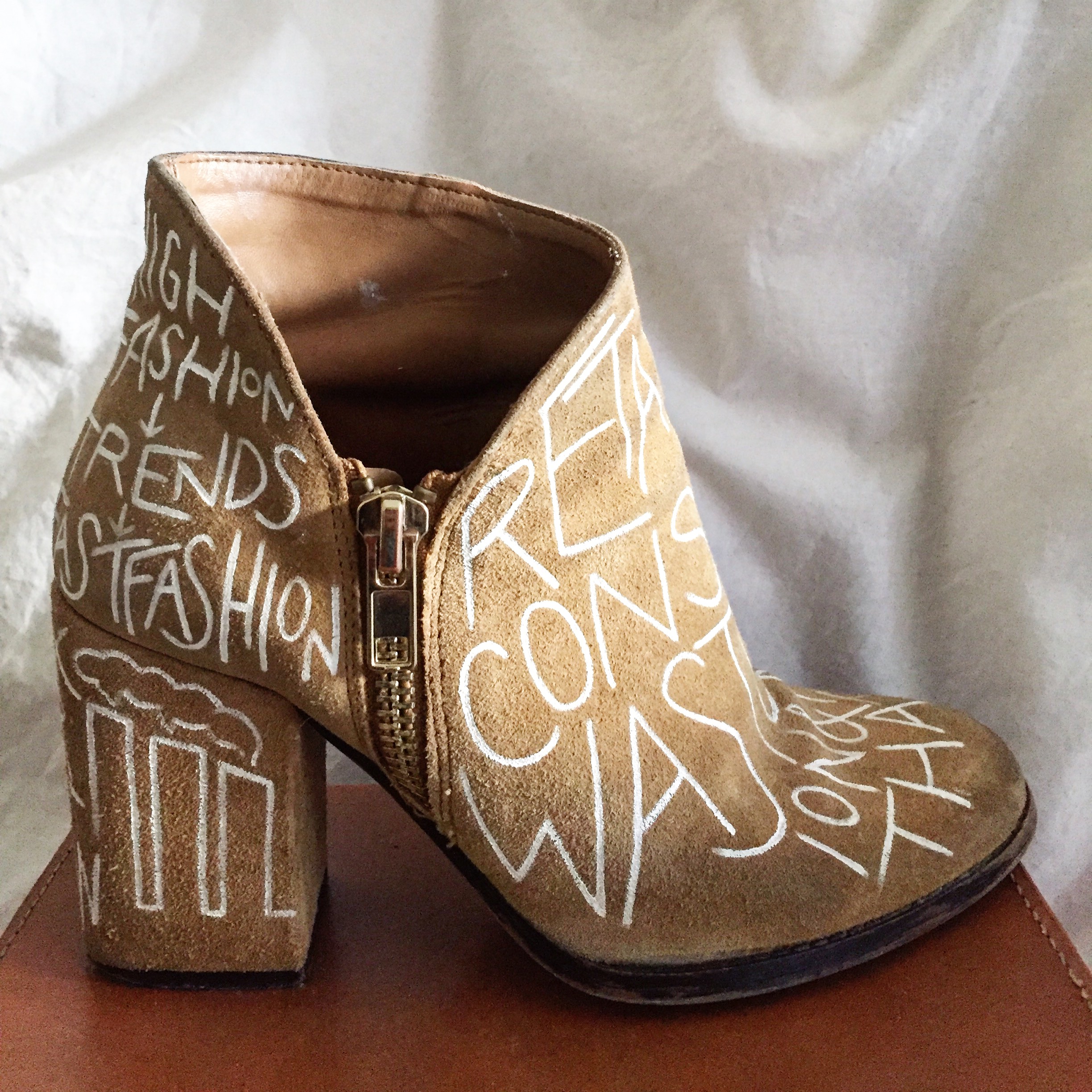
The front of my shoe outlines the producer-consumer relationship and how this relationship perpetuates a never-ending cycle of waste and pollution. As long as fast fashion retailers continue to churn out new and trendy clothing styles, consumers will continue to buy into these trends, grow tired of them after a season or so, and subsequently buy new garments the following season. This system keeps the retailers in business and creates a cycle with no foreseeable ending.
On one side of the shoe, I demonstrated the retailer’s general approach to the construction and manufacturing of garments. First, brands outsource labor, relying on workers from countries like Bangladesh or Cambodia, who work for extremely low profits. A reliance on cheap labor allows brands to sell watered-down runway trends to consumers at an appealingly low price point (although it’s worth noting that these price points are still marginally higher than the cost of production per garment). Because these garments are sold at a low price point, brands can get away with compromising the quality of the garments. Such garments do not need to be made with the finest materials anyways, because they’re essentially made only to last until the following season.
On the opposite side of the shoe, I mapped out the relationship between high fashion and fast fashion. Essentially, high fashion (luxury brands and fashion houses) determines the overarching trends for each season, and fast fashion retailers make note of these trends and subsequently generate cheap iterations of the trends.
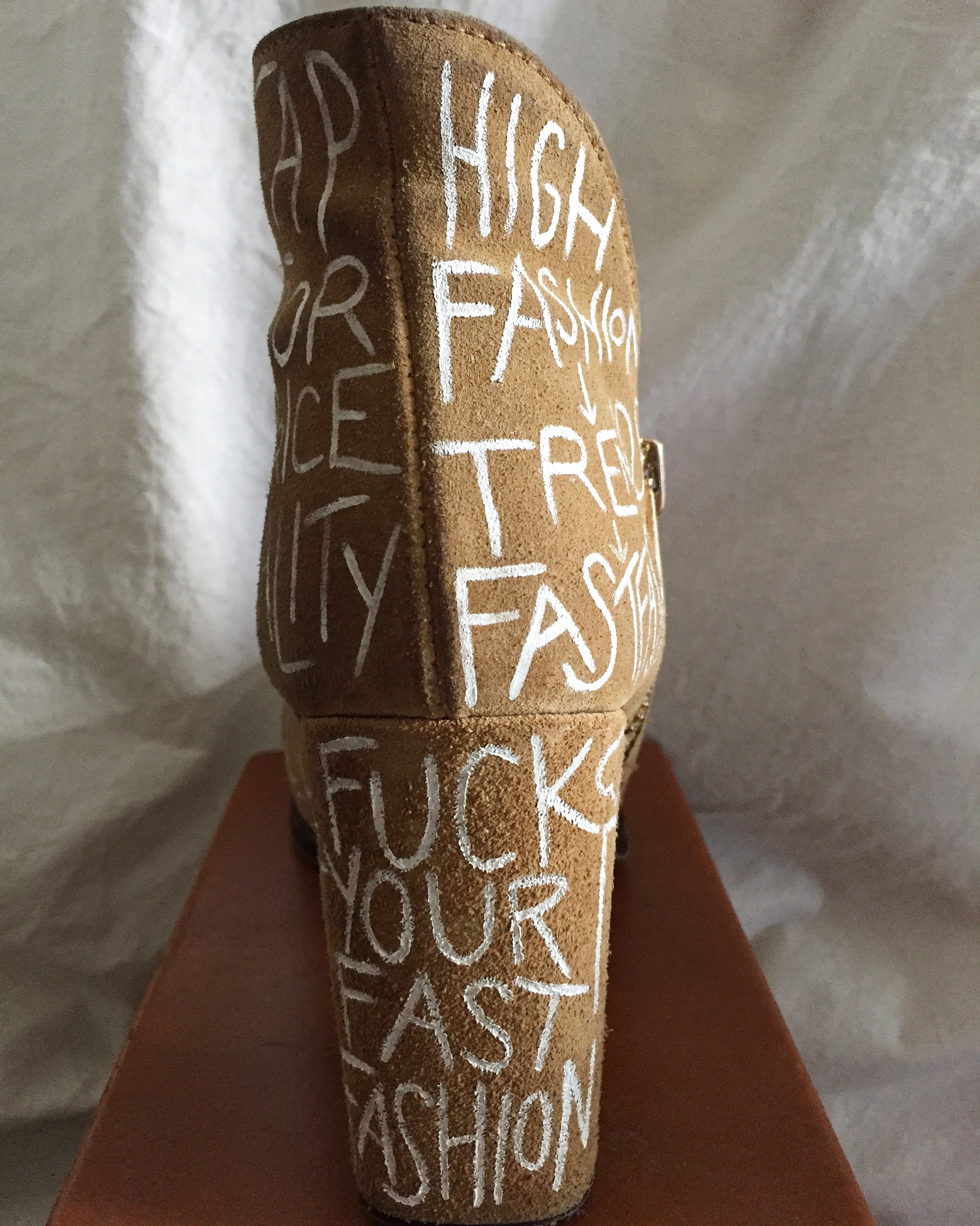
On the rear side of the shoe, I decided to write out a blatant message that contains a clear reaction to the problematic nature of fast fashion:
“FUCK YOUR FAST FASHION”.
The irony, however, lays in the fact that this message is inscribed on an object that would cease to exist without fast fashion. This is the consumer paradox.
BELOW: Photographs of shoe from various angles.


Last semester, in my studio class, I was tasked with creating a fictitious twitter profile and subsequently generating some sort of three-dimensional object that functions as a tangible reflection of the online persona. The aforementioned personas were not intended to function as representations of the student/maker or any pre-existing public figure. Instead, students were encouraged to embody someone or something else. After generating a fake twitter persona, students were then asked to engage and interact with each other’s profiles and ultimately publish (at least) 50 tweets. A successful twitter persona should not represent the student/maker, should not be treated entirely as a joke, and should demonstrate a holistic approach to avatar-making. The object was intended to reveal something about the character that is not formally or blatantly addressed through the character’s twitter profile.
I conducted pretty extensive research for both phases of this multifaceted project, first with the conception of my twitter persona, Mila Petrossian. I derived inspiration from various sources, but all of the traits I chose to demonstrate in my persona were products of my own interests. For example, I decided to create a character who is functions as a heightened exaggeration of many of the perceived stereotypes of a wealthy Upper East Side woman. Although I do not personally identify with this demographic, I’ve always been intrigued by the stereotypes of educated, upper-class women. I pulled a great deal of inspiration from one of my favorite television shows, Odd Mom Out, a Bravo series created by writer and actress Jill Kargman. The show chronicles the trials and tribulations of Jill Weber (played by Kargman), a spunky Upper East Side mom who faces an internal conflict of whether or not to conform to the stereotypes demonstrated by her fellow UES dwellers. The attitude and demeanor of Jill’s sister-in-law, Brooke Von-Weber (played by Abby Elliott) functioned as a crucial source of inspiration in developing my character. Although Mila Petrossian is intended to reflect the stereotypes of an Upper East Side woman, I also wanted her to be multidimensional, functioning as a holistic persona. Again, I referred to my own interests in the character development process, relying on my knowledge and interest in fashion and luxury goods to inform Mila’s character. As much as I detest when fashion is trivialized, I also really enjoy and appreciate something that I refer to as “sartorial satire” (highlighting the flaws and absurdities of the industry through humor). Mila’s twitter profile is a testament to my own sense of humor when it comes to fashion, except that with Mila, her seemingly satirical assertions and declarations about fashion are intended to be taken seriously. I also pulled from my knowledge and interest in astrology to develop a persona for Mila. She is supposed to embody the perceived or expected traits of a Virgo, demonstrating sharp analytical skills and a blunt (sometimes seemingly apathetic) demeanor. Furthermore, I decided to employ my interest in religion — something I’m intrigued by, but have only a superficial understanding of. In order to incorporate religious themes or ideas into Mila’s persona, I had to conduct some research on Christianity (and Catholicism in particular). After conducting my research, I decided that Mila would act as a personification of three of the seven deadly sins: lust, greed, and pride. With all of this information in mind, I was able to construct an intricate background story on Mila that would subsequently inform the way she presented herself on twitter.
Below: an excerpt from my original blog post about this project, which offers some context into Mila’s background
“Mila was born and raised in Fairfield County, Connecticut. She was born into an affluent family; her parents could afford to send her to expensive private schools and invest a considerable amount of money into her education. However, Mila was also raised in a devoutly Catholic household. As an adolescent, she never identified with the religion, and when she finally graduated high school, she fled to New York City to attend Barnard College, a women’s liberal arts school. Due to the resentment she felt towards growing up in an “oppressive” Catholic household, Mila cut ties with her immediate family and has not spoken to her parents or sister since graduating from Barnard. As a direct result of her resentment towards her Catholic upbringing, Mila (unknowingly) became an embodiment of three of the “Seven Deadly Sins” attributed to the Catholic faith; Mila is a personification of lust, greed, and pride. The “lust” is best exemplified by her views regarding marriage; she claims to love her husband, but she also spends her fair share of time on Raya, an elitist dating app. The bible essentially suggests that (at least) three forms of greed exist: an obsessive desire for ever more material goods and the attendant power; a fearful need to store up surplus goods for a vaguely defined time of want; a desire for more earthly goods for his or her own sake. All three descriptions of greed fit Mila perfectly. Lastly, Mila presents herself as extremely proud and arrogant. All of these “sinful” characterizations manifested as a result of Mila’s attempt to reject the religion that was forced upon her as a child.”
After developing a multidimensional character and subsequently generating a sufficient number of tweets on “her” twitter profile, I was ready to construct an object that would represent Mila Petrossian. By this point in the project, I had already conducted most of the necessary research, however, I did have to conduct some visual research in order to construct my object: a shoe. I chose to construct a shoe as a testament to Mila’s inherently materialistic tendencies and penchant for luxury goods. I wanted my design decisions to serve as subtle reflections of Mila’s most prominent traits — her analytical tendencies and her bluntness — while also alluding to a side of Mila that was not displayed on her twitter profile (her relationship to her religion). I decided to design a shoe that would mimic the architecture of a Catholic confessional, the box/booth often found within churches that a priest will sit in to hear the confessions of penitents.
Below: an excerpt from my original blog post, explaining the thought process behind the decision to incorporate design elements that mimic that of a confessional.
“The subtle replication of the design of the confessional is not only a quiet nod to [Mila’s] upbringing, but it is also intended to evoke a sense of irony; penitents flock to the confessionals to repent for their sins, but Mila is ignorant to the fact that she embodies several sins. If she did become aware of this, surely she would remain unaffected and wouldn’t feel compelled to change her ways.”
Below: Mapping out my research process (notes taken for Seminar 2)

Below: Examples of tweets


Below: Drafting my object (draft created for original studio assignment)


TILE OF WORK: CONFESSIONS OF A POTENTIAL NARCISSIST
PROJECT DESCRIPTION:
Student will create a self-portrait based not on physical appearance but on confessions of self. The self-portrait should not be a literal or traditional rendering (i.e. student will not work from a photograph of herself or draw what she sees in the mirror). The self-portrait should not necessarily resemble the artist but should still function as a reflection of the artist.
Any medium may be applied. For the first phase of the bridge project, the student will create ten self portrait renderings that are based on physical appearance, and subsequently manipulate those renderings in some way to either reveal something new about the artist, or to disguise the artist.
The final project should combine elements of the artist’s strengths and weaknesses (in a creative sense, what do you feel you are good at? What are you not so good at? How can you combine strengths and weaknesses to create a powerful and resonant work of art?)
MATERIALS USED:
(Phase one):
Graphite, Micron pen and Tombow marker on sketchbook paper
Liquid eyeliner and acrylic paint on Canson paper
PROJECT REFLECTION:
The fifth and final bridge project for Integrative Studio was intended to be a self-directed project that functioned as an opportunity for students to explore both their strengths and weaknesses as artists/designers and potentially explore something that they did not have the chance to with previous bridge projects.
Throughout high school, I struggled with severe self-image issues. I was a deeply insecure individual in just about every sense. During my senior year, I was assigned several projects in my art major class that dealt with self portraiture. Such projects were extremely stressful and anxiety-inducing for me; the prospect of having to create renderings of myself made me sick to my stomach. For one of the projects, I had to beg my teacher to let me create a portrait of someone other than myself, because I could not stomach the thought of drawing my own face. Since moving to New York, however, I’ve gotten to a point where I simply do not care so much (presumably because I’m in a position where I just can’t care so much). Although I am not completely confident in who I am, I’ve simply learned how to manage my own self-esteem issues. In addition, I’ve established a creative goal for myself — I want to make art that is powerful and resonant. I want to challenge myself to talk about and explore uncomfortable subjects through my work. I want to be candid and honest and a little bit vulnerable. When Mylo gave us the opportunity to come up with our own project, I knew I needed to take advantage of this opportunity — to express my own inner thoughts and vulnerabilities in a work of art is a little bit terrifying, but it can also be extremely cathartic. If I could successfully pull this off, it would be a testament to how much I’ve grown as an artist in the past year.
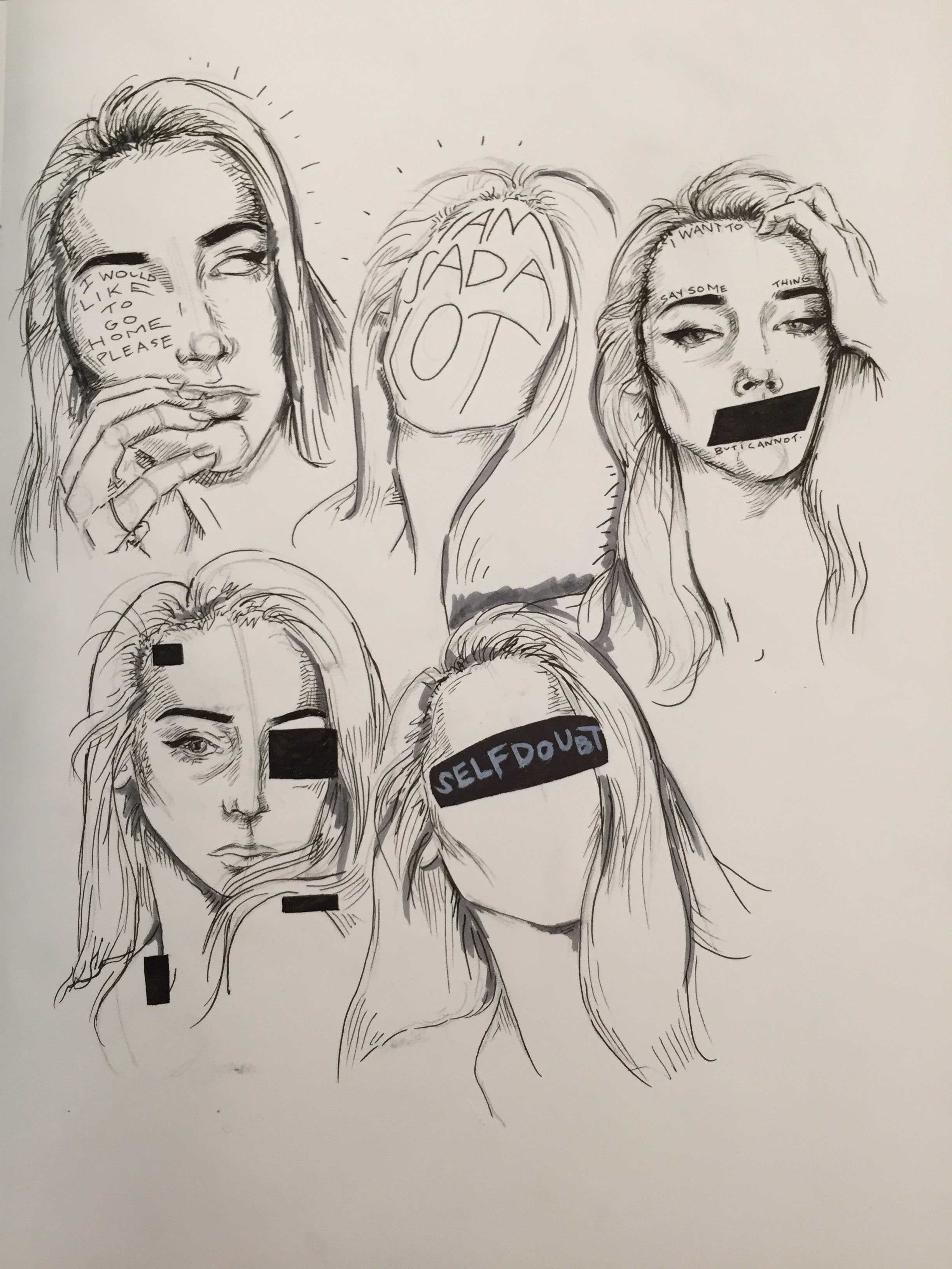
For phase one, I decided to create ten self-portraits based on my physical appearance. To look at my own reflection and draw what I see is still challenging for me, but it also felt extremely liberating. I had to manipulate these renderings in some way, so some of them offered textual confessions, while others bore stylized features that either explicitly or implicitly expressed an emotion or vulnerability. In comparison to phase two (the final piece for this project), these renderings relied far more on my physical appearance. For my final piece, I wanted it to be less about creating a self portrait that looks just like me, and more about a self portrait that says more about me than any physical features could.
Before delving into the final piece, I had to engage in a lot of sketchbook drafting. I knew I wanted my final portrait to be highly stylized; prior to my time at Parsons, I hadn’t really developed my own artistic style. Most (if not, all) of my work consisted of highly realistic drawings/paintings. I was a perfectionist, so much so that I couldn’t bear the thought of creating something that did not look realistic. Since moving to New York, however, I’ve pushed myself to develop my own distinct artistic style. I still haven’t solidified my style yet, but I figured this project would be a perfect exercise in developing my style. I do a lot of personal writing in my free time, and recently I’ve been exploring the notion of combining my passion for art and writing. Thus, many of my sketchbook pages are filled with drawings and text. I knew I wanted text to be one of the primary design elements of my composition, so I began drafting out “confessions” in the pages of my sketchbook. In my final design, the confessions of self occupy the negative space behind the stylized portrait. Poor planning on my part meant that the content of the text was ultimately compromised (the original confession was much longer, but naturally I ran out of space on my paper), but I am still pleased with the outcome. Not only does the content of the text provide insights into how I feel, but the way it’s formatted on the page makes it as much a design element as the actual portrait. The text is intended to reveal the contradictions of my own perception of self. While I still have not fully embraced my physical appearance, I am very much in love with my own mind. I am in love with my thoughts and ideas — I am not always in love with the execution, but always the ideas. I wonder, then, if this makes me a true narcissist. I cannot look at my own reflection in the mirror when I wash my hands. I love to disassociate — abandon my own body and assume a physical form that is more beautiful than my own. But yet, I am madly in love with what goes on inside my mind. I often wonder if I am in fact a narcissist because I love to talk about myself, to write about my life, and to share my musings with others. All of my work is deeply personal. Is the need to make art that expresses one’s own beliefs or identity the truest form of self-obsession? If you feel that the inner-workings of your mind are important enough to be put down on paper and ultimately shared with the world, doesn’t that make you a little bit narcissistic?
The point of my piece, however, is to not look down on my self for being so in love with what exists beyond my physical appearance. My intent is to address this idea that is presumably relatable to a lot of people (aren’t we all in love with our thoughts… if not, shouldn’t we be?) in hopes that I (and others) can feel empowered by this notion. We are taught to feel shame in loving parts of ourselves (perhaps this is why the most confident people are often feared), but is self-love (in whatever way it manifests) not a good thing? If you can’t love your physical being, should you not at least fall in love with your own ideas (the part of your being that you have some control over)?
PHASE ONE: Ten renderings

PHASE TWO: Final composition


TITLE OF WORK: THE HAVES & THE HAVE NOTS
BRIDGE PROJECT SUMMARY: Students were asked to create a zine that addresses a specific social or political issue in the science fiction world of a given film or television show. The creator of said zine should act as an inhabitant of this fictional world, advocating for a position on the chosen social or political issue. The zine, which should be at least six pages in length (in addition to a front and back cover), is intended to function as agitational propaganda. When creating the zines, students should consider the construction of the zine, the size and texture of the paper, and colors used, and how all these elements may contribute to the message or idea expounded within the zine.
“MATERIALS” USED:
(For creation of visuals):
Digital technology/Photoshop/Indesign
(For construction of zine):
Standard 8.5 x 11″ paper
PROJECT REFLECTION:
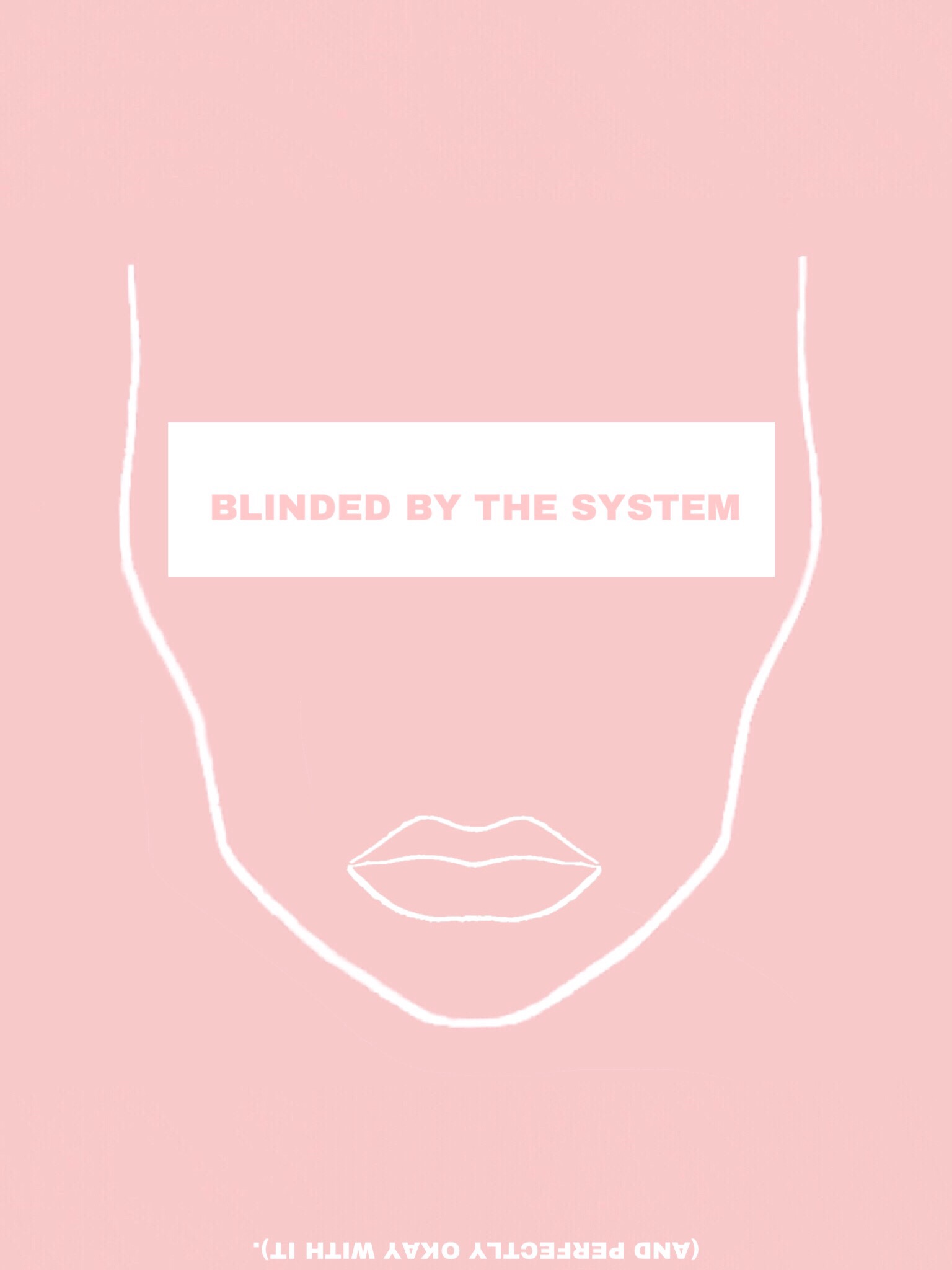
For my zine project, I chose to watch an episode of the British television show “Black Mirror”. I picked the debut episode of the third season, an episode called “Nosedive”. The episode is set in a world where people can essentially “rate” each other using a zero-to-five star digital ranking system. The aforementioned ranking system is so pervasive in this society, that those who conform or submit to the system govern themselves according to the system. In other words, every action, interaction, and relationship is influenced by the prospect of receiving a good or bad rating. Individuals with high rankings (4.5 or above) tend to receive more benefits; not only are they well-liked and “popular”, but they can also acquire discounts on luxury apartments and fly first-class. Likewise, those with low-rankings are without privileges; they are banned from certain public services and are generally ignored or mistreated by other members of society who fear their own rankings will be affected by interacting with low-ranking individuals.
Nosedive functions as a heightened reflection of our own reality; the episode addresses society’s collective tendency to allow social media to dictate our lives, the relationships we have with others, and the way in which we govern ourselves. While we may not have a system or program that allows us to rank other members of society (it is worth noting, however, that an app with this exact purpose was introduced not too long ago, although it was met with severe criticism), we are a society that is driven by our technology. The way we present ourselves on social media is not unlike the way the characters in Nosedive operate in real-life settings; everything is carefully curated and maintained to project a certain image. Social media allows us to dictate what parts of ourselves we wish to reveal and which parts we wish to keep to ourselves. People are driven by a desire to receive validation and positive affirmations from other social media users. Self worth is often based off of how many likes a picture or post receives, or the number of followers a person has. It’s even true that those with high follower counts receive privileges that those with low follower counts do not; one can get paid for his or her posts on Instagram if she has a significant number of followers. While we may not carry our numbers with us or allow these numbers to dictate our lives to the extent that the people in “Nosedive” have, it is still most certainly a cause for concern. Are we relying too heavily on social media and follower counts to define our self worth? Are the most powerful people not the ones who have a significant following, but the ones who have effectively rejected this self-imposed system?
For my zine, I chose to mimic the pastel color palette seen in the aforementioned episode of Black Mirror. Normally, pastel hues evoke a sense of calmness or serenity, but when juxtaposed with the absurdity of the ranking system, the colors are, to some degree, unsettling. I took the position of a member of society who seeks to reject the ranking system; this person advocates for rebellion by way of embracing a low ranking. I chose to employ text as a design element, keeping the composition of each page generally simple to highlight and emphasize the content of the text. Several of the pages use crude language as an homage to the final scene of Nosedive, wherein the main character, Lacie, is thrown into a jailhouse and stripped of her system after a violent outburst at her childhood best friend’s wedding. She encounters another incarcerated individual, the two begin to swear at each other — a testament to the fact that the two are now free from the oppressive ranking system.


TITLE OF WORK: THE BLACK MECCA OF THE WORLD
BRIDGE PROJECT SUMMARY: After exploring the notion of “avatar” in a variety of contexts, students were asked to consider the constructed environments of said avatars. Where might these avatars reside? What is their relationship to the environment they inhabit? Students were put into groups and assigned one of the five following New York City neighborhoods: Chelsea, Greenwich Village, Harlem, Lower East Side, and the Upper West Side. Students were subsequently asked to explore their assigned neighborhood with their teammates and collectively construct a “virtual world” that addresses an interesting(perhaps overlooked) facet particular to that neighborhood.
MATERIALS USED:
Studio markers
Micron pen
Bristol board
PROJECT REFLECTION:
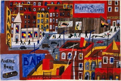
Prior to visiting Harlem, I was aware of the neighborhood’s rich cultural history; in high school, I learned about the Harlem Renaissance and studied the works of Jacob Lawrence and Aaron Douglas. As a motown and soul enthusiast, I knew about the legacy and history of the Apollo Theater. However, it was not until I actually traipsed the streets and avenues of Harlem that I came to an important conclusion about this neighborhood of upper Manhattan. On that day, I realized that Harlem is the unsung sartorial hero of Manhattan. In a city known for embracing a monochromatic palette, Harlem is rich with color.
As soon as I emerged from the subway station on 125th street, I was greeted by the black and emerald cloth dress and corresponding dhuku of a woman pushing a stroller. I saw men sporting colorful ties and even suits; window displays at boutiques presented hats in every shape and style, from red pillbox hats to green sequinned berets. To conform to the sartorial habits of other neighborhoods in Manhattan is to don an all-black outfit; to conform to the unwritten dress code of Harlem is to sport only your most colorful accoutrements.
Prior to gathering as a group to collectively construct our map, my group members and I each planned out our own maps of the neighborhood. My intent was to create a map that acts as a visual testament to the colors and patterns that are embraced by the sartorialists of Harlem. I looked to the paintings of Jacob Lawrence for color inspiration and researched Harlem-based fabric and textile stores (e.g. Yara African Fabrics on 125th street) to use for pattern references. Ultimately, the element of pattern as it relates to clothing and textiles did not find a place on our map, but we did rely heavily on bright colors as a nod to the bold sartorial decisions we saw firsthand and to the colors that are characteristic of Harlem Renaissance paintings.
Our visual of Harlem functions very much as a literal map; it features a fairly accurate outline of the neighborhood as it relates to Manhattan as a whole, and within the confines of the map, there are various literal landmarks that collectively, we felt were a testament to the neighborhood’s tangible culture and history. The Apollo Theater and Cotton Club, for example, are two of the most iconic landmarks within Harlem — it felt appropriate to include such historic landmarks on the map, although in hindsight, I wouldn’t say including such famous sites tells the viewer anything new about Harlem (which was essentially the purpose of this project).
Upon visiting Harlem, I became immediately aware of how proud its residents are of its history and its identity. Since the Great Migration (which began just before the 1920s and continued through the latter half of the twentieth century), Harlem has maintained a reputation of being —in Michael Henry Adams’ words — a “cultural nexus for black America”. The naming of the avenues after influential black artists and activists (e.g. James Brown Way, Adam Clayton Powell Jr. Boulevard) is a direct testament to that notion. We sought to depict the concept of black pride in our map by including a portrait of Marcus Garvey, for example, and a stylized crowd of activists holding picket signs.
Our map draws on the rich cultural history of Harlem by employing familiar imagery of musical instruments as a nod to the popularity of jazz, soul and, as aforementioned, by employing colors and drawing techniques that are intended to be reminiscent of artworks attributed to the Harlem Renaissance. The various residential buildings featured throughout the map are drawn in a manner that is intended to mimic that of Jacob Lawrence’s painting of Harlem from 1930. The way in which the colors spill over the fine black lines is another quiet nod to the artistic conventions attributed to the Harlem Renaissance.
Although I do firmly believe that as a group, we sought to portray Harlem both fairly and accurately, I do think we failed to create a work that 1.) uncovers an interesting, overlooked facet of Harlem and 2.) depicts the neighborhood in a sensitive, socially aware manner.
In retrospect, I recognize the sheer insensitivity of our map. It feeds into a stereotype about Harlem that acts as a gross generalization of a neighborhood that offers so much more than what is depicted on our map. Our map is an unfair representation of Harlem; it alludes to the presence of gangs and police precincts as if to suggest that it is inherently dangerous. During our visit to Harlem, there was not a single moment in which I felt my safety was threatened or that I was in danger. The neighborhood was quiet, calm — on a Thursday morning, Harlem is decidedly less hectic than Midtown.
Below: Sketchbook notes + drawings created prior to the construction of our final project
ahref=”https://portfolio.newschool.edu/annabellewalsh/files/2017/10/HARLEM-13ovjmg.jpg”>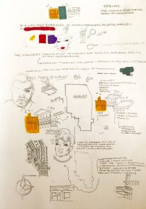
Below: Photograph of the final project, respectively titled, “The Black Mecca of the World”

Below: Jacob Lawrence’s Harlem (1930). This painting functioned as a great source of inspiration for us during the creative process.

TITLE OF WORK: ABJECT MATERIALISM
BRIDGE PROJECT SUMMARY: After watching Spike Jonze’s “Her” and subsequently discussing the notion of “avatar” as it relates to the content of the film, students were asked to create fictitious twitter personas. The personas were not intended to function as representations of the student/maker or any public figure. Instead, students were encouraged to embody someone or something else. After generating a fake twitter persona, students were then asked to engage and interact with each other’s profiles and ultimately publish (at least) 50 tweets. A successful twitter persona should not represent the student/maker, should not be treated entirely as a joke, and should demonstrate a holistic approach to avatar-making.
After completing phase one of Bridge Project 2 (creation of twitter persona), students were asked to create an object that is reflective of his or her twitter persona. The object should function as a clear embodiment of the persona, but it should not rely solely on the content of the twitter profile. Instead, the object should also reveal something about the character that is not formally or blatantly addressed through the character’s tweets.
Project Reflection:
For my twitter profile, I chose to create a fictitious persona based on the stereotypical perception of a high-class, well-educated Upper East side woman. Mila Petrossian (@Lady_Petrossian on Twitter) is the wife of a venture capitalist, the proud mother of a four year old named Genevieve, and a graduate of Barnard’s art history program. Based on how she presents herself online, Mila comes off as incredibly blunt, inherently narcissistic, and utterly materialistic. Online, Mila speaks her mind; it’s evident from her twitter profile that she enjoys boasting about her wealth. She never hesitates to name drop; she loves sharing how much she’s spent on a pair of shoes or how much she’s paying for her four year old’s private school education. Mila is a typical Virgo in every sense; she’s incredibly blunt/bears a dry sense of humor, analytical (re: art history major), rational (decisions are based on logic as opposed to emotion), and emotionally detached (her bio reads, “fiscally espoused, socially single”). Mila essentially embodies the notion of “abject materialism” — materialism experienced to the highest or most extreme degree. Mila’s online presence is a testament to all of the aforementioned characterizations. What her online profile does not reveal, however, is why or how Mila became this way.
During the early stages of this project, Mylo had the class engage in an exercise where ze asked the class a litany of questions about our personas. While Mila certainly began as a stereotypical depiction of an affluent Upper East Side woman, the in-class exercise inspired me to develop an in-depth backstory for my persona. What drives her? What made her the way she is today?
MILA’S BACKSTORY:
Mila was born and raised in Fairfield County, Connecticut. She was born into an affluent family; her parents could afford to send her to expensive private schools and invest a considerable amount of money into her education. However, Mila was also raised in a devoutly Catholic household. As an adolescent, she never identified with the religion, and when she finally graduated high school, she fled to New York City to attend Barnard College, a women’s liberal arts school. Due to the resentment she felt towards growing up in an “oppressive” Catholic household, Mila cut ties with her immediate family and has not spoken to her parents or sister since graduating from Barnard. As a direct result of her resentment towards her Catholic upbringing, Mila (unknowingly) became an embodiment of three of the “Seven Deadly Sins” attributed to the Catholic faith; Mila is a personification of lust, greed, and pride. The “lust” is best exemplified by her views regarding marriage; she claims to love her husband, but she also spends her fair share of time on Raya, an elitist dating app. The bible suggests that (at least) three forms of greed exist: an obsessive desire for ever more material goods and the attendant power, a fearful need to store up surplus goods for a vaguely defined time of want, and a desire for more earthly goods for his or her own sake. All three descriptions of greed fit Mila perfectly. Lastly, Mila presents herself as extremely proud and arrogant. All of these “sinful” characterizations manifested as a result of Mila’s attempt to reject the religion that was imposed upon her as a child.
For my object, I chose to construct a shoe. A shoe is perhaps the most literal illustration of “materialism”. Mila’s twitter icon even depicts her submerged in a bathtub filled with shoes as a testament to her materialistic tendencies. The construction of the shoe directly reflects some of Mila’s most discernible traits. The shoe is sharp and angular; it is comprised of various sharp, geometric pieces. It features a pointed toe and an angular block heel. The decision to construct a heeled shoe as opposed to a flat shoe was intentional; Mila considers herself part of the “elite” and generally feels superior to her acquaintances because of her social status and intellect. Moreover, the sharpness of the shoe is a testament to Mila’s sheer bluntness. The angular nature of the shoe is reflective of her analytical, logic-based demeanor. She views things quite literally — everything is black-and-white; there’s no room for gray area. The shoe does bear one ornamental feature, however, that refers to a part of Mila that is not displayed on her twitter profile. The back of the heeled shoe is intended to mimic the design/architectural features of a Catholic confessional — the box/booth often found within churches that a priest will sit in to hear the confessions of penitents. The subtle replication of the design of the confessional is not only a quiet nod to her upbringing, but it is also intended to evoke a sense of irony; penitents flock to the confessionals to repent for their sins, but Mila is ignorant to the fact that she embodies several sins. If she did become aware of this, surely she would remain unaffected and wouldn’t feel compelled to change her ways.
ROUGH DRAFTS:
(Screencaps of tweets):


OBJECT:
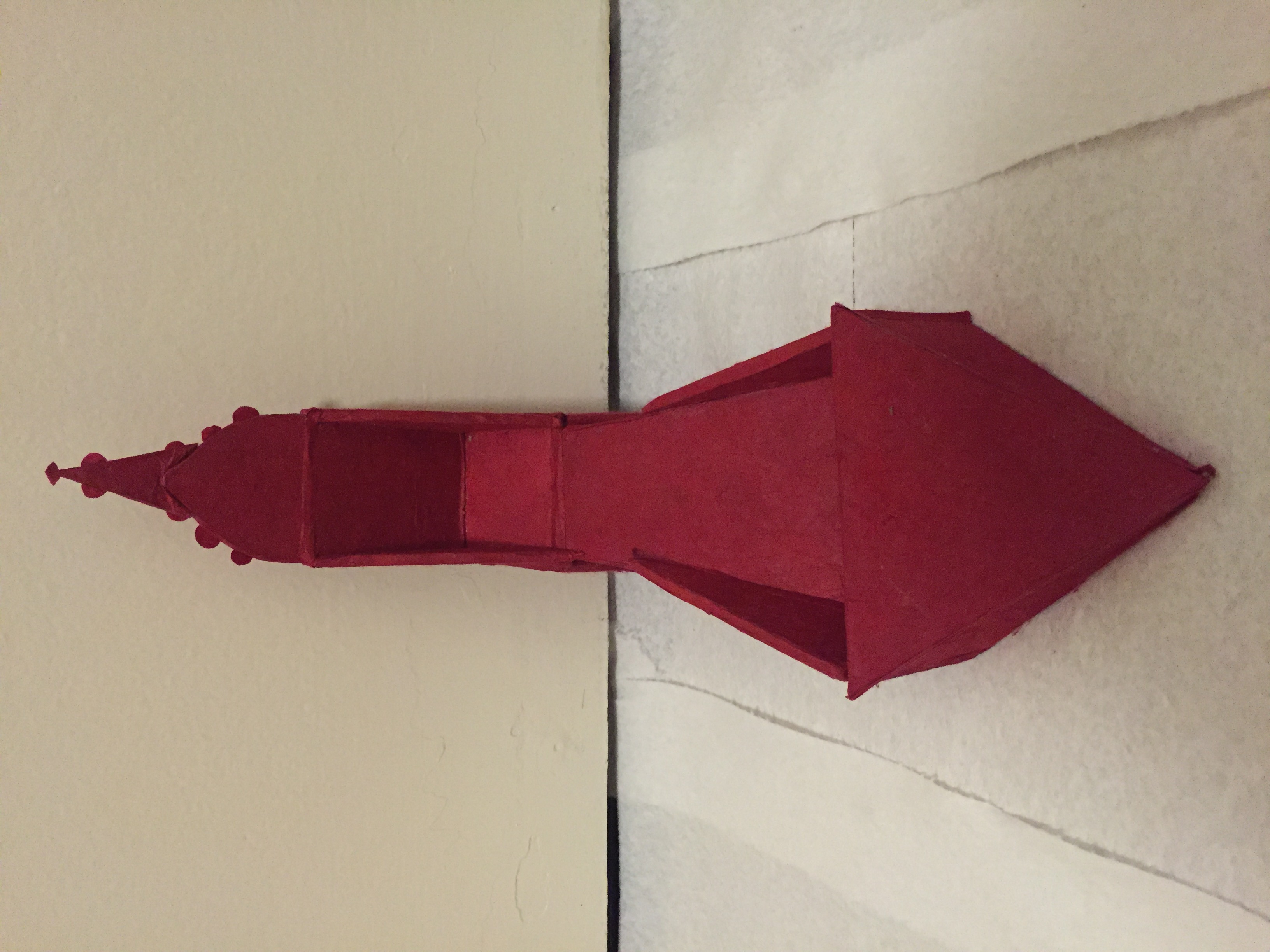


LIST OF MATERIALS USED:
Cardboard
Glue
Lokta paper
TITLE OF WORK: THE RETROSPECTIVE SELF
PROJECT DESCRIPTION: The purpose of bridge project #1 was to explore the notion of avatar as it relates to oneself. How can an avatar function as a form of self identification? Can a single avatar act as a complete embodiment of oneself, or are avatars merely fragmentary visualizations of the self?
The initial phase of this bridge project is characterized by the generation of fifty iterations of an avatar that are intended to represent the creator of said avatars. Students were asked to push the limits of what an avatar can be and to push the parameters of any programming used. Students were required to employ at least five different mediums or programs.
The subsequent phase of this bridge project is the creation of the avatar collage. The collage (made either with physical images or digitally) should borrow from the previously generated iterations to create one “super-avatar”. The collage should not only borrow from the previous iterations, but it should also include anything that those iterations may have lacked.
LIST OF MATERIALS USED:
For phase one (fifty iterations):
Digital programming
For phase two (collage):
printed out images and magazine clippings assembled on bristol board.
PROJECT REFLECTION:
This first bridge project acted as an opportunity to examine and explore the notion of “avatar” in the context of self perception and self identity. With phase one, I sought to generate iterations that as individual images, represent only a fraction of my whole identity. However, as a collection, I wanted these iterations to embody my whole self. In order to achieve this, I divided my avatar-making into various categories; I generated avatars that sought to represent my idealistic tendencies and how that can at times influence my self image. I generated avatars that represented the honest, candid version of myself. In order to do so, I created avatar memes that essentially addressed unfavorable impulses (i.e. tendency to fall in love easily, poor hygiene). I generated a fair amount of avatars that represented “the dark self”, which runs counter to the “self” that is depicted in the memes. This is the “self” that is haunted by the past. For one iteration, I decided to call up my best friend and have her describe my features to me as if I’d never looked in a mirror before. I chose facial features on an avatar simulator based on her description, as opposed to simply choosing the features that I felt looked most similar to mine. Some of my avatars represent my penchant for astrology, others are reflections of my stylistic tendencies as an artist. Overall,
I attempted to produce a holistic collection that is reflective of my multifaceted identity.
My final product for phase two is admittedly less holistic than that of phase one. In generating a collage, I chose to concentrate on the aspects of my identity that are far more difficult to discuss or come to terms with. I employed most of my darker, more cynical iterations to create a collage that effectively pays tribute to the repressed self. The collage includes most of my juvenile iterations — these iterations are reflective of my fears, most of which stem from actual childhood experiences. The collage also features various poetic phrases, which were created by simply cutting out hundreds of words from magazines and assembling the words into relevant phrases. For the most part, the phrases (“she becomes an asylum”, “woman on the verge”, “but our soul retreats to the earth to cry”) bear a poignant tone. The idea was to create a “self portrait” collage that acts almost as a form of catharsis. To generate avatars that represent generally repressed traits (or memories) and to then assemble these avatars into a unified collage felt almost like a purging of this version of “self”. 

