You are here- Passage Vivienne Map
To me, Passage Vivienne was a place that made me think of things that are old and worn out. For the first flatlay, I chose the twine, glasses, and coin purse to go along the scroll map, in order to emphasise the antiquated feel of my map.
The wooden floor panels also helps add an element of rusticity to the picture.
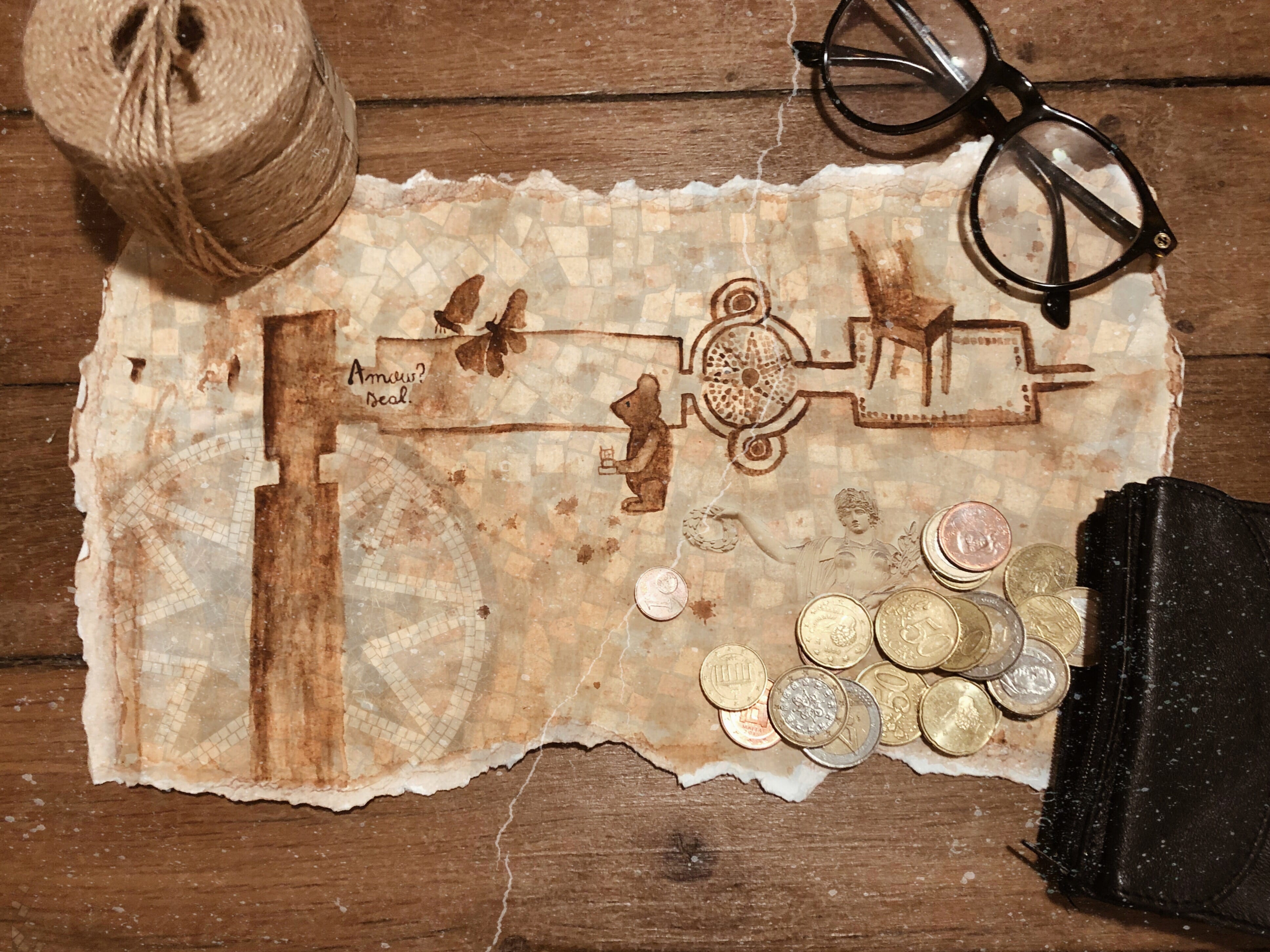
Here, the scroll has been opened and reveals my perception of Passage Vivienne. I’ve painted a basic outline of the literal map itself and added details that stood out to me. The reason behind the details are as follows:
Faint star tile: This symbolises the mosaic floors of Passage Vivienne. I was fascinated by how so many small pieces can be laid out consecutively in order to create a bigger picture.
Amour? Deal. : I just thought this was beautiful and simple but impactful as opposed to the other types of graffiti that is usually more common.
Two butterflies: These are based on the two huge pollen butterflies that were perched on construction material. The contrast between the steel construction tools and the soft wooden coverings stood out to me.
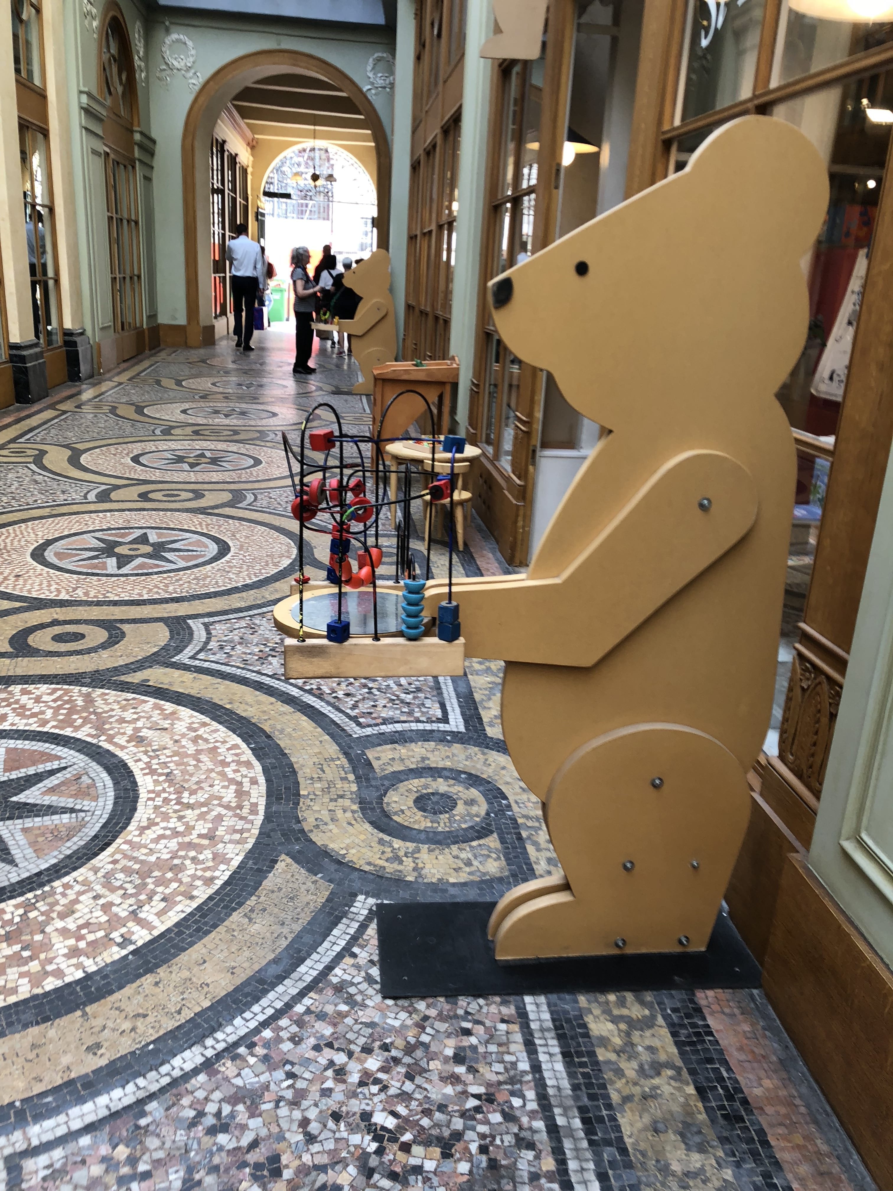
The bear: This was a cork bear outside a toy store. It reminded me of my niece and how I should probably get something for her before my parents leave Paris
The chair: This chair stood out to me because it was woven and it reminded me of how back home woven furniture is used a lot not because it is a trend, but because it (bamboo) is the most easily available resource.
I’ve also scattered some coins on a corner of the page because the gold and copper go along with the theme and colour scheme of my map.

Reference Photos