THE PROCESS
References

Sketches

Reflection
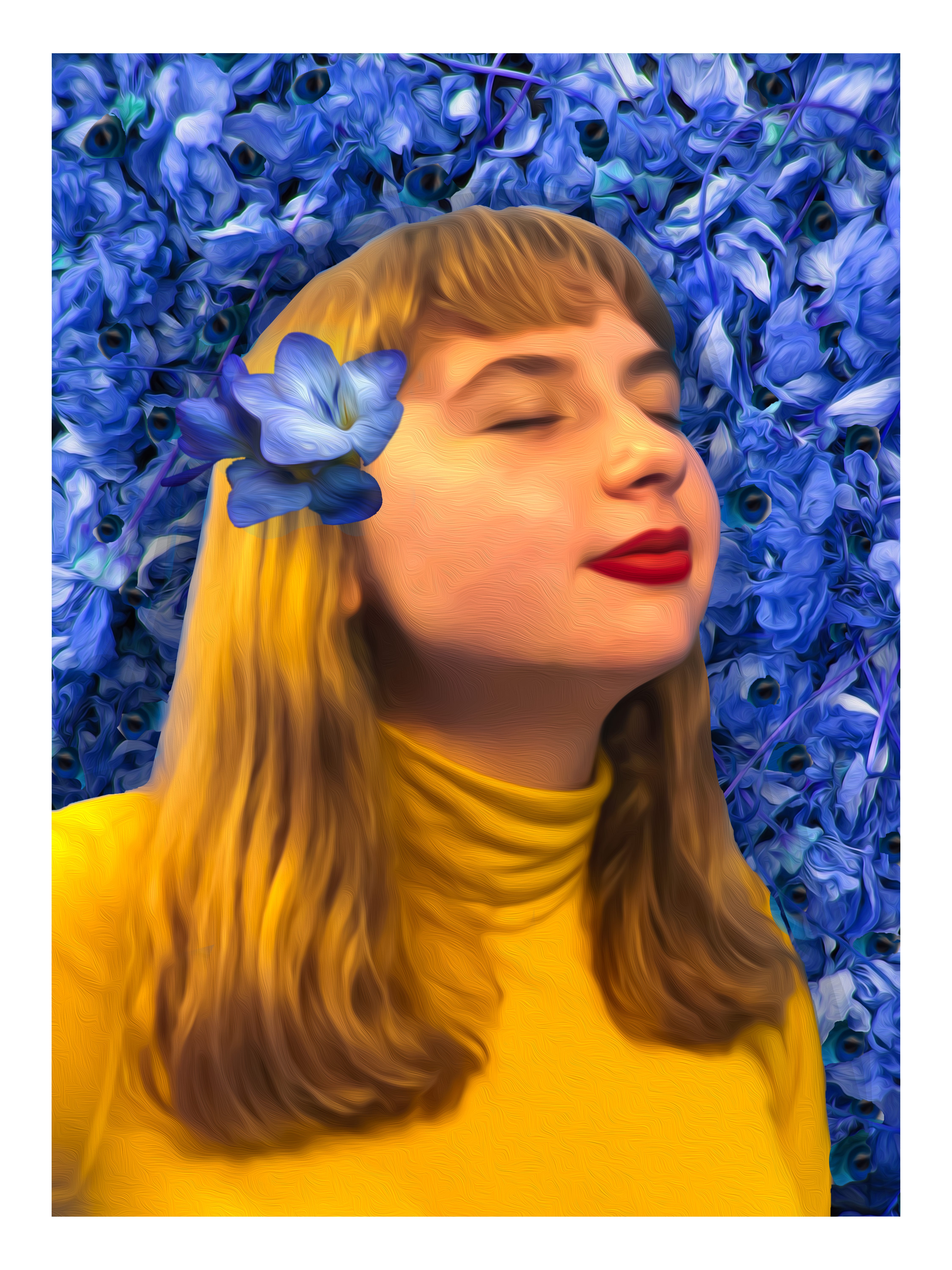
At the beginning of this project, I really struggled with deciding on which archetype/ mythological figure I wanted to use for my merge portrait. Even though the project excited me because I had grown up with Greek mythology and I knew the gods/ goddesses as if they were people I knew in real life, that type of familiarity also made me aware of all the bad things they represented so it was hard for me to feel connected to any of them. I initially chose the wise old man archetype since my friends often come to me for advice or guidance so as my mythological figure I chose Athena as she is known for her wisdom. While I was doing this project, however, I was very hyperaware of the complexity of a human personality and how it couldn’t be boiled down to just a label or at least not just one label so I wanted to create some sort of duality with my piece, I wanted it to have a contrast. Therefore, I chose Ares alongside Athena to signify the side of me that is rash and reckless, opposite of wise judgement. My first sketch was based on these two mythological figures and on that dichotomy. Yet, I still wasn’t feeling a strong connection to the figures or the idea. Thus, I eventually settled for Apollo and he felt like the right choice for me.
Ever since I started studying Greek mythology, I felt a huge connection to Apollo and I was even dubbed the Apollo of my class with my best friend being Artemis. I didn’t choose him at first though because I felt like my connection didn’t have any basis to it but as I looked into him more, I realized that I could relate to him in many fundamental aspects and not just for the fact that he is the god of music (that was the biggest reason why I felt so connected to him when I was younger because I had an interest in music). The thing that made me really relate to Apollo was our relationships, whether they be familial or romantic, I kept feeling the reminiscence of an experience I had previously in my life.
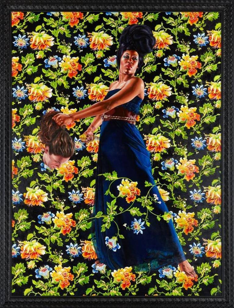
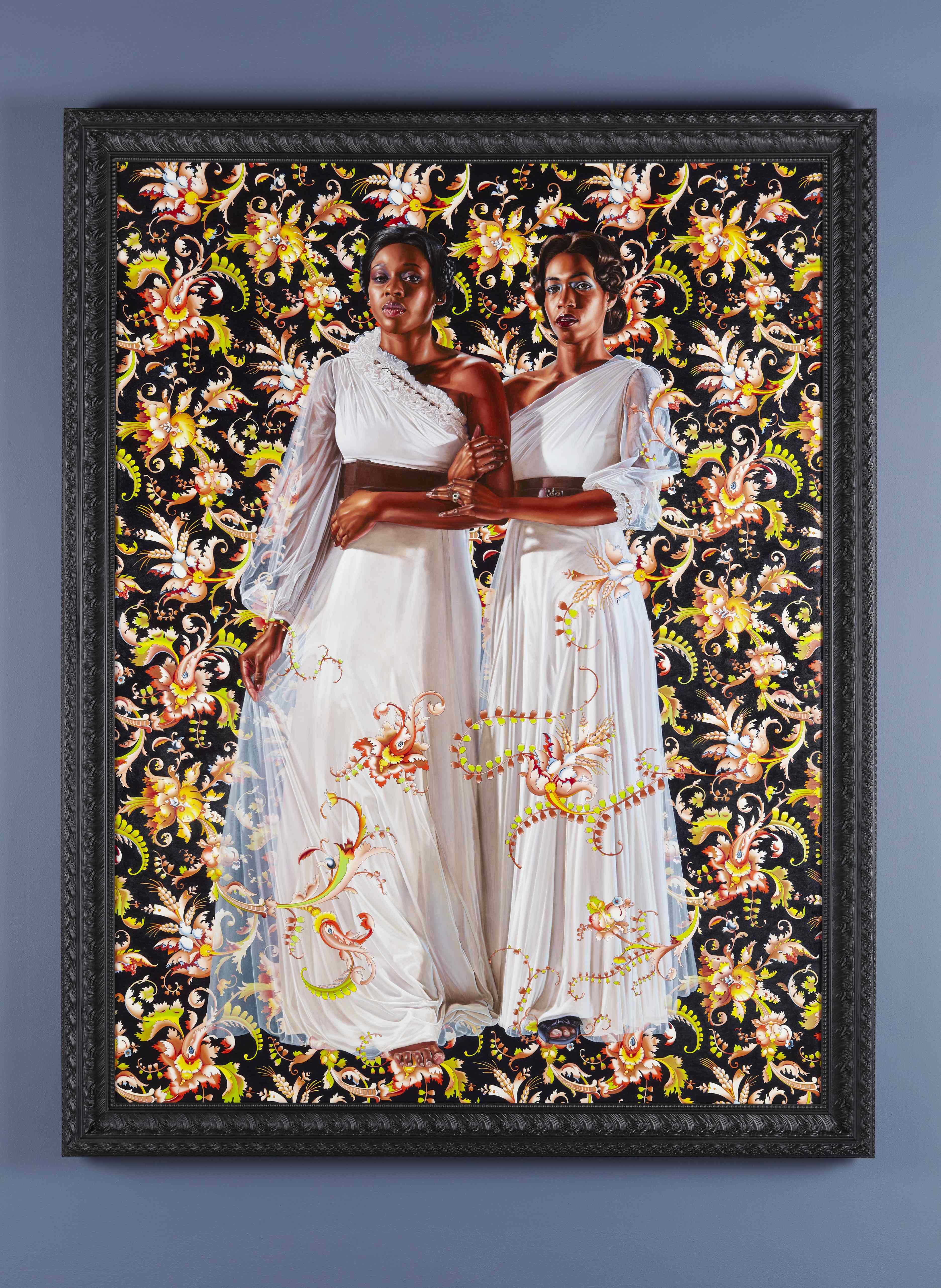
Aesthetically, I chose primary colors because I think they signify me and my personality very well. However, I also chose them for their symbolic value. To me, red invokes confidence and power while yellow encapsulates a playful spirit and bright aura. Blue, on the other hand, is usually a symbol of sadness and vulnerability. Even though all together they look vibrant and lively, individually they have very distinct purposes. The background is blue because it refers to my past that I don’t recall so pleasantly while I stand in front of it in peace with myself, adorned with yellow and red showing how I’ve grown from the sad experiences. Another important aspect of the color in the background is that it makes the flowers in the background look lively and prosperous while they are actually dead. The color also helps blends the eyes peeking through the flowers making them only noticable if looked carefully. The blue flower on my head connects me to my past and communicates that my past isn’t something I hide or I see as a weakness but that it’s something I wear on my sleeve as a reminder that I have gotten past this rough path in my life. The flower background was higly inspired by Kehinde Wiley’s paintings as I thought it was fitting since he uses them for portraiture. He also often integrates the background with the figure in the front which inpired me to do the same.