

 \
\
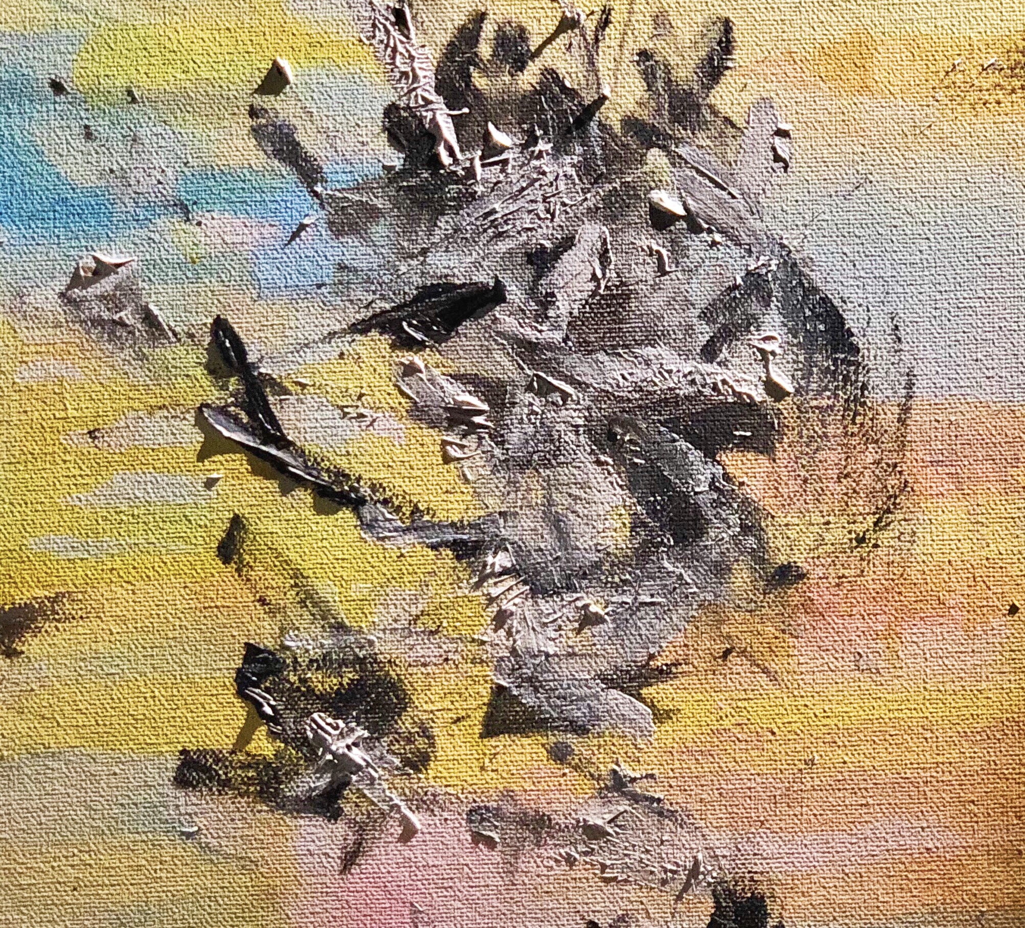
For bridge 1 project, I create 12×12’ acrylic painting as the
response piece. The content of my work is bases on the source
image I choose. For the background, I use the color palette of the
original source image(the sky), blending blue, yellow, white and
yellow together. For the foreground, I use mark making
techniques to make assured yet chaotic brushstrokes. Basically,
it’s a abstract version of the original photograph which relate to
my theme ‘Environment’. Through the painting, I’m trying to
describe how human behaviors such as industrialization or
urbanization influence the natural environment. The discorded
black and white brushstrokes in the foreground contrast strongly
with the harmonious bright colors background.
I choose to use acrylic paints as the material for several reasons.
The original source is a landscape photography, so I want to use
a completely non-digital medium as the response piece. Also,
when the viewer see the original photograph, he or she will just
take it as a pretty photo of the sky during sunset, not think about
the deeper meaning of it. However, the abstract painting add
more power to it by making the content more obvious, forcing
people to focus on the content and think about deeper meaning
about it: Why there’s something unharmonious in the foreground?
And that’s the kind of purpose I want to achieve.
If my artwork is to be placed into the general circulation of Visual
Culture, it need to be developed into a series of paintings that are
all related to the same topic ‘Enviroment’. And it will probably end
up in a museum or as the decoration paintings on the wall in a
hotel. Any places that can catch people’s attention and bring more
consciousness of environment.
Here are some ‘What if’ questions that help me developing my
ideas:
What if the main object is a bridge instead of posts?
What if there are more objects on the background?
What if there are more posts?
What if the color of the sky changes?
What if it is a painting?
What if it is a video?
What if it is a poster?