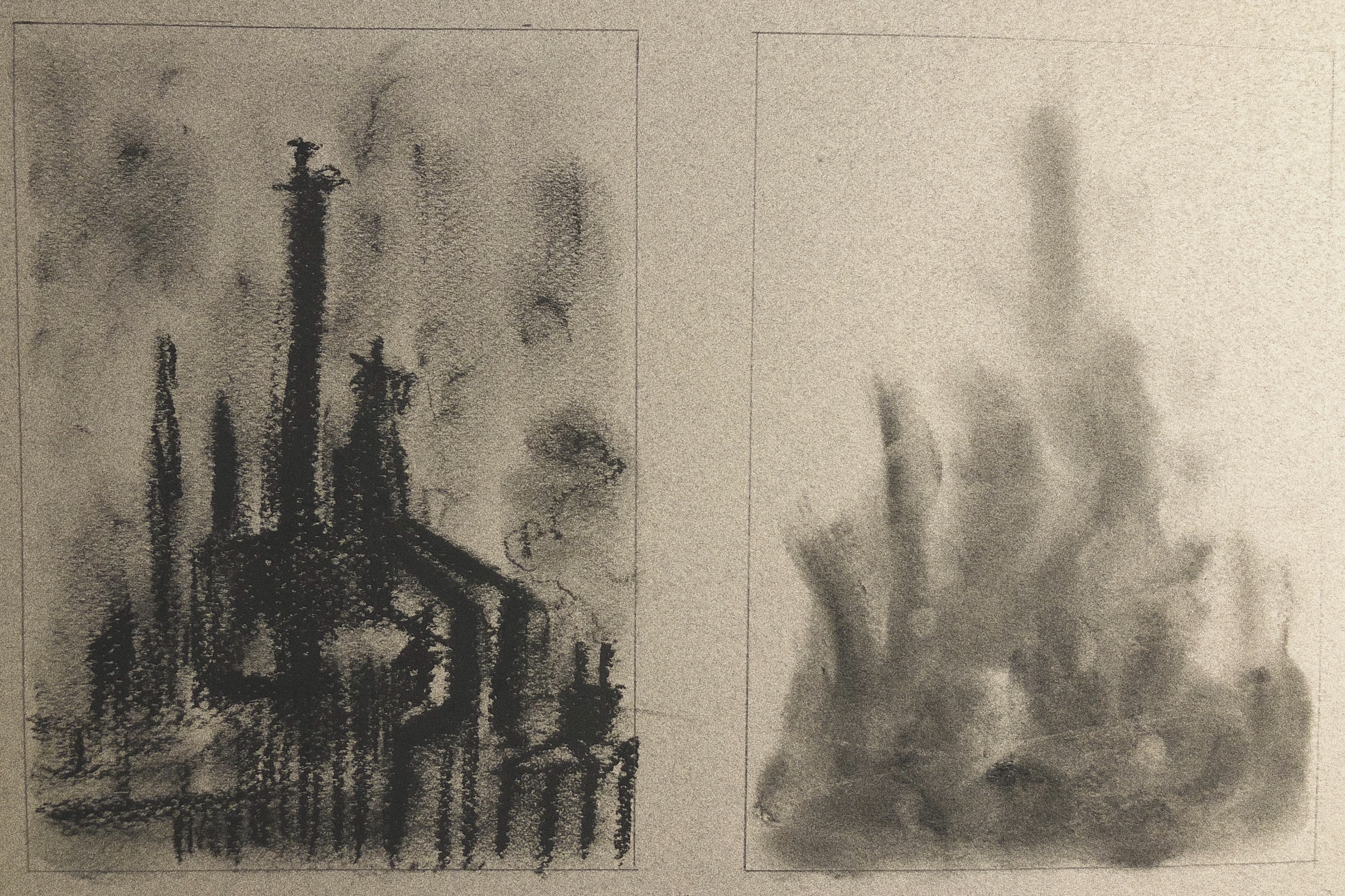
•What conversation happened between each image in this diptych?
the first one has more clear lines while the second one is more blurry, but they are actually the same object—factory. Basically, I’m trying to show what a factory really looks like in the first one, by using well-defined and clear lines, it’s like the “reality”. The other one is what a factory looks like in people’s eyes, because people are not really paying a lot of attentions to industrial pollutions and other problems due to industrialization, even if they do notice, they don’t really care, instead, most people just choose to ignore the problems.
I used charcoal to draw both diptychs, for the first one I draw a clear typical factory(the reality), and for the second one I use finger and cotton swabs to create a kind of blurry effect.(what people see)
•What did you learn about your content through this medium exploration?
I realize the idea after I finish drawing by charcoals, because it’s a kind of material that can be both clear and blurry.
•How did the medium you used change the context of your object, form, or image?
It creates a stronger contrast between two diptychs compares to Posca pens or watercolor.
•What websites / books / museums / galleries / other artists did you research during this process for ideas and inspiration?
I just researched some artworks about industrialization and photos relate to factories.
Regarding the whole process:
•How does this experiment shift your overall thesis question?
Before this experiment, I’m not very sure about which part of my broad topic “environment” I should focus on, now I want to shift my topic and focus on “industrialization”,which is one aspect of it.
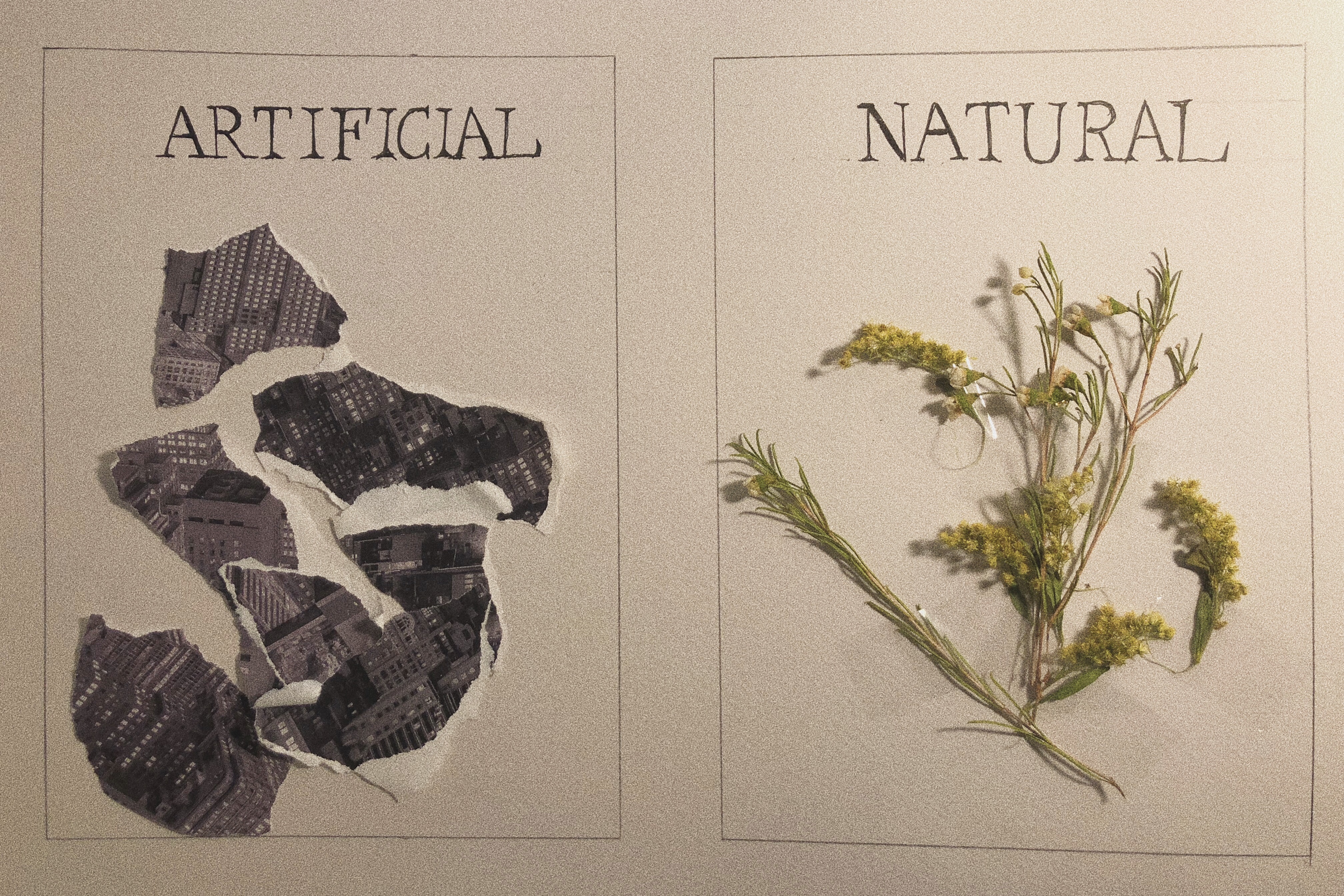
•What conversation happened between each image in this diptych?
For the first one I used paper with photos of buildings and factories printed no it to make a collage, then I wrote “artificial” on the top, for the second one I taped a flower with leaves onto the paper then wrote a word “natural”. It’s kind of ironic to see them together with labels, just like going to a exhibition hundreds of years later: At that time, the world will probably has less and less natural plants due to the effect of pollution or industrialization, so people can only see what flowers look like in museums with introductions beside them.
•How was the medium selected successful at supporting the content of your object, form, or image? (if it was not as successful as others, why?)
The mediums I selected are speaking for themselves, the viewer can touch them directly, so the message can be conveyed more effectively.
•How did the materiality (medium used) affect the content or meaning of the individual artworks?
The use of tape adds some “artificial “ feeling to the flower, creating a kind of contrast between the object and its label “natural”.
•What did you learn about your content through this medium exploration?
I found it’s more effective to convey the idea when I use tape to stick the flowers instead of glue.
•How did the medium you used change the context of your object, form, or image?
It didn’t really change the context, the idea is still about “contrast between industrial world and natural world”
•What websites / books / museums / galleries / other artists did you research during this process for ideas and inspiration?
I searched some photos of skyscrapers in the cities.