David Bowie Inspiration


My inspiration for the topic was from David Bowie’s iconic costuming and characters. I specifically was interested in his 1973 Aladdin Sane outfit after further research.
Infographic Inspiration


The infographics I found myself drawn to had a limited color palette and centralized around a graphic. In the third infographic, I really liked the typography and how simple it was laid out. In the Muhammad Ali infographic, I liked how he was the central focus of the poster.
Brainstorm:
I thought of different data topics I could present on the infographic.
- David Bowie’s 12 eras – different characters and album sales
- cocaine usage vs sales
- an analysis of his different “looks”
Research:
I decided on his original album sales versus his cocaine usage. So, I gathered this data.
1967 David Bowie – 200,000
1969 David Bowie – 2,300,000
1970 The Man Who Sold the World – 1,900,000
1971 Hunky Dory – 4,700,000
1972 The Rise and Fall of Ziggy Stardust and the Spiders from Mars – 8,550,000
1973 Aladdin Sane – 4,900,000
1973 Pin Ups – 2,750,000
1974 Diamond Dogs – 3,650,000
1975 Young Americans – 2,650,000
1976 Station to Station – 2,600,000
1977 Low – 2,600,000
1977 Heroes – 2,900,000
1979 Lodger – 1,650,000
1980 Scary Monsters (And Super Creeps) – 3,450,000
1983 Let’s Dance – 8,700,000
1984 Tonight – 3,400,000
1987 Never Let Me Down – 2,300,000
1989 Tin Machine – 1,400,000
1991 Tin Machine II – 600,000
1993 Black Tie White Noise – 1,500,000
1995 1. Outside – 1,050,000
1997 Earthling – 1,050,000
1999 Hours – 1,000,000
2002 Heathen – 1,250,000
2003 Reality – 950,000
2013 The Next Day – 1,500,000
2016 ★ (Blackstar) – 2,000,000s

Sketches of Format:


For the sketches of possible formats, I focused on one classic data presentation and two experimental ideas. I found that I really like the experimental ideas because of the illustrative component. I decided to go with the third idea because I felt the line graph fluidly combined with his costume.
Symbols:

Since I have two data sets, I chose to have one symbol representing each–album sales and cocaine usage. I focused on having a minimalistic design that only used two colors.
Experimental Type Composition:


Surprisingly, I found that I did utilize these typographical exercises. I used the font of the firt exercise and the line work that appears in the second.
Final Infographic:
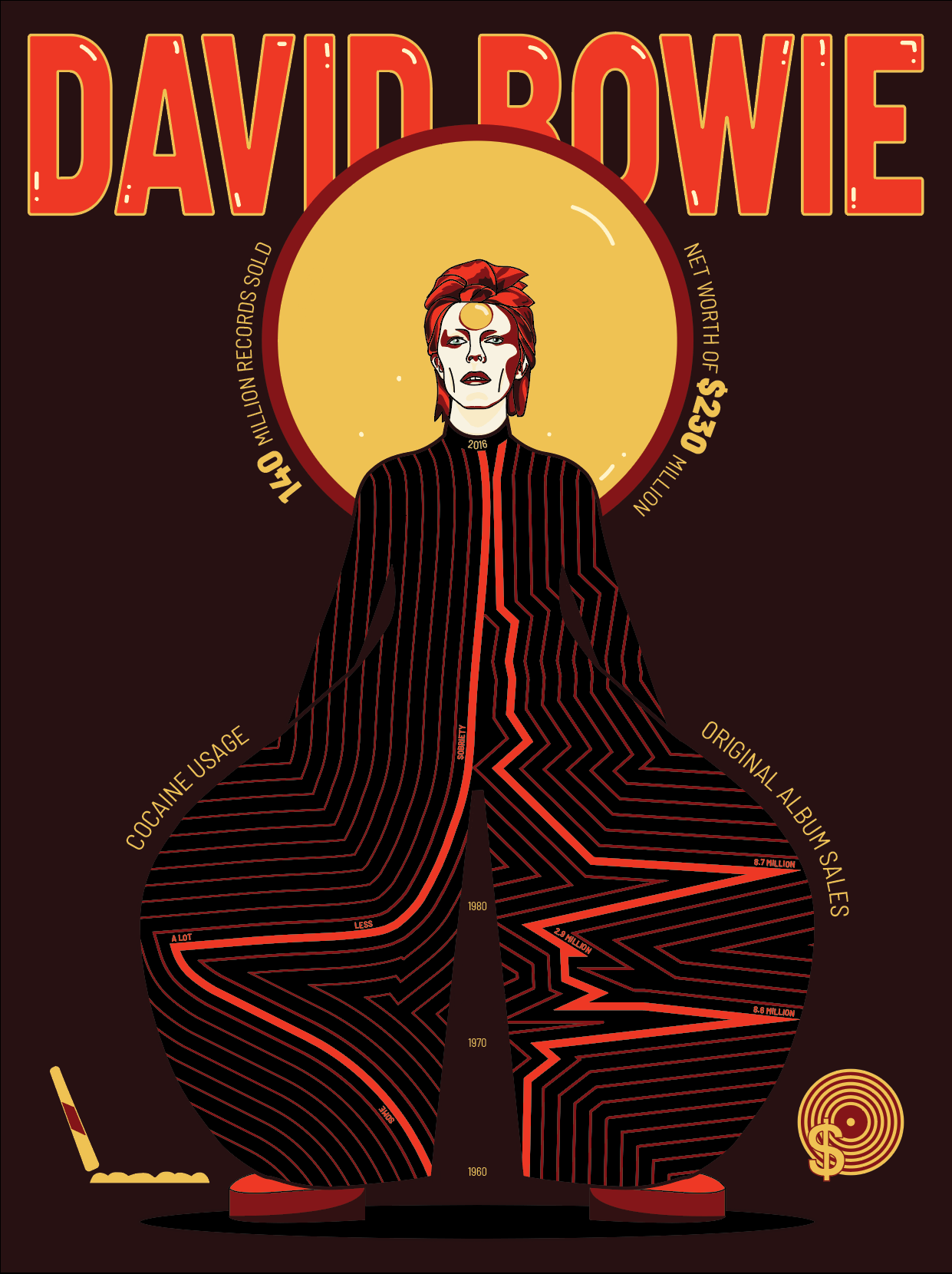
This was probably my favorite assignment this semester. I felt like it was a culmination of many different concepts we had learned this semester. This was the first unit that I think I successfully applied color theory to the project. I also learned more about semiotics, Gestalt Theory, Typography, and Compositional layout. I intentionally organized the icons and the central halo-like circle in a triangular formation. I think this is an application of Gestalt Theory in my infographic. In terms of typography, I chose to use a simple font and simply change size, boldness, color and outlining to highlight certain pieces of information. From the original sketch, I did add icons, the halo circle, a stronger title, and extended the graph to the neck to fill the space. And, I think these were successful additions and edits. It added to the meaning and clarified the information. Overall, I am very happy with how the infographic turned out.