Project description:
Students will choose a space in the city, be it indoors or outdoors, and will take a series of self-portraits that reflect their emotional states when exploring the space. Applying color theory/psychology, students will retouch the photographs in order to convey the emotion(s) felt in a specific timeframe/photo, as in a frozen moment; by selecting parts from some of the photo-series, students will create one final poster that encapsulates a holistic view of the experience.
Library research:
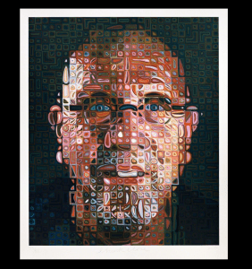
Chuck Close is globally renowned for reinvigorating the art of portrait painting from the late 1960s to the present day, an era when photography had been challenging painting’s former dominance in this area, and succeeding in steadily gaining critical appreciation as an artistic medium in its own right. Close emerged from the 1970s painting movement of Photorealism, also known as Super-Realism, but then moved well beyond its initially hyper-attentive rendering of a given subject to explore how methodical, system-driven portrait painting based on photography’s underlying processes (over its superficial visual appearances) could suggest a wide range of artistic and philosophical concepts. In addition, Close’s personal struggles with dyslexia and subsequently, partial paralysis, have suggested real-life parallels to his professional discipline, as though his methodical and yet also quite intuitive methods of painting are inseparable from his own daily reckoning with the body’s own vulnerable, material condition.
Close has become famous for his rigorous, gridded application of individual color squares, which, although abstract up close, form unified, highly realistic images from afar. “I think most paintings are a record of the decisions that the artist made,” he said. “I just perhaps make them a little clearer than some people have.” Close’s artificially restrictive painting techniques stem in part from physical limitations—he suffers from an inability to recognize faces. This is also important that he become famous.
His painting:

Source:
https://walkerart.org/calendar/2005/chuck-close-self-portraits-1967-2005
https://www.theartstory.org/artist-close-chuck.htm
Objectives:
- Learn about Art Movements through self-discovery/research
- Understand ways in which abstract theories can be translated into pieces of art
- Expand their art vocabulary in order to use language as a way to discuss their pieces eloquently
- Explore different media outlets as a process from digital productions (SLR photography and Adobe Photoshop) to hands-on materials (transferring techniques on fabric, ceramic, etc.)
- Get acquainted with research strategies and writing argumentative papers based on research
- Identify active/passive voice and transform passive to active
- Formulate strong arguments for their design approach, supported by solid research and relevant
Inspiration:
Last week, I had a really good experience about visit Cooper Hewitt Museum.

The first piece I chose THE WATER AT CISTERNERNE OF FREDERIKSBERG, 2017. I thought the installation is very close to nature and had a strong peaceful mood that I felt. The designer Hiroshi Sambuichi considers sun, water, and air to be “moving materials” that he uses to create architecture adapted to a specific site. For this installation, he reopened the ground covering a series of cisterns, reconnecting sun and water. Visitors stroll through the cisterns on wooden platforms, walking above the water, listening to the water, and feeling the air, facilitating a meditation on the changing states of water.

The second piece I chose SCENIC WALLPAPER, SEA BEAUTIES, 1920–1935. I really this wall paper show me a very active “fish” from the exhibition. The concept I think at that time the wall paper is a new lifestyle. This charming and unusual mural, Sea Beauties is intended for use in a bathroom or washroom. Composed of three sections, the panels are lithographs printed for a very smooth, almost watercolor-like appearance. This mural would be a strong addition to both the scenic wallpaper and the sanitary paper holdings.

The last piece I chose SCENIC WALLPAPER, LANDSCAPE NO. 1, 2017. This wall paper I get the attention because it use the RGB color concept and the feeling just like what we are trying to make on our own project image. Amazing design. The design consists of three different scenes, each printed in a different color, one on top of another. By viewing the design through a red, green, or blue filter the different layers of which the image is composed are revealed. When viewed under a red light or filter the scene is an elaborate architectural interior with a central lone figure; with a green filter, it is a landscape with a horse-drawn cart working its way through an old-growth forest; while a blue light reveals a dense group of figures and satyrs.
Sketch:

InDesign:

Final Design:
Reflection:
When I started this project, I feel it was a really cool things that I would like to do. The space in New York first one in my mind was Chinatown and Car showroom. The reason why I chose these cause I want to relate to my home and my habit, it also help me to take a successful series of self-portraits that reflect their emotional states when exploring the space. I made a sketch and discussed concepts with my professor. However, I tried to take the picture but these days the weather was not pretty, so I decided to change my idea with my apartment and the Central park.
I chose my apartment because I really like our country’s culture, some elements and have lots of memories. Even though, I studied far from my country but I still have emotion from my heart. My apartment has really good architecture design with Chinese elements, the interior design and furniture all through this concept. Every time, when I came back home, the familiar feeling that I experienced. It seems as I back to my country. The peaceful and happiness in my heart.
From the design, the special part is plum flower. It was also Chinese traditional flower in the history. The meaning behind the flower, it represent a hardworking person. The good spirit in our culture. Whatever you are successful or in the difficult situation, you still can follow your original goals to achieve it.
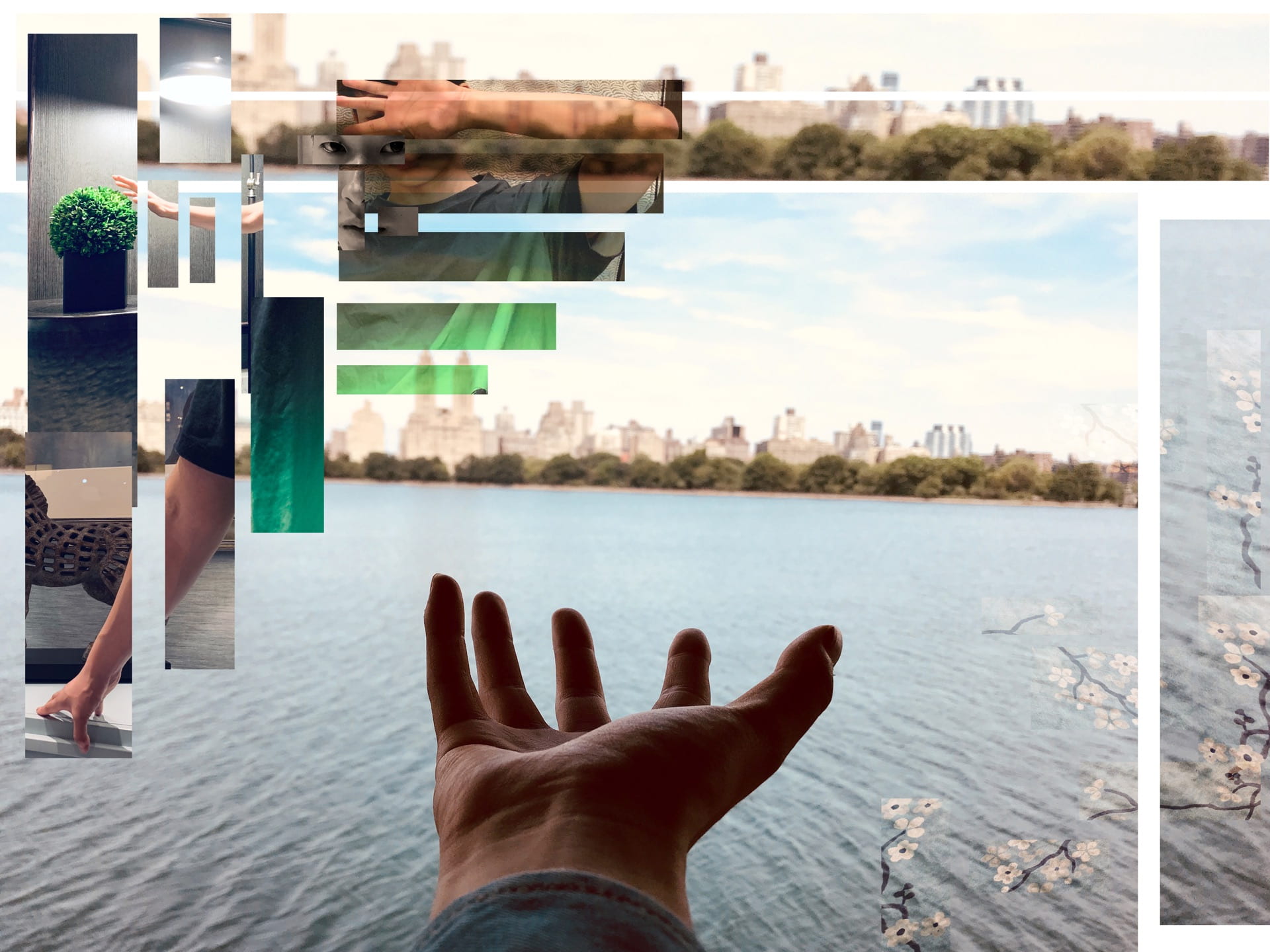
And the last place is central park, the Jacqueline Kennedy Onassis Reservoir. Because Central park is also a symbol of New York, I use my hand to bear “something”. I wanted to show that I studied in New York, I had more chances and challenges to get. Because here is the city of the world. I need to hold these and tried my best to make any possibility come true. This will be a treasure in my life, the different country, culture and perspectives mixed them together improve my own ability. The hand represent the idea explosion and discover the challenges.
The working process about make this poster was not easy. Because this was my first time to use new version of Photoshop and Illustrator, I really carefully to create the design step by step. I selected 5 different images with my self-portraits and objects. I use the black and white portrait as the front face. It was show the peaceful and claim feeling about my personality. The other side portrait behind this was my other personally, sometimes I feel shy and have mysteries distance with people. And I had a pose with tried to green plant because in my opinion, the green plant means growing up and fresh. The next image just relate to this side portrait, I wore green palm t-shirt, it means I am also improve myself and experience our life. I cut them with different shapes but still can see the relationship between each of them. In the below also have the other hand, it tried to touch the Chinese horse, the missing home emotional can express in here. The background is Central park Jacqueline Kennedy Onassis Reservoir, it was a good place to show my emotional and ideas, When you look the lake, enjoyed peaceful and relaxed here. But if you look forward, you can see the upper east side. The view encourage people want to have successful achievement in New York.
About the design, I use different size of rectangle shapes to show my portraits and the elements that I want to express my emotion and mood. The green style means growing up and fresh. The black and white front face means peaceful. The lake waves means claim and mysteries. The different color also shows the different period’s mood.

