Introduction:
in this assignment, I explored the topic of gender by making diptychs that with signifer. The signifier I chose for each diptych is screen, body figure, graffiti, text-based, and skull.
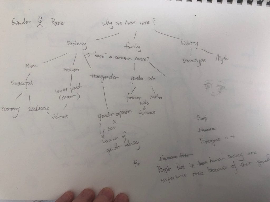
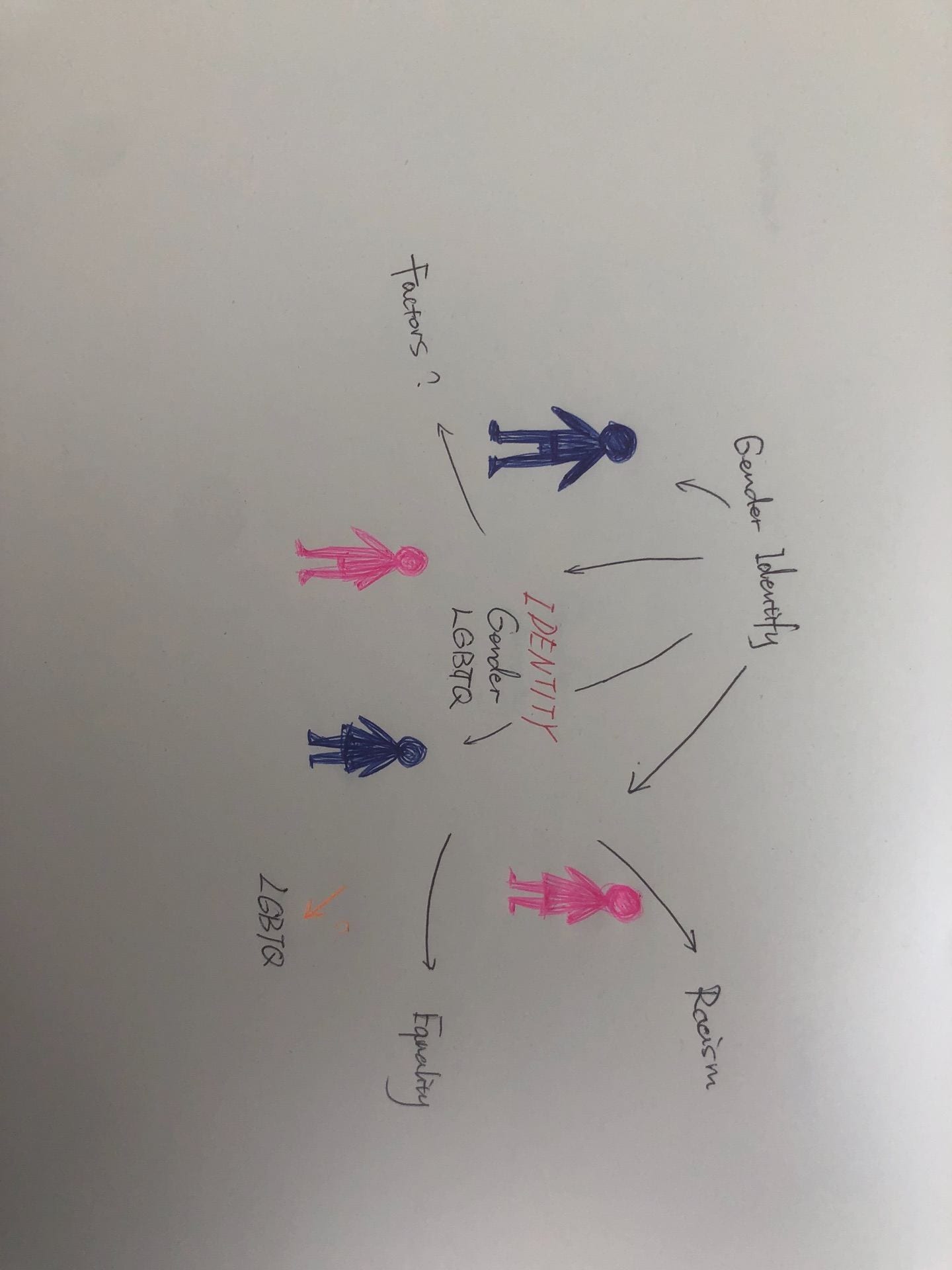
Mind Map:
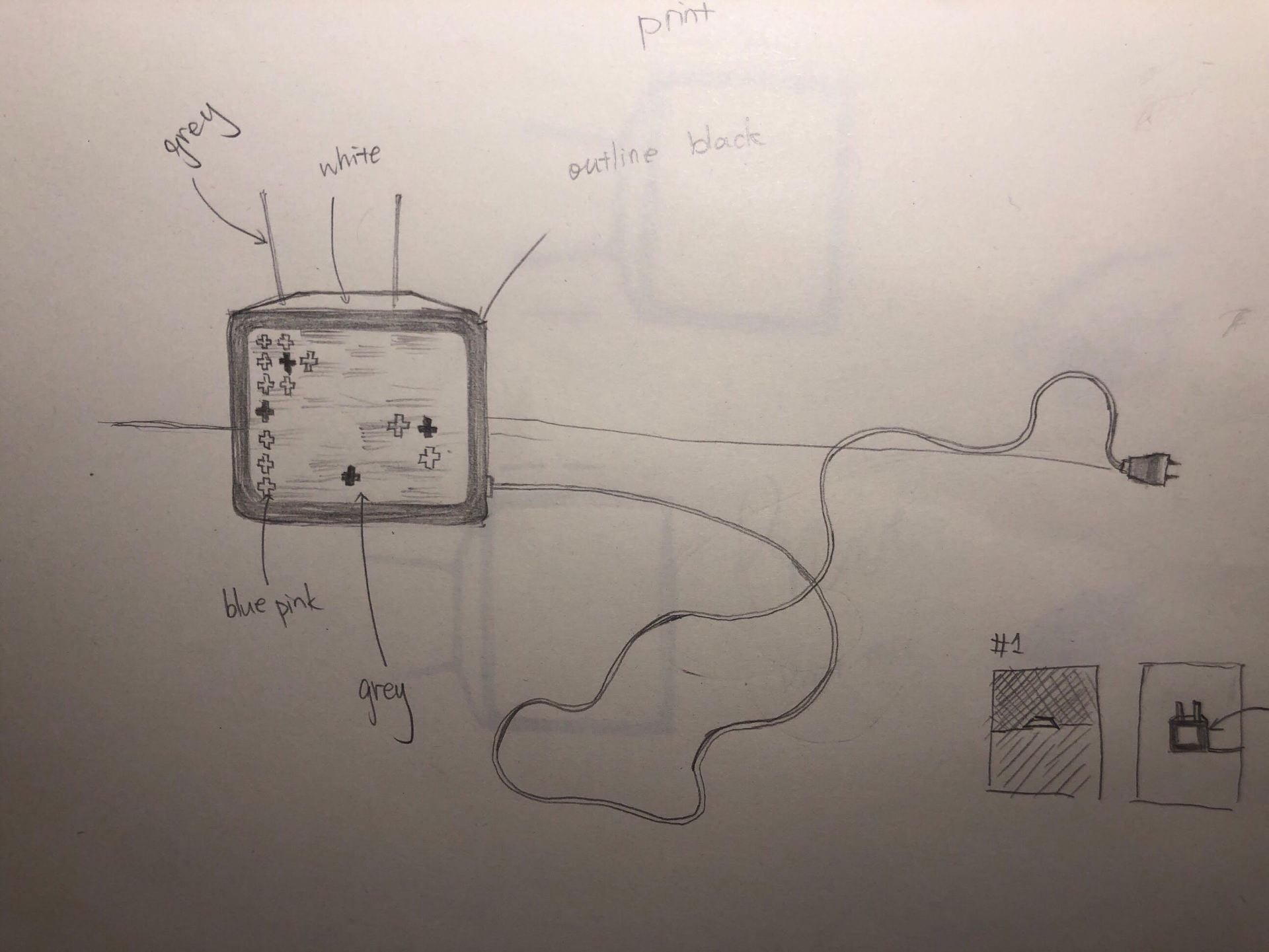
#1
Inspiration:

Betty Tompkin, feminist artist
https://www.artsy.net/artist/betty-tompkins
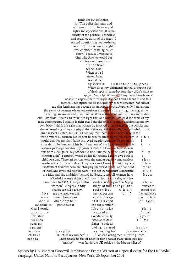
Emma Watson: Gender equality is your issue too
从Reflection:
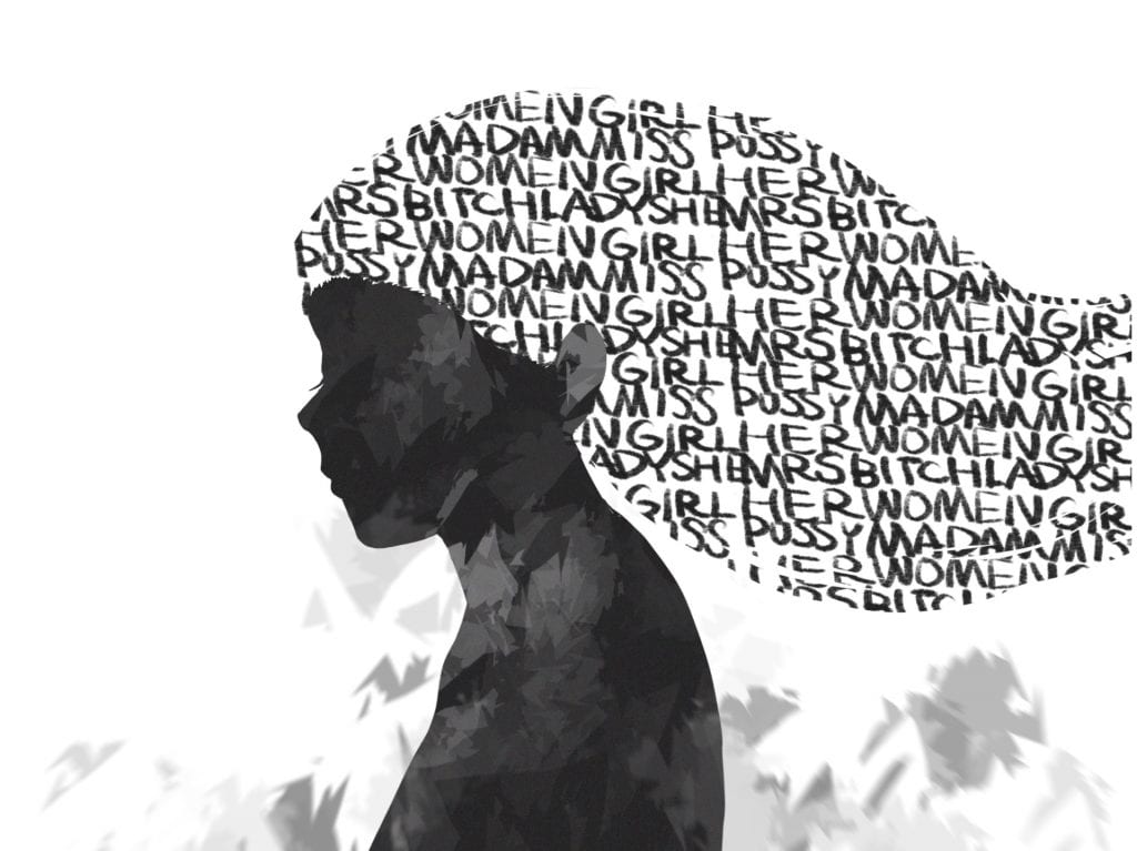
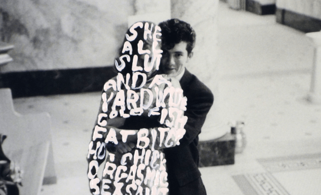
this pair of diptychs is a text-based digital image. the first one is done in InDesign, with the tools in InDesign, I arrange text into the shape of human skulls. The second is hand drawn in procreate, including handwritten texts. Inspired by Betty Tompkins, In my work, I combined text with illustration. The text I chose are the appellations for women. Some of them are cute but some might be rude. I identify myself as a woman and I respect my own gender identity as a female.
?
Why did I choose to use an illustration?
I want to try to combine text and image to express my theme.
Why the color black?
The black color represents life and death.
https://www.verywellmind.com/the-color-psychology-of-pink-2795819
What text did I use in the image?
For the first one, I use the script from Emma Watson’s speech about women equality. for the second one, I asked several of my friends: what will you use to call women, whatever it is a good word or not. using the words I collected, I made the background pattern.
#2
Reflection:
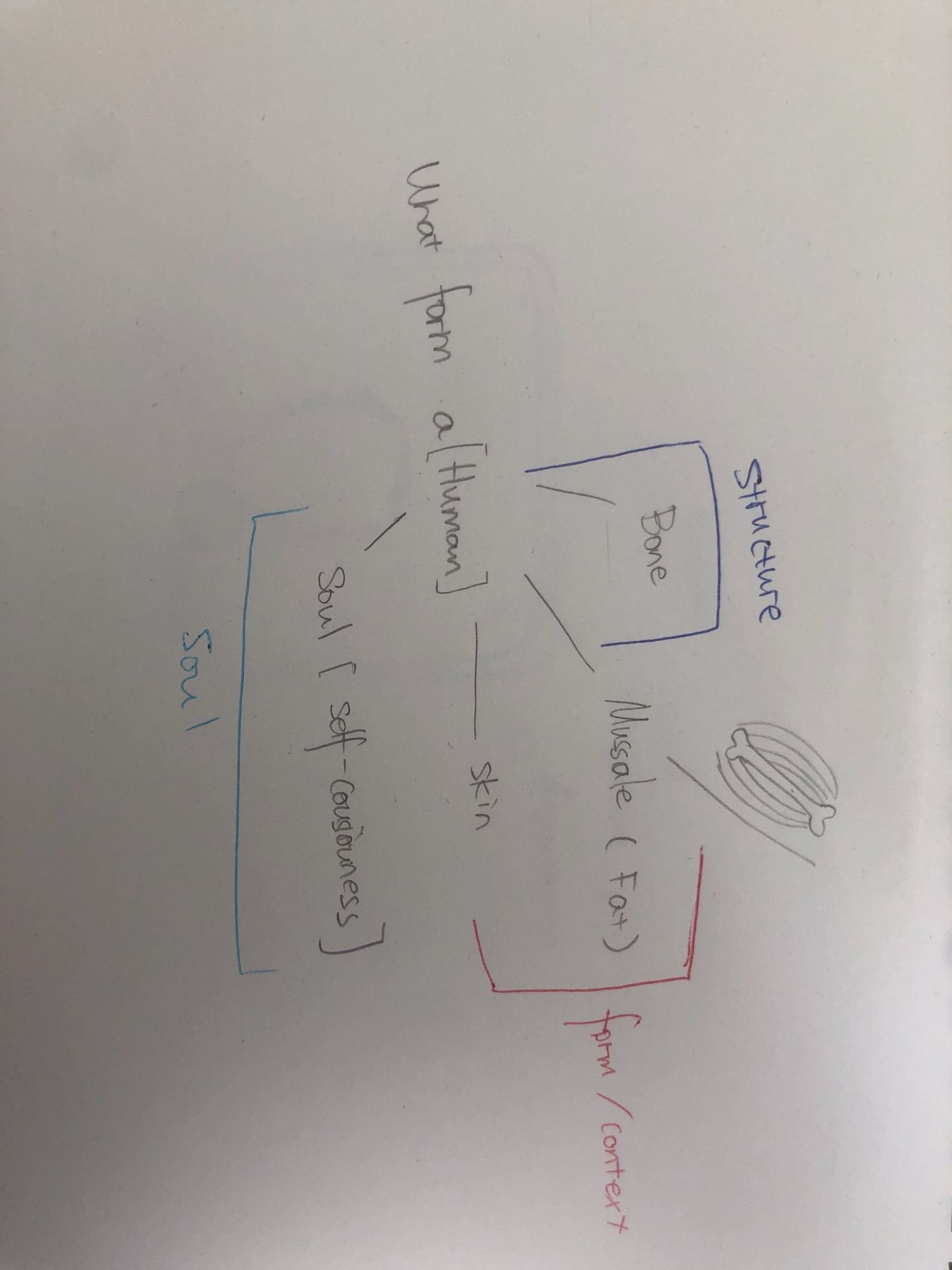
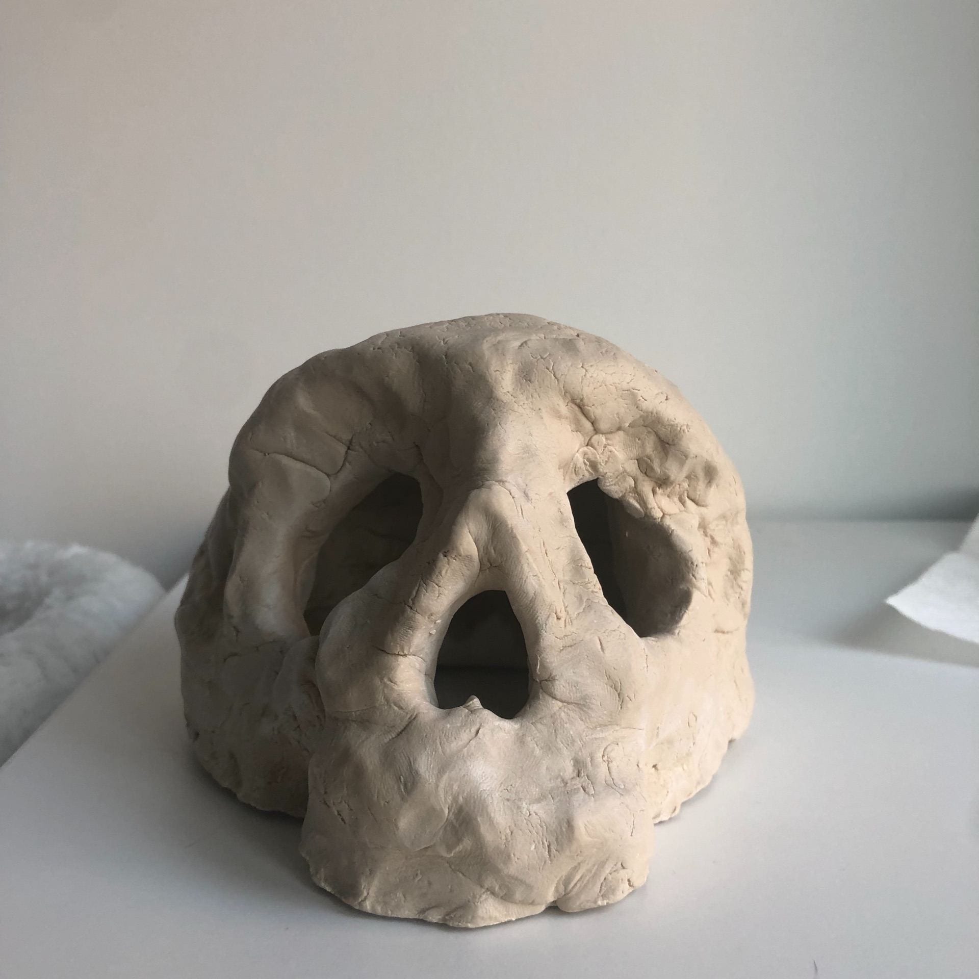
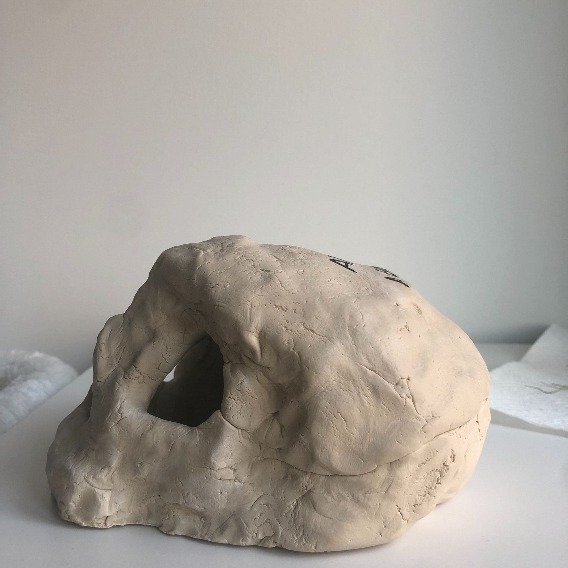
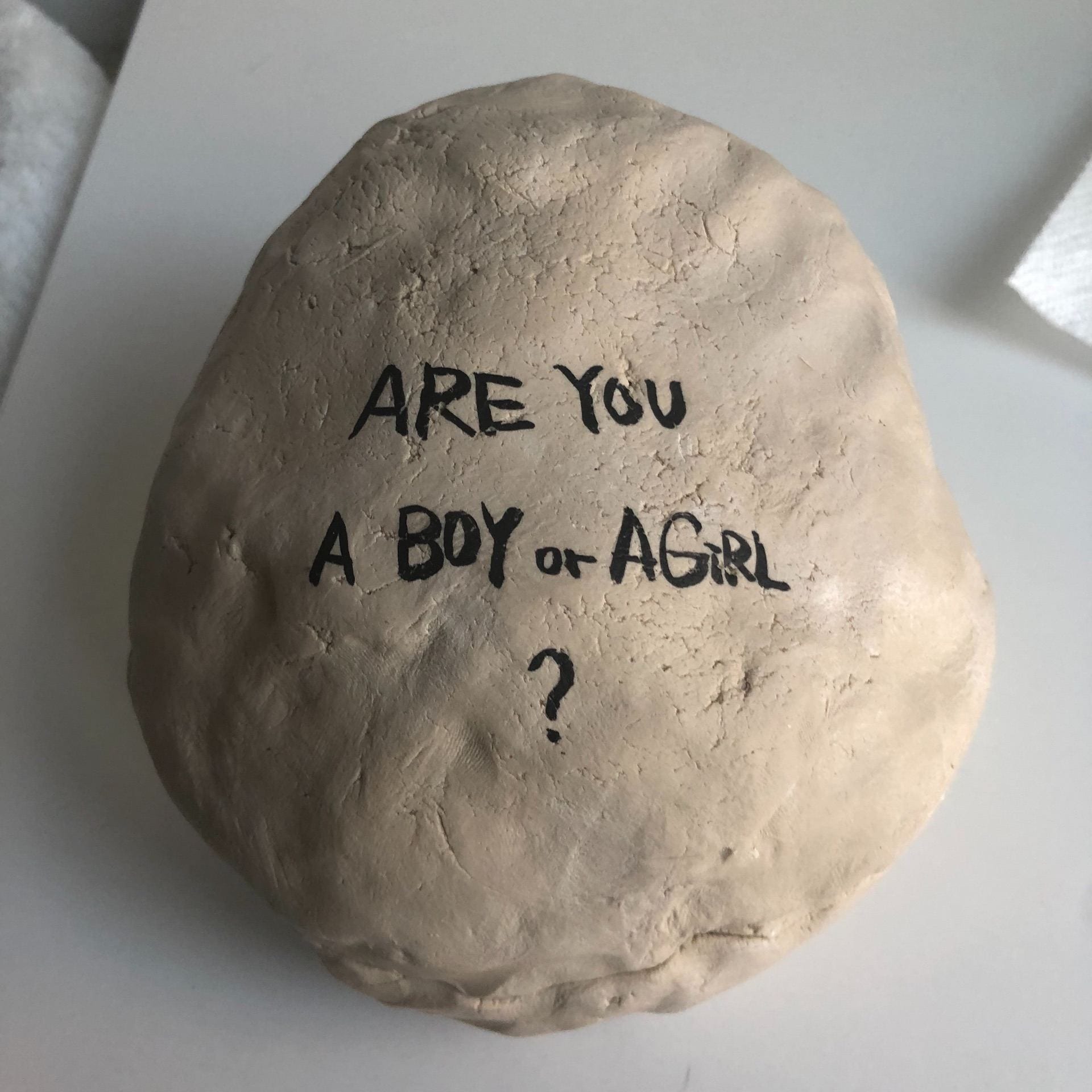
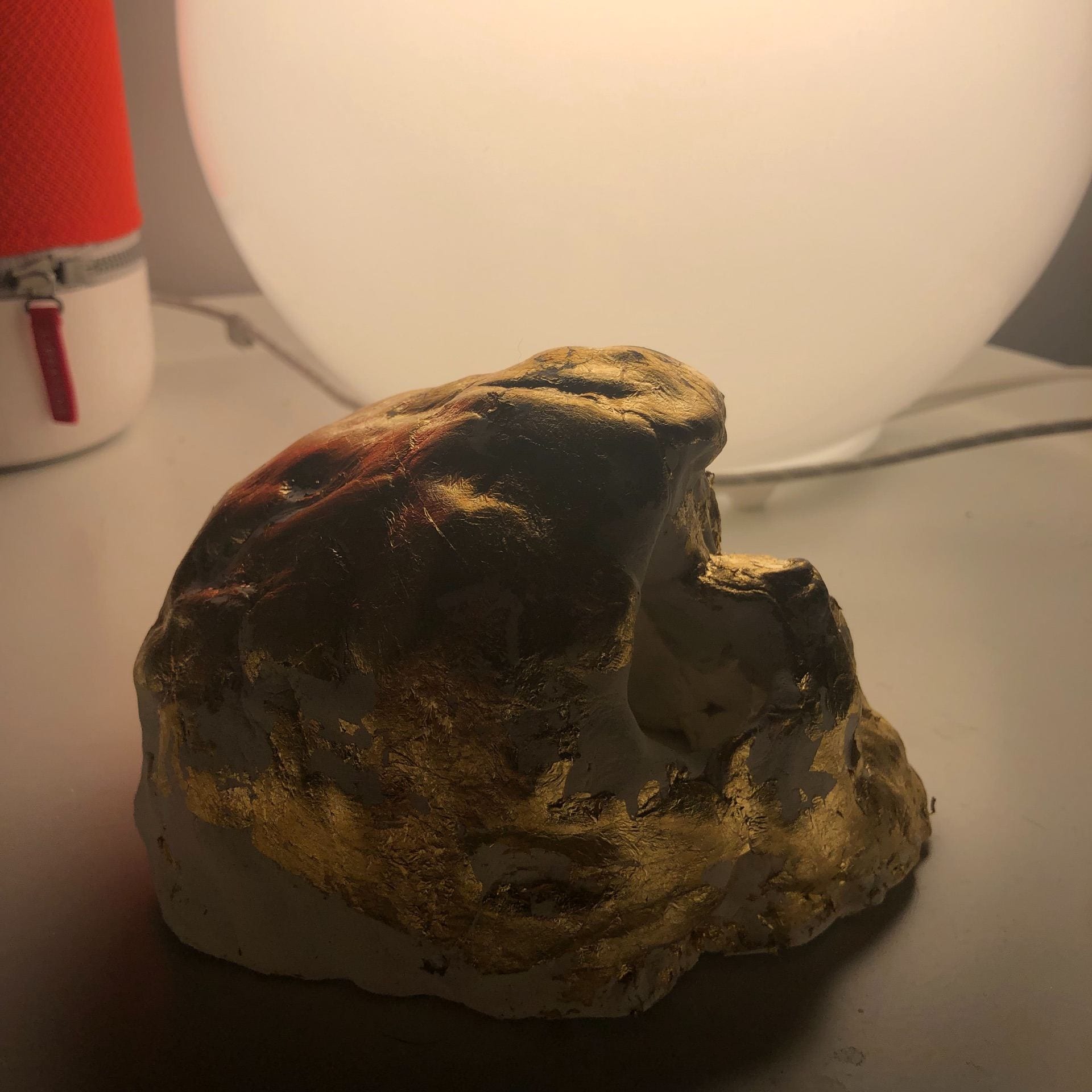
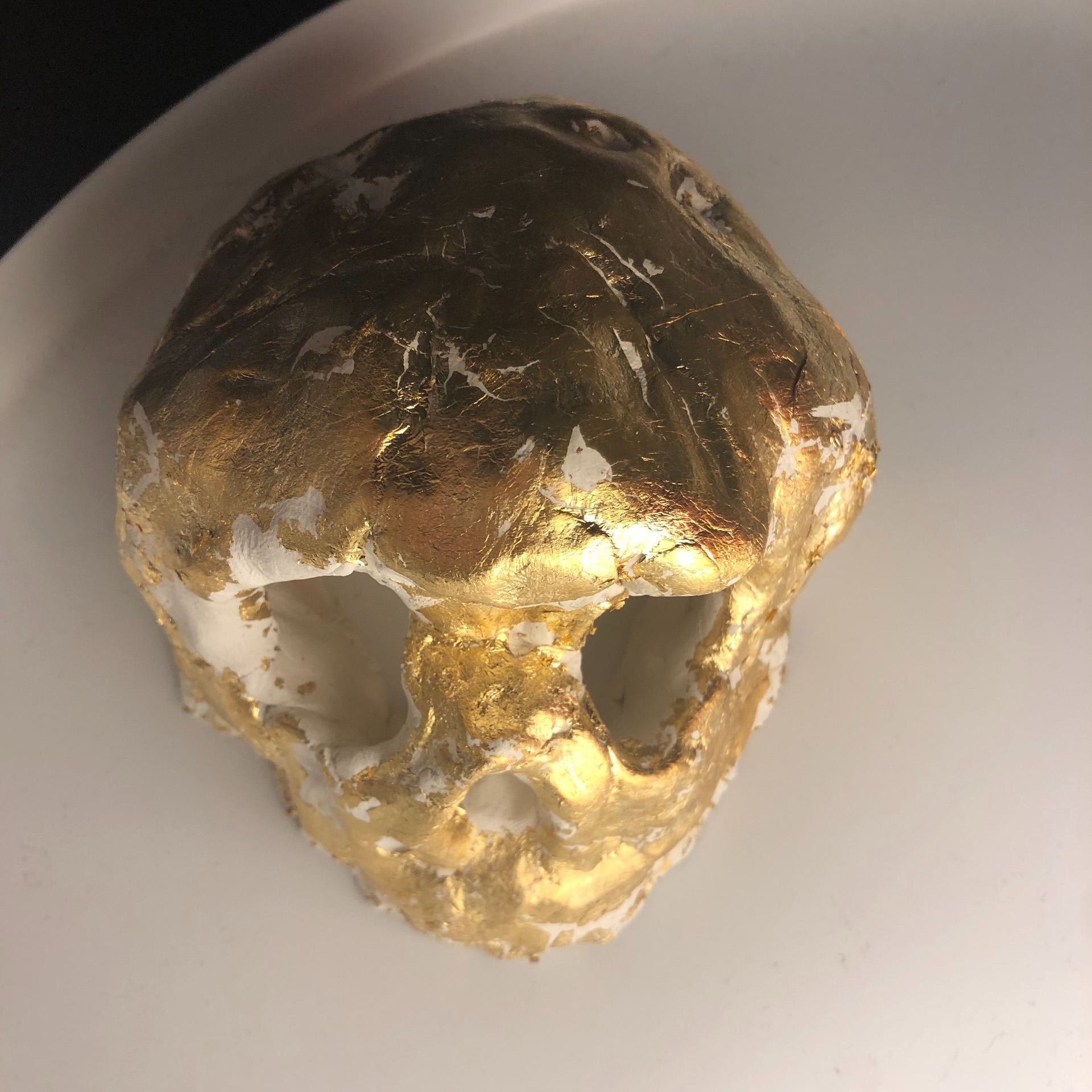
The signifier I chose is the skull. I use clay and gold leaves to make two clay skull. In my understanding, human are combinations of bones, muscles, and soil. Muscles are appearance, beauty, and outlooks. Souls are our inner self, but bones are the structure. People could be different with genders, but they are all the same as a human.
?
Why did I choose to use clay?
I also try paper mache but it doesn’t work out. clay looks rough and natural after it dry and it fit with my concept.
where does the text come from?
I got the text from a poster on the street, it was impressive for me.
Why did I choose to use gold leaves in the second one?
I was inspired by William Shakespeare’s play The Merchant of Venice, All is not gold that glitters,But gold will glitter forever.
After Critique:
Q1: What other materials or media will be good to try?
Projection and College may have an interesting effort with text-based artworks.
Q2: Does text with painting works out?
Yes, it looks strong with text but may be considered with the context more.
Plan:
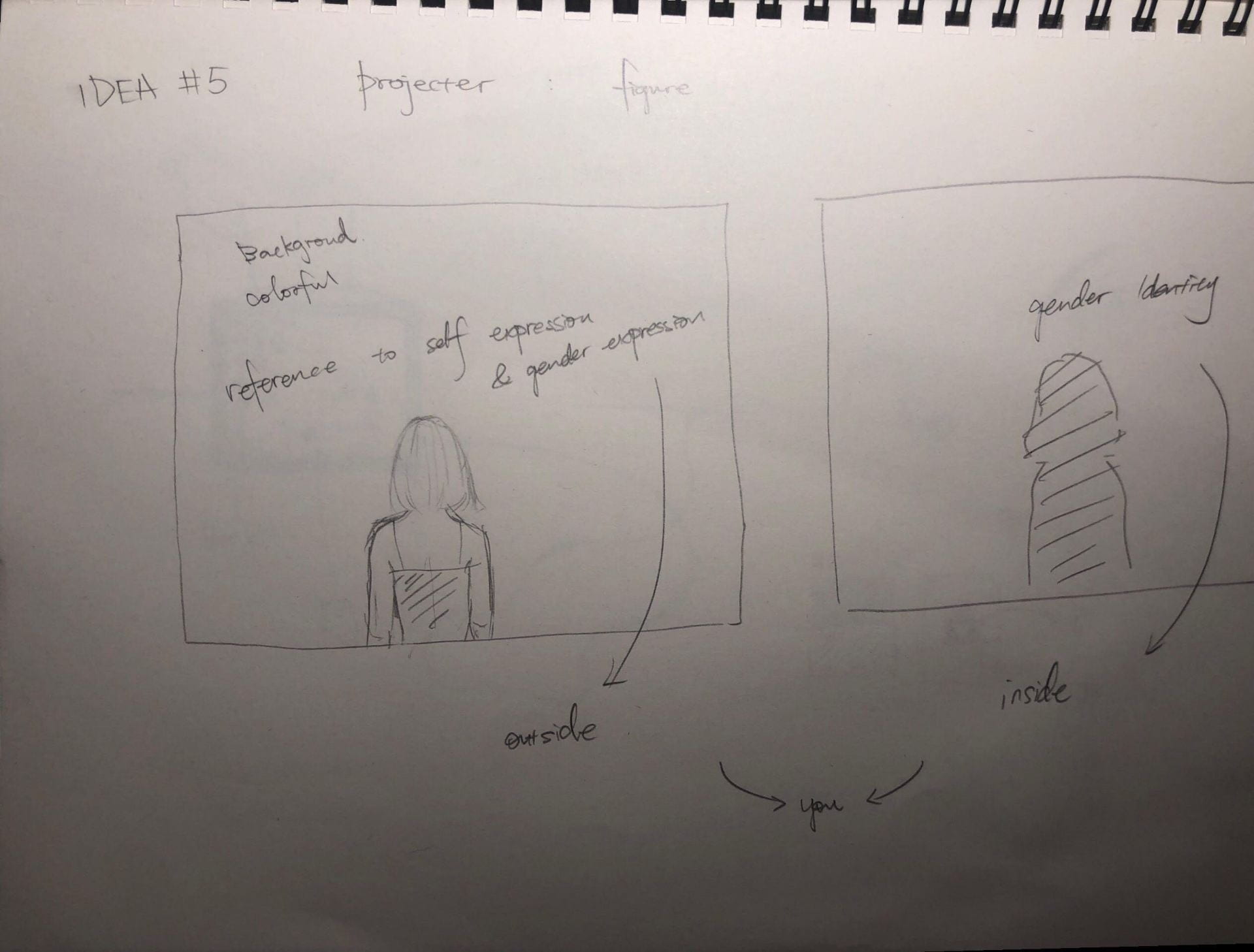
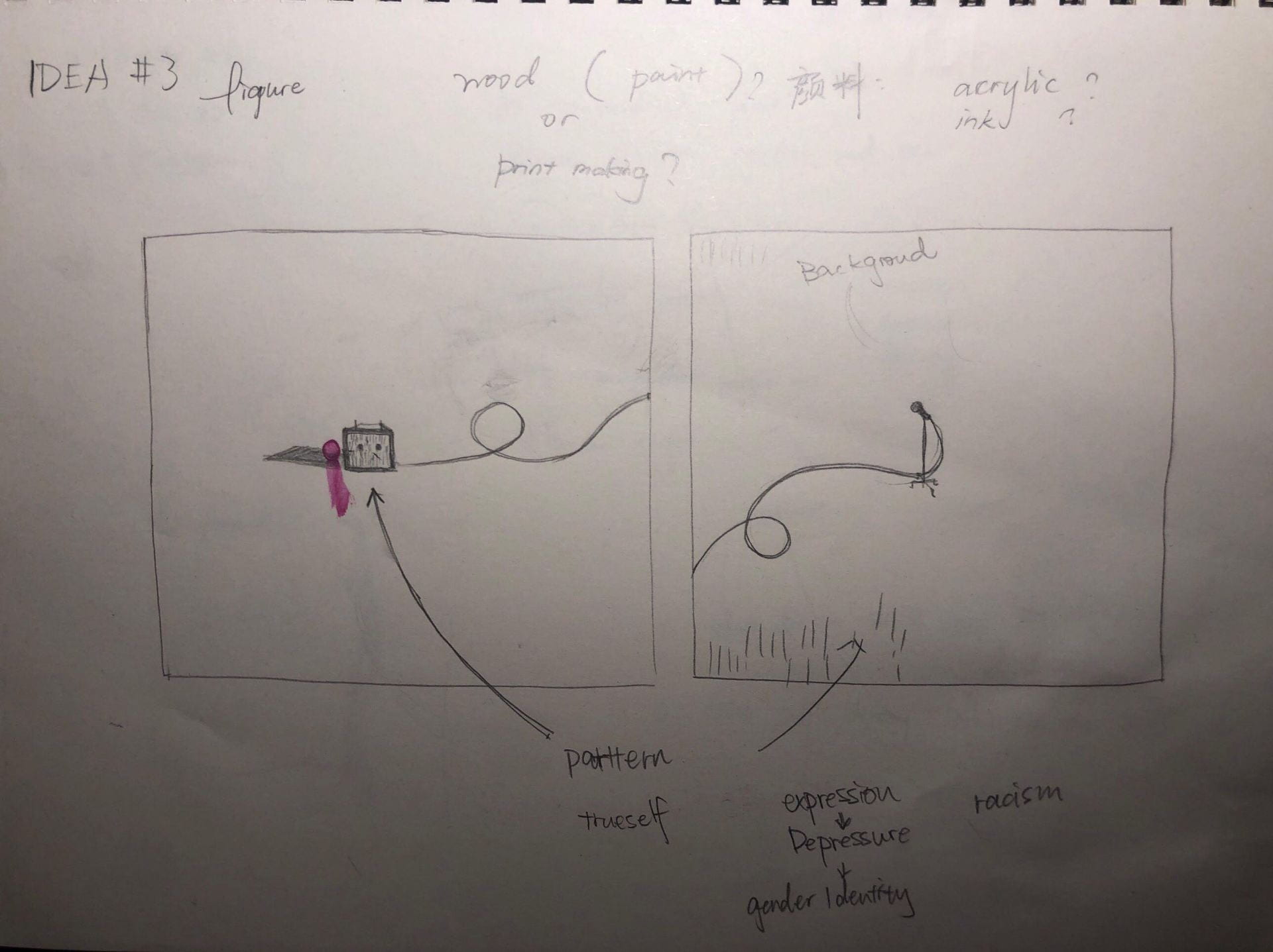
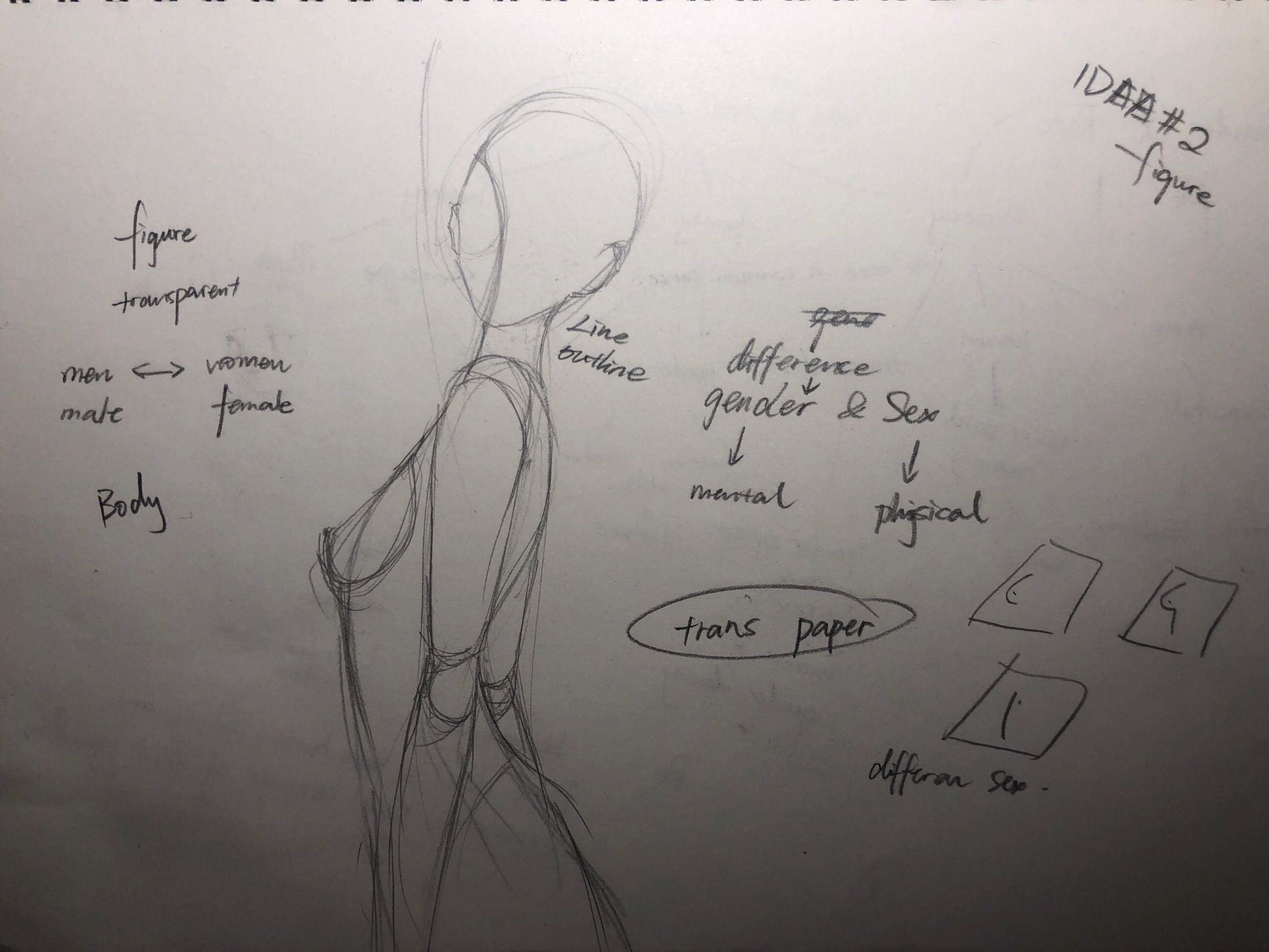
For the other diptychs, I want to try printmaking and projections, or photography. I also want to focus more on the theme of personal gender identity instead of gender equality.