Mark Making Pages


Process notes:
When I am making these mark grids, I see them as textiles. For each page, I want to explore different patterns and materials. Especially the collage page, I have used and tried different materials that come from daily. Also, I wanted to create marks that stand out and forms visual textures to the viewers. The elements I used the most are repetition, density and number/ frequency/density.
Diptych
Birth & Death


Diptych Project Statement
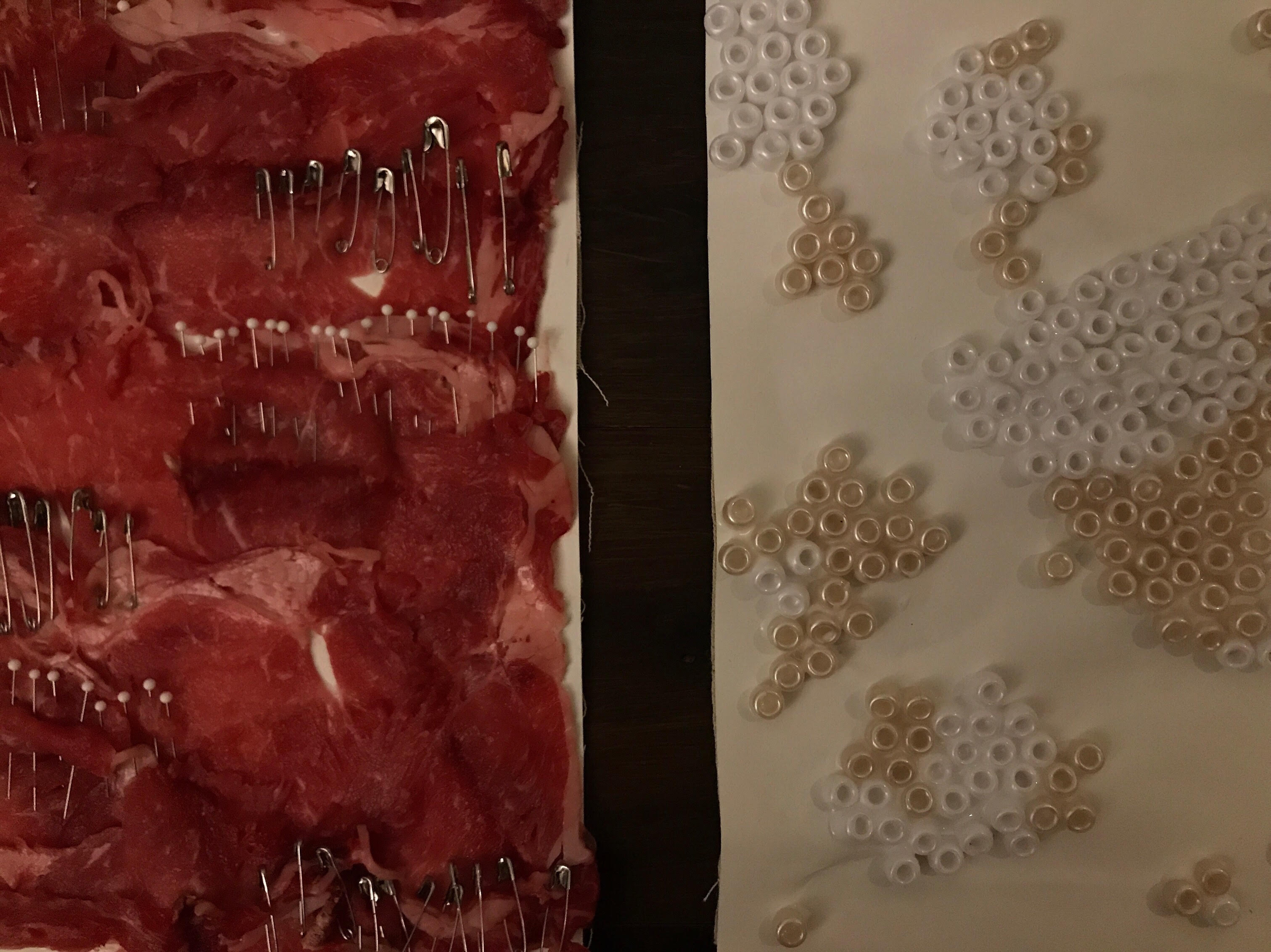
For my diptych project, one of the panel‘s stands for ‘death’ and the other stands for ‘ birth’. At the start, I did not think about what concepts to do, but thought instead about what textures I wanted to contrast. Therefore, I started with roughness and softness, then after thinking back to my mix mark charts and past works that I’ve made; I realize that I work to use materials that hold significant for mark making.
The concept of ‘birth’ and ‘death’ are opposites because one is the start and the other one is the end. However, both somehow relate too, since they are apart of a natural cycle of how life work. Both of the concepts have similar factors, but the feeling of each concept for people is completely different. The Majority people think death is cold, dark and sometimes think of violence. Oppositely, birth for people is a concept of a beginning, of caring and gentleness.
Furthermore, I was definitely certain that my ‘death’ panel would be intense visually and texturally. I wanted to use objects that can create discomfort, but also representative as death. This leads me to consider if I should choose the materials that already had intense colour and were unusual objects to use normally. For the ‘birth”panel, I wanted it to be something pure and shiny, like hope. So, the material that I considered to use was something that looks joyful and plain in the same time. I think both of the panels will be between low and high key, because I will use different colours to balance. Moreover, I have used repetition and sequence in my artwork to create textile like panels. For me, I am a little more on the minimalist side, so the objects that I used are simple and the colours brings depth into the work. As result, the viewers should feel the intensity though the visual elements and from touching the texture of the panel’s surface. Although my work includes a lot of repetition, I am influenced by Kazimir Malevich’s artworks. He uses simplest shapes to form strong paintings and each shapes are filled with one strong colour. Afterwards, the whole painting looks like a view that can absorb you in. You can see the small textural details that are created by brush strokes and contrasting colors between the shape and background. For me, I wanted to create the strong panels and to emphasize the obvious contrast of the two concepts.
Reflection:
Throughout making the diptych’s panels, I think some patterns and materials are developed from the mark making grids. I think these two projects have helped me to develop my ideas and explore materials. As you can see, after exploring different mediums of elements and materials, I then do my diptych project, you can see there are some relations between them. I do enjoy both projects since I am into more abstract works. For future projects, I will continue to be interested in repetition and density elements to form artworks that have textile with strong textures in it. Moreover, exploring more mediums and try to see and develop a significant style of work that represents my values. I believe for my future works I definitely will have more low key and high contrast elements in my artworks. For me, I always think that our surroundings provides us with the necessary knowledge and emotions to help us interact in the world. Therefore, the meanings and what I want to convey in my artworks will be reflecting my life and different perspectives from different people. As result, these ideas and thinking will form my final and concepts of my artworks.