This is a group project and also a continuation of the 2nd Ave subway station work. As a group of 4, we need to create one magazine cover for our site’s fake articles. We separated into a different order of making/adding to the magazine. Moreover, our topic is about how the subway station is haunted, therefore our magazine cover shows horror images and conveys scary feelings.
1st:


Giji was the people who create the background, she found an image of the subway station. The image was special because it was symmetrical and had strong colors. She thought the image was good for as the background that it stood out on its own, but at the same time it could not be too focus as there was more figures to be added on. Moreover, the original color of the image had less contrast. Giji used a few adjustment on Photoshop to alter the color of the image. In particularly, the sharpen tool worked well because it darken the background and created a sense of gloomy. The texture and the atmosphere it created fit our horror theme as we mentioned in the articles.
2nd:

Lamie was the one who added the texts into the piece. Initially he was thinking of adding a simple text for the cover title however since the group’s article is linked to a horror theme, it would be more interesting to make the font a bit eerie and creepy looking. Therefore, Lamie went to search for some other unique fonts online. He also added the text “haunted subway” to emphasize the idea of the article. Along with that, he added the barcode so it seems more realistic to a news cover.
3rd:

Anne was the person who added the figures and modified the background.First of all, she created a red and green glitch effect on the background with photoshop in order to enhance the creepiness and the aesthetic of the cover. Secondly, she added a vague ghost figure in the middle to represent the main character of the group’s fake news. Lastly, she cut out a little girl from the subway artwork leaving only the silhouette except for the ballon the girl is holding since she feels like it is also the main key of the news.
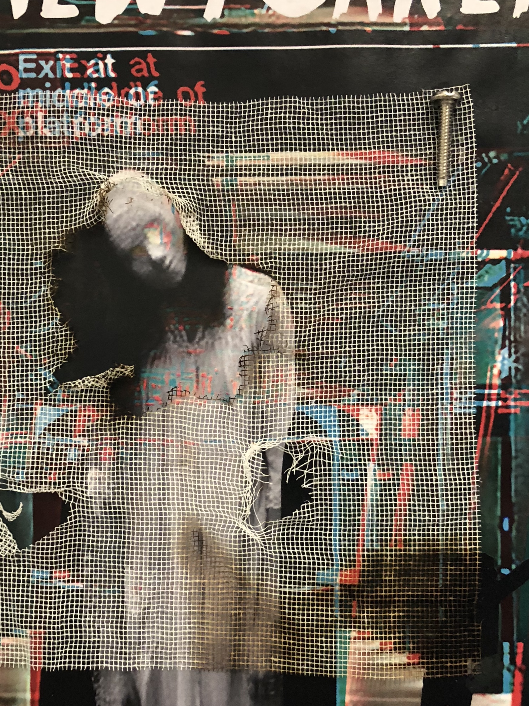
4th:


I was the last person to add on and she added textural layers using other materials. I have printed out the work and rippled the work edges like it was torn, but still looking crisp (not out of shape). Also, I have stuck the work on a piece of red paper to give it a border. At the start, I have found a set of square mesh fabric and thought about suprematism, then she centered it in the middle. Before actually gluing the square on, I burned the fabric creating old and scary visual effect. Moreover, cutting some holes and one big hole in the middle to make the figure of the ghost look like popping out of some sort of window or mist. Lastly, to add more depth and 3D elements into the work, she has put screws and pins to create the feeling of an old subway station and vintage effect.
Final Work
